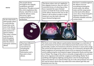
1. Adam Day
The three-colour rule isn’t applied to
this digipak, however, they are still in
consistent terms of colouring as they
have repeated the space themed
colours on both the front and the back
of the album. However the text on the
album is all in white to make it really
stand out over the dark coloured,
space themed background.
They have followed
the traditional
conventions of
including the
production
information and a
barcode to their
album.
One font is used throughout
the album cover for
everything including the
artists name, the album
name and the song names
on the back of the album
cover, this is Tinie Tempah’s
signature font which is
instantly relatable with this
certain artist.
The front cover of the album is particularly interesting; it is a mid shot of
the artist however he has his arms linked around what seems to be a city,
predictably, London, his hometown which he mentions in most of his songs.
The artists facial expression is totally serious, he is dressed in all black with
black sunglasses on wearing what seems to be an expensive bracelet and
watch emphasising the stereotypical rapper being quite flashy and having a
lot of ‘bling’. The image of the artist is instantly recognisable to its audience
due to his signature look with the sunglasses and looking ‘flashy’ He is
sparkling with high key lighting coming down onto his head giving the
impression that he is in control of that city, he is the sole protector of it and
the way he towers above the city makes him seem almost god-like and
dominant over the city.
On the disk itself a
dark purple colour
is used with the
same font as the
rest of the album,
it is a very simple
disk, however it
doesn’t matter.
The colour scheme
and text fits in
with the galaxy
themed digipak
that the artist is
aiming for with his
album.
The purple theme
throughout the digipak
symbolises spiritual
protection. The glow around
the artist emphasises this
theme, which fits in nicely
with the albums name,
Discovery, again
emphasising spiritual
protection.