Download to read offline


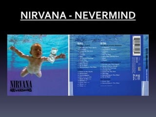


The document discusses the conventions and design elements of digipacks. It provides examples of digipacks for the albums Nevermind by Nirvana, Smash by Offspring, and The Battle of LA by Rage Against the Machine. Some key points: - Digipacks typically include the artist/album name, tracklist, label logo, and barcode - Front panels usually feature the artist image and name in a recognizable font - Back panels contain the tracklist, barcode, and label logos - Color schemes aim to represent the genre and atmosphere of the music


