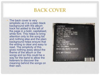
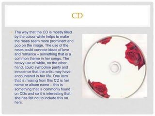
S I N E A D G R A C E
DIGIPAK TEXTUAL
ANALYSIS
YOU ME AT SIX
SINNERS NEVER SLEEP
FRONT COVER
• The front cover of this digipak
is quite simple in that if
features a close mid shot of a
girl’s chest as she holds a
plaque with the band and
album name. The image is
quite symbolic of what you
would find in a prison
mugshot, and so we can
assume that the rest of the
digipak is themed to look like
this. The use of black and
white is interesting as it
makes the image seem old –
this is added to by the
vignette that is visible.
BACK COVER
• The back cover is very
simplistic as it is a plain black
background with the album
track list added to the left of
the page in a bold, capitalised,
white font. This helps to bring
attention only to the song list
and nothing else and the plain
background helps ensure that
the writing is clear and easy to
read. The simplicity of this
gives nothing away about the
theme of the album or the
songs and so this could be a
way for the band to allow the
listeners to discover the
meaning behind the songs on
their own.
INSIDE
• The inside of the digipak follows the prison theme of the front cover
as we can see thumb prints and cut outs of faces/mug shots. As this
prison/arrest theme is so dominant in the digipak, we can assume
that this is a recurrent theme within the songs and possibly any
music videos for singles from this album. On the left panel we can
also see an image of the band, which introduces the buyer to them
and allows us to see what they look like. The fact that their image is
placed next to these thumb prints could suggest they they belong to
them.
OUTSIDE
• The outside of the digipak shows the front and back cover, as well
as another – clearer – image of the band. The fact that their image
has been placed against the front cover and album track list
confirms that this definitely is them and again, introduces the buyer
to the band themselves. The image is quite dark and has high
contrasting tones, which makes it an intriguing image to view. There
are four men stood behind one man who is centered in the frame
and appears larger than the rest, and so we can assume that this is
the lead singer as this is arguably the most important role.
LANA DEL REY
BORN TO DIE
FRONT COVER
• The front cover of this digipak shows a
simple, mid shot portrait of Lana herself.
This is a common trend among digipaks –
especially when there is one single artist –
as it allows the record label to create a
representation of the artist shown. In this
case, we can see Lana’s vintage style and
beauty which is quite unique to herself.
Many of her audience define her for her
look and so it is clear why this is heavily
represented in her album cover. The high
key lighting and outside setting could
connote a sense of adventure and
exploring the world. The font used is quite
simple and clear to read, which allows
viewers to clearly see who this is and
what album it is. The simplicity of this front
cover could be a representation of her
music.
BACK COVER
• Again, this back cover is very
simple as it shows a plain red
background with white and black,
simple text on top. The only thing
listed is the track list from the
album and so this could connote
how the songs are very important
and the only thing that people
should focus on when it comes to
her work – the songs, not herself.
To further this theory, the colours
used on this back page are quite
dominant, bold colours compared
to the light, muted tones on the
front and so this could further
suggest that the songs are more
important than her.
INSIDE
• The inside of this digipak is a similar style to the front and is
most likely taken from the same photo shoot – it is a mid/close
up of Lana Del Rey sat outside. However, with this image, her
body language has changed. What has stayed the same is
her outfit and overall look, which helps Lana to create her own
visual style that she will be recognised for. The fact that this
image has been spread across two panels could signify
Lana’s importance as an artist and a person.
CD
• The way that the CD is mostly filled
by the colour white helps to make
the roses seem more prominent and
pop on the image. The use of the
roses could connote ideas of love
and romance – something that is a
common theme in her songs. The
heavy use of white, on the other
hand, could symbolise purity and
innocence that the artist may have
encountered in her life. One item
that is missing from this CD is her
name or album name – this is
something that is commonly found
on CDs and so it is interesting that
she has felt not to include this on
hers.

Textual Analysis - Digipak

  • 1.
    S I NE A D G R A C E DIGIPAK TEXTUAL ANALYSIS
  • 2.
    YOU ME ATSIX SINNERS NEVER SLEEP
  • 3.
    FRONT COVER • Thefront cover of this digipak is quite simple in that if features a close mid shot of a girl’s chest as she holds a plaque with the band and album name. The image is quite symbolic of what you would find in a prison mugshot, and so we can assume that the rest of the digipak is themed to look like this. The use of black and white is interesting as it makes the image seem old – this is added to by the vignette that is visible.
  • 4.
    BACK COVER • Theback cover is very simplistic as it is a plain black background with the album track list added to the left of the page in a bold, capitalised, white font. This helps to bring attention only to the song list and nothing else and the plain background helps ensure that the writing is clear and easy to read. The simplicity of this gives nothing away about the theme of the album or the songs and so this could be a way for the band to allow the listeners to discover the meaning behind the songs on their own.
  • 5.
    INSIDE • The insideof the digipak follows the prison theme of the front cover as we can see thumb prints and cut outs of faces/mug shots. As this prison/arrest theme is so dominant in the digipak, we can assume that this is a recurrent theme within the songs and possibly any music videos for singles from this album. On the left panel we can also see an image of the band, which introduces the buyer to them and allows us to see what they look like. The fact that their image is placed next to these thumb prints could suggest they they belong to them.
  • 6.
    OUTSIDE • The outsideof the digipak shows the front and back cover, as well as another – clearer – image of the band. The fact that their image has been placed against the front cover and album track list confirms that this definitely is them and again, introduces the buyer to the band themselves. The image is quite dark and has high contrasting tones, which makes it an intriguing image to view. There are four men stood behind one man who is centered in the frame and appears larger than the rest, and so we can assume that this is the lead singer as this is arguably the most important role.
  • 7.
  • 8.
    FRONT COVER • Thefront cover of this digipak shows a simple, mid shot portrait of Lana herself. This is a common trend among digipaks – especially when there is one single artist – as it allows the record label to create a representation of the artist shown. In this case, we can see Lana’s vintage style and beauty which is quite unique to herself. Many of her audience define her for her look and so it is clear why this is heavily represented in her album cover. The high key lighting and outside setting could connote a sense of adventure and exploring the world. The font used is quite simple and clear to read, which allows viewers to clearly see who this is and what album it is. The simplicity of this front cover could be a representation of her music.
  • 9.
    BACK COVER • Again,this back cover is very simple as it shows a plain red background with white and black, simple text on top. The only thing listed is the track list from the album and so this could connote how the songs are very important and the only thing that people should focus on when it comes to her work – the songs, not herself. To further this theory, the colours used on this back page are quite dominant, bold colours compared to the light, muted tones on the front and so this could further suggest that the songs are more important than her.
  • 10.
    INSIDE • The insideof this digipak is a similar style to the front and is most likely taken from the same photo shoot – it is a mid/close up of Lana Del Rey sat outside. However, with this image, her body language has changed. What has stayed the same is her outfit and overall look, which helps Lana to create her own visual style that she will be recognised for. The fact that this image has been spread across two panels could signify Lana’s importance as an artist and a person.
  • 11.
    CD • The waythat the CD is mostly filled by the colour white helps to make the roses seem more prominent and pop on the image. The use of the roses could connote ideas of love and romance – something that is a common theme in her songs. The heavy use of white, on the other hand, could symbolise purity and innocence that the artist may have encountered in her life. One item that is missing from this CD is her name or album name – this is something that is commonly found on CDs and so it is interesting that she has felt not to include this on hers.