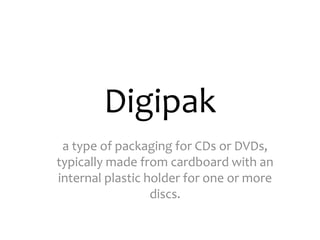
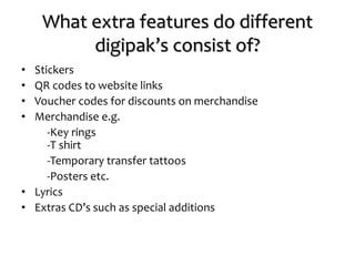
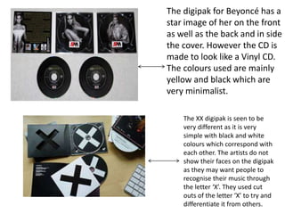
Digipak
a type of packaging for CDs or DVDs,
typically made from cardboard with an
internal plastic holder for one or more
discs.
Did you know…
Digipak is a registered trademark of AGI media
who originally developed the packaging style,
but the term digipak has come into more
common use for other similar packaging. Even
when it’s produced by other companies or
with varying materials.
Ellie Goulding
The effect of having
subtle stars on the
actual CD relates to
the album name
Star image- as she is
the first thing you
would spot when
opening the pack
Artist name is lit up to
relate to the album
name. Lights are also
featured in her hair
The back features
lyrics to her most
common songs
allowing the audience
to learn all the lyrics
and sing along.
The background of the back of
the album has different
diffused pictures with stars on
top, which links into her theme
and it also incorporated at the
front of the CD. This theme is
incorporated throughout the
entire digipak.
The artist is the main attention of
the album cover to show that it is
her album and so when the
audience listens to it they are able
to put an image of her to her
voice.
The ‘XCX’ in her name is the
main attention of the CD and
the font has been made
transparent to show the
image of the background
The artist creates her image within
the clothes she’s wearing for
example, she’s wearing black
trousers that are ripped and a top
with mesh sleeves. This would give
off a grungy style suggesting that
her music is targeted at an audience
that have a similar style to her,
The font for her songs are
spaced out and in capital
letters. This would draw
attention to it as you can
clearly see what each song
is called.
The white and black colours contrast against each other
which makes it stand out
The colours chosen for the album cover is black
and white which can be symbolic of the artist as
you either like or you don’t as you can also tell
through her music- this is something which she
emphasises.
The theme of her album cover portrays a grungy
look as it is black and has low key lighting. This also
portrays her personality and her genre of music
through the presentation of her character. The
audience she is attempting to attract would be
those of similar taste.
This CD is very simple and
leaves the audience
wondering what the genre of
the music is. It leaves a
statement as it is very simple
which correlates to her album
cover and image she
portrays.
The symbolic use of the
colour white promotes purity
and her innocent nature
which juxtaposes the exterior
of the album cover. The use
of the icon at the top of the
CD is an image of her which
may be there as a logo which
her fans may recognise.
• There is no text or any sort of wording which links to the front
cover of the digipak , however, the red roses link to the title,
‘Born to Die’ due to the idea of funerals.
• The roses symbolise love and passion - when you give a rose to
someone you imply that you care about them or feel some way
about them. This suggests that the artist, Lana Del Rey, is
communicating with the her audience, she’s implying the that
the CD is like a present to the audience from her and that
shows that’s she cares about her fans.
• An alternative idea would be that the roses could potentially
look like blood stains reflecting a melancholic atmosphere.
• Moreover, the colour red could imply patriotism as her front
cover includes blue and white as well. This links to one of her
songs ‘National Anthem’.
• The overall look to this CD is very old, classic, slightly faced and
instagram soaked.
These are all the songs within the album and they very
coordinated. The white writing suggest the main songs
and the black writing suggest the bonus songs. The
songs are presented very simply yet they leave a bold
statement that the album is mostly about the music.
There is a uniform song font which makes them look
unified as a whole suggesting that all the songs carry the
same conceptual message.
What features are included in
successful digipaks?
The album
cover with the
title and the
artist name. the
artist is the
main image so
this implies her
star image is
the main key.
List of the song
names in the
album cover
The CD itself
A poster/picture
of the artist.
There is a continuous theme throughout. In this example it is gold and
black with tessellation design.
A bar code to be
able to purchase
the album
Who the artist works for. The record
label.
What extra features do different
digipak’s consist of?
• Stickers
• QR codes to website links
• Voucher codes for discounts on merchandise
• Merchandise e.g.
-Key rings
-T shirt
-Temporary transfer tattoos
-Posters etc.
• Lyrics
• Extras CD’s such as special additions
What colour pallets work successfully
in a digipak?
These album covers have things in
common which are a polaroid effect
which seems to be trending in most
album covers. There are also a range of
colours within the album covers above.
In this Rihanna album the same theme and
colour has been used throughout the
album cover. The colour red is the main
theme to the cover, the effect of the
images and themes are a expired, out of
date theme.
How do different digipak’s
successfully incorporate their
concept?
Depending on the genre and target audience, digipak’s
will consist of various features to successfully put
across their concept. For example rock bands may
include a guitar pick, r&b artists will include posters as
their star image is key.
For the album cover itself, different genre’s have
different themes for example rock bands mainly have
their logo e.g. The Rolling stones has the lips with
tongue as their image to represent them, however a
r&b or pop artist would normally have a picture of
themselves to portray their star image and it usually
correlates to their genre of music.
This album cover is very
different and stands out as it
has a lot of things going on.
This links to the way Lady
GAGA’s music and appearance
which is very bold and messy.
Britney Spears album
cover is very flashy
which corresponds to
the music that she
produces. She is also
shown on the front
cover of he digipak
which shows that she is
trying to be portrayed as
someone who is
glamourous.
The digipak for Beyoncé has a
star image of her on the front
as well as the back and in side
the cover. However the CD is
made to look like a Vinyl CD.
The colours used are mainly
yellow and black which are
very minimalist.
The XX digipak is seen to be
very different as it is very
simple with black and white
colours which correspond with
each other. The artists do not
show their faces on the digipak
as they may want people to
recognise their music through
the letter ‘X’. They used cut
outs of the letter ‘X’ to try and
differentiate it from others.
How large/small are different
features in the design? (e.g. band
name, credits)
• A recurring theme within the given
examples is that the artists image
is key as they are the first thing you
would look at
• Adele, Britney and Nicole
Sherzinger’s cover features their
name as the largest font so their
name is highly recognised
• Rihanna has the album name as
the largest font and the ‘featuring’
in the smallest as this may not be
relevant due to her being the most
important thing in the image.

Digipak Research

  • 1.
    Digipak a type ofpackaging for CDs or DVDs, typically made from cardboard with an internal plastic holder for one or more discs.
  • 2.
    Did you know… Digipakis a registered trademark of AGI media who originally developed the packaging style, but the term digipak has come into more common use for other similar packaging. Even when it’s produced by other companies or with varying materials.
  • 3.
    Ellie Goulding The effectof having subtle stars on the actual CD relates to the album name Star image- as she is the first thing you would spot when opening the pack Artist name is lit up to relate to the album name. Lights are also featured in her hair The back features lyrics to her most common songs allowing the audience to learn all the lyrics and sing along.
  • 4.
    The background ofthe back of the album has different diffused pictures with stars on top, which links into her theme and it also incorporated at the front of the CD. This theme is incorporated throughout the entire digipak. The artist is the main attention of the album cover to show that it is her album and so when the audience listens to it they are able to put an image of her to her voice. The ‘XCX’ in her name is the main attention of the CD and the font has been made transparent to show the image of the background The artist creates her image within the clothes she’s wearing for example, she’s wearing black trousers that are ripped and a top with mesh sleeves. This would give off a grungy style suggesting that her music is targeted at an audience that have a similar style to her, The font for her songs are spaced out and in capital letters. This would draw attention to it as you can clearly see what each song is called.
  • 5.
    The white andblack colours contrast against each other which makes it stand out The colours chosen for the album cover is black and white which can be symbolic of the artist as you either like or you don’t as you can also tell through her music- this is something which she emphasises. The theme of her album cover portrays a grungy look as it is black and has low key lighting. This also portrays her personality and her genre of music through the presentation of her character. The audience she is attempting to attract would be those of similar taste.
  • 6.
    This CD isvery simple and leaves the audience wondering what the genre of the music is. It leaves a statement as it is very simple which correlates to her album cover and image she portrays. The symbolic use of the colour white promotes purity and her innocent nature which juxtaposes the exterior of the album cover. The use of the icon at the top of the CD is an image of her which may be there as a logo which her fans may recognise.
  • 7.
    • There isno text or any sort of wording which links to the front cover of the digipak , however, the red roses link to the title, ‘Born to Die’ due to the idea of funerals. • The roses symbolise love and passion - when you give a rose to someone you imply that you care about them or feel some way about them. This suggests that the artist, Lana Del Rey, is communicating with the her audience, she’s implying the that the CD is like a present to the audience from her and that shows that’s she cares about her fans. • An alternative idea would be that the roses could potentially look like blood stains reflecting a melancholic atmosphere. • Moreover, the colour red could imply patriotism as her front cover includes blue and white as well. This links to one of her songs ‘National Anthem’. • The overall look to this CD is very old, classic, slightly faced and instagram soaked. These are all the songs within the album and they very coordinated. The white writing suggest the main songs and the black writing suggest the bonus songs. The songs are presented very simply yet they leave a bold statement that the album is mostly about the music. There is a uniform song font which makes them look unified as a whole suggesting that all the songs carry the same conceptual message.
  • 8.
    What features areincluded in successful digipaks? The album cover with the title and the artist name. the artist is the main image so this implies her star image is the main key. List of the song names in the album cover The CD itself A poster/picture of the artist. There is a continuous theme throughout. In this example it is gold and black with tessellation design. A bar code to be able to purchase the album Who the artist works for. The record label.
  • 9.
    What extra featuresdo different digipak’s consist of? • Stickers • QR codes to website links • Voucher codes for discounts on merchandise • Merchandise e.g. -Key rings -T shirt -Temporary transfer tattoos -Posters etc. • Lyrics • Extras CD’s such as special additions
  • 10.
    What colour palletswork successfully in a digipak? These album covers have things in common which are a polaroid effect which seems to be trending in most album covers. There are also a range of colours within the album covers above. In this Rihanna album the same theme and colour has been used throughout the album cover. The colour red is the main theme to the cover, the effect of the images and themes are a expired, out of date theme.
  • 11.
    How do differentdigipak’s successfully incorporate their concept? Depending on the genre and target audience, digipak’s will consist of various features to successfully put across their concept. For example rock bands may include a guitar pick, r&b artists will include posters as their star image is key. For the album cover itself, different genre’s have different themes for example rock bands mainly have their logo e.g. The Rolling stones has the lips with tongue as their image to represent them, however a r&b or pop artist would normally have a picture of themselves to portray their star image and it usually correlates to their genre of music.
  • 12.
    This album coveris very different and stands out as it has a lot of things going on. This links to the way Lady GAGA’s music and appearance which is very bold and messy. Britney Spears album cover is very flashy which corresponds to the music that she produces. She is also shown on the front cover of he digipak which shows that she is trying to be portrayed as someone who is glamourous.
  • 13.
    The digipak forBeyoncé has a star image of her on the front as well as the back and in side the cover. However the CD is made to look like a Vinyl CD. The colours used are mainly yellow and black which are very minimalist. The XX digipak is seen to be very different as it is very simple with black and white colours which correspond with each other. The artists do not show their faces on the digipak as they may want people to recognise their music through the letter ‘X’. They used cut outs of the letter ‘X’ to try and differentiate it from others.
  • 14.
    How large/small aredifferent features in the design? (e.g. band name, credits) • A recurring theme within the given examples is that the artists image is key as they are the first thing you would look at • Adele, Britney and Nicole Sherzinger’s cover features their name as the largest font so their name is highly recognised • Rihanna has the album name as the largest font and the ‘featuring’ in the smallest as this may not be relevant due to her being the most important thing in the image.