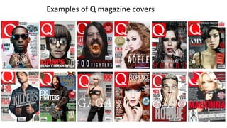
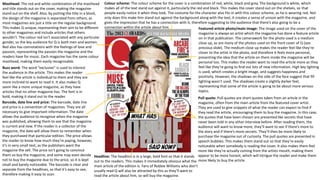
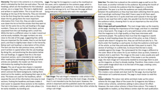
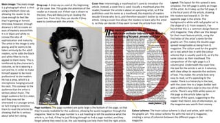
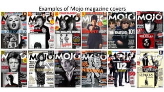
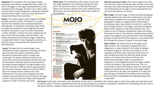
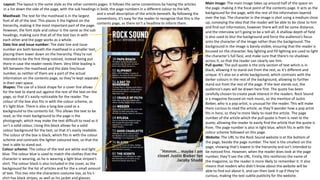
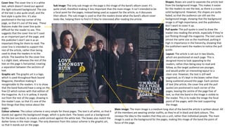
The document analyzes the textual elements and design choices on the cover and contents page of a Q magazine issue. On the cover, the masthead, color scheme, headline, featured image, pull quotes, and other elements are intended to attract readers' attention and make the magazine stand out. Similarly, the main image, headings, pull quotes, and boxes on the contents page are hierarchical in order to guide readers' eyes to the most important information. Throughout, the magazine employs consistent design and formatting elements to clearly convey information and build recognizability with its audience.