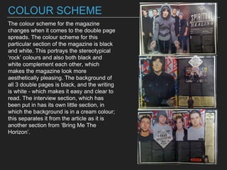
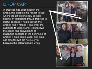
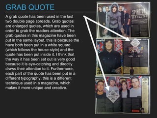
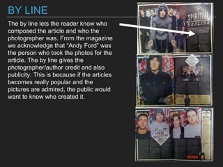
The document analyzes the layout, typography, images, captions, color scheme, and other design elements used across three double page spreads in the magazine "Kerrang!". Each double page spread uses a different layout. Images are used prominently and help break up blocks of text. Captions follow a consistent style across spreads. Black and white is the dominant color scheme, fitting with stereotypical "rock" aesthetics. Design elements like drop caps and grab quotes are employed to guide the reader through the article. Bylines and page numbers add professionalism and aid navigation.


![Location recce]](https://cdn.slidesharecdn.com/ss_thumbnails/locationrecce-161011164627-thumbnail.jpg?width=640&height=640&fit=bounds)


