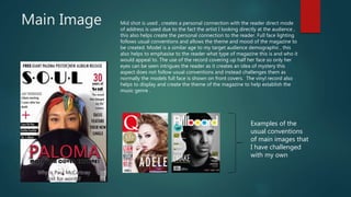
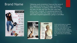
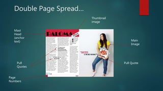
The production challenges and conforms to conventions of real media in the following ways:
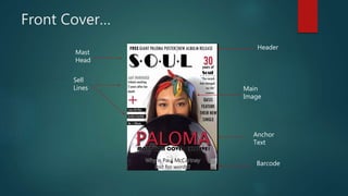
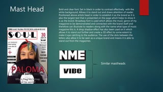
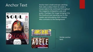
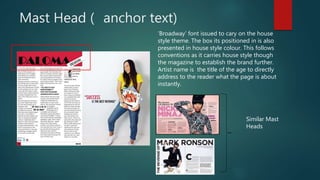
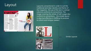
1. The masthead, images, and layout conform to magazine conventions but use unique fonts and effects to create a distinctive style.
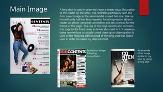
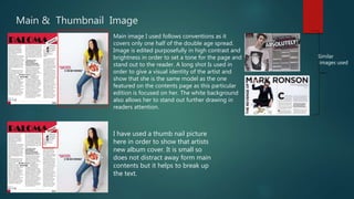
2. Images of the artist are presented in unconventional ways, such as showing only half her face on the cover, to intrigue readers.
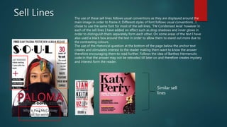
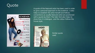
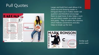
3. Pull quotes, headers, and sell lines follow conventions but use different fonts and effects to distinguish them and draw in readers.
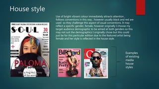
4. The house style of bright colors challenges conventions which typically use black and red, but may not suit the intended mixed-gender audience.