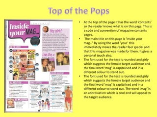
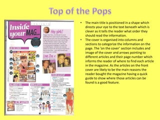
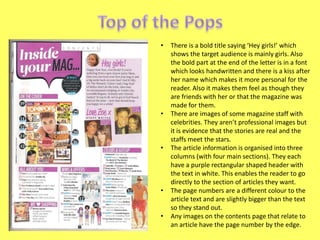
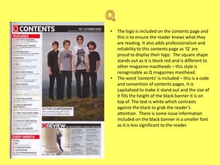
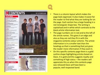
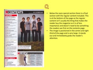
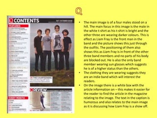
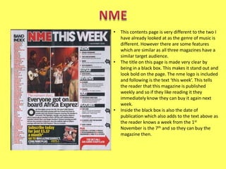
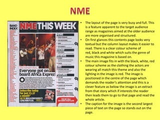
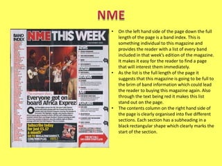
•

•

•

•

At the top of the page it has the word ‘contents’
so the reader knows what is on this page. This is
a code and convention of magazine contents
pages.
The main title on this page is ‘inside your
mag…’ By using the word ‘your’ this
immediately makes the reader feel special and
that this magazine was made for them. It gives a
personal touch also.
The font used for the text is rounded and girly
which suggests the female target audience and
the final word ‘mag’ is capitalised and in a
different colour to stand out.
The font used for the text is rounded and girly
which suggests the female target audience and
the final word ‘mag’ is capitalised and in a
different colour to stand out. The word ‘mag’ is
an abbreviation which is cool and will appeal to
the target audience.
•

•

The main title is positioned in a shape which
directs your eye to the text beneath which is
clever as it tells the reader what order they
should read the information.
The cover is organised into columns and
sections to categorize the information on the
page. The ‘on the cover’ section includes and
image of the cover and arrows pointing to
different articles and their page number which
informs the reader of where to find each article
in the magazine. As the articles on the front
cover are likely to be the main reasons the
reader bought the magazine having a quick
guide to show where those articles can be
found is a good feature.
•

•

•

•
•

There is a bold title saying ‘Hey girls!’ which
shows the target audience is mainly girls. Also
the bold part at the end of the letter is in a font
which looks handwritten and there is a kiss after
her name which makes it more personal for the
reader. Also it makes them feel as though they
are friends with her or that the magazine was
made for them.
There are images of some magazine staff with
celebrities. They aren’t professional images but
it is evidence that the stories are real and the
staffs meet the stars.
The article information is organised into three
columns (with four main sections). They each
have a purple rectangular shaped header with
the text in white. This enables the reader to go
directly to the section of articles they want.
The page numbers are a different colour to the
article text and are slightly bigger than the text
so they stand out.
Any images on the contents page that relate to
an article have the page number by the edge.
•

•

The logo is included on the contents page and
this is to ensure the reader knows what they
are reading. It also adds professionalism and
reliability to this contents page as ‘Q’ are
proud to display their logo. The square shape
stands out as it is block red and is different to
other magazine mastheads – this style is
recognisable as Q magazines masthead.
The word ‘contents’ is included – this is a code
and convention of contents pages. It is
capitalised to make it stand out and the size of
it fills the height of the black banner it is on
top of. The text is white which contrasts
against the black to grab the reader’s
attention. There is some issue information
included on the black banner in a smaller font
as it is less significant to the reader.
•

•

•

There is a column layout which makes the
page look organised. It also makes it easier for
the reader to find what they are looking for on
the page. Each section has a large heading in a
red rectangular shape box. The writing is
capitalised and in white which contrasts to the
black article information text.
The page numbers are in red and to the left of
the article names. This gives it an edge and
also as they are red they fit in with the
magazine contents colour scheme. The article
information is in a smaller text than the
headings as that is something that just gives
the reader more information if they want it.
On this specific contents page there is a gold
outline shape highlighting articles based on
Oasis. It is gold and this suggests royalty and
something of high status – the readers will
appreciate this as when this contents page
was released Oasis will have been a
popular, well respected band.
•

•

Below the oasis special section there is a final
section with the regular content included. This
is at the bottom of the page as the regular
content isn’t usually the thing that makes the
reader buy the magazine so it is of less
importance and doesn’t need to be something
the readers see first on the contents page.
The image is positioned in the centre and right
third of the page and is very large. It stands
out and immediately grabs the reader’s
attention.
•

•
•

The main image is of a four males stood on a
hill. The main focus in this image is the male in
the white t-shirt as his t-shirt is bright and the
other three are wearing darker colours. This is
effect as Liam Fray is the front man in the
band and the picture shows this just through
the outfits. The positioning of them also
shows this as Liam Fray is in front of the other
three band members and no parts of his body
are blocked out. He is also the only band
member wearing sun glasses which suggests
he is of a higher status than the others.
The clothing they are wearing suggests they
are an indie band which will interest the
readers.
On the image there is a white box with the
article information on – this makes it easier for
the reader to find the article in the magazine
relating to the image. The text in the caption is
humorous and also relates to the main image
as it is discussing how Liam Fray is a show off.
•

•

•

This contents page is very different to the two I
have already looked at as the genre of music is
different. However there are some features
which are similar as all three magazines have a
similar target audience.
The title on this page is made very clear by
being in a black box. This makes it stand out and
look bold on the page. The nme logo is included
and following is the text ‘this week’. This tells
the reader that this magazine is published
weekly and so if they like reading it they
immediately know they can buy it again next
week.
Inside the black box is also the date of
publication which also adds to the text above as
the reader knows a week from the 1st
November is the 7th and so they can buy the
magazine then.
•

•

•

•

The layout of the page is very busy and full. This
is a feature apparent to the target audience
range as magazines aimed at the older audience
are more organised and structured.
On first glances this contents page looks very
textual but the column layout makes it easier to
read. There is a clear colour scheme of
red, black and white which suits the genre of
music this magazine is based on.
The main image fits in with the black, white, red
colour scheme as the clothing the actors are
wearing all match this theme and also the
lighting in the image is red. The image is
positioned in the centre of the page which
demands the reader’s attention and this is a
clever feature as below the image is an extract
from that story which if interests the reader
then leads them to go to that page and read the
whole article.
The caption for the image is the second largest
piece of text on the page so stands out on the
page.
•

•

•

On the left hand side of the page down the full
length of the page is a band index. This is
something individual to this magazine and
provides the reader with a list of every band
included in that week’s edition of the magazine.
It makes it easy for the reader to find a page
that will interest them immediately.
As the list is the full length of the page it
suggests that this magazine is going to be full to
the brim of band information which could lead
the reader to buying this magazine again. Also
through the text being red it makes this list
stand out on the page.
The contents column on the right hand side of
the page is clearly organised into five different
sections. Each section has a subheading in a
black rectangular shape which clearly marks the
start of the section.
•

•
•

Within each section there are the articles – each
page has a mini subheading in bold text then
beneath a small snippet of information on that
article. This helps the reader to find something
quickly and easily that interests them.
Some interesting graphical features have been
included such as arrows. This gives the reader
extra information if they chose to read it.
In the centre column of the page there is a black
box with yellow text in giving information about
the subscribing to this magazine. This feature is
to advertise and so by introducing completely
new colours to the page it makes it stand out.

Contents page analysis

  • 2.
    • • • • At the topof the page it has the word ‘contents’ so the reader knows what is on this page. This is a code and convention of magazine contents pages. The main title on this page is ‘inside your mag…’ By using the word ‘your’ this immediately makes the reader feel special and that this magazine was made for them. It gives a personal touch also. The font used for the text is rounded and girly which suggests the female target audience and the final word ‘mag’ is capitalised and in a different colour to stand out. The font used for the text is rounded and girly which suggests the female target audience and the final word ‘mag’ is capitalised and in a different colour to stand out. The word ‘mag’ is an abbreviation which is cool and will appeal to the target audience.
  • 3.
    • • The main titleis positioned in a shape which directs your eye to the text beneath which is clever as it tells the reader what order they should read the information. The cover is organised into columns and sections to categorize the information on the page. The ‘on the cover’ section includes and image of the cover and arrows pointing to different articles and their page number which informs the reader of where to find each article in the magazine. As the articles on the front cover are likely to be the main reasons the reader bought the magazine having a quick guide to show where those articles can be found is a good feature.
  • 4.
    • • • • • There is abold title saying ‘Hey girls!’ which shows the target audience is mainly girls. Also the bold part at the end of the letter is in a font which looks handwritten and there is a kiss after her name which makes it more personal for the reader. Also it makes them feel as though they are friends with her or that the magazine was made for them. There are images of some magazine staff with celebrities. They aren’t professional images but it is evidence that the stories are real and the staffs meet the stars. The article information is organised into three columns (with four main sections). They each have a purple rectangular shaped header with the text in white. This enables the reader to go directly to the section of articles they want. The page numbers are a different colour to the article text and are slightly bigger than the text so they stand out. Any images on the contents page that relate to an article have the page number by the edge.
  • 5.
    • • The logo isincluded on the contents page and this is to ensure the reader knows what they are reading. It also adds professionalism and reliability to this contents page as ‘Q’ are proud to display their logo. The square shape stands out as it is block red and is different to other magazine mastheads – this style is recognisable as Q magazines masthead. The word ‘contents’ is included – this is a code and convention of contents pages. It is capitalised to make it stand out and the size of it fills the height of the black banner it is on top of. The text is white which contrasts against the black to grab the reader’s attention. There is some issue information included on the black banner in a smaller font as it is less significant to the reader.
  • 6.
    • • • There is acolumn layout which makes the page look organised. It also makes it easier for the reader to find what they are looking for on the page. Each section has a large heading in a red rectangular shape box. The writing is capitalised and in white which contrasts to the black article information text. The page numbers are in red and to the left of the article names. This gives it an edge and also as they are red they fit in with the magazine contents colour scheme. The article information is in a smaller text than the headings as that is something that just gives the reader more information if they want it. On this specific contents page there is a gold outline shape highlighting articles based on Oasis. It is gold and this suggests royalty and something of high status – the readers will appreciate this as when this contents page was released Oasis will have been a popular, well respected band.
  • 7.
    • • Below the oasisspecial section there is a final section with the regular content included. This is at the bottom of the page as the regular content isn’t usually the thing that makes the reader buy the magazine so it is of less importance and doesn’t need to be something the readers see first on the contents page. The image is positioned in the centre and right third of the page and is very large. It stands out and immediately grabs the reader’s attention.
  • 8.
    • • • The main imageis of a four males stood on a hill. The main focus in this image is the male in the white t-shirt as his t-shirt is bright and the other three are wearing darker colours. This is effect as Liam Fray is the front man in the band and the picture shows this just through the outfits. The positioning of them also shows this as Liam Fray is in front of the other three band members and no parts of his body are blocked out. He is also the only band member wearing sun glasses which suggests he is of a higher status than the others. The clothing they are wearing suggests they are an indie band which will interest the readers. On the image there is a white box with the article information on – this makes it easier for the reader to find the article in the magazine relating to the image. The text in the caption is humorous and also relates to the main image as it is discussing how Liam Fray is a show off.
  • 9.
    • • • This contents pageis very different to the two I have already looked at as the genre of music is different. However there are some features which are similar as all three magazines have a similar target audience. The title on this page is made very clear by being in a black box. This makes it stand out and look bold on the page. The nme logo is included and following is the text ‘this week’. This tells the reader that this magazine is published weekly and so if they like reading it they immediately know they can buy it again next week. Inside the black box is also the date of publication which also adds to the text above as the reader knows a week from the 1st November is the 7th and so they can buy the magazine then.
  • 10.
    • • • • The layout ofthe page is very busy and full. This is a feature apparent to the target audience range as magazines aimed at the older audience are more organised and structured. On first glances this contents page looks very textual but the column layout makes it easier to read. There is a clear colour scheme of red, black and white which suits the genre of music this magazine is based on. The main image fits in with the black, white, red colour scheme as the clothing the actors are wearing all match this theme and also the lighting in the image is red. The image is positioned in the centre of the page which demands the reader’s attention and this is a clever feature as below the image is an extract from that story which if interests the reader then leads them to go to that page and read the whole article. The caption for the image is the second largest piece of text on the page so stands out on the page.
  • 11.
    • • • On the lefthand side of the page down the full length of the page is a band index. This is something individual to this magazine and provides the reader with a list of every band included in that week’s edition of the magazine. It makes it easy for the reader to find a page that will interest them immediately. As the list is the full length of the page it suggests that this magazine is going to be full to the brim of band information which could lead the reader to buying this magazine again. Also through the text being red it makes this list stand out on the page. The contents column on the right hand side of the page is clearly organised into five different sections. Each section has a subheading in a black rectangular shape which clearly marks the start of the section.
  • 12.
    • • • Within each sectionthere are the articles – each page has a mini subheading in bold text then beneath a small snippet of information on that article. This helps the reader to find something quickly and easily that interests them. Some interesting graphical features have been included such as arrows. This gives the reader extra information if they chose to read it. In the centre column of the page there is a black box with yellow text in giving information about the subscribing to this magazine. This feature is to advertise and so by introducing completely new colours to the page it makes it stand out.