The document provides details about the contents pages of four different magazines: Q Magazine, Billboard, Vibe, and NME. Some key points:
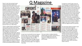
- Q Magazine uses columns, photo placements, and font sizes to grab attention and highlight important stories. Color schemes and short headings make articles easy to browse.
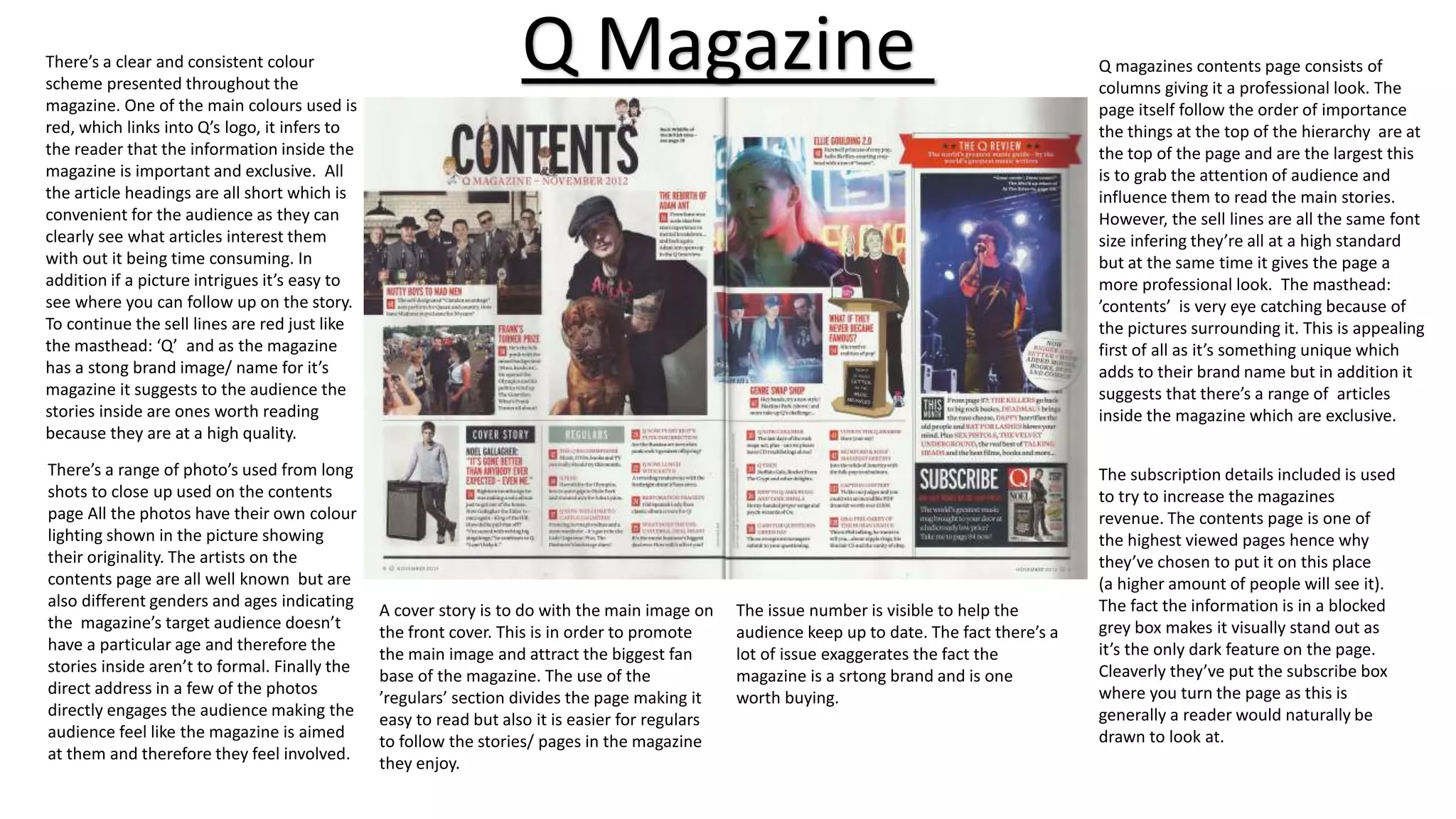
- Billboard breaks conventions by placing the issue number discreetly and using non-traditional layouts. Photos feature a range of people to appeal to wide audiences.
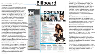
- Vibe has a minimalist single-page design that goes against typical formats. Modern mastheads promote the brand in an original way.
- NME also takes an unconventional approach with its simple presentation and limited details about


![Magazine research really official [recovered]](https://cdn.slidesharecdn.com/ss_thumbnails/magazine-research-really-official-recovered-160211094822-thumbnail.jpg?width=640&height=640&fit=bounds)


![Magazine research really official [recovered]](https://cdn.slidesharecdn.com/ss_thumbnails/magazineresearchreallyofficialrecovered-160222160255-thumbnail.jpg?width=640&height=640&fit=bounds)


![Proposal [autosaved]](https://cdn.slidesharecdn.com/ss_thumbnails/proposalautosaved-161114222431-thumbnail.jpg?width=640&height=640&fit=bounds)


