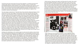
The document summarizes the layout and design of a magazine contents page. It discusses various design elements including the use of color, images, headings, and page numbers. The main goals of the contents page are to attract readers, highlight important stories, and make navigation easy. A large black and white image of the band Take That is used as the main visual to appeal to a wide audience. Other images feature up-and-coming artists. Page numbers, headings, and article summaries help readers find stories that interest them.
In todays lesson we looked at and analysed the front covers of music magazines. This Slideshare shows my analysis of the following magazines:
Rocksound Magazine
Under The Radar Magazine
& Finally Q Magazine.
In todays lesson we looked at and analysed the front covers of music magazines. This Slideshare shows my analysis of the following magazines:
Rocksound Magazine
Under The Radar Magazine
& Finally Q Magazine.
Transforming Brand Perception and Boosting Profitabilityaaryangarg12
In today's digital era, the dynamics of brand perception, consumer behavior, and profitability have been profoundly reshaped by the synergy of branding, social media, and website design. This research paper investigates the transformative power of these elements in influencing how individuals perceive brands and products and how this transformation can be harnessed to drive sales and profitability for businesses.
Through an exploration of brand psychology and consumer behavior, this study sheds light on the intricate ways in which effective branding strategies, strategic social media engagement, and user-centric website design contribute to altering consumers' perceptions. We delve into the principles that underlie successful brand transformations, examining how visual identity, messaging, and storytelling can captivate and resonate with target audiences.
Methodologically, this research employs a comprehensive approach, combining qualitative and quantitative analyses. Real-world case studies illustrate the impact of branding, social media campaigns, and website redesigns on consumer perception, sales figures, and profitability. We assess the various metrics, including brand awareness, customer engagement, conversion rates, and revenue growth, to measure the effectiveness of these strategies.
The results underscore the pivotal role of cohesive branding, social media influence, and website usability in shaping positive brand perceptions, influencing consumer decisions, and ultimately bolstering sales and profitability. This paper provides actionable insights and strategic recommendations for businesses seeking to leverage branding, social media, and website design as potent tools to enhance their market position and financial success.
Top 5 Indian Style Modular Kitchen DesignsFinzo Kitchens
Get the perfect modular kitchen in Gurgaon at Finzo! We offer high-quality, custom-designed kitchens at the best prices. Wardrobes and home & office furniture are also available. Free consultation! Best Quality Luxury Modular kitchen in Gurgaon available at best price. All types of Modular Kitchens are available U Shaped Modular kitchens, L Shaped Modular Kitchen, G Shaped Modular Kitchens, Inline Modular Kitchens and Italian Modular Kitchen.
Expert Accessory Dwelling Unit (ADU) Drafting ServicesResDraft
Whether you’re looking to create a guest house, a rental unit, or a private retreat, our experienced team will design a space that complements your existing home and maximizes your investment. We provide personalized, comprehensive expert accessory dwelling unit (ADU)drafting solutions tailored to your needs, ensuring a seamless process from concept to completion.
Can AI do good? at 'offtheCanvas' India HCI preludeAlan Dix
Invited talk at 'offtheCanvas' IndiaHCI prelude, 29th June 2024.
https://www.alandix.com/academic/talks/offtheCanvas-IndiaHCI2024/
The world is being changed fundamentally by AI and we are constantly faced with newspaper headlines about its harmful effects. However, there is also the potential to both ameliorate theses harms and use the new abilities of AI to transform society for the good. Can you make the difference?
Book Formatting: Quality Control Checks for DesignersConfidence Ago
This presentation was made to help designers who work in publishing houses or format books for printing ensure quality.
Quality control is vital to every industry. This is why every department in a company need create a method they use in ensuring quality. This, perhaps, will not only improve the quality of products and bring errors to the barest minimum, but take it to a near perfect finish.
It is beyond a moot point that a good book will somewhat be judged by its cover, but the content of the book remains king. No matter how beautiful the cover, if the quality of writing or presentation is off, that will be a reason for readers not to come back to the book or recommend it.
So, this presentation points designers to some important things that may be missed by an editor that they could eventually discover and call the attention of the editor.
1. The title has the same house style as the rest of the magazine, it is spread across the top of
contents page making it a dominant convention of the page, it is also in a border which
automatically attracts the readers attention so they are informed straight away what the page is
about. The use of the dark red colour throughout appeals to Q primary target audience of
males. The use of black, bold text represents power and masculinity. The colour used in the title
is the same to the colour used on the cover page mast head making the magazine have
consistency making it look professional.
Article summary, these give the reader a brief idea about the article, they include
the most interesting information so that the reader buys a copy to find out more
about the article. The article summaries are all in white boxes which make them
stand out to the reader whilst keeping with the magazine colour scheme and house
style. The article summary also links up the image, heading and page number so
that the contents page is easy to navigate for both monthly buyers and new
purchasers. Subscription information is found at the bottom of the contents page,
this follows the codes and conventions of the magazine. This is also key information
for new buyers so if they like an issue they can subscribe and get the issue monthly
and also save money whilst becoming a collector. This is also good for Q collectors
so they are able to get every issue.
Page numbers are a key code and convention of music magazines content
pages, the numbers are always next to the chosen topic and are used as an
alternative to using the word “page” , the numbers tell the reader what they have
to go to. The colour of the numbers conform the colour scheme and house style
of Q as they are black, like the contents page title and mast head, they are also in
bold font. The main page numbers are larger than the others and are placed next
to the pictures of artists that the article features, by having these numbers larger it
makes them stand out as the important feature of the magazine. All the page
numbers are in a list style format on both sides of the double spread, this gives
the magazine a organised professional look whilst keeping it easy to navigate.
Headings and subheadings on this contents page are used to give the readers an idea of what
kind of articles/artists are featuring in the magazine issue. The subheadings are bold and have
a thick red underline which highlights there importance, they fit the house style of the magazine
and stand out to the reader. The only main headings on the contents page are “features” and
“regulars” , they are made separate by there difference style to the other article headings, by
having them different it shows there importance on the magazine. The heading “features” is
about what is in the magazine, as most artists and bands are usually one offs and so would
interest readers who aren’t the usual audience of Q . The heading “Regulars” is used to show
the readers, specifically monthly buyers/subscribers what is always going to be in Q.
The main image is a band shot of “Take that” they all look extremely relaxed and happy. Q have
chosen that to be their main image as Take that are a well known pop band that have been
around for a very long period of time, by having them as the main image it would appeal to a
very large audience as many people are aware of who they are and be interested in their genre
of music. Take that look very playful in this image which engages the reader as they will aspire
to have a similar friendship. The image is in black and white to emphasise that they have been
around for a long time and gives the band a cool representation which links in with the house
style of the magazine. By having the image in black and white it makes it stand out in
comparison to the colour images on the page. By having the main image as take that it wouldn’t
just attract the buyers of Q but also fans of take that, this would increase the sales of the
magazine and may even mean more customers for Q in the future. The date is extremely small
and at the bottom, this is there so that collectors can look back and see when they purchased
the issue. This is in the same place on every contents page so that collectors know where to
quickly look. The other images on the contents page play a key marketing role. These images
are also of a similar genre to the main image. The artists/bands in these images may not be as
well known as those in the main image, as they may be upcoming within the industry . The
images are all different sizes representing their importance as the images that are larger are the
ones the audience would be most interested in.
2. Images: this contents page differs from the other two example, although all coming from the same
magazine. The page includes 10 images ranging from performance shots, to studio location and also one
cartoon (one of animated characters from the popular band the Gorillaz). With this specific cartoon and one
of the studio images featuring much more mature themes (guns and bullets), we get the idea that this
magazine is focused to a much more older audience. Each of the images range in sizes, with some being
tilted in certain angles however majority being in a rectangular or squared format. The various angles of the
images, make the page look untidy which is also shown by how the images over lap the title of the contents
page and also are over lapped by each other. The cartoon images are used in each of the examples I have
chosen and also show the relaxed nature of the magazine. Only three of the images include any associated
text other than that of the page number the story is featured on, showing how the people in these images
may already explain themselves and a description and headline is not needed.
Layout: the layout the page in split into four main columns, with some being taken up primarily by text and
others just with images. this shows how both the text and also the images are important in the pages layout
and each have their own use and intention for attracting the reader. However in this specific issue our
attention is directly to the large cartoon image and its page number which takes up an entire column on its
own. This depicts that it is an important factor in this issue and will interest the targeted audience. The page
is slightly uniformed by not being too busy or mixing different aspects together making it untidy, however we
can get a sense of its slight lack of uniformity by the varying angles of some of the images.
Sections: there are many different sections on this page including, The Q review, section for the images
and one of the large animation, and also lists of articles at each side of the page under the titles of Features
and Regulars. Underneath these headings are various articles in black and grey serif fonts, split up by their
black font page numbers and a thin red line under and above each. The Q review section however is
different by having all of its text except it heading in red and featuring an image to represent what it is
talking about. All of the page numbers are placed either to the left hand side to all of the text and in a clear
space not coving the image. Those numbers on the image are quite large and increase in size, depending
on the size of the image. There is not subscription service of social media links on this contents page, as it
is quite an old issue and may not have been a necessary asset at this time and also possibly having these
elements featured on a different page. The cover story is not identified on this page, making it different to
each of the other examples. There is a small footer of a black line at the bottom of the page with the page
number of the contents underneath it, however there is a thick red and black bordered header which
includes the issue number Contents page title and name of the magazine. Finally the magazine does not
include a band index on the page as it is not a necessity to its success in attracting readers to specific
stories.