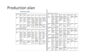
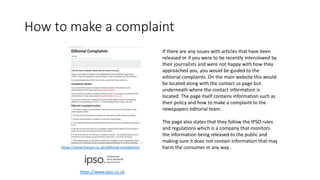
Contents page
Front page Inspiration analysis
Main image: the main image of
the artist should be large so the
reader knows what the article is
on about and I would like to
recreate this layout for the main
image is in my magazine due to it
being bold and eye catching.
The main headline of the page
is the second biggest text on
the page because this is what it
would be focusing on in this
issue. It is also all in capital
letters to help it stand out more
from the rest of the magazines
that would be featured.
The cover lines are fairly
big but not as big as the
main headline due to the
fact that the main
headline needs to be big
as that is what the
magazine is featuring the
issue on.
The masthead is the biggest
text on the magazine cover
with it being very bold. I would
like to incorporate this into my
magazine so it is very eye-
catching and help the
magazine seem more
professional
The barcode is located at the bottom right of the
page which helps to keep it out of view of the main
image yet visible enough to know how much the
magazine costs. I will be placing my barcode in the
same place for the exact same reasons.
In this issue of Vibe magazine the strapline is not evident
which goes to show that its such a well known magazine
it does not need one. For my magazine ill be placing on
underneath the masthead of the magazine.
DPS Inspiration analysis
Main image: the main
image of the artist
should be large so the
reader knows what the
article is on about and I
would like to recreate
this layout for the main
image is in my magazine
due to it being bold and
eye catching.
The stand first: the stand first is the introduction to the article
and the way this magazine has done it is with a simple pun hat
brings some humour to it. I would use this method of introducing
the article as it makes it more lighthearted rather than being all
serious.
Differentiated questions: This is used effectively as we can see what type
of questions were asked to the celebrity and see what their answer was. It
is also an easy layout for the reader to understand and read as the
questions are highlighted in bold to differentiate them from the answers. I
would use the technique of making the questions bold or changing the
colours in general as it will help the reader to see the questions and
answers more clearly.
Magazine ideas
Types of images
Frequency
Brand identity
Masthead
Colour scheme Target audience
I want to have bold colours
so that it will stick out more
from the rest of the
magazines that would be
featured at local news
agents.
The main image would be a
close up cutting of at the
shoulder line.
Masthead names:
- Electro Eskimo
- Pulse
these names are very catchy and simple which would help draw
in an audience from the public.
The target audience is aimed at those
between 16-24. This is because it will
feature electro-pop music from artists
such as Alan Walker and Tobu.
My main colours for the magazine will
be black , white and blue which fades
from dark blue to light from bottom
to top. This will help the magazine to
stand out as they are bold colours.
I will also be putting in small
thumbnail photos of other
artists to promote them on the
sides of the front cover.
My magazine will be released weekly
My logo will be placed on every page in the magazine
at the top right corner of the page. This way the
reader now that the magazine is created by me even if
the front cover has been ton of.
Mind map final idea
pulse content editorial headline advert
headline headline headline
advert advert headline reviews reviews
advert
content
competitions Next issueadvertheadline
reviews
advert
headline
Flat plan
photo
Article
Planned format and style- front cover
As you can see the
masthead will be located
on top of the page with it
going fully across so its
visible to the reader
The strapline is located
underneath the masthead
so when you read it you
know its linked to the
masthead of the magazine
The photo will be located
in the center but a bit to
the right so it will not be
covered by straplines.
Cover lines will be
located in the left of the
main image so its not
going over it yet big
enough that it is easy to
read.
The barcode will be located on the bottom
left of the image so its out of the way from
the main information on the page yet
visible enough so you can see what the
price is
The main headline will be located
above of the main image so they
know what the issue is about and
who is being featured
The headline will be
located on the top left
of the double page
spread above the main
image
The articles will
be located on the
right page and be
separated into 3
columns. The
drop capital will
also be located in
the first article to
signify where the
article has
started.
I would have 1 main
photo located on
the left page with it
taking up the whole
page to make it bold
and signify what the
article is about.
At the bottom of every page will be the page number along with social
media logos and the website for the magazine so it would make it
easier for the reader to know where to look for additional information.
Also on the top left of the page will be the name of the magazine so
they know what magazine is publishing the article.
Planned format and style- double page spread
Font style
I have chosen the font
minion pro for the
writing in my
magazine. This is
because it is very clear
and will be easy for
the reader to read the
writing. Furthermore,
if the writing was not
clear and hard to read,
the reader would
become uninterested
with the content being
shown potentially
causing them to stop
reading the magazine
all together.
I have chosen this font for the
masthead of the magazine
because I believe this helps to
give of the feel of the genre of
the magazine to the reader
and help them to instantly
identify what the magazine is
about. I also chose this font
because it is different from
other magazine font styles
which will help it become
recognizable when being sold
in local retailers.
Mood board final idea
Mood board alternate idea idea
Magazine ideas
Types of images
Frequency
Brand identity
Masthead
Colour scheme Target audience
I want to have bold colours
so that it will stick out more
from the rest of the
magazines that would be
featured at local news
agents.
The main image would be a
close up cutting of at the
shoulder line.
Masthead names:
- Electro Eskimo
- Pulse
these names are very catchy and simple which would help draw
in an audience from the public.
The target audience is aimed at those
between 16-24. This is because it will
feature electro-pop music from artists
such as Alan Walker and Tobu.
My main colours for the magazine will
be black , white and grey/silver which
will be constant throughout the whole
page instead of changing shade of the
colour. This will help the magazine to
stand out as they are bold colours.
I will also be putting in small
thumbnail photos of other
artists to promote them on the
sides of the front cover.
My magazine will be released weekly
My logo will be placed on every
page in the magazine at the top
right corner of the page. This way
the reader now that the magazine is
created by me even if the front
cover has been ton of.
Mind map alternate idea
The masthead is the
biggest text on the
page with it being
one letter ‘Q’. This is
to catch the readers
eye and make them
drawn in to read
more. The red is also
very eye-catching as it
gives of an important
aura since that is
what that colour
normally represents
in todays society.
The main headline of the
page is the second biggest
text on the page because
this is what it would be
focusing on in this issue. It
is also all in capital letters
to help it stand out more
from the rest of the
magazines that would be
featured.
Cover lines: In this issue of Q, the smaller stories of this issue
is listed at the bottom of the front page which illustrates that
they are not that significant in this issue of the magazine. This
is mainly used to show the reader that these people would
also be featured but will not contain as much information as
the main band being featured.
Price tag/issue: The
price is £3.70 and the
issue is unknown
Q magazines slogan is
'The World's Greatest
Music Magazine'. This
slogan is serious and
makes the magazine
seem its of high quality
but it is not always
featured on the magazine
as seen on this issue.
Deconstruction of a front page
Double page spread
The large red ‘L’, takes up the whole page
containing al the information on the artist. The
letter is linked to the artist who is Lady Gaga.
This is to make it very eye catching and the font
of the ‘L’ is linked to the magazines style of
font.
There is no title for this
page and the only thing
that resembles a title is
that of the name of the
artist which is ‘Lady
Gaga’. This to make it
clear what the article is
being based on and
make sure that it is
clearly visible for the
reader so that if they do
not want to read this
article they can turn the
page without having to
read the article.
The article itself is divided into three columns.
This is to make it easier for the reader to read it
instead of it all being pilled up across the page
where it would be hard to distinguish each
question/fact that is being displayed.
At the bottom left the magazine logo is displayed.
This makes the article look more professional as
it is advertising the magazine that is publishing
the article on the artist
The main image on
the left is of the
artist which in this
case is Lady Gaga
who is what the
magazine is writing
about. The image is
in black and white
which gives of a
more attractive look
and the dress she is
wearing is to give of
the impression of
outrageousness
which is what her
fashion and
personality is about.
The stand first is the
introduction to the
article which is used to
help the reader get the
gist of what the interview
is about and what to
expect. It also used to
help the reader decide if
they want to read it or
not. However in this
issue of the magazine
there is not one present
which makes it hard for
the readers but the use
of the main image helps
to identify what the
article is about
Within the main article of this
double page spread a drop capital
has been used, this is an effective
method of getting the readers
attention to the start of the text.
Contents Page analysis
The information
surrounding are all the
topics being covered by this
issue of the magazine. As
you can see it is separated
into 9 sections with one
being about an oasis
special. The way you can
tell that its separated into 9
sections is through the
titles being printed in bold.
This helps us as the reader
to see what's being covered
and whether or not we
would like to go to those
specific topics within the
magazine.
Within Q Magazine there
is only one contents
page. This connotes how
the magazine does not
want to branch of on to
unrelated topics but
rather wants to get
straight to the point. It
also contains some
colours that are not of
the house style on the
front page such as light
blue which goes to show
that the editors want us
to realise this and make
us want to look through
it due to it not looking
like the rest of the
magazine.
The magazine contents page also
features an image of the band that is
being featured in this issue. This
helps us as the readers to
understand that this band is what
the magazines is currently featuring
on and allows us to see what their
general look is as a band as well as
an individual.
Target audienceHartley:
Age- my magazine is aimed for people who are between the ages of 15- 24 years old. This is due to the fact that the newer generation of todays society would like to keep
in touch with the newest bands that are being featured on today’s social network.
Gender- the gender for my magazine can vary due to the fact that most of the new generation in todays society like electro music and the genre itself is not really aimed at
a specific gender group therefore my magazine will be aimed at both genders.
Class- my magazine is mainly aimed at people who are high in the class system for example a person who is the owner of their own company. This is due to the magazine
using sophisticated lettering as its font as well as the use of words to describe an artist. If it were to be aimed at people whop are lower in the class system such as an
unemployed person, the magazine would include words that would be befitting for them such as using slang for their typical age group.
Katz:
Personal identification- My magazine helps the audience to relate to the character they are featuring by including all their struggles that they have faced in order to get to
the place they are now. This helps the audience relate to their troubles and believe in themselves to achieve great things like the characters in the magazine have.
Personal relationship- My magazine helps to create a personal relationship between the reader and character through including what they normally do on a daily basis.
This makes the reader relate to the characters as they may be doing things that the characters themselves do.
Informed and educated- My magazine educates and informs readers because they are expected to give information about recent bands and singles that would eventually
stick to the minds of the young so they can use later when they tell others about what they have learned in the magazine.
Diversion- My magazine helps to divert readers from reality due to them wanting to live the lives the characters the magazine is covering . They do this through going into
a lot of detail when describing the characters lives so the reader can immerse themselves into the text and imagine that they were living a similar life
Maslow's Hierarchy of Needs:
My magazine is aimed for those who are social climbers in society. This is because the magazine usually covers characters who have gone through a lot to go against others
expectations of them whether they were thought to achieve a lot or nothing at all. This helps to indicate that the magazine is trying to promote this and that we should be
able to do anything we want in life and not just follow what people want us to do.
Form and Style
• The style of my magazine will be very bold with clear lettering across all pages of
the magazine. This is because I want my magazine to be very clear to the reader and
for them not to be overwhelmed with two much information.
• For the house colour’s for Pulse magazine, I want them to be black, white and blue.
This is because these colour’s are very bold and with the colour blue you can make
a lot of variants of the colour such as azure or turquoise. The white will also help to
make the main headline of the page as it is quite bold and noticeable when you put
it over a dark background.
• For the house colours for Electro Eskimo magazine, I want them to be black, white
and silver. This is because these colours are again very bold and I want them all to
make each other standout when being shown on the front cover
Draft interview• Hello ATLAS, how are you?
• I'm fine thank you just a bit nervous for the interview.
• So just to get started, how long have you been in the music business?
• I say for about 7 months as professional artist but in total it must be around 4 years.
• So you have a fair amount of knowledge on music, and what do you enjoy the most about being an artist?
• I guess it would have to be meeting all the fans I have at concerts as its just amazing and heart warming seeing all their faces light up when they hear your music. There was also
this one time when a kid, no older then 12, with down-syndrome managed to get backstage passes at one of my concerts and when I went over to talk to him after the concert had
ended he said that ‘it was the most fun he has ever had’ and I would like to think that I can give happiness to those all around the world through my music just like I did with that
kid.
• What got you into the electro genre of music?
• I would have to say it was when I first heard Alan Walker’s ‘Spectre’ due to the fact that at the time I did not know how it was possible to create those sounds let alone put it into
whole tune and once I heard it I tried to recreate those sounds on my own and with my own little flair to it.
• Who or what would you say is your inspiration into becoming a music artist?
• My inspiration in becoming a music artist would definitely be Alan Walker. It has to be due to the fact that he was not a well known artist during his early days and would have to
post his music on other people YouTube channels such as No Copyright sounds until he got his own, and now he is very well known having his own concerts in places such as
Singapore in Asia
• What do you aim for the future?
• My aim as an artist is to have my own record company so that I will be able to guide and hopefully create successful inspiring artists so that can influence the new generation with
their music.
• How did you react when you got your first good response from the public?
• I was pretty ecstatic when I saw so much support from the views and downloads of my songs as it was at that moment that I realized people actually listen to my music and like it.
• What would you say were your biggest obstacles in your music career so far?
• I would have to say that my biggest obstacle would be trying to get recognized from my career on YouTube mainly due to the fact that most artists get contracted to music
companies through talent and music shows and by starting on YouTube it means that I would be one step behind them due to the fact that millions of people watch the shows
where I would be lucky getting a couple of thousand views. I would have to say that was my biggest obstacle and I am just thankful to the record company who found me on
YouTube and decided to take me on as a professional artist.
• To conclude this interview, how would you celebrate if you got the award for best
• I would have to say that I would celebrate by hosting my own party for a night, but not like a party where hundreds of people come but where its just my family as they have
supported me through the whole journey, and at the end of the party I'll just have a good night sleep in my own bed back in London.
Location recceLocation
Time
Date
Why?
School court yard
 I took this image in a place where it would give of a sophisticated vibe so it doesn’t give of an impression that
all music artists are people who didn’t do well in school and that anyone could become one so I chose a school
coirt yard.
Picture Needed/Required
Shot Type
Props/Equipment
Lighting
Costume
Person/People
Why?
 I used my friend as the subject of the photo as I believe he gives of the main image of what my music
magazine genre is about.
 I used natural lighting from the environement aroud me as it was bright enough to light up his features and
not too dark that you his clothes blended together.
 Costume was nothing inparticular, just the clothing he was wearin g at the time which was a red coat and
jogging bottoms.
Digital camera
SD card
Computer
Subject (person) – Thomas Myers
Specific Clothing:
Red coat
Jogging bottoms
lighting
Permission Needed
Contact needed to be made
Evidence of this?
There is no evidence for my permission as it was a friend who was willing to take the time out of there day to be the
model of the photo and magazine.
Potential Hazards/Risks
Location specific
Why?
 Breaking camera- sharp pieces could be dangerous and harmful to you or others around you.
 Surrounding environment.
 Loose wiring and trails of wires may be a hazard to tripping over.
 trip over any chairs that are in the way.
 Stones could be dangerous in a case of falling and them being lodged into the skin.
 Sharp corners on tables
 No drinking near computer as if spilt could be dangerous as its electrical.
Photography plan
Production plan
Budget summary
Equipment cost
Office space £1,500 (per 2 months)
Apple macbook (x9) £11,691
Adobe CS6 master collection £6433.54
Desks (x9) £855
Chairs(x9) £405
printer £40
Camera £549
Pens (x 10) £10
paper £6.99
Staff Salary
Publisher £40,845
Editors £25,361
journalists £23,825
Writers £22,500
Photographers £22,000
Marketing £30,513
Finance £37,268
Design £30,280
Human resources £33,409
On the table on the left, these are the basic necessities in starting a magazine
company that are for 9 people. Even though it may be very expensive they are needed
to for the magazine to be successful and to pull in more buyers. Furthermore, as you
can see from the table on the right, the cost of having the staff members on the
editorial team will be a huge dent in the companies budget.
Ethical & Legal Issues.
Source: http://www.pcc.org.uk/
All press complaints are handled by a regulated body. As the slide suggests handling complaints was switched to IPSO who now handle all complaints relating to press
organizations.
Role of Relevant Regulatory Bodies
The Independent Press Standards Organisation (IPSO) is the independent regulator for the newspaper and magazine industry in the UK. We hold
newspapers and magazines to account for their actions, protect individual rights, uphold high standards of journalism and help to maintain freedom
of expression for the press.
◾They make sure that member newspapers and magazines follow the Editors' Code.
◾They investigate complaints about printed and online material that may breach the Editors’ Code.
Source: https://www.ipso.co.uk/about-ipso/
Editors code of practice
• Accuracy:
• The Press must take care not to publish inaccurate, misleading or distorted information or images, including headlines not supported by the text.
• A significant inaccuracy, misleading statement or distortion must be corrected, promptly and with due prominence, and — where appropriate — an
apology published. In cases involving IPSO, due prominence should be as required by the regulator.
• A fair opportunity to reply to significant inaccuracies should be given, when reasonably called for.
• The Press, while free to editorialise and campaign, must distinguish clearly between comment, conjecture and fact.
• Privacy:
• Everyone is entitled to respect for his or her private and family life, home, health and correspondence, including digital communications.
• Editors will be expected to justify intrusions into any individual's private life without consent. Account will be taken of the complainant's own public
disclosures of information.
• It is unacceptable to photograph individuals, without their consent, in public or private places where there is a reasonable expectation of privacy.
The reason why I have to be these things when I am creating an article on an artist is because I as the writer have the potential to destroy
someone's career depending on the way I phrase things or if someone has a different perspective from me. Therefore, I will need to write
down the article in a way where everyone will be able to understand it and not let there be misunderstanding between the public and artist
which can affect their career on a whole.
https://www.ipso.co.uk/editors-code-of-practice/
Copyright ©
• Copyright- is when there is a legal right which lasts for a certain amount of years so you can’t print, publish,
perform, film, or record literary, artistic or musical material that already exists.
• This means that if I take images from anyone without their permission I could get prosecuted for plagiarism.
This can also be used for my own benefit as it is a system that protects me from having my own images used
for another format without my permission allowing me to prosecute them and get money from it.
Intellectual property (IP) refers to creations of the mind, such as inventions, literary and artistic works, designs, and
symbols, names and images used in commerce. IP is protected in law by, for example, patents, copyright and
trademarks, which enable people to earn recognition or financial benefit from what they invent or create.
As well as IP on printed work, you can get a digital watermark which protects any copyrighted content from any
magazine online and in any digital format. It is important to have this because it means people will have to pay you
to use your information/ ideas. The best way to protect your IP is to acquire a patent. However, this can take several
years to get and costs over $7000 in fees.
IP/Watermark
Data protection act 1988
• The Data Protection Act controls how your personal information is
used by organizations, businesses or the government. They must
insure the information is :used lawfully fairly, used for limited and
specifically stated purposes.
• Since my magazine has used the information fairly and is limited for
the specific purpose for the aimed magazine audience.
https://www.gov.uk/data-protection/the-data-protection-act
How to make a complaint
If there are any issues with articles that have been
released or if you were to be recently interviewed by
their journalists and were not happy with how they
approached you, you would be guided to the
editorial complaints. On the main website this would
be located along with the contact us page but
underneath where the contact information is
located. The page itself contains information such as
their policy and how to make a complaint to the
newspapers editorial team.
The page also states that they follow the IPSO rules
and regulations which is a company that monitors
the information being released to the public and
making sure it does not contain information that may
harm the consumer in any way .https://www.thesun.co.uk/editorial-complaints/
https://www.ipso.co.uk
Making a complaint
Tom Cruz was suing Bauer
media on the allegations
that he wasn't taken proper
care for his daughter. He was
trying to get $50 million
from the media company
however by the end of it
they settled with an
agreement so neither either
gained or lost money due to
the court case.
Unit 30-Planning and pitching-feedback of
pitch- Survey Monkey
By asking this question I felt
like it will help me decide on
how to improve on my
presentation for future
reference. I agree with the
result that gave me high
quality as I believe it is what
any presentation should be
like however I still believe it
can be majorly improved to
the level of what professional
presentations would be like for
major publishing companies.
By asking this question I felt
like it will help me decide on
how to improve on my
presentation for future
reference. I agree with the
results that I got because I was
indeed missing slides and
needed to include more detail
in order for it to be
presentable and get me a high
recommendation from any
company.
This has helped me as
the feedback suggests
that these points were
what made the pitch
successful and how it
has helped me give a
convincing presentation.
This will also help me
decide on what I should
include and how I will
present it on future
occasions.
This shows that there
are still points on the
mark scheme that I
have not covered
therefore my priority
is to include and
change things around
that will help me
meet the required
criteria that is on the
mark scheme and
make a convincing
presentation.
This result shows that the
detail within my presentation
was acceptable to a degree
that it has enough information
and analysis needed that
would be suitable for a
professional in the publishing
industry therefore I would like
to keep up the same level of
detail in this presentation for
any other future pitch
presentations I may present.
This result helps me as it
shows that my covers are
appealing that the
publishers who reviewed
it would consider using it
as one of their magazine
covers. Therefore, if I
were to create another
magazine cover I would
have to make it at the
same levels for it to be
acceptable.
This result helps me
because it gives me the
feedback needed for me
to improve on my pitch
that in the end I will
hopefully be able to
create another pitch and
include all these points
first time making it a
successful pitch that can
be used in a professional
way.
Unit 30- Planning and pitching- Environment
of presentation
• I have taken several images of the environment where I presented my pitch to the publishers. I used a smart board in the
center of the room to project the prezi presentation onto. The publishers were suited around on the edge around the
room, this made it much easier to see both the presentation as well as me presenting it instead of them being close and
having to turn their head every time I speak. I also used a slide changer when changing my slides, this allowed me to stay
in one place when presenting my pitch instead of having to move every time I wanted to change slide on the pitch.
Witness statement
Unit 30- Evidence of pitch
• When conducting my pitch it was recorded on a camera. This will help me for further reference as it allows me to look
back on the presentation and view my strengths and weaknesses based on my feedback and what I can see from the
video. Once I completed my pitch I was given a witness statement from the head publisher. On it it outlined the main
areas where I had to improve as well as where I was at my strongest. I have used the feed back I have gained to make the
improvements I need to make the pitch even better.

Unit 30- LO2

  • 2.
  • 3.
    Front page Inspirationanalysis Main image: the main image of the artist should be large so the reader knows what the article is on about and I would like to recreate this layout for the main image is in my magazine due to it being bold and eye catching. The main headline of the page is the second biggest text on the page because this is what it would be focusing on in this issue. It is also all in capital letters to help it stand out more from the rest of the magazines that would be featured. The cover lines are fairly big but not as big as the main headline due to the fact that the main headline needs to be big as that is what the magazine is featuring the issue on. The masthead is the biggest text on the magazine cover with it being very bold. I would like to incorporate this into my magazine so it is very eye- catching and help the magazine seem more professional The barcode is located at the bottom right of the page which helps to keep it out of view of the main image yet visible enough to know how much the magazine costs. I will be placing my barcode in the same place for the exact same reasons. In this issue of Vibe magazine the strapline is not evident which goes to show that its such a well known magazine it does not need one. For my magazine ill be placing on underneath the masthead of the magazine.
  • 4.
    DPS Inspiration analysis Mainimage: the main image of the artist should be large so the reader knows what the article is on about and I would like to recreate this layout for the main image is in my magazine due to it being bold and eye catching. The stand first: the stand first is the introduction to the article and the way this magazine has done it is with a simple pun hat brings some humour to it. I would use this method of introducing the article as it makes it more lighthearted rather than being all serious. Differentiated questions: This is used effectively as we can see what type of questions were asked to the celebrity and see what their answer was. It is also an easy layout for the reader to understand and read as the questions are highlighted in bold to differentiate them from the answers. I would use the technique of making the questions bold or changing the colours in general as it will help the reader to see the questions and answers more clearly.
  • 5.
    Magazine ideas Types ofimages Frequency Brand identity Masthead Colour scheme Target audience I want to have bold colours so that it will stick out more from the rest of the magazines that would be featured at local news agents. The main image would be a close up cutting of at the shoulder line. Masthead names: - Electro Eskimo - Pulse these names are very catchy and simple which would help draw in an audience from the public. The target audience is aimed at those between 16-24. This is because it will feature electro-pop music from artists such as Alan Walker and Tobu. My main colours for the magazine will be black , white and blue which fades from dark blue to light from bottom to top. This will help the magazine to stand out as they are bold colours. I will also be putting in small thumbnail photos of other artists to promote them on the sides of the front cover. My magazine will be released weekly My logo will be placed on every page in the magazine at the top right corner of the page. This way the reader now that the magazine is created by me even if the front cover has been ton of. Mind map final idea
  • 6.
    pulse content editorialheadline advert headline headline headline advert advert headline reviews reviews advert content competitions Next issueadvertheadline reviews advert headline Flat plan photo Article
  • 7.
    Planned format andstyle- front cover As you can see the masthead will be located on top of the page with it going fully across so its visible to the reader The strapline is located underneath the masthead so when you read it you know its linked to the masthead of the magazine The photo will be located in the center but a bit to the right so it will not be covered by straplines. Cover lines will be located in the left of the main image so its not going over it yet big enough that it is easy to read. The barcode will be located on the bottom left of the image so its out of the way from the main information on the page yet visible enough so you can see what the price is The main headline will be located above of the main image so they know what the issue is about and who is being featured
  • 8.
    The headline willbe located on the top left of the double page spread above the main image The articles will be located on the right page and be separated into 3 columns. The drop capital will also be located in the first article to signify where the article has started. I would have 1 main photo located on the left page with it taking up the whole page to make it bold and signify what the article is about. At the bottom of every page will be the page number along with social media logos and the website for the magazine so it would make it easier for the reader to know where to look for additional information. Also on the top left of the page will be the name of the magazine so they know what magazine is publishing the article. Planned format and style- double page spread
  • 9.
    Font style I havechosen the font minion pro for the writing in my magazine. This is because it is very clear and will be easy for the reader to read the writing. Furthermore, if the writing was not clear and hard to read, the reader would become uninterested with the content being shown potentially causing them to stop reading the magazine all together. I have chosen this font for the masthead of the magazine because I believe this helps to give of the feel of the genre of the magazine to the reader and help them to instantly identify what the magazine is about. I also chose this font because it is different from other magazine font styles which will help it become recognizable when being sold in local retailers.
  • 10.
  • 11.
  • 12.
    Magazine ideas Types ofimages Frequency Brand identity Masthead Colour scheme Target audience I want to have bold colours so that it will stick out more from the rest of the magazines that would be featured at local news agents. The main image would be a close up cutting of at the shoulder line. Masthead names: - Electro Eskimo - Pulse these names are very catchy and simple which would help draw in an audience from the public. The target audience is aimed at those between 16-24. This is because it will feature electro-pop music from artists such as Alan Walker and Tobu. My main colours for the magazine will be black , white and grey/silver which will be constant throughout the whole page instead of changing shade of the colour. This will help the magazine to stand out as they are bold colours. I will also be putting in small thumbnail photos of other artists to promote them on the sides of the front cover. My magazine will be released weekly My logo will be placed on every page in the magazine at the top right corner of the page. This way the reader now that the magazine is created by me even if the front cover has been ton of. Mind map alternate idea
  • 13.
    The masthead isthe biggest text on the page with it being one letter ‘Q’. This is to catch the readers eye and make them drawn in to read more. The red is also very eye-catching as it gives of an important aura since that is what that colour normally represents in todays society. The main headline of the page is the second biggest text on the page because this is what it would be focusing on in this issue. It is also all in capital letters to help it stand out more from the rest of the magazines that would be featured. Cover lines: In this issue of Q, the smaller stories of this issue is listed at the bottom of the front page which illustrates that they are not that significant in this issue of the magazine. This is mainly used to show the reader that these people would also be featured but will not contain as much information as the main band being featured. Price tag/issue: The price is £3.70 and the issue is unknown Q magazines slogan is 'The World's Greatest Music Magazine'. This slogan is serious and makes the magazine seem its of high quality but it is not always featured on the magazine as seen on this issue. Deconstruction of a front page
  • 14.
    Double page spread Thelarge red ‘L’, takes up the whole page containing al the information on the artist. The letter is linked to the artist who is Lady Gaga. This is to make it very eye catching and the font of the ‘L’ is linked to the magazines style of font. There is no title for this page and the only thing that resembles a title is that of the name of the artist which is ‘Lady Gaga’. This to make it clear what the article is being based on and make sure that it is clearly visible for the reader so that if they do not want to read this article they can turn the page without having to read the article. The article itself is divided into three columns. This is to make it easier for the reader to read it instead of it all being pilled up across the page where it would be hard to distinguish each question/fact that is being displayed. At the bottom left the magazine logo is displayed. This makes the article look more professional as it is advertising the magazine that is publishing the article on the artist The main image on the left is of the artist which in this case is Lady Gaga who is what the magazine is writing about. The image is in black and white which gives of a more attractive look and the dress she is wearing is to give of the impression of outrageousness which is what her fashion and personality is about. The stand first is the introduction to the article which is used to help the reader get the gist of what the interview is about and what to expect. It also used to help the reader decide if they want to read it or not. However in this issue of the magazine there is not one present which makes it hard for the readers but the use of the main image helps to identify what the article is about Within the main article of this double page spread a drop capital has been used, this is an effective method of getting the readers attention to the start of the text.
  • 15.
    Contents Page analysis Theinformation surrounding are all the topics being covered by this issue of the magazine. As you can see it is separated into 9 sections with one being about an oasis special. The way you can tell that its separated into 9 sections is through the titles being printed in bold. This helps us as the reader to see what's being covered and whether or not we would like to go to those specific topics within the magazine. Within Q Magazine there is only one contents page. This connotes how the magazine does not want to branch of on to unrelated topics but rather wants to get straight to the point. It also contains some colours that are not of the house style on the front page such as light blue which goes to show that the editors want us to realise this and make us want to look through it due to it not looking like the rest of the magazine. The magazine contents page also features an image of the band that is being featured in this issue. This helps us as the readers to understand that this band is what the magazines is currently featuring on and allows us to see what their general look is as a band as well as an individual.
  • 16.
    Target audienceHartley: Age- mymagazine is aimed for people who are between the ages of 15- 24 years old. This is due to the fact that the newer generation of todays society would like to keep in touch with the newest bands that are being featured on today’s social network. Gender- the gender for my magazine can vary due to the fact that most of the new generation in todays society like electro music and the genre itself is not really aimed at a specific gender group therefore my magazine will be aimed at both genders. Class- my magazine is mainly aimed at people who are high in the class system for example a person who is the owner of their own company. This is due to the magazine using sophisticated lettering as its font as well as the use of words to describe an artist. If it were to be aimed at people whop are lower in the class system such as an unemployed person, the magazine would include words that would be befitting for them such as using slang for their typical age group. Katz: Personal identification- My magazine helps the audience to relate to the character they are featuring by including all their struggles that they have faced in order to get to the place they are now. This helps the audience relate to their troubles and believe in themselves to achieve great things like the characters in the magazine have. Personal relationship- My magazine helps to create a personal relationship between the reader and character through including what they normally do on a daily basis. This makes the reader relate to the characters as they may be doing things that the characters themselves do. Informed and educated- My magazine educates and informs readers because they are expected to give information about recent bands and singles that would eventually stick to the minds of the young so they can use later when they tell others about what they have learned in the magazine. Diversion- My magazine helps to divert readers from reality due to them wanting to live the lives the characters the magazine is covering . They do this through going into a lot of detail when describing the characters lives so the reader can immerse themselves into the text and imagine that they were living a similar life Maslow's Hierarchy of Needs: My magazine is aimed for those who are social climbers in society. This is because the magazine usually covers characters who have gone through a lot to go against others expectations of them whether they were thought to achieve a lot or nothing at all. This helps to indicate that the magazine is trying to promote this and that we should be able to do anything we want in life and not just follow what people want us to do.
  • 17.
    Form and Style •The style of my magazine will be very bold with clear lettering across all pages of the magazine. This is because I want my magazine to be very clear to the reader and for them not to be overwhelmed with two much information. • For the house colour’s for Pulse magazine, I want them to be black, white and blue. This is because these colour’s are very bold and with the colour blue you can make a lot of variants of the colour such as azure or turquoise. The white will also help to make the main headline of the page as it is quite bold and noticeable when you put it over a dark background. • For the house colours for Electro Eskimo magazine, I want them to be black, white and silver. This is because these colours are again very bold and I want them all to make each other standout when being shown on the front cover
  • 18.
    Draft interview• HelloATLAS, how are you? • I'm fine thank you just a bit nervous for the interview. • So just to get started, how long have you been in the music business? • I say for about 7 months as professional artist but in total it must be around 4 years. • So you have a fair amount of knowledge on music, and what do you enjoy the most about being an artist? • I guess it would have to be meeting all the fans I have at concerts as its just amazing and heart warming seeing all their faces light up when they hear your music. There was also this one time when a kid, no older then 12, with down-syndrome managed to get backstage passes at one of my concerts and when I went over to talk to him after the concert had ended he said that ‘it was the most fun he has ever had’ and I would like to think that I can give happiness to those all around the world through my music just like I did with that kid. • What got you into the electro genre of music? • I would have to say it was when I first heard Alan Walker’s ‘Spectre’ due to the fact that at the time I did not know how it was possible to create those sounds let alone put it into whole tune and once I heard it I tried to recreate those sounds on my own and with my own little flair to it. • Who or what would you say is your inspiration into becoming a music artist? • My inspiration in becoming a music artist would definitely be Alan Walker. It has to be due to the fact that he was not a well known artist during his early days and would have to post his music on other people YouTube channels such as No Copyright sounds until he got his own, and now he is very well known having his own concerts in places such as Singapore in Asia • What do you aim for the future? • My aim as an artist is to have my own record company so that I will be able to guide and hopefully create successful inspiring artists so that can influence the new generation with their music. • How did you react when you got your first good response from the public? • I was pretty ecstatic when I saw so much support from the views and downloads of my songs as it was at that moment that I realized people actually listen to my music and like it. • What would you say were your biggest obstacles in your music career so far? • I would have to say that my biggest obstacle would be trying to get recognized from my career on YouTube mainly due to the fact that most artists get contracted to music companies through talent and music shows and by starting on YouTube it means that I would be one step behind them due to the fact that millions of people watch the shows where I would be lucky getting a couple of thousand views. I would have to say that was my biggest obstacle and I am just thankful to the record company who found me on YouTube and decided to take me on as a professional artist. • To conclude this interview, how would you celebrate if you got the award for best • I would have to say that I would celebrate by hosting my own party for a night, but not like a party where hundreds of people come but where its just my family as they have supported me through the whole journey, and at the end of the party I'll just have a good night sleep in my own bed back in London.
  • 19.
    Location recceLocation Time Date Why? School courtyard  I took this image in a place where it would give of a sophisticated vibe so it doesn’t give of an impression that all music artists are people who didn’t do well in school and that anyone could become one so I chose a school coirt yard. Picture Needed/Required Shot Type Props/Equipment Lighting Costume Person/People Why?  I used my friend as the subject of the photo as I believe he gives of the main image of what my music magazine genre is about.  I used natural lighting from the environement aroud me as it was bright enough to light up his features and not too dark that you his clothes blended together.  Costume was nothing inparticular, just the clothing he was wearin g at the time which was a red coat and jogging bottoms. Digital camera SD card Computer Subject (person) – Thomas Myers Specific Clothing: Red coat Jogging bottoms lighting Permission Needed Contact needed to be made Evidence of this? There is no evidence for my permission as it was a friend who was willing to take the time out of there day to be the model of the photo and magazine. Potential Hazards/Risks Location specific Why?  Breaking camera- sharp pieces could be dangerous and harmful to you or others around you.  Surrounding environment.  Loose wiring and trails of wires may be a hazard to tripping over.  trip over any chairs that are in the way.  Stones could be dangerous in a case of falling and them being lodged into the skin.  Sharp corners on tables  No drinking near computer as if spilt could be dangerous as its electrical.
  • 20.
  • 21.
  • 22.
    Budget summary Equipment cost Officespace £1,500 (per 2 months) Apple macbook (x9) £11,691 Adobe CS6 master collection £6433.54 Desks (x9) £855 Chairs(x9) £405 printer £40 Camera £549 Pens (x 10) £10 paper £6.99 Staff Salary Publisher £40,845 Editors £25,361 journalists £23,825 Writers £22,500 Photographers £22,000 Marketing £30,513 Finance £37,268 Design £30,280 Human resources £33,409 On the table on the left, these are the basic necessities in starting a magazine company that are for 9 people. Even though it may be very expensive they are needed to for the magazine to be successful and to pull in more buyers. Furthermore, as you can see from the table on the right, the cost of having the staff members on the editorial team will be a huge dent in the companies budget.
  • 23.
    Ethical & LegalIssues. Source: http://www.pcc.org.uk/ All press complaints are handled by a regulated body. As the slide suggests handling complaints was switched to IPSO who now handle all complaints relating to press organizations.
  • 24.
    Role of RelevantRegulatory Bodies The Independent Press Standards Organisation (IPSO) is the independent regulator for the newspaper and magazine industry in the UK. We hold newspapers and magazines to account for their actions, protect individual rights, uphold high standards of journalism and help to maintain freedom of expression for the press. ◾They make sure that member newspapers and magazines follow the Editors' Code. ◾They investigate complaints about printed and online material that may breach the Editors’ Code. Source: https://www.ipso.co.uk/about-ipso/
  • 25.
    Editors code ofpractice • Accuracy: • The Press must take care not to publish inaccurate, misleading or distorted information or images, including headlines not supported by the text. • A significant inaccuracy, misleading statement or distortion must be corrected, promptly and with due prominence, and — where appropriate — an apology published. In cases involving IPSO, due prominence should be as required by the regulator. • A fair opportunity to reply to significant inaccuracies should be given, when reasonably called for. • The Press, while free to editorialise and campaign, must distinguish clearly between comment, conjecture and fact. • Privacy: • Everyone is entitled to respect for his or her private and family life, home, health and correspondence, including digital communications. • Editors will be expected to justify intrusions into any individual's private life without consent. Account will be taken of the complainant's own public disclosures of information. • It is unacceptable to photograph individuals, without their consent, in public or private places where there is a reasonable expectation of privacy. The reason why I have to be these things when I am creating an article on an artist is because I as the writer have the potential to destroy someone's career depending on the way I phrase things or if someone has a different perspective from me. Therefore, I will need to write down the article in a way where everyone will be able to understand it and not let there be misunderstanding between the public and artist which can affect their career on a whole. https://www.ipso.co.uk/editors-code-of-practice/
  • 26.
    Copyright © • Copyright-is when there is a legal right which lasts for a certain amount of years so you can’t print, publish, perform, film, or record literary, artistic or musical material that already exists. • This means that if I take images from anyone without their permission I could get prosecuted for plagiarism. This can also be used for my own benefit as it is a system that protects me from having my own images used for another format without my permission allowing me to prosecute them and get money from it.
  • 27.
    Intellectual property (IP)refers to creations of the mind, such as inventions, literary and artistic works, designs, and symbols, names and images used in commerce. IP is protected in law by, for example, patents, copyright and trademarks, which enable people to earn recognition or financial benefit from what they invent or create. As well as IP on printed work, you can get a digital watermark which protects any copyrighted content from any magazine online and in any digital format. It is important to have this because it means people will have to pay you to use your information/ ideas. The best way to protect your IP is to acquire a patent. However, this can take several years to get and costs over $7000 in fees. IP/Watermark
  • 28.
    Data protection act1988 • The Data Protection Act controls how your personal information is used by organizations, businesses or the government. They must insure the information is :used lawfully fairly, used for limited and specifically stated purposes. • Since my magazine has used the information fairly and is limited for the specific purpose for the aimed magazine audience. https://www.gov.uk/data-protection/the-data-protection-act
  • 29.
    How to makea complaint If there are any issues with articles that have been released or if you were to be recently interviewed by their journalists and were not happy with how they approached you, you would be guided to the editorial complaints. On the main website this would be located along with the contact us page but underneath where the contact information is located. The page itself contains information such as their policy and how to make a complaint to the newspapers editorial team. The page also states that they follow the IPSO rules and regulations which is a company that monitors the information being released to the public and making sure it does not contain information that may harm the consumer in any way .https://www.thesun.co.uk/editorial-complaints/ https://www.ipso.co.uk
  • 30.
    Making a complaint TomCruz was suing Bauer media on the allegations that he wasn't taken proper care for his daughter. He was trying to get $50 million from the media company however by the end of it they settled with an agreement so neither either gained or lost money due to the court case.
  • 31.
    Unit 30-Planning andpitching-feedback of pitch- Survey Monkey By asking this question I felt like it will help me decide on how to improve on my presentation for future reference. I agree with the result that gave me high quality as I believe it is what any presentation should be like however I still believe it can be majorly improved to the level of what professional presentations would be like for major publishing companies.
  • 32.
    By asking thisquestion I felt like it will help me decide on how to improve on my presentation for future reference. I agree with the results that I got because I was indeed missing slides and needed to include more detail in order for it to be presentable and get me a high recommendation from any company.
  • 33.
    This has helpedme as the feedback suggests that these points were what made the pitch successful and how it has helped me give a convincing presentation. This will also help me decide on what I should include and how I will present it on future occasions.
  • 34.
    This shows thatthere are still points on the mark scheme that I have not covered therefore my priority is to include and change things around that will help me meet the required criteria that is on the mark scheme and make a convincing presentation.
  • 35.
    This result showsthat the detail within my presentation was acceptable to a degree that it has enough information and analysis needed that would be suitable for a professional in the publishing industry therefore I would like to keep up the same level of detail in this presentation for any other future pitch presentations I may present.
  • 36.
    This result helpsme as it shows that my covers are appealing that the publishers who reviewed it would consider using it as one of their magazine covers. Therefore, if I were to create another magazine cover I would have to make it at the same levels for it to be acceptable.
  • 37.
    This result helpsme because it gives me the feedback needed for me to improve on my pitch that in the end I will hopefully be able to create another pitch and include all these points first time making it a successful pitch that can be used in a professional way.
  • 38.
    Unit 30- Planningand pitching- Environment of presentation • I have taken several images of the environment where I presented my pitch to the publishers. I used a smart board in the center of the room to project the prezi presentation onto. The publishers were suited around on the edge around the room, this made it much easier to see both the presentation as well as me presenting it instead of them being close and having to turn their head every time I speak. I also used a slide changer when changing my slides, this allowed me to stay in one place when presenting my pitch instead of having to move every time I wanted to change slide on the pitch.
  • 39.
  • 40.
    Unit 30- Evidenceof pitch • When conducting my pitch it was recorded on a camera. This will help me for further reference as it allows me to look back on the presentation and view my strengths and weaknesses based on my feedback and what I can see from the video. Once I completed my pitch I was given a witness statement from the head publisher. On it it outlined the main areas where I had to improve as well as where I was at my strongest. I have used the feed back I have gained to make the improvements I need to make the pitch even better.

Editor's Notes

  • #14 Do background, inside features and pull quote + banner and pug
  • #16 Refer to reviews, sublines, nubers and lyout