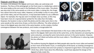
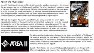
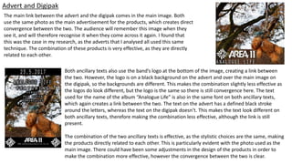
How effective is the
combination of your main
product and ancillary texts?
Digipak and Music Video
To create a link between the digipak and music video, we used props and
locations. The focus of the photograph on the front cover is a teddy bear, which is
the same teddy as the one used in the flashbacks of the music video. The photo
was also shot in the same woods as in the music video. In doing this, the image
has a direct link to the music video. However, as the teddy is only in a very small
part of the video, and isn’t focused on, it may have been better to use a different
object. For example, the ring was seen in multiple close-up shots, so this may
have been more of a representative symbol for the video than the teddy.
However, the location is clear as both the photo and the video were shot in the
same woods at the same time of year, so this link is effective. The other photos of
trees in the digipak were also shot in the same location, so this creates a further
convergence between the two products, and creates a recognisable link.
There is also a link between the band shots in the music video and the photo of the
band in the digipak. Both were shot at the same time, so the characters are wearing the
same costumes, carrying the same instruments and are in the same location. However,
the photo isn’t black and white and the music video is. The difference in colouring make
this less effective.
The audience buying the digipak are likely people who saw the music video and wanted
to hear more of the band’s music, or existing fans of the band, so creating convergence
between the ancillary text and main product is important to give them a full experience.
I think that, while I have done this effectively, I could have adjusted the design of the
digipak to fully create this.
Advert and Music Video
Like with the digipak, the image is of the teddy bear in the woods, which creates a link between
the two products, but not as effectively as it could be. The advert also doesn’t include an image
of the band. The audience may recognise the band from seeing their image in the music video,
so by not including this image in the advert, an audience may be less likely to recognise the
band being advertised. Therefore, while the advert does have a link to the music video, it’s not
completely effective, and the combination of the two products is slightly weaker.
Although the image on the advert is less effective, the text used is not. The band’s logo is
included at the bottom of the advert in white font on a black background. I have also included
the logo at the end of the music video, again in white against a black background. This is a
direct link between the two products. If the audience member has watched the music video
first, they will recognise the logo on the advert, and if they’ve seen the advert first, they will
recognise the logo when they watch the music video. This is a very effective link between the
main product and ancillary text.
The advert also lists tracks that are featured on the album, one of which is “Red Queen,”
the song that we made the music video for. By including this on the advert, another link
is created between the two products. The audience may decide to look up the song and
find the video, of they may have already seen the video and recognise it on the advert,
prompting them to buy the digipak.
Overall, I think that the link between the two products could’ve been stronger with a
different image being used, however there is still an effective link between the two.
Advert and Digipak
The main link between the advert and the digipak comes in the main image. Both
use the same photo as the main advertisement for the products, which creates direct
convergence between the two. The audience will remember this image when they
see it, and will therefore recognise it when they come across it again. I found that
this was the case in my research, as the adverts that I analysed all used this same
technique. The combination of these products is very effective, as they are directly
related to each other.
Both ancillary texts also use the band’s logo at the bottom of the image, creating a link between
the two. However, the logo is on a black background on the advert and over the main image on
the digipak, so the backgrounds are different. This makes the combination slightly less effective as
the logos do look different, but the logo is the same so there is still convergence here. The text
used for the name of the album “Analogue Life” is also in the same font on both ancillary texts,
which again creates a link between the two. The text on the advert has a defined black stroke
around the letters, whereas the text on the digipak doesn’t. This makes the text look different on
both ancillary texts, therefore making the combination less effective, although the link is still
present.
The combination of the two ancillary texts is effective, as the stylistic choices are the same, making
the products directly related to each other. This is particularly evident with the photo used as the
main image. There could have been some adjustments in the design of the products in order to
make the combination more effective, however the convergence between the two is clear.
Summary
My main product and ancillary texts all use very similar objects and designs. All three
products use the band’s logo, the image of the teddy and the location in the woods.
These different factors create synergy between the products that I think is effective. The
products together work better than the products individually. There’s elements from the
products, like the band logo, that are recognisable. The audience can use these
elements. For example, when they see the magazine advert with the band logo, then
see the digipak on the shelf in a store also with the band logo, they are likely to
remember the advert, and are more likely to pick up the digipak. The combination of my
main product and ancillary texts is effective they work better as a promotional package
than individually, and a synergetic effect is present.
Although I think that the combination of my main product and ancillary texts is effective,
there is still room for improvement. Although I have created links between the products,
these could be stronger. There is slight differences in the design of some of the products that
weaken this link. The icon of the teddy could’ve also been replaced with the icon of the ring
as it holds more symbolic meaning. These small adjustments would’ve made the synergy
stronger, and the combination of the products would’ve been more effective overall.
I think that the combination of my main product and ancillary texts is effective, however isn’t
as effective as it could’ve been and I could’ve improved it.

Q2

  • 1.
    How effective isthe combination of your main product and ancillary texts?
  • 2.
    Digipak and MusicVideo To create a link between the digipak and music video, we used props and locations. The focus of the photograph on the front cover is a teddy bear, which is the same teddy as the one used in the flashbacks of the music video. The photo was also shot in the same woods as in the music video. In doing this, the image has a direct link to the music video. However, as the teddy is only in a very small part of the video, and isn’t focused on, it may have been better to use a different object. For example, the ring was seen in multiple close-up shots, so this may have been more of a representative symbol for the video than the teddy. However, the location is clear as both the photo and the video were shot in the same woods at the same time of year, so this link is effective. The other photos of trees in the digipak were also shot in the same location, so this creates a further convergence between the two products, and creates a recognisable link. There is also a link between the band shots in the music video and the photo of the band in the digipak. Both were shot at the same time, so the characters are wearing the same costumes, carrying the same instruments and are in the same location. However, the photo isn’t black and white and the music video is. The difference in colouring make this less effective. The audience buying the digipak are likely people who saw the music video and wanted to hear more of the band’s music, or existing fans of the band, so creating convergence between the ancillary text and main product is important to give them a full experience. I think that, while I have done this effectively, I could have adjusted the design of the digipak to fully create this.
  • 3.
    Advert and MusicVideo Like with the digipak, the image is of the teddy bear in the woods, which creates a link between the two products, but not as effectively as it could be. The advert also doesn’t include an image of the band. The audience may recognise the band from seeing their image in the music video, so by not including this image in the advert, an audience may be less likely to recognise the band being advertised. Therefore, while the advert does have a link to the music video, it’s not completely effective, and the combination of the two products is slightly weaker. Although the image on the advert is less effective, the text used is not. The band’s logo is included at the bottom of the advert in white font on a black background. I have also included the logo at the end of the music video, again in white against a black background. This is a direct link between the two products. If the audience member has watched the music video first, they will recognise the logo on the advert, and if they’ve seen the advert first, they will recognise the logo when they watch the music video. This is a very effective link between the main product and ancillary text. The advert also lists tracks that are featured on the album, one of which is “Red Queen,” the song that we made the music video for. By including this on the advert, another link is created between the two products. The audience may decide to look up the song and find the video, of they may have already seen the video and recognise it on the advert, prompting them to buy the digipak. Overall, I think that the link between the two products could’ve been stronger with a different image being used, however there is still an effective link between the two.
  • 4.
    Advert and Digipak Themain link between the advert and the digipak comes in the main image. Both use the same photo as the main advertisement for the products, which creates direct convergence between the two. The audience will remember this image when they see it, and will therefore recognise it when they come across it again. I found that this was the case in my research, as the adverts that I analysed all used this same technique. The combination of these products is very effective, as they are directly related to each other. Both ancillary texts also use the band’s logo at the bottom of the image, creating a link between the two. However, the logo is on a black background on the advert and over the main image on the digipak, so the backgrounds are different. This makes the combination slightly less effective as the logos do look different, but the logo is the same so there is still convergence here. The text used for the name of the album “Analogue Life” is also in the same font on both ancillary texts, which again creates a link between the two. The text on the advert has a defined black stroke around the letters, whereas the text on the digipak doesn’t. This makes the text look different on both ancillary texts, therefore making the combination less effective, although the link is still present. The combination of the two ancillary texts is effective, as the stylistic choices are the same, making the products directly related to each other. This is particularly evident with the photo used as the main image. There could have been some adjustments in the design of the products in order to make the combination more effective, however the convergence between the two is clear.
  • 5.
    Summary My main productand ancillary texts all use very similar objects and designs. All three products use the band’s logo, the image of the teddy and the location in the woods. These different factors create synergy between the products that I think is effective. The products together work better than the products individually. There’s elements from the products, like the band logo, that are recognisable. The audience can use these elements. For example, when they see the magazine advert with the band logo, then see the digipak on the shelf in a store also with the band logo, they are likely to remember the advert, and are more likely to pick up the digipak. The combination of my main product and ancillary texts is effective they work better as a promotional package than individually, and a synergetic effect is present. Although I think that the combination of my main product and ancillary texts is effective, there is still room for improvement. Although I have created links between the products, these could be stronger. There is slight differences in the design of some of the products that weaken this link. The icon of the teddy could’ve also been replaced with the icon of the ring as it holds more symbolic meaning. These small adjustments would’ve made the synergy stronger, and the combination of the products would’ve been more effective overall. I think that the combination of my main product and ancillary texts is effective, however isn’t as effective as it could’ve been and I could’ve improved it.