- The main image takes up the entire left page and is in black and white, contrasting with the page. It does not have direct eye contact with the viewer.
- The kicker at the top right provides background information on the subject of the article, the band Beady Eye.
- The large header "Beady Eye" is the biggest text and draws the eye to learn what the article is about. Additional information and the continuation of the text are on the right page to complement the main image.
This is Tom's answer to question 1 of the evaluation for our music magazine. The question is, "In what way does your media product use, develop or challenge codes and conventions of real media products?".
This is Tom's answer to question 1 of the evaluation for our music magazine. The question is, "In what way does your media product use, develop or challenge codes and conventions of real media products?".
Acqua avenida das torres, apartamentos de 2 e 3 dormitórios, área de lazer completa, complexo aquático e o melhor de tudo pronto para morar com todo conforto e segurança valores especiais.
Informações e Reservas : (92) 8199-0251
E-mail : jose.augusto@innovamanaus.com.br
Embracing GenAI - A Strategic ImperativePeter Windle
Artificial Intelligence (AI) technologies such as Generative AI, Image Generators and Large Language Models have had a dramatic impact on teaching, learning and assessment over the past 18 months. The most immediate threat AI posed was to Academic Integrity with Higher Education Institutes (HEIs) focusing their efforts on combating the use of GenAI in assessment. Guidelines were developed for staff and students, policies put in place too. Innovative educators have forged paths in the use of Generative AI for teaching, learning and assessments leading to pockets of transformation springing up across HEIs, often with little or no top-down guidance, support or direction.
This Gasta posits a strategic approach to integrating AI into HEIs to prepare staff, students and the curriculum for an evolving world and workplace. We will highlight the advantages of working with these technologies beyond the realm of teaching, learning and assessment by considering prompt engineering skills, industry impact, curriculum changes, and the need for staff upskilling. In contrast, not engaging strategically with Generative AI poses risks, including falling behind peers, missed opportunities and failing to ensure our graduates remain employable. The rapid evolution of AI technologies necessitates a proactive and strategic approach if we are to remain relevant.
Welcome to TechSoup New Member Orientation and Q&A (May 2024).pdfTechSoup
In this webinar you will learn how your organization can access TechSoup's wide variety of product discount and donation programs. From hardware to software, we'll give you a tour of the tools available to help your nonprofit with productivity, collaboration, financial management, donor tracking, security, and more.
2024.06.01 Introducing a competency framework for languag learning materials ...Sandy Millin
http://sandymillin.wordpress.com/iateflwebinar2024
Published classroom materials form the basis of syllabuses, drive teacher professional development, and have a potentially huge influence on learners, teachers and education systems. All teachers also create their own materials, whether a few sentences on a blackboard, a highly-structured fully-realised online course, or anything in between. Despite this, the knowledge and skills needed to create effective language learning materials are rarely part of teacher training, and are mostly learnt by trial and error.
Knowledge and skills frameworks, generally called competency frameworks, for ELT teachers, trainers and managers have existed for a few years now. However, until I created one for my MA dissertation, there wasn’t one drawing together what we need to know and do to be able to effectively produce language learning materials.
This webinar will introduce you to my framework, highlighting the key competencies I identified from my research. It will also show how anybody involved in language teaching (any language, not just English!), teacher training, managing schools or developing language learning materials can benefit from using the framework.
Introduction to AI for Nonprofits with Tapp NetworkTechSoup
Dive into the world of AI! Experts Jon Hill and Tareq Monaur will guide you through AI's role in enhancing nonprofit websites and basic marketing strategies, making it easy to understand and apply.
Model Attribute Check Company Auto PropertyCeline George
In Odoo, the multi-company feature allows you to manage multiple companies within a single Odoo database instance. Each company can have its own configurations while still sharing common resources such as products, customers, and suppliers.
A Strategic Approach: GenAI in EducationPeter Windle
Artificial Intelligence (AI) technologies such as Generative AI, Image Generators and Large Language Models have had a dramatic impact on teaching, learning and assessment over the past 18 months. The most immediate threat AI posed was to Academic Integrity with Higher Education Institutes (HEIs) focusing their efforts on combating the use of GenAI in assessment. Guidelines were developed for staff and students, policies put in place too. Innovative educators have forged paths in the use of Generative AI for teaching, learning and assessments leading to pockets of transformation springing up across HEIs, often with little or no top-down guidance, support or direction.
This Gasta posits a strategic approach to integrating AI into HEIs to prepare staff, students and the curriculum for an evolving world and workplace. We will highlight the advantages of working with these technologies beyond the realm of teaching, learning and assessment by considering prompt engineering skills, industry impact, curriculum changes, and the need for staff upskilling. In contrast, not engaging strategically with Generative AI poses risks, including falling behind peers, missed opportunities and failing to ensure our graduates remain employable. The rapid evolution of AI technologies necessitates a proactive and strategic approach if we are to remain relevant.
June 3, 2024 Anti-Semitism Letter Sent to MIT President Kornbluth and MIT Cor...Levi Shapiro
Letter from the Congress of the United States regarding Anti-Semitism sent June 3rd to MIT President Sally Kornbluth, MIT Corp Chair, Mark Gorenberg
Dear Dr. Kornbluth and Mr. Gorenberg,
The US House of Representatives is deeply concerned by ongoing and pervasive acts of antisemitic
harassment and intimidation at the Massachusetts Institute of Technology (MIT). Failing to act decisively to ensure a safe learning environment for all students would be a grave dereliction of your responsibilities as President of MIT and Chair of the MIT Corporation.
This Congress will not stand idly by and allow an environment hostile to Jewish students to persist. The House believes that your institution is in violation of Title VI of the Civil Rights Act, and the inability or
unwillingness to rectify this violation through action requires accountability.
Postsecondary education is a unique opportunity for students to learn and have their ideas and beliefs challenged. However, universities receiving hundreds of millions of federal funds annually have denied
students that opportunity and have been hijacked to become venues for the promotion of terrorism, antisemitic harassment and intimidation, unlawful encampments, and in some cases, assaults and riots.
The House of Representatives will not countenance the use of federal funds to indoctrinate students into hateful, antisemitic, anti-American supporters of terrorism. Investigations into campus antisemitism by the Committee on Education and the Workforce and the Committee on Ways and Means have been expanded into a Congress-wide probe across all relevant jurisdictions to address this national crisis. The undersigned Committees will conduct oversight into the use of federal funds at MIT and its learning environment under authorities granted to each Committee.
• The Committee on Education and the Workforce has been investigating your institution since December 7, 2023. The Committee has broad jurisdiction over postsecondary education, including its compliance with Title VI of the Civil Rights Act, campus safety concerns over disruptions to the learning environment, and the awarding of federal student aid under the Higher Education Act.
• The Committee on Oversight and Accountability is investigating the sources of funding and other support flowing to groups espousing pro-Hamas propaganda and engaged in antisemitic harassment and intimidation of students. The Committee on Oversight and Accountability is the principal oversight committee of the US House of Representatives and has broad authority to investigate “any matter” at “any time” under House Rule X.
• The Committee on Ways and Means has been investigating several universities since November 15, 2023, when the Committee held a hearing entitled From Ivory Towers to Dark Corners: Investigating the Nexus Between Antisemitism, Tax-Exempt Universities, and Terror Financing. The Committee followed the hearing with letters to those institutions on January 10, 202
Read| The latest issue of The Challenger is here! We are thrilled to announce that our school paper has qualified for the NATIONAL SCHOOLS PRESS CONFERENCE (NSPC) 2024. Thank you for your unwavering support and trust. Dive into the stories that made us stand out!
Synthetic Fiber Construction in lab .pptxPavel ( NSTU)
Synthetic fiber production is a fascinating and complex field that blends chemistry, engineering, and environmental science. By understanding these aspects, students can gain a comprehensive view of synthetic fiber production, its impact on society and the environment, and the potential for future innovations. Synthetic fibers play a crucial role in modern society, impacting various aspects of daily life, industry, and the environment. ynthetic fibers are integral to modern life, offering a range of benefits from cost-effectiveness and versatility to innovative applications and performance characteristics. While they pose environmental challenges, ongoing research and development aim to create more sustainable and eco-friendly alternatives. Understanding the importance of synthetic fibers helps in appreciating their role in the economy, industry, and daily life, while also emphasizing the need for sustainable practices and innovation.
Front covers, contents pages, double page spreads #5
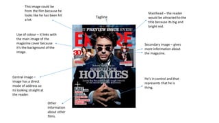
1. Masthead – the reader
would be attracted to the
title because its big and
bright red.
Tagline
Secondary image – gives
more information about
the magazine.
Use of colour – it links with
the main image of the
magazine cover because
it’s the background of the
image.
Central image –
image has a direct
mode of address so
its looking straight at
the reader.
He's in control and that
represents that he is
thing.
Other
information
about other
films.
This image could be
from the film because he
looks like he has been hit
a lot.
2. Main Image – being placed in the central and using
the effect of direct address to create a bond with the
reader and entice them into the magazine. Alex Turner
is dressed in black, making Alex stand out from the
grey/white background. Having roses on his shirt, this
could show the reader that he is loving person but at the
same has power because he is wearing black. Holding a
record in his hand, this links with the heading ‘The
Record That Changed My Life’ linking everything
together in the front cover. Having direct address in the
image so main image looking at the reader into there
eyes, but in reality Alex is at into the camera.
Cover Line – the cover line is in white, red, and blue.
this stands out more on the front cover as the cover line
is placed on a black background, the brightest text on
the magazine. No other story but the main cover line is
overlapping the main image, this shows the authority in
the magazine and his story in the magazine. The letters
are in capital letters and in the4 same fonts. They are
placed all over the magazine and create symmetrical
balance with each of the features on the magazine. In
any magazine cover lines are a big impact on the
magazine as it ensures the viewers purchases the
magazine. The cover line and the main image have big
impact on the magazine as they are the features that
attract the reader to the magazine in the first place.
There are a number of more information are on the
magazine cover to attract the reader to the
magazine and it gives the magazine to entertain
the reader in more different ways. Having more
stories on the front cover. Other stories on the
front cover are in blue and white, red, and black.
Having information in the box which is placed just
next to the main image. Pulling the reader to the
magazine cover, its like a pull quote to the
magazine. ‘The ultimate guide every release!’
having a ultimate music release only on this
magazine, this would pull the reader to the
magazine as they would want more information on
this story. Other stories on the magazine cover are
with the convergences of the magazine, having
multiple of stories on one page.
The record in the main image goes with the
colour scheme of the magazine cover. They
have linked the record to the convergences on
the magazine. Showing the reader that this is a
music magazine by outing a record in the main
image and also its in the cover line. A non-
reader of this magazine would know that this is
a music magazine as it follows the music
magazine convergences.
3. The masthead is a letter ‘Q’ logo. This
name is catchy and easy to remember for
the magazine company and this is the same
on every Q magazine. The font on the
magazine is formal and more aimed at a
older target audience. As the font being
simple and easy to read on the front cover.
Easily attracting the older target audience
rather than the younger audience. The font
doesn’t look like a childish masthead. The
masthead is also placed in the top left
corner as the reader will see the Q logo
first, the colour is bright red and white
therefore it will be the first colour noticed
on the magazine cover.
The anchorage text the biggest boldest
information on the magazine (other than
the masthead) as this links to the main
image, the reader would see the main
image and would instantly want to know
what it is about therefore it crucial that
the anchorage text is larger than the cover
lines so the reader would not get confused
about which one linked to the main image.
‘Take That’ are in bold letters as this
shows the reader that they are main focus
on magazine.
The date and price are indicated near the
main image on the right hand side. They are
placed with the barcode in small print, this is
usually as the company doesn’t want the
price to standout as it doesn’t appeal to the
reader.
The header has been placed on top of the
anchorage text. The colour of the header is in
red, making easy to read and easy to attract the
readers eyes. Giving more information about the
main image and the anchorage text.
The cover lines are situated around the
band members (the main image) and are in
bold red and gold colour. This is because
they want to keep the main attention on
the anchorage text but keeping the cover
lines attractive enough to get the readers
attention. These cover lines inform the
reader of any other artist within the
magazine – this will influence whether the
reader will purchase the magazine or not.
The main colours used are white, red
and black (a bit of gold). Yet some of
the gold indicates that Q are a mature,
traditional magazine that it takes itself
more seriously.
The layout of the magazine cover is different
from other magazine covers. The
information are presented on the top, right,
left and the bottom of the page, making the
reader look all over the magazine cover.
4. Masthead – uses yellow,
black and white colour
scheme to make the
heading stand out.
Main image –
images relating to
the bands the
magazine
represents.
Uses image of
Kerrang’s previous
issue to show new
readers what they
missed out on last
time.
This is what the
editor of the
magazine wrote
about the
bands/magazine it
self.
Using big bold words
to attract the readers
attention to the
magazine. Separates
different type of
sub-heading of
the magazine.
The new or old
issues of the
magazine. Tells the
reader what they
have missed out on
over the week.
Tells the reader that
its been wrote by the
editor because its
been signed by the
editor.
Including page
numbers next
to the images.
relating to
what’s inside
the magazine.
5. Been signed by the editor –
makes the reader feel like the
editor is talking to them directly.
Contents coloumntext consists
mainly of band names – it attracts
the readers attention so they will buy
the magazine and with all of their
favourite bands.
Masthead – the magazine is breaking
the colour scheme because its got
more than three colours on the
contents page.
the sub-titles have a different colour
scheme than the masthead. Using
different sub-heading in the magazine
– e.g. ‘NEWS’.
The image tells
the reader that
there is a story in
the magazine.
Page numbers –
including page
numbers next to the
image so tells the
reader what's inside
the magazine.
Put in a different shape
so tells the reader its
important.
Images relating to
genre that the
magazine represents.
One of the band
wrote a book so
tells the reader ‘you
should reader
you’re favourite
bands book’.
Bold sub-heading in
capital letters – its eye
catching
6. Kerrang’s colour
scheme is always
the same. Yellow,
black and white.
Mainly about the bands
names – trying to attract
readers attention so they
will buy this magazine
because of their favourite
bands.
Images are relating to
genre that the readers
like and the magazine
represents.
This is the main cover
line of the contents
page. Tells the reader
what the text is
about.
The editor of the magazine
wrote about the bands that
week. This is talking to the
reader directly.
Other issues of
the Kerrang's
magazines. The
reader might
have missed out
on.
Using bold
writing because
it catch the
readers eye.
The text is talking about that
band and not other bands in
the magazine.
7.
8. The large ‘T’ at the start of the article shows where the text
will be starting from, this gives the double page spread a
professional look and makes it more interesting to look at.
Kicker
This is used in double page spreads
to give the reader information
about the celebrity being
presented on the page, give
background information if the
reader does not know who they,
this also provides about the main
image. The kicker is giving the
reader the celebrities name, what
music they play and just their
background information, this is
because the reader might not
know what the double page spread
is about but are interested in them.
Header
The header is being placed at the
top of the right hand side of the
double page spread, this is because
the image is on the left hand side
taking the whole of that side place,
the next thing the reader will be
attracted by is the heading of the
double page spread. ‘Beady Eye’ is
the heading, presenting in the
biggest writing on the page and
being the brightest on the double
page spread itself. This also makes
it simple for the reader to interact
around the page.
Main Image
The main image presented in black
and grey, making the main image
contrast with the background and
the colour convention going in the
double page spread. The main
image complies with the colour
scheme as it flows with it all. All of
this suits the style of the artist
presented on the double page
spread. The main image is
contrasting with the page a lot.
Main Image, this takes up the whole left hand side page. As you
can see the main image was planned for this page but the image
doesn’t have direct address to the audience and this is different to
other magazine double page spreads. The image is not interacting
with the audience, the way the image is portrayed, the reader may
think that he could be sharing something with them but not looking
at them. The image is also in black and white, this doesn’t generate
colours to attract the reader and doesn’t generate that much bright
colour and take the focus away from the magazine or the article.
Main Image looks relaxed
and chilled, and this is
what the reader the be
like, reading this in a
chilled place and being
relaxed at the same time.
The reader would enjoy
this because how the
conventions are just
flowing in the right places.
9. Style
The style of this double spread page
has been aimed at the higher target
audience. The colour scheme of the
double spread page is pink, white
and grey. The colours are dual
because it has been aimed at a
higher audience than a pop style
magazine. The page has been aimed
at women because of the colours
they have been using in the
magazine. Using an image to fell on
side of the double spread page to
show the women and so it has been
aimed at women target audience.
Image
The image is the biggest thing on the
spread page. Felling the hole page
and making it stand out to the target
audience. The image is a women so
it has been aimed at women's. The
image is big and stands out to the
audience eyes so it will attract the
women to the double spread page.
Text
The text is an formal language so
aimed at a higher audience. The
text is simple and easy to read for
the audience and easy to
understand.
Main Image is placed in the right
hand side of the page, as the image
is in black and white colour, this is
not taking away the focus from the
article in the double page spread.
The image ahs got direct address to
the reader, this makes the reader
feel like that the artist is look at
them and trying to get there
attention through the magazine.
Layout
The layout of the double page spread is simple and follows the
convention of the magazine cover. Putting the main image on the
right hand side and just having the image on that side. As you can
see there is text on the page, a lot of text so shows the reader likes
to read about the artist, not having a Kicker in this double page
spread, this may represent that everyone should know who the
artist is and the reader should just get into the information given
on the page.