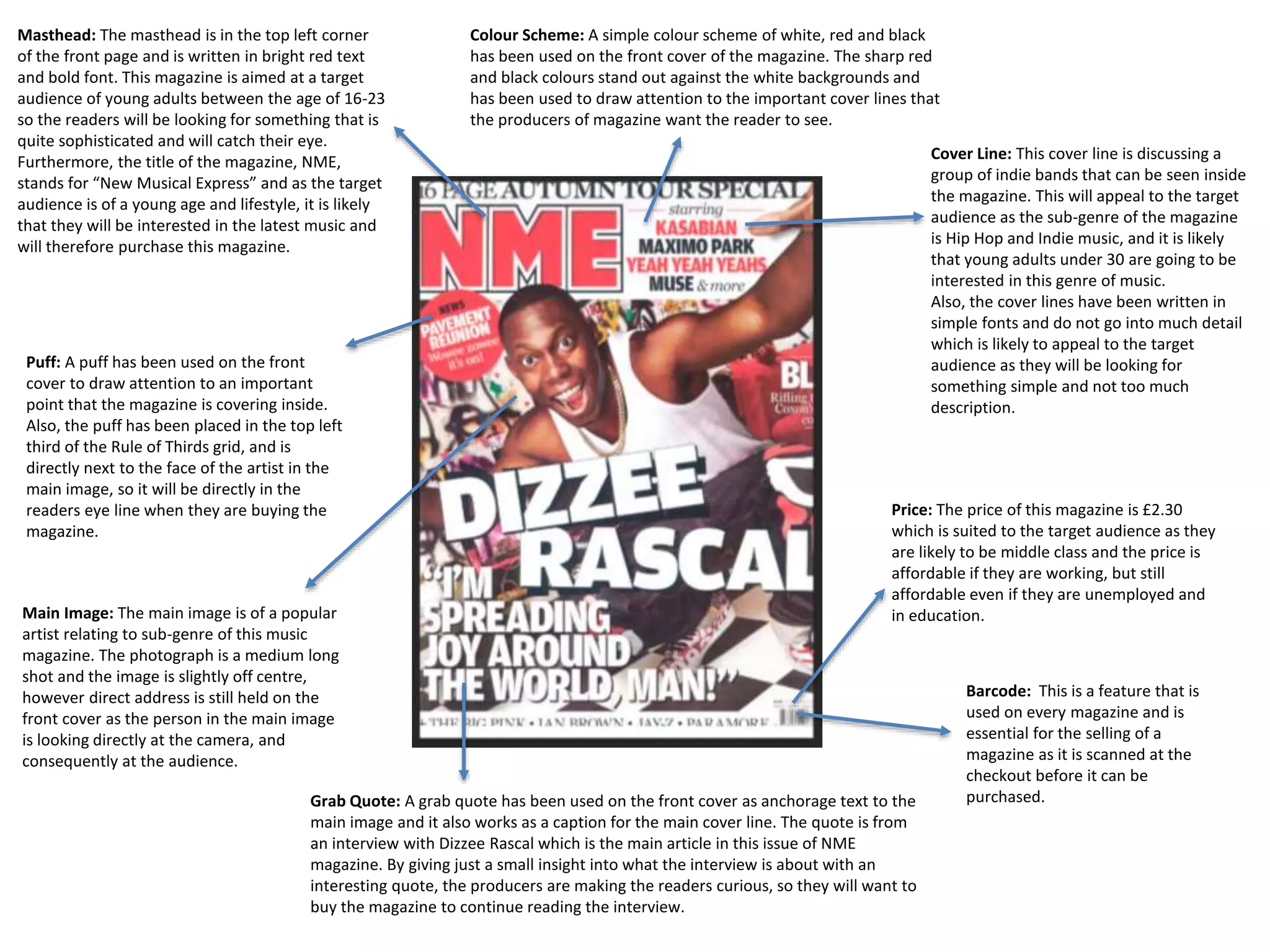
Masthead: The masthead is in the top left corner 
of the front page and is written in bright red text 
and bold font. This magazine is aimed at a target 
audience of young adults between the age of 16-23 
so the readers will be looking for something that is 
quite sophisticated and will catch their eye. 
Furthermore, the title of the magazine, NME, 
stands for “New Musical Express” and as the target 
audience is of a young age and lifestyle, it is likely 
that they will be interested in the latest music and 
will therefore purchase this magazine. 
Colour Scheme: A simple colour scheme of white, red and black 
has been used on the front cover of the magazine. The sharp red 
and black colours stand out against the white backgrounds and 
has been used to draw attention to the important cover lines that 
the producers of magazine want the reader to see. 
Puff: A puff has been used on the front 
cover to draw attention to an important 
point that the magazine is covering inside. 
Also, the puff has been placed in the top left 
third of the Rule of Thirds grid, and is 
directly next to the face of the artist in the 
main image, so it will be directly in the 
readers eye line when they are buying the 
magazine. 
Cover Line: This cover line is discussing a 
group of indie bands that can be seen inside 
the magazine. This will appeal to the target 
audience as the sub-genre of the magazine 
is Hip Hop and Indie music, and it is likely 
that young adults under 30 are going to be 
interested in this genre of music. 
Also, the cover lines have been written in 
simple fonts and do not go into much detail 
which is likely to appeal to the target 
audience as they will be looking for 
something simple and not too much 
description. 
Price: The price of this magazine is £2.30 
which is suited to the target audience as they 
are likely to be middle class and the price is 
affordable if they are working, but still 
affordable even if they are unemployed and 
Main Image: The main image is of a popular in education. 
artist relating to sub-genre of this music 
magazine. The photograph is a medium long 
shot and the image is slightly off centre, 
however direct address is still held on the 
front cover as the person in the main image 
is looking directly at the camera, and 
consequently at the audience. 
Barcode: This is a feature that is 
used on every magazine and is 
essential for the selling of a 
magazine as it is scanned at the 
checkout before it can be 
Grab Quote: A grab quote has been used on the front cover as anchorage text to the purchased. 
main image and it also works as a caption for the main cover line. The quote is from 
an interview with Dizzee Rascal which is the main article in this issue of NME 
magazine. By giving just a small insight into what the interview is about with an 
interesting quote, the producers are making the readers curious, so they will want to 
buy the magazine to continue reading the interview.
Masthead: The title of the magazine has been 
used again on the contents page in a strap line 
across the top of the page. The masthead has 
been written in the same font and styling as it is 
on the front cover of the magazine. This has been 
done so that the title becomes recognisable to the 
audience and can become a branded name. 
However, the title is slightly smaller on this page 
than on the front cover and this follows one of the 
codes and conventions of a contents page, as the 
masthead must be included but in smaller text, as 
it is not a main feature on the contents page as it 
is on the front cover. 
Section Headings: The magazine contents have been split up into sub-sections based on their genre. 
These are written in capitals and are in bold, white font against a black background so they are clear 
to see and will stand out to the audience. This feature is useful as it makes it easier for the reader to 
find a specific type of article they are looking for without having to read through all of the contents. 
Main Image: The main image on this page 
features what seems to be the editor of the 
magazine next to a tour bus. The image is above 
a note which anchors the image as the heading is 
“Touring Special” which connects the image and 
the text as the image links in with the “touring” 
aspect. This will appeal to the target audience of 
young adults between the age of 16-23 as they 
are likely to be interested in live music and as the 
producers of the magazine have used the 
adjective “special”, it suggests that the 
information held in the magazine can not be seen 
anywhere else and the audience will therefore 
want to purchase the magazine to find out the 
information first. 
Index: An index has been used on this page which orders the bands included inside the magazine in alphabetical order 
and tells the reader what page they can be found on. This feature will be useful to the target audience as they will be 
able to directly find their favourite artists without having to spend time flicking through the whole magazine trying to 
find what they are specifically looking for. Furthermore, this will appeal to the audience more as they are most likely 
not going to want to read all of the magazine as not everything will interest them, so this will save them time. 
Rule of Thirds: The feature of rule of 
thirds has been used on the contents 
page to make the layout of the page 
clear. This makes the page easier for the 
audience to understand as it is separated 
into 3 sections that include different 
content. This follows a convention of a 
contents page as they are typically split 
into three columns for the readers 
benefit so the information is presented 
in a more readable manner. 
Offer: A subscription offer has been 
included on the contents page. This 
will appeal to the target audience as 
the offer states that the reader will 
save money and 16-23 year olds are 
going to want to save their money so 
a bargain will catch their eye. Also, a 
subscription offers delivery of each 
new issue of the magazine first which 
may appeal to the audience as they 
will not have to go and get it 
themselves, and will receive it the 
day it is released so can hear the 
latest music news first.
Article Title: A play on words has been used in the title of the article as the magazine producers have changed the phrase “from 
rags to riches” into “from tags to riches”. This has been done to link the main image to the text as in the image the artist is shown 
to be tagging a wall. The heading has been written in large, bold text and fills half of the page to attract the reader as they may 
be able to empathise with some aspects of the story just from reading the title, or they might purely be attracted by the twist on 
the words used. 
Main Image: The main image 
on this page includes Dizzee 
Rascal, the artist that the 
article on the opposite page is 
about. This will appeal to the 
target audience as if they have 
purchased the magazine, they 
are most likely going to like 
the artist shown and by 
placing the main image on it’s 
own page, there is no 
distractions and the reader 
will be attracted to the colours 
and different aspects of the 
image. Furthermore, a 
different angle has been used 
in this shot compared to the 
main image of the artist on 
the front cover to show a 
connection between this 
image and the opposing 
article. 
Corner Tab: There has 
been a square added to 
the corner of the double 
page spread that says 
“Dizzee”. This would be 
useful for the target 
audience as they are likely 
to just be flicking through 
the magazine, and could 
therefore see this corner 
feature and will turn to 
read this feature article. 
Sub-Heading: The sub-heading 
of any article gives 
the reader a slight insight 
into what the article will be 
about. This feature will 
appeal to the target 
audience as the small line 
explains that the artist has 
not always had a 
glamorous lifestyle, and 
therefore the readers may 
be able to relate to the 
article as they may feel 
that they have been in 
some of the same positions 
as him when he was the 
same age as the target 
audience. 
Article: The main article has been written in smaller text than the heading of the article and the sub-heading and has also been 
divided into four columns. These columns spread the text out so it is displayed in a more organised manner. This will appeal to the 
target audience as a large chunk of text will most likely be off putting to 16-23 year olds, but as it is split up, it looks clearer and like 
there is less to read.

Research Task 2

  • 1.
    Masthead: The mastheadis in the top left corner of the front page and is written in bright red text and bold font. This magazine is aimed at a target audience of young adults between the age of 16-23 so the readers will be looking for something that is quite sophisticated and will catch their eye. Furthermore, the title of the magazine, NME, stands for “New Musical Express” and as the target audience is of a young age and lifestyle, it is likely that they will be interested in the latest music and will therefore purchase this magazine. Colour Scheme: A simple colour scheme of white, red and black has been used on the front cover of the magazine. The sharp red and black colours stand out against the white backgrounds and has been used to draw attention to the important cover lines that the producers of magazine want the reader to see. Puff: A puff has been used on the front cover to draw attention to an important point that the magazine is covering inside. Also, the puff has been placed in the top left third of the Rule of Thirds grid, and is directly next to the face of the artist in the main image, so it will be directly in the readers eye line when they are buying the magazine. Cover Line: This cover line is discussing a group of indie bands that can be seen inside the magazine. This will appeal to the target audience as the sub-genre of the magazine is Hip Hop and Indie music, and it is likely that young adults under 30 are going to be interested in this genre of music. Also, the cover lines have been written in simple fonts and do not go into much detail which is likely to appeal to the target audience as they will be looking for something simple and not too much description. Price: The price of this magazine is £2.30 which is suited to the target audience as they are likely to be middle class and the price is affordable if they are working, but still affordable even if they are unemployed and Main Image: The main image is of a popular in education. artist relating to sub-genre of this music magazine. The photograph is a medium long shot and the image is slightly off centre, however direct address is still held on the front cover as the person in the main image is looking directly at the camera, and consequently at the audience. Barcode: This is a feature that is used on every magazine and is essential for the selling of a magazine as it is scanned at the checkout before it can be Grab Quote: A grab quote has been used on the front cover as anchorage text to the purchased. main image and it also works as a caption for the main cover line. The quote is from an interview with Dizzee Rascal which is the main article in this issue of NME magazine. By giving just a small insight into what the interview is about with an interesting quote, the producers are making the readers curious, so they will want to buy the magazine to continue reading the interview.
  • 2.
    Masthead: The titleof the magazine has been used again on the contents page in a strap line across the top of the page. The masthead has been written in the same font and styling as it is on the front cover of the magazine. This has been done so that the title becomes recognisable to the audience and can become a branded name. However, the title is slightly smaller on this page than on the front cover and this follows one of the codes and conventions of a contents page, as the masthead must be included but in smaller text, as it is not a main feature on the contents page as it is on the front cover. Section Headings: The magazine contents have been split up into sub-sections based on their genre. These are written in capitals and are in bold, white font against a black background so they are clear to see and will stand out to the audience. This feature is useful as it makes it easier for the reader to find a specific type of article they are looking for without having to read through all of the contents. Main Image: The main image on this page features what seems to be the editor of the magazine next to a tour bus. The image is above a note which anchors the image as the heading is “Touring Special” which connects the image and the text as the image links in with the “touring” aspect. This will appeal to the target audience of young adults between the age of 16-23 as they are likely to be interested in live music and as the producers of the magazine have used the adjective “special”, it suggests that the information held in the magazine can not be seen anywhere else and the audience will therefore want to purchase the magazine to find out the information first. Index: An index has been used on this page which orders the bands included inside the magazine in alphabetical order and tells the reader what page they can be found on. This feature will be useful to the target audience as they will be able to directly find their favourite artists without having to spend time flicking through the whole magazine trying to find what they are specifically looking for. Furthermore, this will appeal to the audience more as they are most likely not going to want to read all of the magazine as not everything will interest them, so this will save them time. Rule of Thirds: The feature of rule of thirds has been used on the contents page to make the layout of the page clear. This makes the page easier for the audience to understand as it is separated into 3 sections that include different content. This follows a convention of a contents page as they are typically split into three columns for the readers benefit so the information is presented in a more readable manner. Offer: A subscription offer has been included on the contents page. This will appeal to the target audience as the offer states that the reader will save money and 16-23 year olds are going to want to save their money so a bargain will catch their eye. Also, a subscription offers delivery of each new issue of the magazine first which may appeal to the audience as they will not have to go and get it themselves, and will receive it the day it is released so can hear the latest music news first.
  • 3.
    Article Title: Aplay on words has been used in the title of the article as the magazine producers have changed the phrase “from rags to riches” into “from tags to riches”. This has been done to link the main image to the text as in the image the artist is shown to be tagging a wall. The heading has been written in large, bold text and fills half of the page to attract the reader as they may be able to empathise with some aspects of the story just from reading the title, or they might purely be attracted by the twist on the words used. Main Image: The main image on this page includes Dizzee Rascal, the artist that the article on the opposite page is about. This will appeal to the target audience as if they have purchased the magazine, they are most likely going to like the artist shown and by placing the main image on it’s own page, there is no distractions and the reader will be attracted to the colours and different aspects of the image. Furthermore, a different angle has been used in this shot compared to the main image of the artist on the front cover to show a connection between this image and the opposing article. Corner Tab: There has been a square added to the corner of the double page spread that says “Dizzee”. This would be useful for the target audience as they are likely to just be flicking through the magazine, and could therefore see this corner feature and will turn to read this feature article. Sub-Heading: The sub-heading of any article gives the reader a slight insight into what the article will be about. This feature will appeal to the target audience as the small line explains that the artist has not always had a glamorous lifestyle, and therefore the readers may be able to relate to the article as they may feel that they have been in some of the same positions as him when he was the same age as the target audience. Article: The main article has been written in smaller text than the heading of the article and the sub-heading and has also been divided into four columns. These columns spread the text out so it is displayed in a more organised manner. This will appeal to the target audience as a large chunk of text will most likely be off putting to 16-23 year olds, but as it is split up, it looks clearer and like there is less to read.