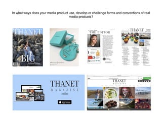
SlideShare a Scribd company logo
In what ways does your media product use, develop or challenge forms and conventions of real
media products?

FRONT COVER
I stuck with the common conventions for my
masthead. I had a serif mast head in a stand
out colour which contrasts with the
background of the magazine. I placed the title
on two lines which isn't a common convention
but has been seen used in some regional
magazines. I also followed the convention
of having then name of the region.
I also added a slight glossy sheen to it which
is a common convention of the regional
magazines The Cheshire Magazine and
Kensington and Chelsea Magazine.
I used the convention of airbrushing and
enhancing the model on photoshop. This
is so the cover star looks more appealing
to the audience and more likely to capture
their attention. Because I used a female on
the cover I also followed the convention of
them wearing makeup to further enhance the
aesthetic appeal and attract the female target
prudence of my magazine. I airbrushed the
cover star by smoothing/evening the skin
tone and covering up dark circle and
blemishes.
I also followed the convention of having a
the main image shot in high key lighting. It
was also kept in colour as in other regional
magazines I’ve researched. My media
product is a ‘fashion special’ of a popular
regional lifestyle magazine, which is loosely
based on The Cheshire Magazine and
Kensington and Chelsea Magazine as I like
the style of theirs.
I followed the front cover convention of
having a cover image of a person.
According to Mulvey woman are used
in media for the male gaze and are
quite often sexualised. I wanted to
challenge this convention of her being
for the male gaze and put her in a
more powerful stance with elegant
clothes on making her the subject not
the object.
I stuck with the convention of using
simple serif text with minimal
punctuation but made sure it was still
short sentences that capture the
readers attention and keep them
informed with whats inside the
magazine (uses and gratifications
theory) I stuck with my house them
white font as it’s contrasting, it stands
out against the darker background
and looks professional. I put some of
the words in italic to emphasis them.
I also added small subheading below to
give a bit more insight into whats inside
the magazine but I still kept it short to
keep the audience wanting more. This
fits under Roland Barthes: Enigma
Code, which leaves the audience
guessing and makes them want to read
on and find out more. This is a very
common convention of magazines so I
decided to include it.
ADIVERTISMENT PAGE 

I kept the common convention of
it being an advert for a local
company. This keeps it personal
and useful for the audience. This
links to the uses and
gratifications theory of
gratification surveillance as
the audience is gaining
information.
I stuck with the common
convention of adding an
address of the company so
its easily assessable and
informative for the readers.
High key lighting is used to
shoot the product. This is a
common convention as it
makes the product more
autistically pleasing and detail
can be seen on the image.
The name of the magazine is the
largest font on the page this is a
common convention of regional
magazines. I also chose a font
that contrasts the background
with the colour.
As in many other adverts I
airbrushed and edited the image to
make it more ascetically pleasing to
the audience to draw them in.
EDITORIAL PAGE 

I stuck with the common convention
of regional magazines of having an
editorial page with text written by
the editor to the readers. This
creates a personal relationship
between the editor and the reader.
(uses and grat). This uses and
conforms to hegemonic norms, so
conforms to my audiences beliefs
making it more relatable to them.
I kept the common conventions of
having a small picture of the editor
and a signature next to it.
I also put social media tags to
connect it to the magazine and
create a wider audience. It will also
help to appeal more to the younger
side of my target audience as
they're statistically more involved
in social media.
Lots of regional magazines feature
editorial picks or favourites so I
decided to also include it in my
editorial page.
I used the conventional picture for
my editorial page. This breaks up
the text and makes it more
interesting than just text. It makes it
more atheistically pleasing also.
Large titles are often used in regional
magazines as they attract the
attention of the audience. Using
titles like mine make it seem more
personal to the audience as if its a
‘letter’ just for them. This creates a
personal relationship with the
readership. (uses and gratifications
theory)
CONTENTS PAGE

Titles are used to organise the text
neatly it also creates easy guidance
around the page.
More short sentences are used to give
insight and inform the readers (uses
and grat) of what is inside the magazine.
This is a common convention of all
magazines not just regional ones so I
decided to include it in mine.
I also stuck with serif font in black to
contract the white background and stick
with my house theme.
I stuck with the simple lay out of columns
for the text and pictures on a separate part
of the page. This is often used in
regional magazines to keep the page
looking neat and atheistically pleasing for
the reader. It also makes it easier to
navigate.
For the pictures I kept them relevant to the
articles and the text which helps create a
connection. I also added page numbers
on to them to create easy navigation to
the rest of the magazine. This is a common
convention of regional magazines.
I stuck with the common convention of having
the magazines logo at the top of the page to
create brand awareness. It is also the largest
text on the page to attract attention to it.
To fit the house theme of more neutral
colours I used grey for the title
‘inside’ to still contrast the
background but not draw away from
the other text. By adding the date and issue number it
keeps the magazine informative for the
readers. This is often used in
magazines.
I also added ‘cover info’ to further the
readerships knowledge. This is
sometimes used in regional magazines
such as Cheshire Magazine but isn't a
very common convention. It is more
often used in fashion magazines.
I also added the magazines website to the
bottom of the page to help the audience
interact with the magazine between issues.
I also added page numbers. This is on every
page and is a common convention to help
people navigate round the magazine.
BILLBOARD

Billboards aren't to common for regional magazines so it was hard to
create a billboard mainly based on codes and conventions. I did find
one for The Resident so I used it to help me create it.
As in The Resident I stuck to having a plain
background. This will help to create brand
awareness if people keep seeing it and therefor
will associate the colour to the brand every time
they see it.
This isn't just a common convention of regional
magazines it is a very common convention in most
media productions and advertising.
I also decided to include and follow the
convention of having the information that the
magazine can be found on a variety of different
platforms. This can create a wider audience and
keep readers up to date between issues.
I put the logo as the
biggest font on the page.
This helps to catch
peoples eyes and create
brand awareness as in
the Resident and other
billboards for thousands
of other brands.
WEBSITE
I stuck with the common
convention of having the
logo as the largest text on
the page. This is commonly
used in magazine websites
as it attracts peoples
attentions if they recognise
the logo. It also creates
brand awareness.
As in other magazines I
have added pictures with
links to articles this
makes the page
aesthetically pleasing
and interesting to look at.
If the audience is also
attracted to the pictures
there more likely to click
on it and read the article.
Also as in other regional
magazine websites I
added articles below,
including a small
paragraph about it and a
picture.
A social media tag attracts
a younger audience and
keeps the audience
interactive. This is a
common convention of
magazine websites.
I included the common
convention of having a
subscription sign up form
on the Home page to build
a more permanent reader
base. By keeping it simple
it also makes people more
likely to fill it in as it wont
take as long.

More Related Content

What's hot

Billboards research pdf
Billboards research pdfBillboards research pdf
Billboards research pdf
Martha Ralph-Harding
 
Codes and conventions a2 contents page
Codes and conventions a2 contents pageCodes and conventions a2 contents page
Codes and conventions a2 contents page
Amber Stagg
 
Codes and conventions regional front covers
Codes and conventions regional front coversCodes and conventions regional front covers
Codes and conventions regional front covers
Amber Stagg
 
Codes and Conventions - Advertisement
Codes and Conventions - AdvertisementCodes and Conventions - Advertisement
Codes and Conventions - Advertisement
luciahoyle12
 
Evaluation 3
Evaluation 3 Evaluation 3
Evaluation 3
Martha Ralph-Harding
 
Codes and Conventions of Regional Magazines - Front Covers
Codes and Conventions of Regional Magazines - Front CoversCodes and Conventions of Regional Magazines - Front Covers
Codes and Conventions of Regional Magazines - Front Covers
harrygoldsmithmedia
 
Evaluation
EvaluationEvaluation
Evaluation
Isobelle White
 
Evaluation
EvaluationEvaluation
Evaluation
Isobelle White
 
Question 1 -
Question 1 - Question 1 -
Question 1 -
emilyilett
 
Codes and conventions of a regional magazine
Codes and conventions of a regional magazineCodes and conventions of a regional magazine
Codes and conventions of a regional magazine
billybetterknow
 
Codes and conventions regional websites
Codes and conventions regional websitesCodes and conventions regional websites
Codes and conventions regional websites
Amber Stagg
 
Codes and Conventions - Websites
Codes and Conventions - WebsitesCodes and Conventions - Websites
Codes and Conventions - Websites
luciahoyle12
 
Analysis of general magazine front covers
Analysis of general magazine front coversAnalysis of general magazine front covers
Analysis of general magazine front covers
srelliott22
 
Codes and Conventions - Billboards
Codes and Conventions - BillboardsCodes and Conventions - Billboards
Codes and Conventions - Billboards
luciahoyle12
 
Eval 1.1
Eval 1.1Eval 1.1
Evaluation
EvaluationEvaluation
Evaluation
bj05077281
 
Evaluation - Question 1
Evaluation - Question 1 Evaluation - Question 1
Evaluation - Question 1
Martha Ralph-Harding
 
Analysis of magazines
Analysis of magazinesAnalysis of magazines
Analysis of magazines
GeorgeAnderton21
 

What's hot (20)

Billboards research pdf
Billboards research pdfBillboards research pdf
Billboards research pdf
 
Codes and conventions a2 contents page
Codes and conventions a2 contents pageCodes and conventions a2 contents page
Codes and conventions a2 contents page
 
Codes and conventions regional front covers
Codes and conventions regional front coversCodes and conventions regional front covers
Codes and conventions regional front covers
 
Codes and Conventions - Advertisement
Codes and Conventions - AdvertisementCodes and Conventions - Advertisement
Codes and Conventions - Advertisement
 
Evaluation 3
Evaluation 3 Evaluation 3
Evaluation 3
 
Codes and Conventions of Regional Magazines - Front Covers
Codes and Conventions of Regional Magazines - Front CoversCodes and Conventions of Regional Magazines - Front Covers
Codes and Conventions of Regional Magazines - Front Covers
 
Evaluation
EvaluationEvaluation
Evaluation
 
Evaluation
EvaluationEvaluation
Evaluation
 
Question 1 -
Question 1 - Question 1 -
Question 1 -
 
Codes and conventions of a regional magazine
Codes and conventions of a regional magazineCodes and conventions of a regional magazine
Codes and conventions of a regional magazine
 
Codes and conventions regional websites
Codes and conventions regional websitesCodes and conventions regional websites
Codes and conventions regional websites
 
Codes and Conventions - Websites
Codes and Conventions - WebsitesCodes and Conventions - Websites
Codes and Conventions - Websites
 
Analysis of general magazine front covers
Analysis of general magazine front coversAnalysis of general magazine front covers
Analysis of general magazine front covers
 
Codes and Conventions - Billboards
Codes and Conventions - BillboardsCodes and Conventions - Billboards
Codes and Conventions - Billboards
 
Eval 1.1
Eval 1.1Eval 1.1
Eval 1.1
 
7
77
7
 
Evaluation
EvaluationEvaluation
Evaluation
 
Evaluation - Question 1
Evaluation - Question 1 Evaluation - Question 1
Evaluation - Question 1
 
Analysis of magazines
Analysis of magazinesAnalysis of magazines
Analysis of magazines
 
Question 1 of 7
Question 1 of 7Question 1 of 7
Question 1 of 7
 

Similar to Evaluation 1

Evaluation Q1
Evaluation Q1Evaluation Q1
Evaluation Q1
Brandon Nolan
 
Evaluation q1
Evaluation q1Evaluation q1
Evaluation q1
Brandon Nolan
 
Eval q1
Eval q1Eval q1
Eval q1
luciahoyle12
 
Evaluation q1 a2
Evaluation q1 a2Evaluation q1 a2
Evaluation q1 a2
shantelle bowman
 
Evaluation
Evaluation Evaluation
Evaluation
rosedalyx
 
Question 1
Question 1Question 1
Question 1
Kaylee Heckford
 
Evaluation question one
Evaluation question oneEvaluation question one
Evaluation question one
Samjohnson98
 
As Media Studies Evaluation
As Media Studies EvaluationAs Media Studies Evaluation
As Media Studies Evaluation
chloeparsons
 
Evaluation question one
Evaluation question oneEvaluation question one
Evaluation question one
Samjohnson98
 
Media Evaluation
Media EvaluationMedia Evaluation
Media Evaluation
Deanna Rapley
 
A2 Evaluation Question 1
A2 Evaluation Question 1A2 Evaluation Question 1
A2 Evaluation Question 1
PaigeRebecca
 
Evaluation Question 1
Evaluation Question 1Evaluation Question 1
Evaluation Question 1samdwayne18
 
A2 media studies evaluation
A2 media studies evaluationA2 media studies evaluation
A2 media studies evaluation
Thierry_Preston
 
Question 1
Question 1Question 1
Question 1
frantomkins
 
Media evaluation (1)
Media evaluation (1)Media evaluation (1)
Media evaluation (1)
Eleanorpearce4
 
Evaluation 1
Evaluation 1Evaluation 1
Evaluation 1
mollybeck_
 
Evaluation question 1
Evaluation question 1Evaluation question 1
Evaluation question 1
asmediab15
 

Similar to Evaluation 1 (20)

Evaluation Q1
Evaluation Q1Evaluation Q1
Evaluation Q1
 
Evaluation q1
Evaluation q1Evaluation q1
Evaluation q1
 
Eval q1
Eval q1Eval q1
Eval q1
 
Evaluation q1 a2
Evaluation q1 a2Evaluation q1 a2
Evaluation q1 a2
 
Evaluation
Evaluation Evaluation
Evaluation
 
Question 1
Question 1Question 1
Question 1
 
Evaluation question one
Evaluation question oneEvaluation question one
Evaluation question one
 
Question 1
Question 1Question 1
Question 1
 
As Media Studies Evaluation
As Media Studies EvaluationAs Media Studies Evaluation
As Media Studies Evaluation
 
Evaluation question one
Evaluation question oneEvaluation question one
Evaluation question one
 
Media Evaluation
Media EvaluationMedia Evaluation
Media Evaluation
 
A2 Evaluation Question 1
A2 Evaluation Question 1A2 Evaluation Question 1
A2 Evaluation Question 1
 
Evaluationmedia
EvaluationmediaEvaluationmedia
Evaluationmedia
 
Evaluation Question 1
Evaluation Question 1Evaluation Question 1
Evaluation Question 1
 
Evaluation (1)
Evaluation (1)Evaluation (1)
Evaluation (1)
 
A2 media studies evaluation
A2 media studies evaluationA2 media studies evaluation
A2 media studies evaluation
 
Question 1
Question 1Question 1
Question 1
 
Media evaluation (1)
Media evaluation (1)Media evaluation (1)
Media evaluation (1)
 
Evaluation 1
Evaluation 1Evaluation 1
Evaluation 1
 
Evaluation question 1
Evaluation question 1Evaluation question 1
Evaluation question 1
 

Recently uploaded

一比一原版UPenn毕业证宾夕法尼亚大学毕业证成绩单如何办理
一比一原版UPenn毕业证宾夕法尼亚大学毕业证成绩单如何办理一比一原版UPenn毕业证宾夕法尼亚大学毕业证成绩单如何办理
一比一原版UPenn毕业证宾夕法尼亚大学毕业证成绩单如何办理
beduwt
 
thGAP - BAbyss in Moderno!! Transgenic Human Germline Alternatives Project
thGAP - BAbyss in Moderno!!  Transgenic Human Germline Alternatives ProjectthGAP - BAbyss in Moderno!!  Transgenic Human Germline Alternatives Project
thGAP - BAbyss in Moderno!! Transgenic Human Germline Alternatives Project
Marc Dusseiller Dusjagr
 
一比一原版(GU毕业证)格里菲斯大学毕业证成绩单
一比一原版(GU毕业证)格里菲斯大学毕业证成绩单一比一原版(GU毕业证)格里菲斯大学毕业证成绩单
一比一原版(GU毕业证)格里菲斯大学毕业证成绩单
zvaywau
 
2137ad Merindol Colony Interiors where refugee try to build a seemengly norm...
2137ad  Merindol Colony Interiors where refugee try to build a seemengly norm...2137ad  Merindol Colony Interiors where refugee try to build a seemengly norm...
2137ad Merindol Colony Interiors where refugee try to build a seemengly norm...
luforfor
 
一比一原版(qut毕业证)昆士兰科技大学毕业证如何办理
一比一原版(qut毕业证)昆士兰科技大学毕业证如何办理一比一原版(qut毕业证)昆士兰科技大学毕业证如何办理
一比一原版(qut毕业证)昆士兰科技大学毕业证如何办理
taqyed
 
Memory Rental Store - The Chase (Storyboard)
Memory Rental Store - The Chase (Storyboard)Memory Rental Store - The Chase (Storyboard)
Memory Rental Store - The Chase (Storyboard)
SuryaKalyan3
 
2137ad - Characters that live in Merindol and are at the center of main stories
2137ad - Characters that live in Merindol and are at the center of main stories2137ad - Characters that live in Merindol and are at the center of main stories
2137ad - Characters that live in Merindol and are at the center of main stories
luforfor
 
Caffeinated Pitch Bible- developed by Claire Wilson
Caffeinated Pitch Bible- developed by Claire WilsonCaffeinated Pitch Bible- developed by Claire Wilson
Caffeinated Pitch Bible- developed by Claire Wilson
ClaireWilson398082
 
Sundabet | Slot gacor dan terpercaya mudah menang
Sundabet | Slot gacor dan terpercaya mudah menangSundabet | Slot gacor dan terpercaya mudah menang
Sundabet | Slot gacor dan terpercaya mudah menang
Sundabet | Situs Slot gacor dan terpercaya
 
ashokathegreat project class 12 presentation
ashokathegreat project class 12 presentationashokathegreat project class 12 presentation
ashokathegreat project class 12 presentation
aditiyad2020
 
ART FORMS OF KERALA: TRADITIONAL AND OTHERS
ART FORMS OF KERALA: TRADITIONAL AND OTHERSART FORMS OF KERALA: TRADITIONAL AND OTHERS
ART FORMS OF KERALA: TRADITIONAL AND OTHERS
Sandhya J.Nair
 
Codes n Conventionss copy (2).pptx new new
Codes n Conventionss copy (2).pptx new newCodes n Conventionss copy (2).pptx new new
Codes n Conventionss copy (2).pptx new new
ZackSpencer3
 
The Last Polymath: Muntadher Saleh‎‎‎‎‎‎‎‎‎‎‎‎
The Last Polymath: Muntadher Saleh‎‎‎‎‎‎‎‎‎‎‎‎The Last Polymath: Muntadher Saleh‎‎‎‎‎‎‎‎‎‎‎‎
The Last Polymath: Muntadher Saleh‎‎‎‎‎‎‎‎‎‎‎‎
iraqartsandculture
 
一比一原版(DU毕业证)迪肯大学毕业证成绩单
一比一原版(DU毕业证)迪肯大学毕业证成绩单一比一原版(DU毕业证)迪肯大学毕业证成绩单
一比一原版(DU毕业证)迪肯大学毕业证成绩单
zvaywau
 
Inter-Dimensional Girl Boards Segment (Act 3)
Inter-Dimensional Girl Boards Segment (Act 3)Inter-Dimensional Girl Boards Segment (Act 3)
Inter-Dimensional Girl Boards Segment (Act 3)
CristianMestre
 
Memory Rental Store - The Ending(Storyboard)
Memory Rental Store - The Ending(Storyboard)Memory Rental Store - The Ending(Storyboard)
Memory Rental Store - The Ending(Storyboard)
SuryaKalyan3
 
acting board rough title here lolaaaaaaa
acting board rough title here lolaaaaaaaacting board rough title here lolaaaaaaa
acting board rough title here lolaaaaaaa
angelicafronda7
 
The Legacy of Breton In A New Age by Master Terrance Lindall
The Legacy of Breton In A New Age by Master Terrance LindallThe Legacy of Breton In A New Age by Master Terrance Lindall
The Legacy of Breton In A New Age by Master Terrance Lindall
BBaez1
 
IrishWritersCtrsPersonalEssaysMay29.pptx
IrishWritersCtrsPersonalEssaysMay29.pptxIrishWritersCtrsPersonalEssaysMay29.pptx
IrishWritersCtrsPersonalEssaysMay29.pptx
Aine Greaney Ellrott
 

Recently uploaded (20)

一比一原版UPenn毕业证宾夕法尼亚大学毕业证成绩单如何办理
一比一原版UPenn毕业证宾夕法尼亚大学毕业证成绩单如何办理一比一原版UPenn毕业证宾夕法尼亚大学毕业证成绩单如何办理
一比一原版UPenn毕业证宾夕法尼亚大学毕业证成绩单如何办理
 
thGAP - BAbyss in Moderno!! Transgenic Human Germline Alternatives Project
thGAP - BAbyss in Moderno!!  Transgenic Human Germline Alternatives ProjectthGAP - BAbyss in Moderno!!  Transgenic Human Germline Alternatives Project
thGAP - BAbyss in Moderno!! Transgenic Human Germline Alternatives Project
 
一比一原版(GU毕业证)格里菲斯大学毕业证成绩单
一比一原版(GU毕业证)格里菲斯大学毕业证成绩单一比一原版(GU毕业证)格里菲斯大学毕业证成绩单
一比一原版(GU毕业证)格里菲斯大学毕业证成绩单
 
2137ad Merindol Colony Interiors where refugee try to build a seemengly norm...
2137ad  Merindol Colony Interiors where refugee try to build a seemengly norm...2137ad  Merindol Colony Interiors where refugee try to build a seemengly norm...
2137ad Merindol Colony Interiors where refugee try to build a seemengly norm...
 
European Cybersecurity Skills Framework Role Profiles.pdf
European Cybersecurity Skills Framework Role Profiles.pdfEuropean Cybersecurity Skills Framework Role Profiles.pdf
European Cybersecurity Skills Framework Role Profiles.pdf
 
一比一原版(qut毕业证)昆士兰科技大学毕业证如何办理
一比一原版(qut毕业证)昆士兰科技大学毕业证如何办理一比一原版(qut毕业证)昆士兰科技大学毕业证如何办理
一比一原版(qut毕业证)昆士兰科技大学毕业证如何办理
 
Memory Rental Store - The Chase (Storyboard)
Memory Rental Store - The Chase (Storyboard)Memory Rental Store - The Chase (Storyboard)
Memory Rental Store - The Chase (Storyboard)
 
2137ad - Characters that live in Merindol and are at the center of main stories
2137ad - Characters that live in Merindol and are at the center of main stories2137ad - Characters that live in Merindol and are at the center of main stories
2137ad - Characters that live in Merindol and are at the center of main stories
 
Caffeinated Pitch Bible- developed by Claire Wilson
Caffeinated Pitch Bible- developed by Claire WilsonCaffeinated Pitch Bible- developed by Claire Wilson
Caffeinated Pitch Bible- developed by Claire Wilson
 
Sundabet | Slot gacor dan terpercaya mudah menang
Sundabet | Slot gacor dan terpercaya mudah menangSundabet | Slot gacor dan terpercaya mudah menang
Sundabet | Slot gacor dan terpercaya mudah menang
 
ashokathegreat project class 12 presentation
ashokathegreat project class 12 presentationashokathegreat project class 12 presentation
ashokathegreat project class 12 presentation
 
ART FORMS OF KERALA: TRADITIONAL AND OTHERS
ART FORMS OF KERALA: TRADITIONAL AND OTHERSART FORMS OF KERALA: TRADITIONAL AND OTHERS
ART FORMS OF KERALA: TRADITIONAL AND OTHERS
 
Codes n Conventionss copy (2).pptx new new
Codes n Conventionss copy (2).pptx new newCodes n Conventionss copy (2).pptx new new
Codes n Conventionss copy (2).pptx new new
 
The Last Polymath: Muntadher Saleh‎‎‎‎‎‎‎‎‎‎‎‎
The Last Polymath: Muntadher Saleh‎‎‎‎‎‎‎‎‎‎‎‎The Last Polymath: Muntadher Saleh‎‎‎‎‎‎‎‎‎‎‎‎
The Last Polymath: Muntadher Saleh‎‎‎‎‎‎‎‎‎‎‎‎
 
一比一原版(DU毕业证)迪肯大学毕业证成绩单
一比一原版(DU毕业证)迪肯大学毕业证成绩单一比一原版(DU毕业证)迪肯大学毕业证成绩单
一比一原版(DU毕业证)迪肯大学毕业证成绩单
 
Inter-Dimensional Girl Boards Segment (Act 3)
Inter-Dimensional Girl Boards Segment (Act 3)Inter-Dimensional Girl Boards Segment (Act 3)
Inter-Dimensional Girl Boards Segment (Act 3)
 
Memory Rental Store - The Ending(Storyboard)
Memory Rental Store - The Ending(Storyboard)Memory Rental Store - The Ending(Storyboard)
Memory Rental Store - The Ending(Storyboard)
 
acting board rough title here lolaaaaaaa
acting board rough title here lolaaaaaaaacting board rough title here lolaaaaaaa
acting board rough title here lolaaaaaaa
 
The Legacy of Breton In A New Age by Master Terrance Lindall
The Legacy of Breton In A New Age by Master Terrance LindallThe Legacy of Breton In A New Age by Master Terrance Lindall
The Legacy of Breton In A New Age by Master Terrance Lindall
 
IrishWritersCtrsPersonalEssaysMay29.pptx
IrishWritersCtrsPersonalEssaysMay29.pptxIrishWritersCtrsPersonalEssaysMay29.pptx
IrishWritersCtrsPersonalEssaysMay29.pptx
 

Evaluation 1

  • 1. In what ways does your media product use, develop or challenge forms and conventions of real media products?

  • 2. FRONT COVER
I stuck with the common conventions for my masthead. I had a serif mast head in a stand out colour which contrasts with the background of the magazine. I placed the title on two lines which isn't a common convention but has been seen used in some regional magazines. I also followed the convention of having then name of the region. I also added a slight glossy sheen to it which is a common convention of the regional magazines The Cheshire Magazine and Kensington and Chelsea Magazine. I used the convention of airbrushing and enhancing the model on photoshop. This is so the cover star looks more appealing to the audience and more likely to capture their attention. Because I used a female on the cover I also followed the convention of them wearing makeup to further enhance the aesthetic appeal and attract the female target prudence of my magazine. I airbrushed the cover star by smoothing/evening the skin tone and covering up dark circle and blemishes. I also followed the convention of having a the main image shot in high key lighting. It was also kept in colour as in other regional magazines I’ve researched. My media product is a ‘fashion special’ of a popular regional lifestyle magazine, which is loosely based on The Cheshire Magazine and Kensington and Chelsea Magazine as I like the style of theirs. I followed the front cover convention of having a cover image of a person. According to Mulvey woman are used in media for the male gaze and are quite often sexualised. I wanted to challenge this convention of her being for the male gaze and put her in a more powerful stance with elegant clothes on making her the subject not the object. I stuck with the convention of using simple serif text with minimal punctuation but made sure it was still short sentences that capture the readers attention and keep them informed with whats inside the magazine (uses and gratifications theory) I stuck with my house them white font as it’s contrasting, it stands out against the darker background and looks professional. I put some of the words in italic to emphasis them. I also added small subheading below to give a bit more insight into whats inside the magazine but I still kept it short to keep the audience wanting more. This fits under Roland Barthes: Enigma Code, which leaves the audience guessing and makes them want to read on and find out more. This is a very common convention of magazines so I decided to include it.
  • 3. ADIVERTISMENT PAGE 
 I kept the common convention of it being an advert for a local company. This keeps it personal and useful for the audience. This links to the uses and gratifications theory of gratification surveillance as the audience is gaining information. I stuck with the common convention of adding an address of the company so its easily assessable and informative for the readers. High key lighting is used to shoot the product. This is a common convention as it makes the product more autistically pleasing and detail can be seen on the image. The name of the magazine is the largest font on the page this is a common convention of regional magazines. I also chose a font that contrasts the background with the colour. As in many other adverts I airbrushed and edited the image to make it more ascetically pleasing to the audience to draw them in.
  • 4. EDITORIAL PAGE 
 I stuck with the common convention of regional magazines of having an editorial page with text written by the editor to the readers. This creates a personal relationship between the editor and the reader. (uses and grat). This uses and conforms to hegemonic norms, so conforms to my audiences beliefs making it more relatable to them. I kept the common conventions of having a small picture of the editor and a signature next to it. I also put social media tags to connect it to the magazine and create a wider audience. It will also help to appeal more to the younger side of my target audience as they're statistically more involved in social media. Lots of regional magazines feature editorial picks or favourites so I decided to also include it in my editorial page. I used the conventional picture for my editorial page. This breaks up the text and makes it more interesting than just text. It makes it more atheistically pleasing also. Large titles are often used in regional magazines as they attract the attention of the audience. Using titles like mine make it seem more personal to the audience as if its a ‘letter’ just for them. This creates a personal relationship with the readership. (uses and gratifications theory)
  • 5. CONTENTS PAGE
 Titles are used to organise the text neatly it also creates easy guidance around the page. More short sentences are used to give insight and inform the readers (uses and grat) of what is inside the magazine. This is a common convention of all magazines not just regional ones so I decided to include it in mine. I also stuck with serif font in black to contract the white background and stick with my house theme. I stuck with the simple lay out of columns for the text and pictures on a separate part of the page. This is often used in regional magazines to keep the page looking neat and atheistically pleasing for the reader. It also makes it easier to navigate. For the pictures I kept them relevant to the articles and the text which helps create a connection. I also added page numbers on to them to create easy navigation to the rest of the magazine. This is a common convention of regional magazines. I stuck with the common convention of having the magazines logo at the top of the page to create brand awareness. It is also the largest text on the page to attract attention to it. To fit the house theme of more neutral colours I used grey for the title ‘inside’ to still contrast the background but not draw away from the other text. By adding the date and issue number it keeps the magazine informative for the readers. This is often used in magazines. I also added ‘cover info’ to further the readerships knowledge. This is sometimes used in regional magazines such as Cheshire Magazine but isn't a very common convention. It is more often used in fashion magazines. I also added the magazines website to the bottom of the page to help the audience interact with the magazine between issues. I also added page numbers. This is on every page and is a common convention to help people navigate round the magazine.
  • 6. BILLBOARD
 Billboards aren't to common for regional magazines so it was hard to create a billboard mainly based on codes and conventions. I did find one for The Resident so I used it to help me create it. As in The Resident I stuck to having a plain background. This will help to create brand awareness if people keep seeing it and therefor will associate the colour to the brand every time they see it. This isn't just a common convention of regional magazines it is a very common convention in most media productions and advertising. I also decided to include and follow the convention of having the information that the magazine can be found on a variety of different platforms. This can create a wider audience and keep readers up to date between issues. I put the logo as the biggest font on the page. This helps to catch peoples eyes and create brand awareness as in the Resident and other billboards for thousands of other brands.
  • 7. WEBSITE I stuck with the common convention of having the logo as the largest text on the page. This is commonly used in magazine websites as it attracts peoples attentions if they recognise the logo. It also creates brand awareness. As in other magazines I have added pictures with links to articles this makes the page aesthetically pleasing and interesting to look at. If the audience is also attracted to the pictures there more likely to click on it and read the article. Also as in other regional magazine websites I added articles below, including a small paragraph about it and a picture. A social media tag attracts a younger audience and keeps the audience interactive. This is a common convention of magazine websites. I included the common convention of having a subscription sign up form on the Home page to build a more permanent reader base. By keeping it simple it also makes people more likely to fill it in as it wont take as long.