Photography plans are described for a music magazine, including a close-up shot of an artist on the cover to draw attention, shots of bands for the contents page, and images of solo artists featured in articles that portray them as genuine
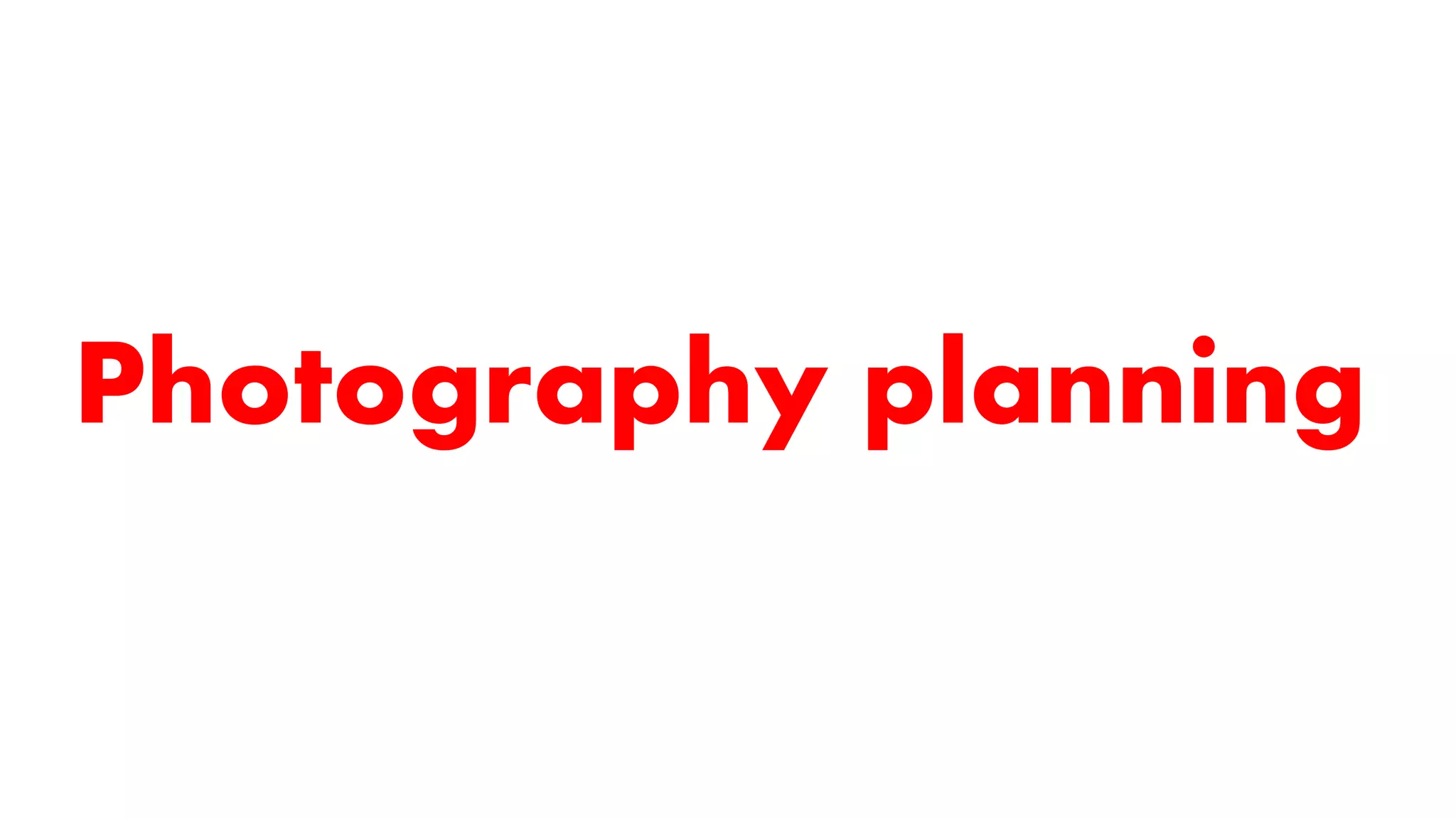
Cover image
Camerawork:
I wantthe image on the cover to be a medium close up shot. This will mean that the
main focus of the cover will be the artists face, drawing attention to them, and quickly
informing the reader that there’s an article about them. A medium close up also
suggests more intimacy, conveying the idea that the article is going to be very honest
about the artist, and that the reader is going to get a good insight into their life. Readers
want to relate to the artists, so they want to be able to see what’s happening in their
lives.
Example of a medium close up shot:
Mise-en-scene:
The background of the image is going to be plain white, with no accents or designs. I
want the featured artist to stand out from the background, and I don’t want the
background to distract the reader’s eye so that they look at that instead of the artist.
There also isn’t going to be any props in the image, so that the artist is the focal point
of the image. They will be looking directly into the camera, making eye contact with
the audience, so that the reader feels like the artist is making an intimate connection
with them. The character in the image will be the artist, who will be female, in order
to target female readers, as more females responded to my survey. She will be
wearing black, so that she fits in with the colour scheme of the magazine, and is
contrasted to the white background. I’m going to use key lighting and fill lighting to
make sure that her face is well lit.
Studio set up:
3.
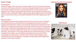
Contents page mainimage:
This image is going to be of a band featured in an article within the magazine. They are
just releasing their second album, and so are still quite new to the music industry.
Camerawork:
The photo is going to be a medium long shot of the band in order to fully get in the
whole band. I want the angle to be eye level so that the photo looks more natural.
Mise-en-scene:
Characters:
The characters are going to be a band of 2 members. They are going to be acting
naturally rather than posing, as I want them to come across as relatable to the audience.
Costume & props:
Instead of being styled to all look alike and match, they are going to wear stylish clothes
which allow their individual personalities come through. They won’t be using any props,
as they’re not going to pose, and I don’t want them to appear unnatural with the props.
Location:
The location is going to be an urban setting, so that that the audience get the impression
that they are current and new, which is the type of music that the magazine advertises.
4.
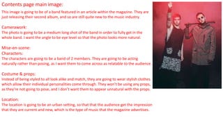
Contents page subimage:
The sub image for the contents page is going to be a collage of album covers, which are going to be included in
the reviews section of the magazine. This is similar to the contents page from Q magazine, which I looked at in
my textual analysis. I’m going to use 4 album covers, which I will make on Photoshop. They’ll be arranged
together in a square to keep the contents page looking organised. I’m going to design the covers so that they
look like they’re from different genres, showing how diverse the magazine is.
Cover 1:
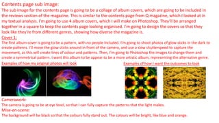
The first album cover is going to be a pattern, with no people included. I’m going to shoot photos of glow sticks in the dark to
create patterns. I’ll move the glow sticks around in front of the camera, and use a slow shutterspeed to capture the
movement, as this will create lines of colour and patterns. Then, I’m going to Photoshop the images to change them and
create a symmetrical pattern. I want this album to be appear to be a more artistic album, representing the alternative genre.
Examples of how my original photos will look Examples of how I want the outcomes to look
Camerawork:
The camera is going to be at eye level, so that I can fully capture the patterns that the light makes.
Mise-en-scene:
The background will be black so that the colours fully stand out. The colours will be bright, like blue and orange.
5.
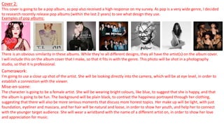
Cover 2:
This coveris going to be a pop album, as pop also received a high response on my survey. As pop is a very wide genre, I decided
to research recently release pop albums (within the last 2 years) to see what design they use.
Examples of pop albums:
There is an obvious similarity in these albums. While they’re all different designs, they all have the artist(s) on the album cover.
I will include this on the album cover that I make, so that it fits in with the genre. This photo will be shot in a photography
studio, so that it is professional.
Camerawork:
I’m going to use a close up shot of the artist. She will be looking directly into the camera, which will be at eye level, in order to
establish a connection with the viewer.
Mise-en-scene:
The character is going to be a female artist. She will be wearing bright colours, like blue, to suggest that she is happy, and that
the album is going to be fun. The background will be plain black, to contrast the happiness portrayed through her clothing,
suggesting that there will also be more serious moments that discuss more honest topics. Her make up will be light, with just
foundation, eyeliner and mascara, and her hair will be natural and loose, in order to show her youth, and help her to connect
with the younger target audience. She will wear a wristband with the name of a different artist on, in order to show her love
and appreciation for music.
6.
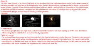
Cover 3:
The thirdcover is going to be for an indie band, as this genre received the highest responses on my survey. As the name of
the genre suggests, the band will be an independent band, so they won’t have the funds to be able to afford a professional
shoot. Instead, I’m going to take photos outdoors of the night sky, which I will then edit on Photoshop to include the name
of the band and the album name. The photo will include the moon and clouds to convey a sense of mystery. This photo
could be difficult to get, as I will have to wait for just the right time.
Examples:
Camerawork:
The photo is going to be a low angle shot, so that it feels like the audience are really looking up at this view. It will be an
extreme long shot in order to fit in as much of the sky as possible.
Mise-en-scene:
The photo will have deep space, so that the reader feels like they’re looking out into the distance. This also creates a more 3-
dimensional image, which will be visually appealing and appealing and will catch the reader’s eye. The colours used will be
natural colours of the sky; black, grey and white. These colours have connotations of mystery, and will make the reader feel
curious about the album. However the bright moon will contrast the dark sky.
7.
Cover 4:
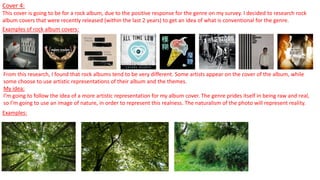
This coveris going to be for a rock album, due to the positive response for the genre on my survey. I decided to research rock
album covers that were recently released (within the last 2 years) to get an idea of what is conventional for the genre.
Examples of rock album covers:
From this research, I found that rock albums tend to be very different. Some artists appear on the cover of the album, while
some choose to use artistic representations of their album and the themes.
My idea:
I’m going to follow the idea of a more artistic representation for my album cover. The genre prides itself in being raw and real,
so I’m going to use an image of nature, in order to represent this realness. The naturalism of the photo will represent reality.
Examples:
8.
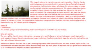
This image isgoing to be my reference and main inspiration. I like that the sky
and the treetops are contrasted, which represents the conflicting feelings and
emotions that the lyrics in the album will discuss. I’m going to create an image
similar to this in order to represent this theme. This uses the idea of portraying
the album’s theme through the cover, and I will put the text for the artist’s
name at the top of the image in a darker colour, so that it will stand out against
the lighter coloured sky. I also like how the trees are mostly all quite level in
height, but some in the background look smaller. I want to try and do this with
Image 1
Camerawork:
The photo is going to be an extreme long shot in order to capture a lot of the sky and treetops.
Mise-en-scene:
The trees will be the only object in the photo. I am going to try and find an area where the trees are mostly level, with a
small area that is lower, like with my reference image. I will shoot the photo on a slightly foggy day when the sky is whiter, so
that I will achieve a better contrast.
While this is the shot that I will aim to get, I am also going to take other photos of plants and trees at other angles so that I can
compare them and see if they work better than this image does. My main goes is to represent the rock genre and what their aim
is, so I want to choose the photo that best represents this.
my image, as I feel that it is representative of the genre. The level trees convey the idea of control while the smaller area
conveys an element of chaos. This suggests that the band are trying to control the chaos that they are feeling by writing it
down into a song. This fits well with the rock genre.
9.
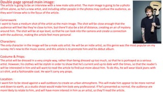
Double page spreadmain image:
Characters:
The only character in the image will be a male solo artist. He will be an indie artist, as this genre was the most popular on my
survey. He’s new to the music scene, and this article is to promote him and his debut album.
Costume & Props:
The artist will be dressed in a very simple way, rather than being dressed up too much, so that he is portrayed as a serious
artist. However, his clothes will be stylish in order to show that he’s current and up to date with the times, so that the reader’s
will be interested in him and will want to read the article to find out more about him. To do this, he will wear black jeans with
a t-shirt, and a fashionable coat. He won’t carry any props.
Location:
I want him to be stood against a wall outdoors to create an urban atmosphere. This will make him appear to be more normal
and down to earth, as a studio shoot would make him look very professional. If he’s presented as normal, the audience are
more likely to relate to him, and will have more interest in him as an artist, so they’ll read the article.
The article is going to be an interview with a new male solo artist. The main image is going to be a photo
of him alone, as he’s a new artist, and including other people in the photos may confuse the audience, as
they won’t know who is the focus of the article.
Camerawork:
I want to have a medium shot of the artist as the main image. The shot will be close enough that the
audience will feel like they’re close to him, but there’ll also be a bit of distance, creating an air of mystery
around him. The shot will be at eye level, so that he can look into the camera and create a connection
with the audience, making the article feel more personal.
10.
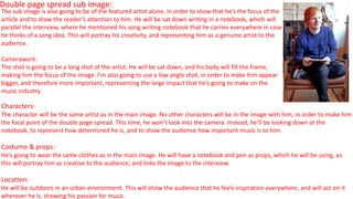
Double page spreadsub image:
Characters:
The character will be the same artist as in the main image. No other characters will be in the image with him, in order to make him
the focal point of the double page spread. This time, he won’t look into the camera. Instead, he’ll be looking down at the
notebook, to represent how determined he is, and to show the audience how important music is to him.
Costume & props:
He’s going to wear the same clothes as in the main image. He will have a notebook and pen as props, which he will be using, as
this will portray him as creative to the audience, and links the image to the interview.
Location:
He will be outdoors in an urban environment. This will show the audience that he feels inspiration everywhere, and will act on it
wherever he is, showing his passion for music.
The sub image is also going to be of the featured artist alone, in order to show that he’s the focus of the
article and to draw the reader’s attention to him. He will be sat down writing in a notebook, which will
parallel the interview, where he mentioned his song writing notebook that he carries everywhere in case
he thinks of a song idea. This will portray his creativity, and representing him as a genuine artist to the
audience.
Camerawork:
The shot is going to be a long shot of the artist. He will be sat down, and his body will fill the frame,
making him the focus of the image. I’m also going to use a low angle shot, in order to make him appear
bigger, and therefore more important, representing the large impact that he’s going to make on the
music industry.
11.
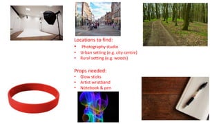
Locations to find:
•Photography studio
• Urban setting (e.g. city centre)
• Rural setting (e.g. woods)
Props needed:
• Glow sticks
• Artist wristband
• Notebook & pen