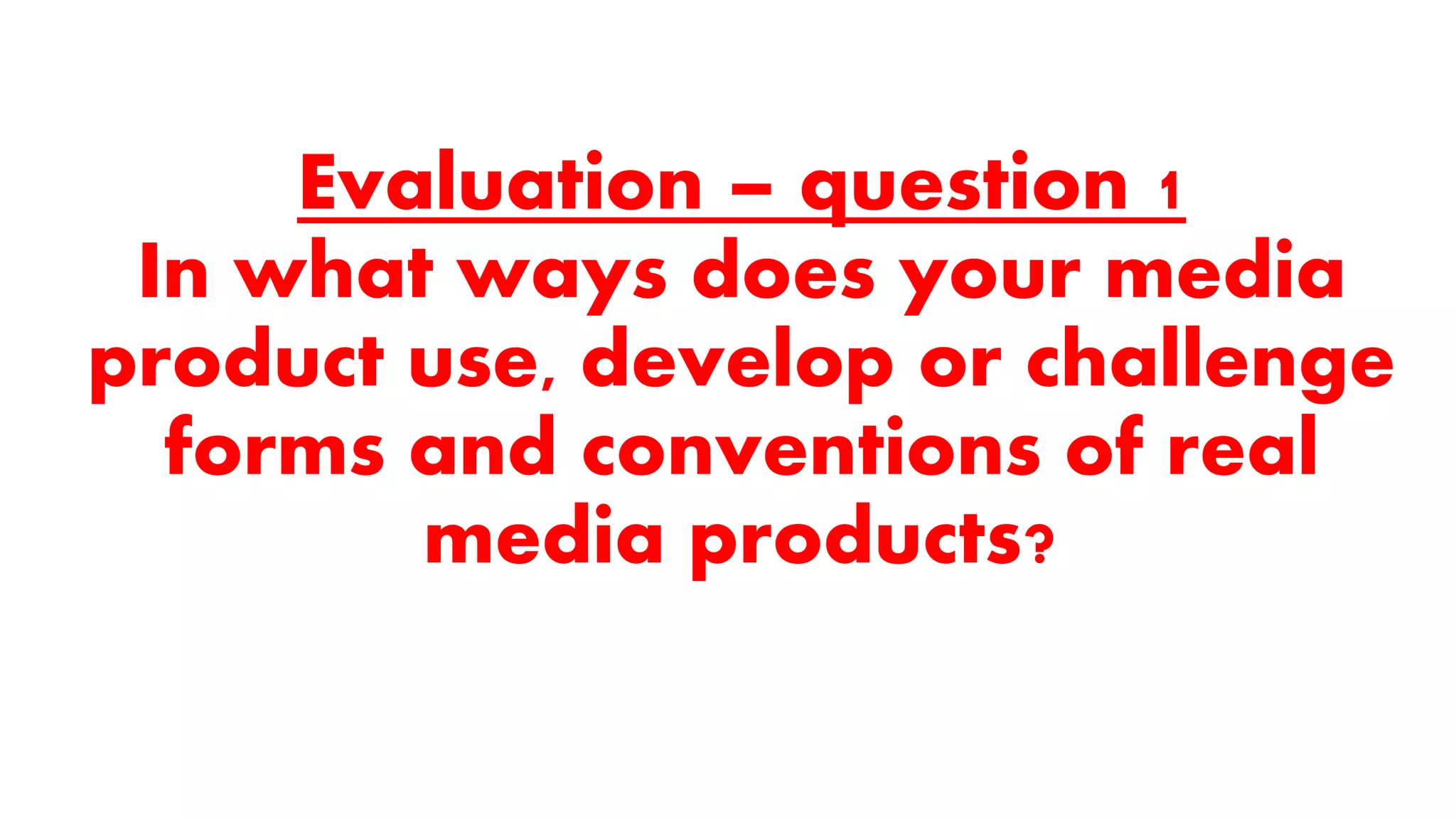
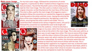
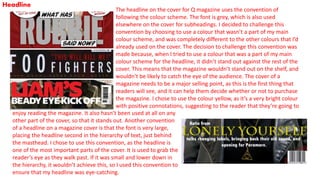
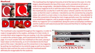
The document discusses various conventions used in magazine design that the author employed or challenged in their own magazine cover and spreads. They followed conventions like using a close-up of the main artist as the cover image, a large masthead, and page numbers. However, they challenged conventions like using a non-scheme color for the headline to make it stand out, and including sub-images on spreads rather than just one main image. The author analyzes their design choices in relation to the real magazine Q.