Download to read offline
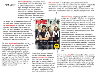
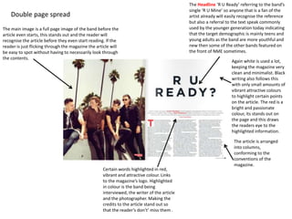
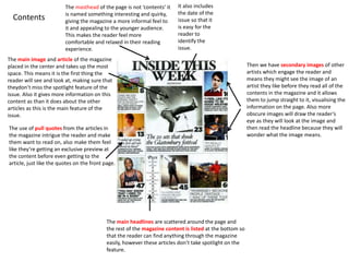
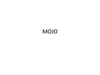
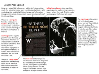
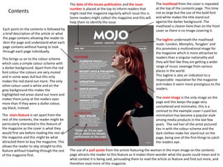
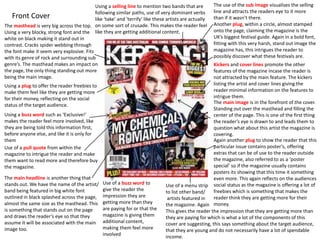

This document analyzes the front covers and contents pages of three music magazines: NME, Kerrang!, and Mojo. For NME, the summary discusses how the masthead is placed in the top left for readability, the main image features the band outside in natural lighting, and pull quotes are used to make readers feel like insiders. The Mojo summary notes that the masthead is layered behind the main image so loyalty is assumed, images are layered with text for visual interest, and pull quotes again provide exclusivity. For all magazines, design elements like headlines, images, colors and quotes are used to attract, inform and engage readers while representing the magazines' brands and target demographics.


