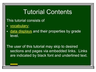
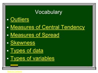
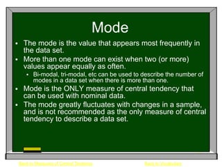
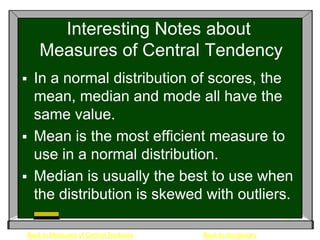
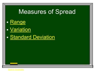
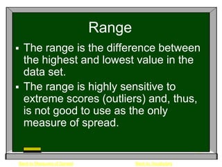
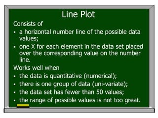
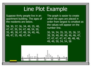
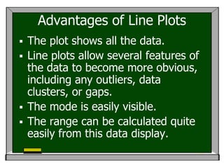
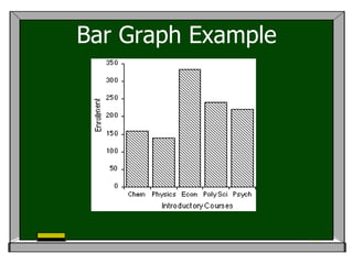
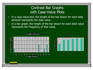
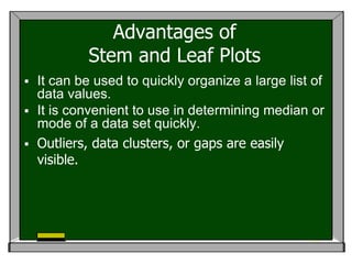
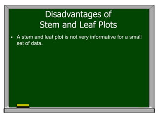
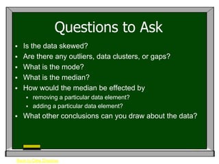
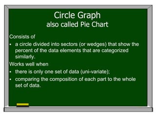
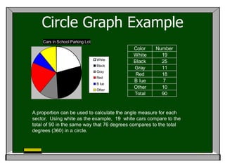
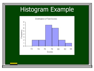
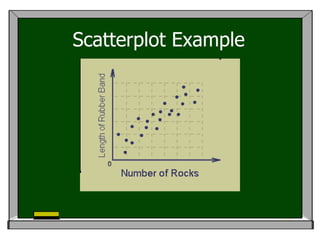
Statistics and Displays
          A Basic Tutorial

This tutorial is designed as a refresher study for
teachers but may be adapted for use with students.
Tutorial Contents
This tutorial consists of
 vocabulary;
 data displays and their properties by grade
  level.

The user of this tutorial may skip to desired
  sections and pages via embedded links. Links
  are indicated by black font and underlined text.
Vocabulary
   Outliers
   Measures of Central Tendency
   Measures of Spread
   Skewness
   Types of data
   Types of variables

Back to Contents
Outliers
 An outlier is a data point that lies outside
  the overall pattern of a distribution.
 Specifically, it is a point which falls more
  than 1.5 times the interquartile range
  above the third quartile or below the first
  quartile.
 An outlier may exist in both uni-variate
  data and bi-variate data.


    Back to Vocabulary
Measures of Central Tendency
 Mean
 Median
 Mode


All of these measures can describe the
 “average” of a data set, thus the term
 “average” is not to be synonymous
 with the term “mean.” More notes…

Back to Vocabulary
Mean (Arithmetic Mean)
    The mean is the sum of all the values in
     the data set divided by the number of
     data points in the set.
    Mean is good measure for roughly
     symmetric sets of data.
    It may be misleading in skewed sets of
     data as it is influenced by extreme values.
                           x1 x2 ...xn
                    mean
                               n
    Back to Measures of Central Tendency   Back to Vocabulary
Median
 The median is the middle term in an ordered list
  of data points.
 It is the middle of a distribution of data values.
  Thus, half the scores lie on one side, and half
  lie on the other side.
 The median is less sensitive to extreme scores.
 It is a good measure to use when describing a
  set with extreme outlier values.


    Back to Measures of Central Tendency       Back to Vocabulary
Mode
 The mode is the value that appears most frequently in
  the data set.
 More than one mode can exist when two (or more)
  values appear equally as often.
          Bi-modal, tri-modal, etc can be used to describe the number of
           modes in a data set when there is more than one.
     Mode is the ONLY measure of central tendency that
      can be used with nominal data.
     The mode greatly fluctuates with changes in a sample,
      and is not recommended as the only measure of central
      tendency to describe a data set.


    Back to Measures of Central Tendency           Back to Vocabulary
Interesting Notes about
    Measures of Central Tendency
 In a normal distribution of scores, the
  mean, median and mode all have the
  same value.
 Mean is the most efficient measure to
  use in a normal distribution.
 Median is usually the best to use when
  the distribution is skewed with outliers.

Back to Measures of Central Tendency   Back to Vocabulary
Measures of Spread
 Range
 Variation
 Standard Deviation


Back to Vocabulary
Range
 The range is the difference between
  the highest and lowest value in the
  data set.
 The range is highly sensitive to
  extreme scores (outliers) and, thus,
  is not good to use as the only
  measure of spread.


Back to Measures of Spread           Back to Vocabulary
Variation
 Variation is a measure of how spread
  out a distribution is.
 Variation is computed as the mean of
  the squared differences of each value
  from the mean of the set.
 Variation is basically a measure of how
  far apart, on average, each value is
  from the next value in the set.
                             (X    x1 ) 2 ( X    x2 ) 2 ...( X     xn ) 2
                                                n
Back to Measures of Spread                           Back to Vocabulary
Standard Deviation
 The standard deviation is computed as the
  square root of the variance.
 It is the best and most commonly used
  measure of spread for a data set because it
  takes into account all the data points rather
  than just the extreme ends.
 It is most often used as a measure of risk in
  real world applications such as stock
  investments.
 The standard deviation is very useful when
  working with a normal distribution.


    Back to Measures of Spread   Back to Vocabulary
Skewness
 A distribution of data is skewed if one of the
  tails (ends) is longer than the other
 Positive skew – long tail in the positive (right)
  end
          Mean is larger than the median
     Negative skew – long tail in the negative (left)
      end
          Mean is smaller than the median
     Symmetric distributions look like the normal
      curve and are symmetrical on both tails
          Mean and median are equal


    Back to Vocabulary
Types of Data
   Uni-variate data
       The data is collected on only one
        variable.
   Bi-variate data
       The data is collected on two
        variables and plotted together for
        investigation.

Back to Vocabulary
Types of Variables
   A categorical variable has values that are labels for a
    particular attribute (e.g., ice cream flavors).
        Nominal – categories are in no particular order
        Ordinal – categories are in a particular order
   A quantitative variable has values that not only are
    numerical but also allow descriptions such as mean and
    range to be meaningful (e.g., test scores).
   A discrete variable has only countable values (e.g., the
    number of students in a class).
   A continuous variable has numerical values that can be
    any of the values in a range of numbers (e.g., the
    speed of a car).


Back to Vocabulary
Data Displays
                   and their Properties
 6th Grade
 7th Grade
 8th Grade


Back to Contents
6th   Grade
 Line plot
 Line graph
 Bar graph
 Stem and leaf
 Circle graph (sketch only)

Back to Data Displays
7th   Grade
   Line plot
   Line graph
   Bar graph
   Stem and leaf
   Circle graph
   Venn diagram

Back to Data Displays
8th   Grade
   Line plot                   Venn diagram
   Line graph                  Box and
   Bar graph                    whisker
   Stem and leaf               Histogram

   Circle graph                  Scatterplot


Back to Data Displays
Line Plot
Consists of
 a horizontal number line of the possible data
  values;
 one X for each element in the data set placed
  over the corresponding value on the number
  line.
Works well when
 the data is quantitative (numerical);
 there is one group of data (uni-variate);
 the data set has fewer than 50 values;
 the range of possible values is not too great.
Line Plot Example
Suppose thirty people live in an   The graph is easier to create
apartment building. The ages of    when the ages are placed in
the residents are below.           order from largest to smallest as
                                   the values will appear on the
58, 30, 37, 36, 34, 49, 35, 40,
                                   number line.
47, 47, 39, 54, 47, 48, 54, 50,
35, 40, 38, 47, 48, 34, 40, 46,    30, 34, 34, 35, 35, 35, 36, 37,
49, 47, 35, 48, 47, 46             38, 39, 40, 40, 40, 46, 46, 47,
                                   47, 47, 47, 47, 47, 48, 48, 48,
                                   49, 49, 50, 54, 54, 58
Advantages of Line Plots
 The plot shows all the data.
 Line plots allow several features of
  the data to become more obvious,
  including any outliers, data
  clusters, or gaps.
 The mode is easily visible.
 The range can be calculated quite
  easily from this data display.
Disadvantages of Line Plots
 A line plot may only be used for
  quantitative (numerical) data.
 A line plot is not efficient when
  the data is large and/or the the
  range is large.
Questions to Ask
 Is the data skewed?
 How do the mean, median, and
  mode compare to each other?
 Are there any outliers, data
  clusters, or gaps in the data?


Back to Data Displays
Line Graph
Consists of
 paired values graphed as points on a
  plane defined by an x- and y-axis;
 line segments connecting the graphed
  points (much like a dot-to-dot).
Works well when
 the data is paired (bi-variate);
 the data is continuous.
Line Graph Example
                                 75
    John's Weight in Kilograms   74
                                 73
                                 72
                                 71
                                 70
                                 69
                                 68
                                 67
                                 66
                                 65
                                      1991   1992   1993   1994   1995
                                                    Year


John weighed 68 kg in 1991, 70 kg in 1992, 74 kg in
1993, 74 kg in 1994, and 73 kg in 1995.
Advantages of Line Graphs
   A line graph is a way to summarize how two
    pieces of information are related and how they
    vary depending on one another.
Disadvantages of Line Graphs

   Changing the scale of either axes can
    dramatically change the visual impression of
    the graph.
Questions to Ask
 As one variable (displayed on the x-axis)
  increases, what happens to the other variable
  (displayed on the y-axis)?
 What other trends in the data do you notice?


Back to Data Displays
Bar Graph
Consists of
 bars of the same width drawn either horizontally
  or vertically;
 bars whose length (or height) represents the
  frequencies of each value in a data set.
Works well when
 the data is numerical or categorical;
 the data is discrete;
 the data is collected using a frequency table.
Bar Graph Example
Contrast Bar Graphs
                    with Case-Value Plots
   In a case-value plot, the length of the bar drawn for each data
    element represents the data value.
   In a bar graph, the length of the bar drawn for each data value
    represents the frequency of that value.


                                                                         Lenth of Six Cats
                                                            30

                                                            25


                                         Length in Inches
                                                            20

                                                            15

                                                            10

                                                             5

                                                             0
                                                                 A   B          C         D   E   F
                                                                                    Cat
Advantages of Bar Graphs
 The mode is easily visible.
 A bar graph can be used with numerical or
  categorical data.
Disadvantages of Bar Graphs
   A bar graph shows only the frequencies of the
    elements of a data set.
Questions to Ask
   Is the data skewed?
   What is the mode?
   What if the data were collected _____ instead
    of _______?
   Why do you suppose ______ appears only
    ____ times in the data set?
   What other conclusions can you draw about the
    data?


Back to Data Displays
Stem and Leaf Plot
Consists of
 Numbers on the left, called the stem, which are the first
  half of the place value of the numbers (such as tens
  values);
 Numbers on the right, called the leaf, which are the
  second half of the place value of the numbers (such as
  ones values) so that each leaf represents one of the
  data elements.
Works well when
 the data contains more than 25 elements;
 the data is collected in a frequency table;
 the data values span many “tens” of values.
Stem and Leaf Plot
              Additional Notes
 A stem and leaf plot is also called a stem plot.
 It is usually used for one set of data, but a back-to-back
  stem and leaf plot can be used to compare two data
  sets.
                      Data             Data
                      Set A            Set B
                      Leaf     Stem     Leaf

                      320       4      1567

          The numbers 40, 42, and 43 are from Data Set A.
         The numbers 41, 45, 46, and 47 are from Data Set B.
Stem and Leaf Plot Example
The number of points scored by the Vikings basketball team this season:
78, 96, 88, 74, 63, 86, 92, 66, 72, 88, 83, 90, 67, 81, 85, 94.
          Writing the data in numerical order
          may help to organize the data, but is   63, 66, 67, 72, 74, 78, 81, 83, 85,
          NOT a required step.                        86, 88, 88, 90, 92, 94, 96
          Separate each number into a stem            The number 63 would be
          and a leaf. Since these are two digit           represented as
          numbers, the tens digit is the stem              Stem    Leaf
          and the units digit is the leaf.
                                                               6       3
          Group the numbers with the same           Points scored by the Vikings
          stems. List the stems in numerical
          order. Title the graph.                       Stem               Leaf
                                                          6         3 6 7
                                                          7         2 4 8
                                                          8         1 3 5 6 8 8
                                                          9         0 2 4 6
Advantages of
           Stem and Leaf Plots
 It can be used to quickly organize a large list of
  data values.
 It is convenient to use in determining median or
  mode of a data set quickly.
 Outliers, data clusters, or gaps are easily
  visible.
Disadvantages of
              Stem and Leaf Plots
   A stem and leaf plot is not very informative for a small
    set of data.
Questions to Ask
   Is the data skewed?
   Are there any outliers, data clusters, or gaps?
   What is the mode?
   What is the median?
   How would the median be effected by
       removing a particular data element?
       adding a particular data element?
   What other conclusions can you draw about the data?


Back to Data Displays
Circle Graph
                also called Pie Chart
Consists of
 a circle divided into sectors (or wedges) that show the
  percent of the data elements that are categorized
  similarly.
Works well when
 there is only one set of data (uni-variate);
 comparing the composition of each part to the whole
  set of data.
Circle Graph Example
    Cars in School Parking Lot
                                            Color     Number
                                            White       19
                                 White
                                            Black       25
                                 Black
                                            Gray        11
                                 Gray
                                             Red        18
                                 Red
                                            B lue       7
                                 B lue
                                 Other
                                            Other       10
                                            Total       90


A proportion can be used to calculate the angle measure for each
sector. Using white as the example, 19 white cars compare to the
total of 90 in the same way that 76 degrees compares to the total
degrees (360) in a circle.
Advantages of Circle Graphs
 A circle graph can be used for either numerical
  or categorical data.
 A circle graph shows a part to whole
  relationship.
Disadvantages of Circle Graphs
   Without technology, a circle graph may be difficult to
    make. Each percent must be converted to an angle by
    calculating the fraction of 360 degrees. Then the
    correct angle must be drawn.
   A circle graph does not provide information about
    measures of central tendency or spread.
Questions to Ask
   How does each part compare to another?
   Why do you suppose ________ was selected more
    than _______?
   What conclusions can you draw about the data?


Back to Data Displays
Venn Diagram
Consists of
 circles containing the value of each set or group;
 overlapping or intersecting circles to illustrate the
  common elements in groups;
 any nonexamples displayed with a value outside of all
  circles.
Works well when
 a relationship exists between different groups of things
  (sets).
Venn Diagram Example
Advantages of Venn Diagram
 A Venn diagram visually illustrates the
  relationship between different groups of things
  (sets).
 It shows the occurrence of sharing of common
  properties.
Disadvantages of Venn Diagram
   A Venn diagram provides little usefulness when there
    are no shared features among sets.
Questions to Ask
   How many elements are in each set?
   How many elements are common to set ___ and set
    ___?
   How many elements are in set ___ but not in set ___?
   What conclusions can you draw about the data?


Back to Data Displays
Box and Whisker Plot
Consists of
 the “five-point summary” (the least value, the greatest value, the
  median, the first quartile, and the third quartile);
 a box drawn to show the interval from the first (25th percentile) to
  the third quartile (75th percentile) with a line drawn through the box
  at the median;
 line segments, called the whiskers, connecting the box to the least
  and greatest values in the data distribution.
Works well when
 there is only one set of data (uni-variate);
 there are many data values.
Box and Whisker Plot Example
Math test scores 80, 75, 90, 95, 65, 65, 80, 85, 70, 100.
   Write the data in numerical order and                  Median
   find the five point summary..
                   median = 80
                first quartile = 70        65, 65, 70, 75, 80, 80, 85, 90, 95, 100
               third quartile = 90
              smallest value = 65      Median of Lower Part,     Median of Upper Part,
              largest value = 100         First Quartile              Third Quartile


   Place a point beneath each of these       65 70   75 80 85 90      95 100
   values on a number line.


   Draw the box and whiskers and             65 70   75 80 85 90      95 100
   median line.
Box and Whisker Plot Example
The following set of numbers        52 is the lower quartile
are the amount (arranged
                               The lower quartile is the median of
from least to greatest) of
                               the lower half of the values (18 27
video games owned by each
                               34 52 54 59 61).
boy in the club.
                                   87 is the upper quartile
 18 27 34 52 54 59 61 68 78
     82 85 87 91 93 100        The upper quartile is the median of
                               the upper half of the values (78,
    68 is the median           82, 85, 87, 91, 93, 100).
The median is the value
exactly in the middle of
an ordered set of
numbers.
Advantages of Box and Whisker Plots
 Immediate visuals of a box-and-whisker plot
  are the center, the spread, and the overall
  range of distribution.
 Box plots are useful for comparing data sets,
  especially when the data sets are large or when
  they have different numbers of data elements.
Disadvantages of Box and Whisker Plots
   It shows only certain statistics rather than
    all the data.
   Since the data elements are not
    displayed, it is impossible to determine if
    there are gaps or clusters in the data.
Questions to Ask
 Is the data skewed?
 What is the median?
 How does the median compare to the mean?
 What other conclusions can you draw about the
  data?


Back to Data Displays
Histogram
Consists of
 equal intervals marked on the horizontal axis;
 bars of equal width drawn for each interval, with the
  height of each bar representing either the number of
  elements or the percent of elements in that interval.
  (There is no space between the bars.)
Works well when
 data elements could assume any value in a range;
 there is one set of data (uni-variate);
 the data is collected using a frequency table.
Histogram Example
Advantages of Histograms
   A histogram provides a way to display the
    frequency of occurrences of data along an
    interval.
Disadvantages of Histograms
   The use of intervals prevents the calculation of
    an exact measure of central tendency.
Questions to Ask
 What is the most frequently occurring interval of
  values?
 What is the least frequently occurring interval of
  values?
 What conclusions can you draw from the data?


Back to Data Displays
Scatterplot
Consists of
 paired data (bi-variate) displayed on
  a two-dimensional grid.
Works well when
 multiple measurements are made for
  each element of a sample.
Additional Notes about Scatterplots
   If the relationship is thought to be a causal one, then
    the independent variable is represented along the x-
    axis and the dependent variable on the y-axis
   A scatterplot can show that there is a positive, negative,
    constant, or no relationship (correlation) between the
    variables.
       Positive: As the value of one variable increases, so does the
        other.
       Negative: As the value of one variable increases, the other
        decreases.
       Constant: As the value of one variable increases (or
        decreases), the other remains constant.
       No relationship: There is no pattern to the points.
Scatterplot Example
Advantages of Scatterplots
 A scatter plot is one of the best ways to
  determine if two characteristics are related.
 A scatterplot may be used when there are
  multiple trials for the same input variable in an
  experiment.
Disadvantages of Scatterplots
   When a scatterplot shows an association
    between two variables, there is not necessarily
    a cause and effect relationship. Both variables
    could be related to some third variable that
    explains their variation or there could be some
    other cause. Alternatively, an apparent
    association could simply be a result of chance.
Questions to Ask
 Is there a relationship between the variables?
  If so, what kind?
 What predictions can you make about the data
  based on the graph?


Back to Data Displays

Data Representations

  • 1.
    Statistics and Displays A Basic Tutorial This tutorial is designed as a refresher study for teachers but may be adapted for use with students.
  • 2.
    Tutorial Contents This tutorialconsists of  vocabulary;  data displays and their properties by grade level. The user of this tutorial may skip to desired sections and pages via embedded links. Links are indicated by black font and underlined text.
  • 3.
    Vocabulary  Outliers  Measures of Central Tendency  Measures of Spread  Skewness  Types of data  Types of variables Back to Contents
  • 4.
    Outliers  An outlieris a data point that lies outside the overall pattern of a distribution.  Specifically, it is a point which falls more than 1.5 times the interquartile range above the third quartile or below the first quartile.  An outlier may exist in both uni-variate data and bi-variate data. Back to Vocabulary
  • 5.
    Measures of CentralTendency  Mean  Median  Mode All of these measures can describe the “average” of a data set, thus the term “average” is not to be synonymous with the term “mean.” More notes… Back to Vocabulary
  • 6.
    Mean (Arithmetic Mean)  The mean is the sum of all the values in the data set divided by the number of data points in the set.  Mean is good measure for roughly symmetric sets of data.  It may be misleading in skewed sets of data as it is influenced by extreme values. x1 x2 ...xn mean n Back to Measures of Central Tendency Back to Vocabulary
  • 7.
    Median  The medianis the middle term in an ordered list of data points.  It is the middle of a distribution of data values. Thus, half the scores lie on one side, and half lie on the other side.  The median is less sensitive to extreme scores.  It is a good measure to use when describing a set with extreme outlier values. Back to Measures of Central Tendency Back to Vocabulary
  • 8.
    Mode  The modeis the value that appears most frequently in the data set.  More than one mode can exist when two (or more) values appear equally as often.  Bi-modal, tri-modal, etc can be used to describe the number of modes in a data set when there is more than one.  Mode is the ONLY measure of central tendency that can be used with nominal data.  The mode greatly fluctuates with changes in a sample, and is not recommended as the only measure of central tendency to describe a data set. Back to Measures of Central Tendency Back to Vocabulary
  • 9.
    Interesting Notes about Measures of Central Tendency  In a normal distribution of scores, the mean, median and mode all have the same value.  Mean is the most efficient measure to use in a normal distribution.  Median is usually the best to use when the distribution is skewed with outliers. Back to Measures of Central Tendency Back to Vocabulary
  • 10.
    Measures of Spread Range  Variation  Standard Deviation Back to Vocabulary
  • 11.
    Range  The rangeis the difference between the highest and lowest value in the data set.  The range is highly sensitive to extreme scores (outliers) and, thus, is not good to use as the only measure of spread. Back to Measures of Spread Back to Vocabulary
  • 12.
    Variation  Variation isa measure of how spread out a distribution is.  Variation is computed as the mean of the squared differences of each value from the mean of the set.  Variation is basically a measure of how far apart, on average, each value is from the next value in the set. (X x1 ) 2 ( X x2 ) 2 ...( X xn ) 2 n Back to Measures of Spread Back to Vocabulary
  • 13.
    Standard Deviation  Thestandard deviation is computed as the square root of the variance.  It is the best and most commonly used measure of spread for a data set because it takes into account all the data points rather than just the extreme ends.  It is most often used as a measure of risk in real world applications such as stock investments.  The standard deviation is very useful when working with a normal distribution. Back to Measures of Spread Back to Vocabulary
  • 14.
    Skewness  A distributionof data is skewed if one of the tails (ends) is longer than the other  Positive skew – long tail in the positive (right) end  Mean is larger than the median  Negative skew – long tail in the negative (left) end  Mean is smaller than the median  Symmetric distributions look like the normal curve and are symmetrical on both tails  Mean and median are equal Back to Vocabulary
  • 15.
    Types of Data  Uni-variate data  The data is collected on only one variable.  Bi-variate data  The data is collected on two variables and plotted together for investigation. Back to Vocabulary
  • 16.
    Types of Variables  A categorical variable has values that are labels for a particular attribute (e.g., ice cream flavors).  Nominal – categories are in no particular order  Ordinal – categories are in a particular order  A quantitative variable has values that not only are numerical but also allow descriptions such as mean and range to be meaningful (e.g., test scores).  A discrete variable has only countable values (e.g., the number of students in a class).  A continuous variable has numerical values that can be any of the values in a range of numbers (e.g., the speed of a car). Back to Vocabulary
  • 17.
    Data Displays and their Properties  6th Grade  7th Grade  8th Grade Back to Contents
  • 18.
    6th Grade  Line plot  Line graph  Bar graph  Stem and leaf  Circle graph (sketch only) Back to Data Displays
  • 19.
    7th Grade  Line plot  Line graph  Bar graph  Stem and leaf  Circle graph  Venn diagram Back to Data Displays
  • 20.
    8th Grade  Line plot  Venn diagram  Line graph  Box and  Bar graph whisker  Stem and leaf  Histogram  Circle graph  Scatterplot Back to Data Displays
  • 21.
    Line Plot Consists of a horizontal number line of the possible data values;  one X for each element in the data set placed over the corresponding value on the number line. Works well when  the data is quantitative (numerical);  there is one group of data (uni-variate);  the data set has fewer than 50 values;  the range of possible values is not too great.
  • 22.
    Line Plot Example Supposethirty people live in an The graph is easier to create apartment building. The ages of when the ages are placed in the residents are below. order from largest to smallest as the values will appear on the 58, 30, 37, 36, 34, 49, 35, 40, number line. 47, 47, 39, 54, 47, 48, 54, 50, 35, 40, 38, 47, 48, 34, 40, 46, 30, 34, 34, 35, 35, 35, 36, 37, 49, 47, 35, 48, 47, 46 38, 39, 40, 40, 40, 46, 46, 47, 47, 47, 47, 47, 47, 48, 48, 48, 49, 49, 50, 54, 54, 58
  • 23.
    Advantages of LinePlots  The plot shows all the data.  Line plots allow several features of the data to become more obvious, including any outliers, data clusters, or gaps.  The mode is easily visible.  The range can be calculated quite easily from this data display.
  • 24.
    Disadvantages of LinePlots  A line plot may only be used for quantitative (numerical) data.  A line plot is not efficient when the data is large and/or the the range is large.
  • 25.
    Questions to Ask Is the data skewed?  How do the mean, median, and mode compare to each other?  Are there any outliers, data clusters, or gaps in the data? Back to Data Displays
  • 26.
    Line Graph Consists of paired values graphed as points on a plane defined by an x- and y-axis;  line segments connecting the graphed points (much like a dot-to-dot). Works well when  the data is paired (bi-variate);  the data is continuous.
  • 27.
    Line Graph Example 75 John's Weight in Kilograms 74 73 72 71 70 69 68 67 66 65 1991 1992 1993 1994 1995 Year John weighed 68 kg in 1991, 70 kg in 1992, 74 kg in 1993, 74 kg in 1994, and 73 kg in 1995.
  • 28.
    Advantages of LineGraphs  A line graph is a way to summarize how two pieces of information are related and how they vary depending on one another.
  • 29.
    Disadvantages of LineGraphs  Changing the scale of either axes can dramatically change the visual impression of the graph.
  • 30.
    Questions to Ask As one variable (displayed on the x-axis) increases, what happens to the other variable (displayed on the y-axis)?  What other trends in the data do you notice? Back to Data Displays
  • 31.
    Bar Graph Consists of bars of the same width drawn either horizontally or vertically;  bars whose length (or height) represents the frequencies of each value in a data set. Works well when  the data is numerical or categorical;  the data is discrete;  the data is collected using a frequency table.
  • 32.
  • 33.
    Contrast Bar Graphs with Case-Value Plots  In a case-value plot, the length of the bar drawn for each data element represents the data value.  In a bar graph, the length of the bar drawn for each data value represents the frequency of that value. Lenth of Six Cats 30 25 Length in Inches 20 15 10 5 0 A B C D E F Cat
  • 34.
    Advantages of BarGraphs  The mode is easily visible.  A bar graph can be used with numerical or categorical data.
  • 35.
    Disadvantages of BarGraphs  A bar graph shows only the frequencies of the elements of a data set.
  • 36.
    Questions to Ask  Is the data skewed?  What is the mode?  What if the data were collected _____ instead of _______?  Why do you suppose ______ appears only ____ times in the data set?  What other conclusions can you draw about the data? Back to Data Displays
  • 37.
    Stem and LeafPlot Consists of  Numbers on the left, called the stem, which are the first half of the place value of the numbers (such as tens values);  Numbers on the right, called the leaf, which are the second half of the place value of the numbers (such as ones values) so that each leaf represents one of the data elements. Works well when  the data contains more than 25 elements;  the data is collected in a frequency table;  the data values span many “tens” of values.
  • 38.
    Stem and LeafPlot Additional Notes  A stem and leaf plot is also called a stem plot.  It is usually used for one set of data, but a back-to-back stem and leaf plot can be used to compare two data sets. Data Data Set A Set B Leaf Stem Leaf 320 4 1567 The numbers 40, 42, and 43 are from Data Set A. The numbers 41, 45, 46, and 47 are from Data Set B.
  • 39.
    Stem and LeafPlot Example The number of points scored by the Vikings basketball team this season: 78, 96, 88, 74, 63, 86, 92, 66, 72, 88, 83, 90, 67, 81, 85, 94. Writing the data in numerical order may help to organize the data, but is 63, 66, 67, 72, 74, 78, 81, 83, 85, NOT a required step. 86, 88, 88, 90, 92, 94, 96 Separate each number into a stem The number 63 would be and a leaf. Since these are two digit represented as numbers, the tens digit is the stem Stem Leaf and the units digit is the leaf. 6 3 Group the numbers with the same Points scored by the Vikings stems. List the stems in numerical order. Title the graph. Stem Leaf 6 3 6 7 7 2 4 8 8 1 3 5 6 8 8 9 0 2 4 6
  • 40.
    Advantages of Stem and Leaf Plots  It can be used to quickly organize a large list of data values.  It is convenient to use in determining median or mode of a data set quickly.  Outliers, data clusters, or gaps are easily visible.
  • 41.
    Disadvantages of Stem and Leaf Plots  A stem and leaf plot is not very informative for a small set of data.
  • 42.
    Questions to Ask  Is the data skewed?  Are there any outliers, data clusters, or gaps?  What is the mode?  What is the median?  How would the median be effected by  removing a particular data element?  adding a particular data element?  What other conclusions can you draw about the data? Back to Data Displays
  • 43.
    Circle Graph also called Pie Chart Consists of  a circle divided into sectors (or wedges) that show the percent of the data elements that are categorized similarly. Works well when  there is only one set of data (uni-variate);  comparing the composition of each part to the whole set of data.
  • 44.
    Circle Graph Example Cars in School Parking Lot Color Number White 19 White Black 25 Black Gray 11 Gray Red 18 Red B lue 7 B lue Other Other 10 Total 90 A proportion can be used to calculate the angle measure for each sector. Using white as the example, 19 white cars compare to the total of 90 in the same way that 76 degrees compares to the total degrees (360) in a circle.
  • 45.
    Advantages of CircleGraphs  A circle graph can be used for either numerical or categorical data.  A circle graph shows a part to whole relationship.
  • 46.
    Disadvantages of CircleGraphs  Without technology, a circle graph may be difficult to make. Each percent must be converted to an angle by calculating the fraction of 360 degrees. Then the correct angle must be drawn.  A circle graph does not provide information about measures of central tendency or spread.
  • 47.
    Questions to Ask  How does each part compare to another?  Why do you suppose ________ was selected more than _______?  What conclusions can you draw about the data? Back to Data Displays
  • 48.
    Venn Diagram Consists of circles containing the value of each set or group;  overlapping or intersecting circles to illustrate the common elements in groups;  any nonexamples displayed with a value outside of all circles. Works well when  a relationship exists between different groups of things (sets).
  • 49.
  • 50.
    Advantages of VennDiagram  A Venn diagram visually illustrates the relationship between different groups of things (sets).  It shows the occurrence of sharing of common properties.
  • 51.
    Disadvantages of VennDiagram  A Venn diagram provides little usefulness when there are no shared features among sets.
  • 52.
    Questions to Ask  How many elements are in each set?  How many elements are common to set ___ and set ___?  How many elements are in set ___ but not in set ___?  What conclusions can you draw about the data? Back to Data Displays
  • 53.
    Box and WhiskerPlot Consists of  the “five-point summary” (the least value, the greatest value, the median, the first quartile, and the third quartile);  a box drawn to show the interval from the first (25th percentile) to the third quartile (75th percentile) with a line drawn through the box at the median;  line segments, called the whiskers, connecting the box to the least and greatest values in the data distribution. Works well when  there is only one set of data (uni-variate);  there are many data values.
  • 54.
    Box and WhiskerPlot Example Math test scores 80, 75, 90, 95, 65, 65, 80, 85, 70, 100. Write the data in numerical order and Median find the five point summary.. median = 80 first quartile = 70 65, 65, 70, 75, 80, 80, 85, 90, 95, 100 third quartile = 90 smallest value = 65 Median of Lower Part, Median of Upper Part, largest value = 100 First Quartile Third Quartile Place a point beneath each of these 65 70 75 80 85 90 95 100 values on a number line. Draw the box and whiskers and 65 70 75 80 85 90 95 100 median line.
  • 55.
    Box and WhiskerPlot Example The following set of numbers 52 is the lower quartile are the amount (arranged The lower quartile is the median of from least to greatest) of the lower half of the values (18 27 video games owned by each 34 52 54 59 61). boy in the club. 87 is the upper quartile 18 27 34 52 54 59 61 68 78 82 85 87 91 93 100 The upper quartile is the median of the upper half of the values (78, 68 is the median 82, 85, 87, 91, 93, 100). The median is the value exactly in the middle of an ordered set of numbers.
  • 56.
    Advantages of Boxand Whisker Plots  Immediate visuals of a box-and-whisker plot are the center, the spread, and the overall range of distribution.  Box plots are useful for comparing data sets, especially when the data sets are large or when they have different numbers of data elements.
  • 57.
    Disadvantages of Boxand Whisker Plots  It shows only certain statistics rather than all the data.  Since the data elements are not displayed, it is impossible to determine if there are gaps or clusters in the data.
  • 58.
    Questions to Ask Is the data skewed?  What is the median?  How does the median compare to the mean?  What other conclusions can you draw about the data? Back to Data Displays
  • 59.
    Histogram Consists of  equalintervals marked on the horizontal axis;  bars of equal width drawn for each interval, with the height of each bar representing either the number of elements or the percent of elements in that interval. (There is no space between the bars.) Works well when  data elements could assume any value in a range;  there is one set of data (uni-variate);  the data is collected using a frequency table.
  • 60.
  • 61.
    Advantages of Histograms  A histogram provides a way to display the frequency of occurrences of data along an interval.
  • 62.
    Disadvantages of Histograms  The use of intervals prevents the calculation of an exact measure of central tendency.
  • 63.
    Questions to Ask What is the most frequently occurring interval of values?  What is the least frequently occurring interval of values?  What conclusions can you draw from the data? Back to Data Displays
  • 64.
    Scatterplot Consists of  paireddata (bi-variate) displayed on a two-dimensional grid. Works well when  multiple measurements are made for each element of a sample.
  • 65.
    Additional Notes aboutScatterplots  If the relationship is thought to be a causal one, then the independent variable is represented along the x- axis and the dependent variable on the y-axis  A scatterplot can show that there is a positive, negative, constant, or no relationship (correlation) between the variables.  Positive: As the value of one variable increases, so does the other.  Negative: As the value of one variable increases, the other decreases.  Constant: As the value of one variable increases (or decreases), the other remains constant.  No relationship: There is no pattern to the points.
  • 66.
  • 67.
    Advantages of Scatterplots A scatter plot is one of the best ways to determine if two characteristics are related.  A scatterplot may be used when there are multiple trials for the same input variable in an experiment.
  • 68.
    Disadvantages of Scatterplots  When a scatterplot shows an association between two variables, there is not necessarily a cause and effect relationship. Both variables could be related to some third variable that explains their variation or there could be some other cause. Alternatively, an apparent association could simply be a result of chance.
  • 69.
    Questions to Ask Is there a relationship between the variables? If so, what kind?  What predictions can you make about the data based on the graph? Back to Data Displays