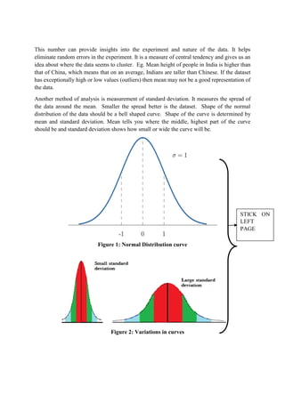
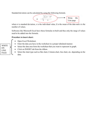
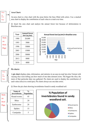
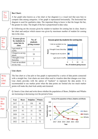
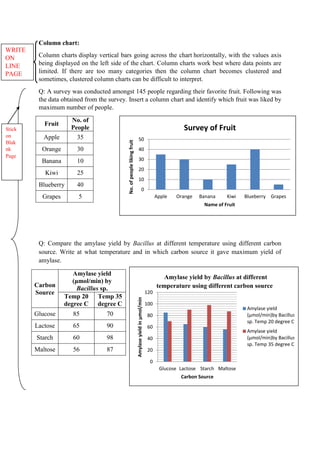
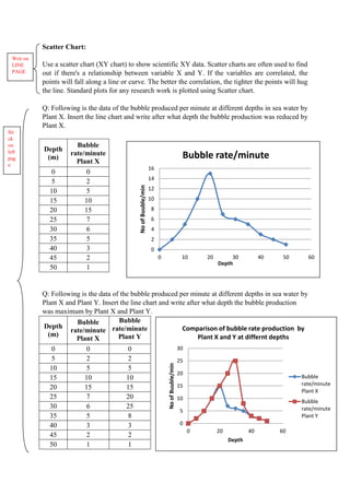
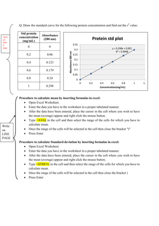
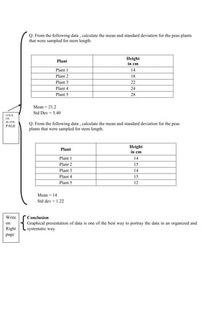
1. Aim: Graphical representation of data using statistical tools.
Introduction
A Graphical representation is a visual display of data and statistical results using plots and
charts. There are different types of graphical representations which can be used depending on
the nature of the data and the nature of the statistical analysis. It is used in many academic
and professional disciplines but it is most widely accepted in the field of mathematics,
medicine science and research. The proper graphical representation of data helps researchers
to quantify, sort and present data in a more robust and efficient way that is understandable
and reproducible to a large variety of audience.
A chart is a visual representative of data in both columns and rows. There are different chart
formats such as Bar, Column, Pie, Line, Area, Doughnut, Scatter, Surface, or Radar charts.
Different scenarios require different types of charts. The type of chart that you choose
depends on the type of data that you want to visualize. With Excel, it is easy to create a chart.
Whatever the type of graph, it should contain chart elements. Chart elements give more
descriptions to your charts, thus making your data more meaningful and visually appealing.
Chart elements mainly includes Chart area, Plot Area, Chart title, Grid lines, Axes titles,
Trend lines, Series, Data labels, etc.
Limitations of a Graph are as follows-
A graph lacks complete accuracy of facts.
It depicts only a few selected characteristics of the data.
We cannot use a graph in support of a statement.
A graph is not a substitute for tables.
Typically, a graph shows the unreasonable tendency of the data and the actual values
are not clear.
Use of Statistical analysis methods can ensure that the results are robust and repeatable by
avoiding analytical errors such as biased sampling, overgeneralization, causality, etc that
might have happened during collection of data. One such representation of statistics is mean
or average. It measures the center of the numerical data set and expresses an amount that is
for a group of people or things. For example on average, students are on their phone 5 hours
per day. It is an indicator of the amount spend on phone in general where some might spend
more time or some might spend less time on phone. It summarizes a large amount of data into
a single value and indicates there is variability around this value in the original data.
Another such method of analysis is measure of standard deviation. It is a measure for the
spread of the data or variability. Data spread over a short range is preferred over data over a
wide range.
2. Principle
Algebraic Principles are applied to all types of graphical representation of data. In graphs, it
is represented using two lines are called coordinate axes. The horizontal axis is denoted as x –
axis and the vertical axis is denoted as y – axis. The point at which two lines intersect is
called origin, ‘ O '. Consider x axis, the distance from origin to the right have a positive value
and the distance from the origin to the left side have positive value. Similarly for the y axis,
the distance above the origin have a positive value and the distance below the origin have
negative value.
Depending on the nature of the question asked and the data obtained, different types of
graphs can be constructed.
Line Chart:
It is suitable for representing obtained data chronologically in an ascending or descending
order. Usually, it shows the behavior of a variable over time.
Bar Chart:
It is a widely used method of data representation. This chart is applied specially in a situation
where the given data can be classified on the basis of a non- measurable criterion.
Pie Chart:
It is another effective method to represent quantitative data simply and diagrammatically.
When the values of a variable possesses different properties, in order to express the inherent
relationship among them and for the aggregate value of the variable, pie diagram possibly is
the best method.
Scatter-plot:
The scatter-plot is excellent for showing the relationship between two data series and
determining their correlation. The scatter-plot is great for showing what a distribution of data
points looks like and for drawing a line of best fit for regression analysis.
Area Chart:
Area chart emphasizes differences between several sets of data over a period of time.
Statistics is the science of collecting, analyzing, presenting and interpreting data. Statistical
analysis guides the scientist in performing well designed experiments, proper interpretation of
results etc. Many statistical techniques are available for analysis.
Mean or Average is calculated by taking the sum of all the values in the data set divided by
the number of values in the data set. Formula is as follows
where (bar x) is symbol for mean, means sum, x is individual values of the dataset and
n is the number of values.
3. This number can provide insights into the experiment and nature of the data. It helps
eliminate random errors in the experiment. It is a measure of central tendency and gives us an
idea about where the data seems to cluster. Eg. Mean height of people in India is higher than
that of China, which means that on an average, Indians are taller than Chinese. If the dataset
has exceptionally high or low values (outliers) then mean may not be a good representation of
the data.
Another method of analysis is measurement of standard deviation. It measures the spread of
the data around the mean. Smaller the spread better is the dataset. Shape of the normal
distribution of the data should be a bell shaped curve. Shape of the curve is determined by
mean and standard deviation. Mean tells you where the middle, highest part of the curve
should be and standard deviation shows how small or wide the curve will be.
Figure 1: Normal Distribution curve
Figure 2: Variations in curves
STICK ON
LEFT
PAGE
4. Standard deviation can be calculated by using the following formula.
where σ is standard deviation, x is the individual value, is the mean of the data and n is the
number of values.
Softwares like Microsoft Excel have these formulas in-built and thus only the range of values
need to be added into the formula.
Procedure to insert chart:
Open Excel Worksheet.
Enter the data you have in the worksheet in a proper tabulated manner.
Select the data area from the worksheet that you want to represent in graph.
Click on INSERT tab from the ribbon.
Select the chart type such as Bar chart, Column chart, line chart, etc. depending on the
data.
σ
Write On
Line page
WRITE
ON
LINE
PAGE
5. Area Chart:
An area chart is a line chart with the areas below the lines filled with colors. Use a stacked
area chart to display the contribution of each value to a total over time.
Q: Insert the area chart and analyze the annual forest lost because of deforestation in
Brazilian area.
Year
Annual forest
lost (sq km)
1988 20,000
1993 5000
1998 10000
2003 15000
2008 30000
2013 8000
2018 4000
Pie charts:
A pie chart displays data, information, and statistics in an easy-to-read 'pie-slice' format with
varying slice sizes telling you how much of one data element exists. The bigger the slice, the
more of that particular data was gathered. Pie charts are used to display the contribution of
each value (slice) to a total (pie). Pie charts always use one data series.
Q: Draw the pie chart showing invertebrates found in sandy woodland soil.
Name of
invertebrate
%
Population
Round worms 45
Mites 20
Earthworms 28
Spiders 15
Centipedes 5
0
5,000
10,000
15,000
20,000
25,000
30,000
35,000
1988
1993
1998
2003
2008
2013
2018
Annual
forest
lost
in
sq
km
Year
Annual forest lost (sq km) in Brazilian area
Annual forest lost (sq
km)
Stick
on
Blank
Page
Write
on
Line
Page
Write
on
Line
Page
% Population of
invertebrates found in sandy
woodland soil.
Round worms
Mites
Earthworms
Spiders
Centipedes
Stick
on
Blank
Page
6. Bar Chart:
A bar graph (also known as a bar chart or bar diagram) is a visual tool that uses bars to
compare data among categories. A bar graph is represented horizontally. The horizontal bar
diagram is used for qualitative data. The important thing to know is that the longer the bar,
the greater its value. The length of the bar is proportional to data value.
Q: Following are the excuses given by student to teachers for coming late in class. Insert a
bar chart and analyze which reason was given by maximum number of student for coming
late in the class.
Excuses given
by students to
come late in
class
No. of
students
giving excuses
I got stuck in
traffic
15
I forgot to set my
alarm
10
I thought it was
Saturday
5
I met an accident
on my way
3
Line chart:
The line chart or a line plot or line graph is represented by a series of data points connected
with a straight line. Line charts are most often used to visualize data that changes over time.
Line charts provides with the option of "markers" to represent the data points. It is
recommended to use marker point when the data points are limited else too much marker
points will make the chart look untidy and clustered.
Q: Insert a Line chart and write down whether the population of Bears, Dolphins and Whales
are increasing or decreasing over the period of time.
Year Bears Dolphins Whales
2017 8 150 80
2018 54 77 54
2019 93 32 100
2020 116 11 76
2021 137 6 93
2022 184 1 72
0 5 10 15 20
I got stuck in traffic
I forgot to set my alarm
I thought it was Saturday
I met an accident on my
way
No. of students giving excuse
Reason
Excuses given by students for coming late
Write
on
LINE
PAGE
Stick
on
Blan
k
Page
0
50
100
150
200
2017 2018 2019 2020 2021 2022
Population
count
Year
Survey of the population of Bears, Dolphins and Whales
Bears
Dolphins
Whales
Write
on
LINE
page
Stick
on
Blan
k
page
7. Column chart:
Column charts display vertical bars going across the chart horizontally, with the values axis
being displayed on the left side of the chart. Column charts work best where data points are
limited. If there are too many categories then the column chart becomes clustered and
sometimes, clustered column charts can be difficult to interpret.
Q: A survey was conducted amongst 145 people regarding their favorite fruit. Following was
the data obtained from the survey. Insert a column chart and identify which fruit was liked by
maximum number of people.
Fruit
No. of
People
Apple 35
Orange 30
Banana 10
Kiwi 25
Blueberry 40
Grapes 5
Q: Compare the amylase yield by Bacillus at different temperature using different carbon
source. Write at what temperature and in which carbon source it gave maximum yield of
amylase.
Carbon
Source
Amylase yield
(μmol/min) by
Bacillus sp.
Temp 20
degree C
Temp 35
degree C
Glucose 85 70
Lactose 65 90
Starch 60 98
Maltose 56 87
WRITE
ON
LINE
PAGE
0
10
20
30
40
50
Apple Orange Banana Kiwi Blueberry Grapes
No.
of
people
liking
fruit
Name of Fruit
Survey of Fruit
0
20
40
60
80
100
120
Glucose Lactose Starch Maltose
Amylase
yield
in
μmol/min
Carbon Source
Amylase yield by Bacillus at different
temperature using different carbon source
Amylase yield
(μmol/min)by Bacillus
sp. Temp 20 degree C
Amylase yield
(μmol/min)by Bacillus
sp. Temp 35 degree C
Stick
on
Blak
nk
Page
8. Scatter Chart:
Use a scatter chart (XY chart) to show scientific XY data. Scatter charts are often used to find
out if there's a relationship between variable X and Y. If the variables are correlated, the
points will fall along a line or curve. The better the correlation, the tighter the points will hug
the line. Standard plots for any research work is plotted using Scatter chart.
Q: Following is the data of the bubble produced per minute at different depths in sea water by
Plant X. Insert the line chart and write after what depth the bubble production was reduced by
Plant X.
Depth
(m)
Bubble
rate/minute
Plant X
0 0
5 2
10 5
15 10
20 15
25 7
30 6
35 5
40 3
45 2
50 1
Q: Following is the data of the bubble produced per minute at different depths in sea water by
Plant X and Plant Y. Insert the line chart and write after what depth the bubble production
was maximum by Plant X and Plant Y.
Depth
(m)
Bubble
rate/minute
Plant X
Bubble
rate/minute
Plant Y
0 0 0
5 2 2
10 5 5
15 10 10
20 15 15
25 7 20
30 6 25
35 5 8
40 3 3
45 2 2
50 1 1
Writ on
LINE
PAGE
Sti
ck
on
left
pag
e
0
5
10
15
20
25
30
0 20 40 60
No
of
Buuble/min
Depth
Comparison of bubble rate production by
Plant X and Y at differnt depths
Bubble
rate/minute
Plant X
Bubble
rate/minute
Plant Y
0
2
4
6
8
10
12
14
16
0 10 20 30 40 50 60
No
of
Buuble/min
Depth
Bubble rate/minute
9. Q: Draw the standard curve for the following protein concentration and find out the r2
value.
Std protein
concentration
(mg/mL)
Absorbance
(280 nm)
0 0
0.2 0.06
0.4 0.123
0.6 0.179
0.8 0.24
1 0.298
Procedure to calculate mean by inserting formulas in excel:
Open Excel Worksheet.
Enter the data you have in the worksheet in a proper tabulated manner.
After the data have been entered, place the cursor in the cell where you wish to have
the mean (average) appear and right click the mouse button.
Type =AVG( in the cell and then select the range of the cells for which you have to
calculate mean.
Once the range of the cells will be selected in the cell then close the bracket ")"
Press Enter
Procedure to calculate Standard deviation by inserting formulas in excel:
Open Excel Worksheet.
Enter the data you have in the worksheet in a proper tabulated manner.
After the data have been entered, place the cursor in the cell where you wish to have
the mean (average) appear and right click the mouse button.
Type =STDEV( in the cell and then select the range of the cells for which you have to
calculate mean.
Once the range of the cells will be selected in the cell then close the bracket )
Press Enter
y = 0.298x + 0.001
R² = 0.9998
0
0.05
0.1
0.15
0.2
0.25
0.3
0.35
0 0.2 0.4 0.6 0.8 1 1.2
Absorbance
280
nm
Concentration(mg/mL)
Protein std plot
Stick
on
blan
k
page
Write
on
LINE
PAGE
10. Q: From the following data , calculate the mean and standard deviation for the peas plants
that were sampled for stem length.
Plant
Height
in cm
Plant 1 14
Plant 2 18
Plant 3 22
Plant 4 24
Plant 5 28
Mean = 21.2
Std Dev = 5.40
Q: From the following data , calculate the mean and standard deviation for the peas
plants that were sampled for stem length.
Plant
Height
in cm
Plant 1 14
Plant 2 15
Plant 3 14
Plant 4 15
Plant 5 12
Mean = 14
Std dev = 1.22
Conclusion
Graphical presentation of data is one of the best way to portray the data in an organized and
systematic way.
STICK
ON
BLANK
PAGE
Write
on
Right
page