Downloaded 24 times
![[Your company name] presents:Microsoft® Office Excel®2007 TrainingCreate a chart](https://image.slidesharecdn.com/exceltrainingcreateachart-100914100417-phpapp02/85/Excel-training-create-a-chart-1-320.jpg)
![[Your company name] presents:Microsoft® Office Excel®2007 TrainingCreate a chart](https://image.slidesharecdn.com/exceltrainingcreateachart-100914100417-phpapp02/75/Excel-training-create-a-chart-1-2048.jpg)

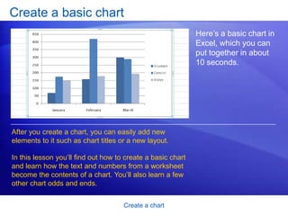
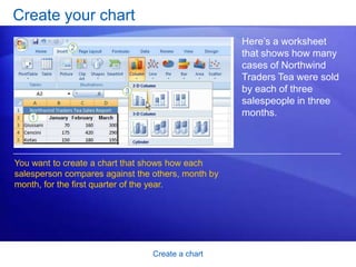
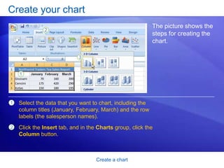
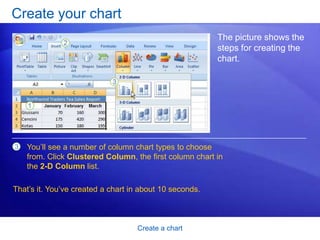


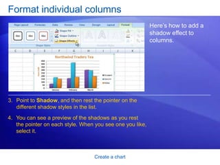
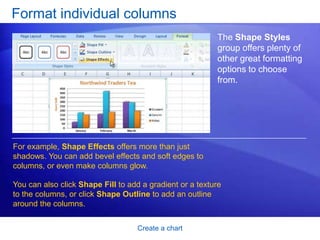
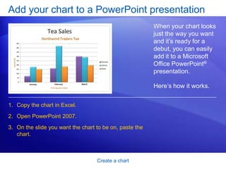
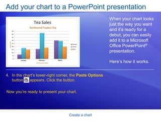


This document provides a training course on creating and customizing charts in Microsoft Excel 2007. The course contains two lessons that teach how to create a basic chart using sample sales data, and how to customize charts by changing styles, formatting titles, and adding effects. The document includes step-by-step instructions, examples, and practice questions for learners.