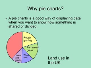
1. A pie chart is used to show how something is divided or shared by displaying data as a circle divided into sectors proportional to the quantities.
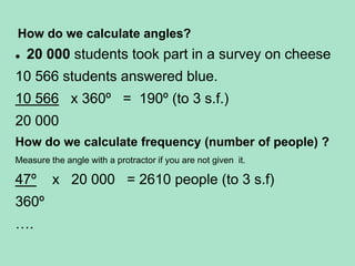
2. To calculate angles and frequencies from a pie chart, you take the angle/frequency for a category and divide it by the total to get the proportional amount.
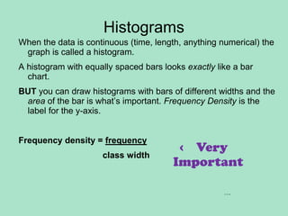
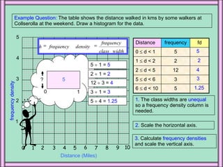
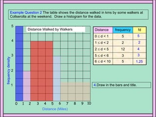
3. A histogram is similar to a bar chart but used for continuous numerical data, with bars of unequal widths to show frequency density on the y-axis rather than just frequency.