Downloaded 56 times


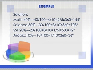


To create a pie chart: 1. Draw a circle and mark its center. 2. Draw lines from the center to the edge to divide the circle into sectors based on data percentages. 3. Measure each sector's angle and label it to match its data label. A pie chart illustrates proportional data by dividing a circle into sectors sized according to data percentages. It is commonly used in business to visualize data distributions but can be difficult to compare across charts. Bar charts are often a better alternative.


![Circle graphs[1]](https://cdn.slidesharecdn.com/ss_thumbnails/circlegraphs1-120315115056-phpapp01-thumbnail.jpg?width=640&height=640&fit=bounds)


![Presenting-Experimental-Data-Grade-8 [Autosaved].pptx](https://cdn.slidesharecdn.com/ss_thumbnails/presenting-experimental-data-grade-8autosaved-240925105557-9775d0ae-thumbnail.jpg?width=640&height=640&fit=bounds)
![Presenting-Experimental-Data-Grade-8 [Autosaved].pptx](https://cdn.slidesharecdn.com/ss_thumbnails/presenting-experimental-data-grade-8autosaved-240925104859-008a237a-thumbnail.jpg?width=640&height=640&fit=bounds)


