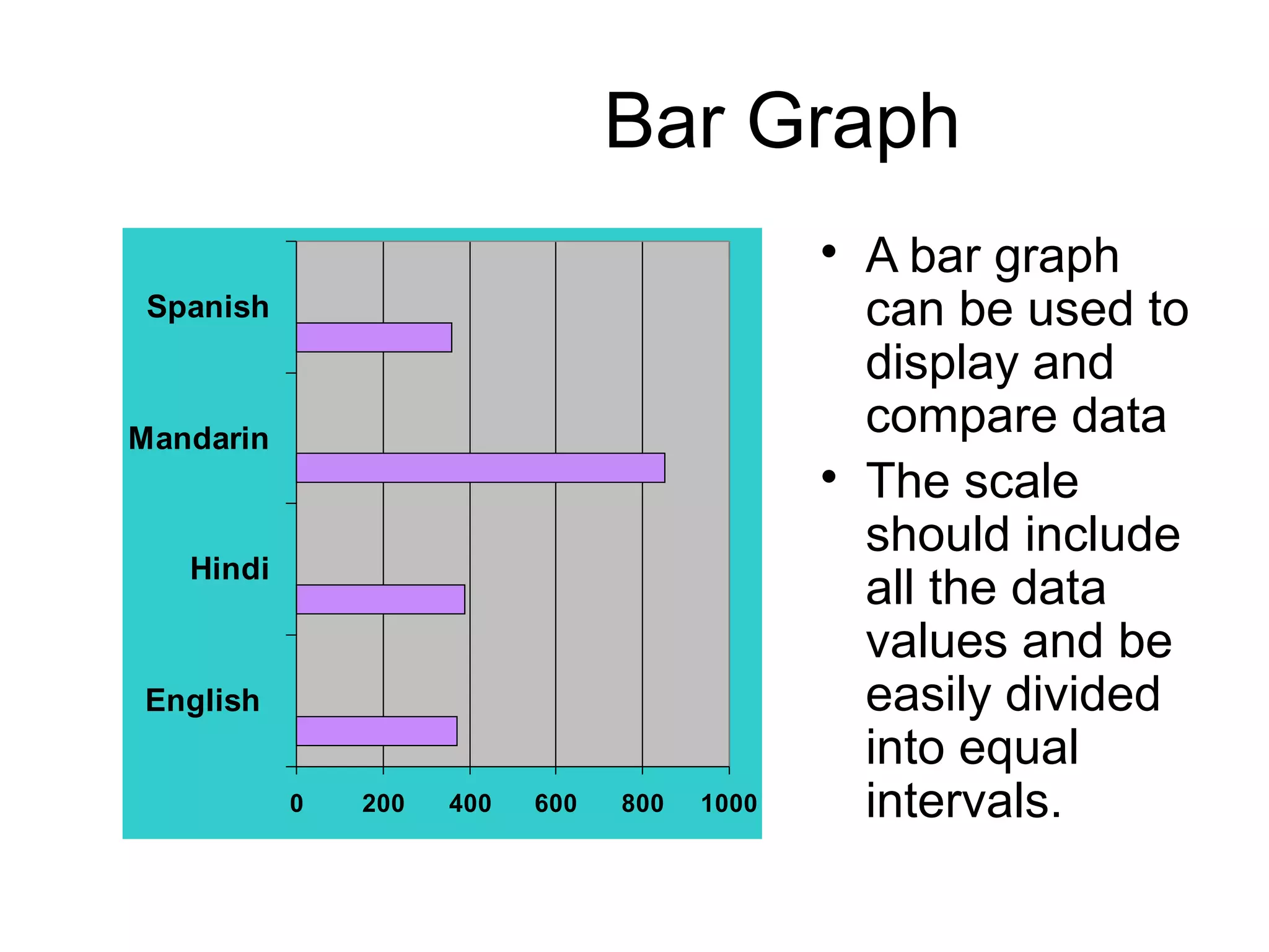
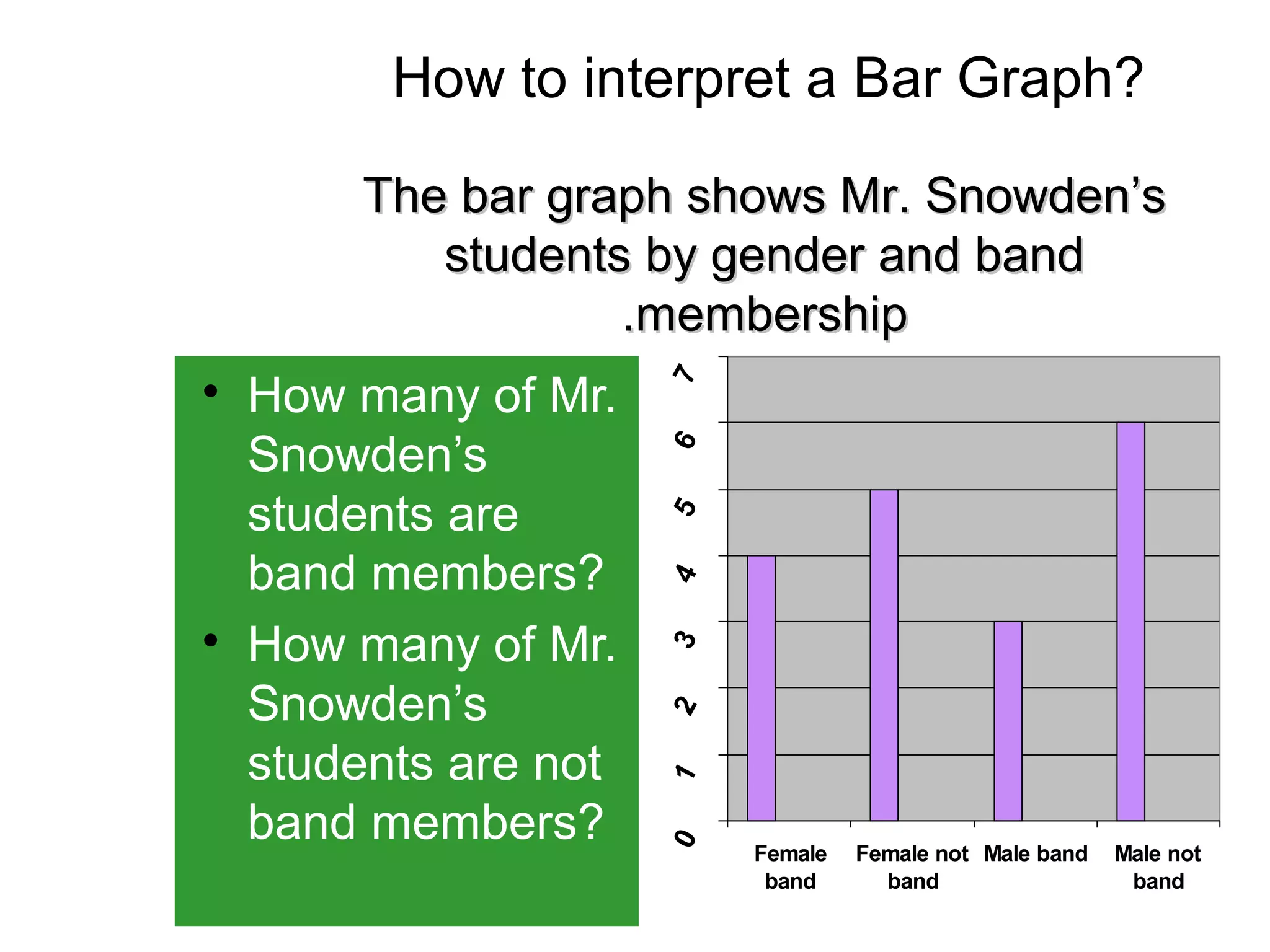
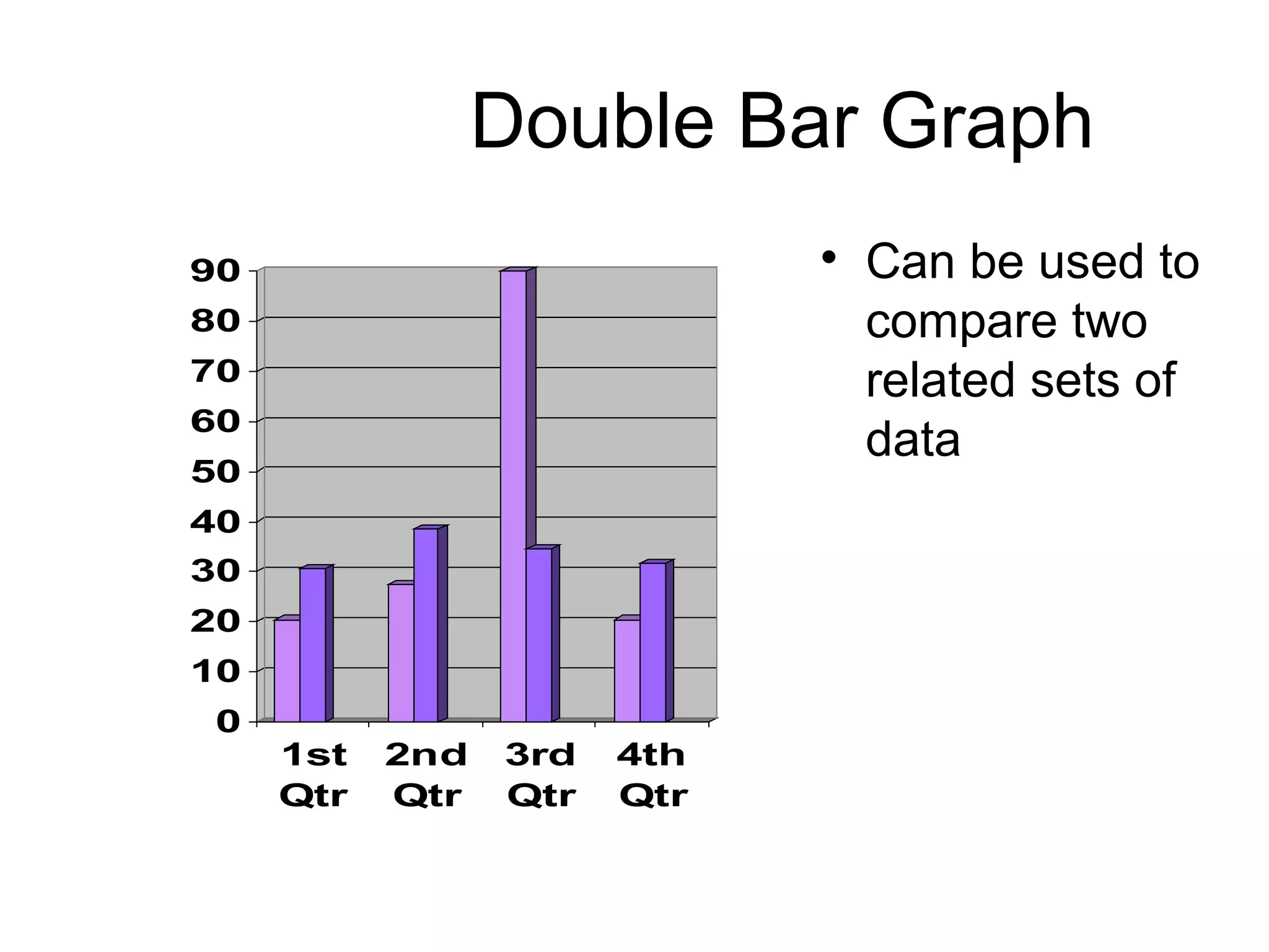
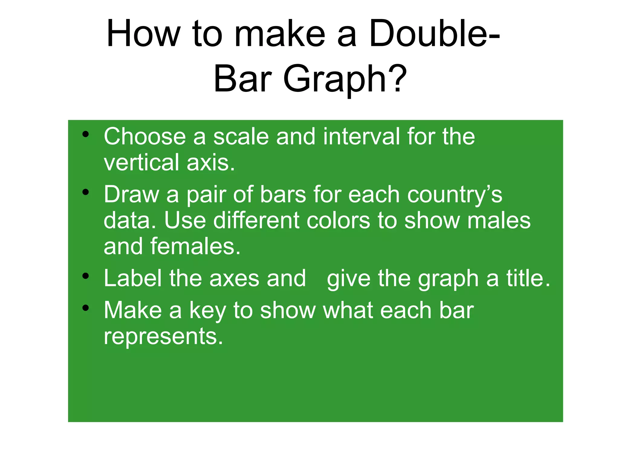
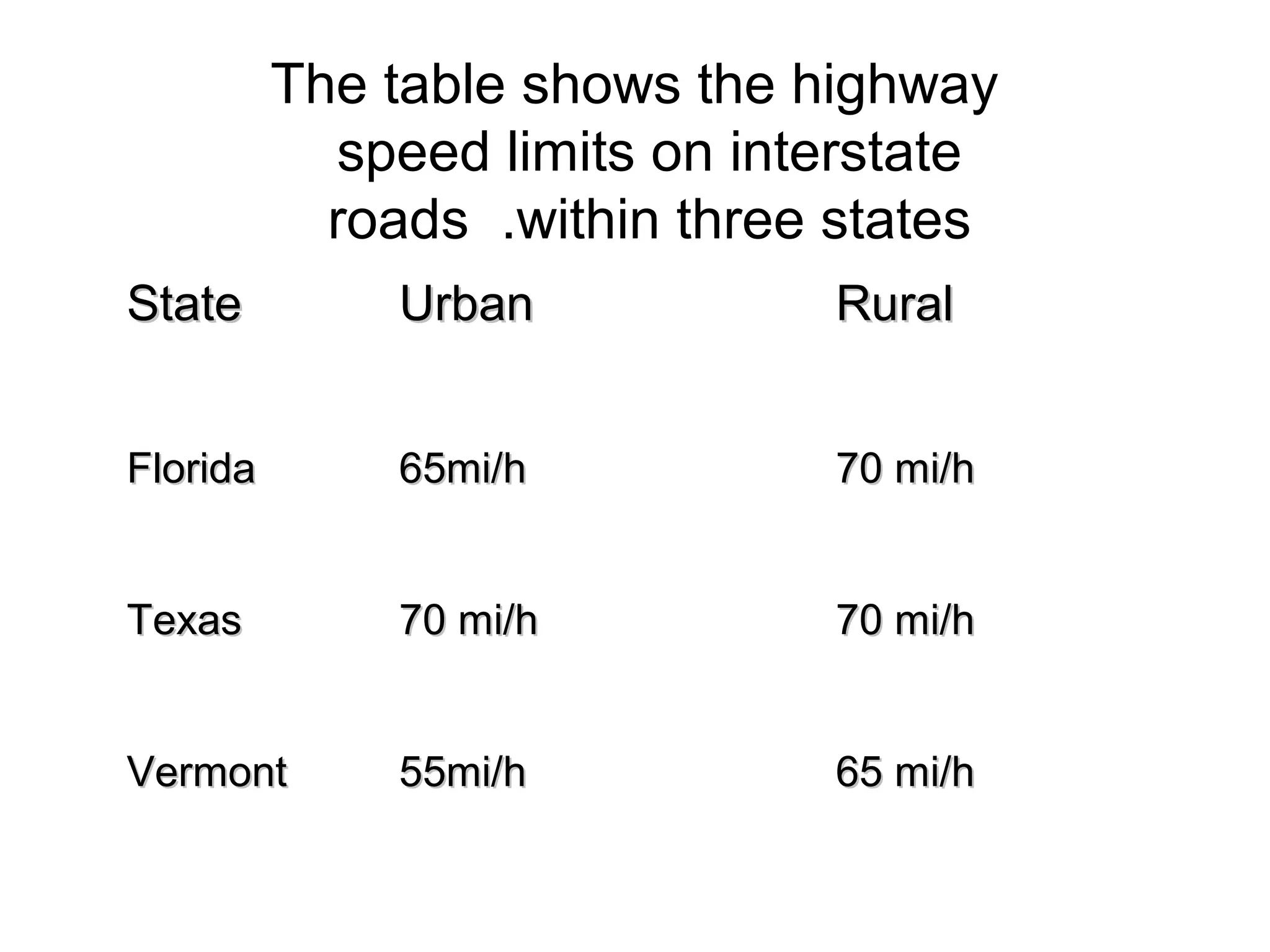
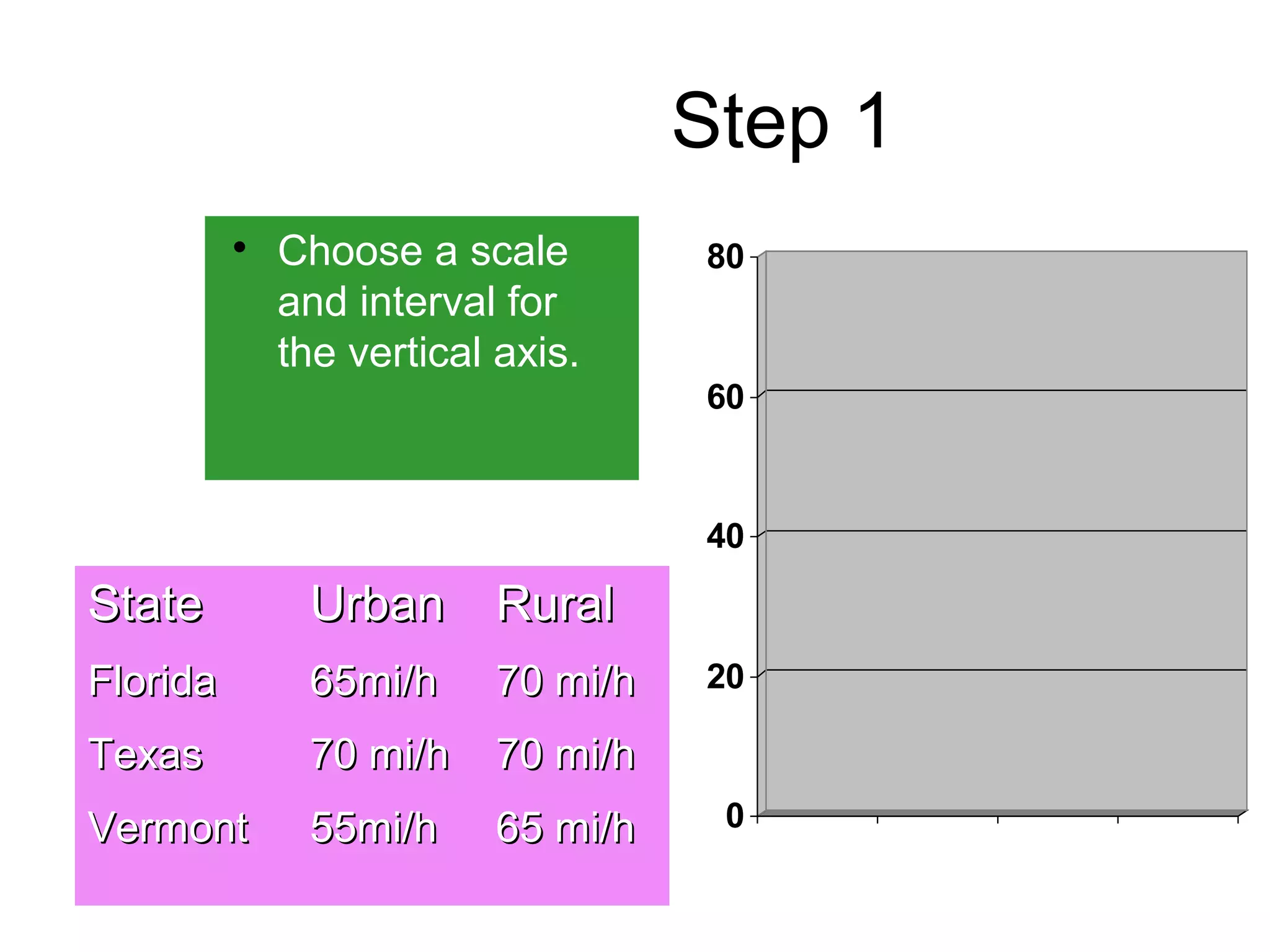
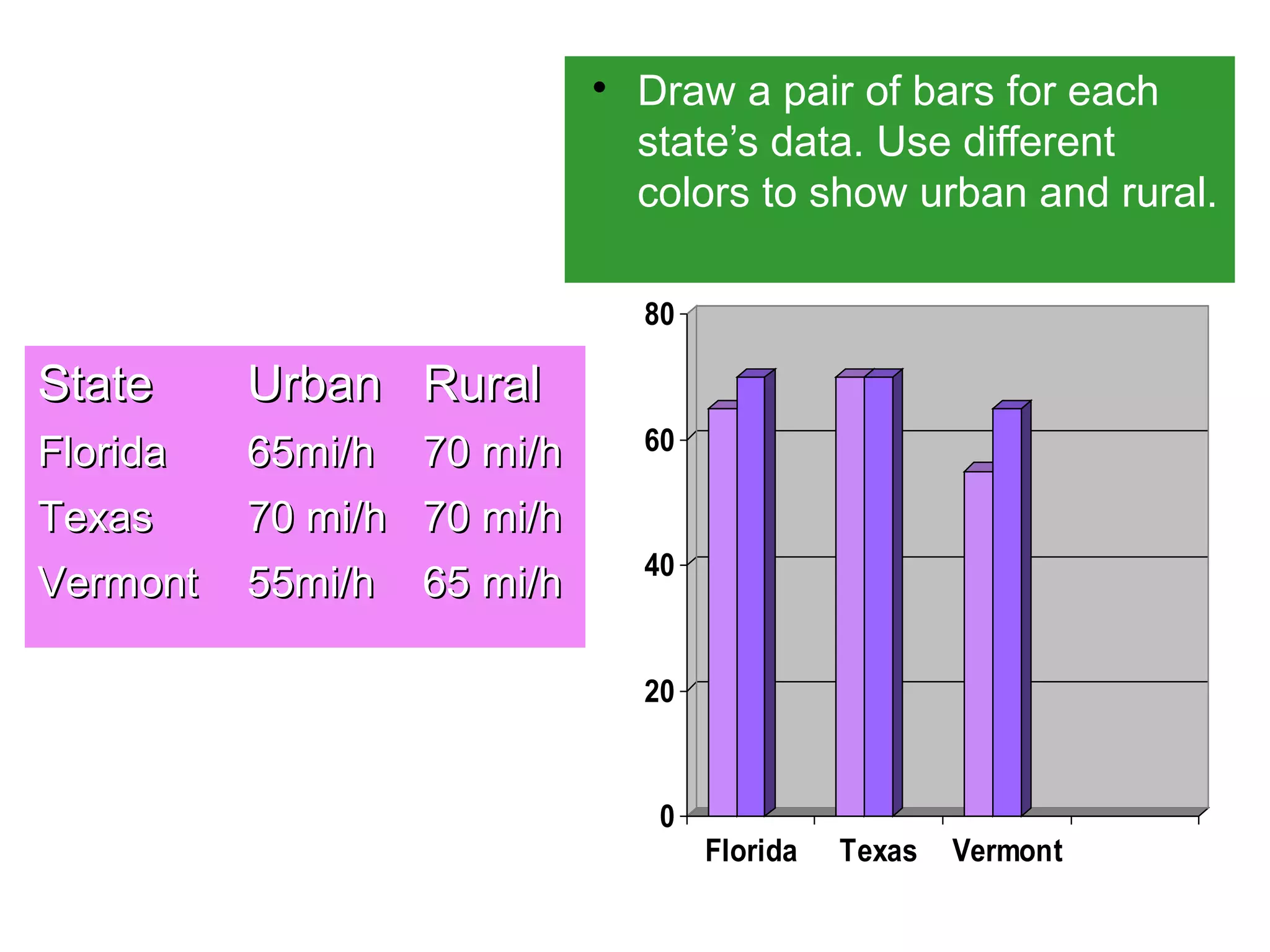
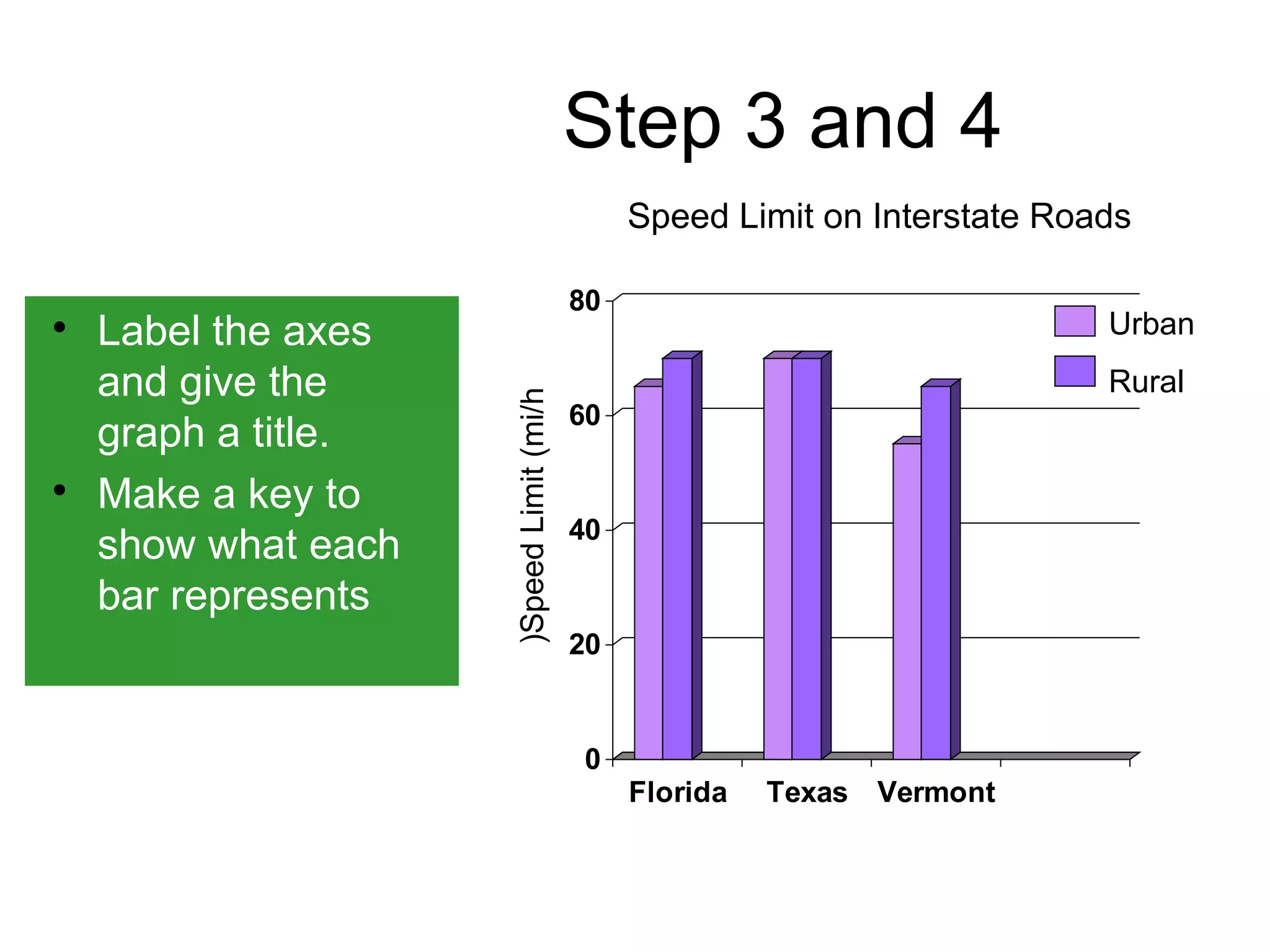
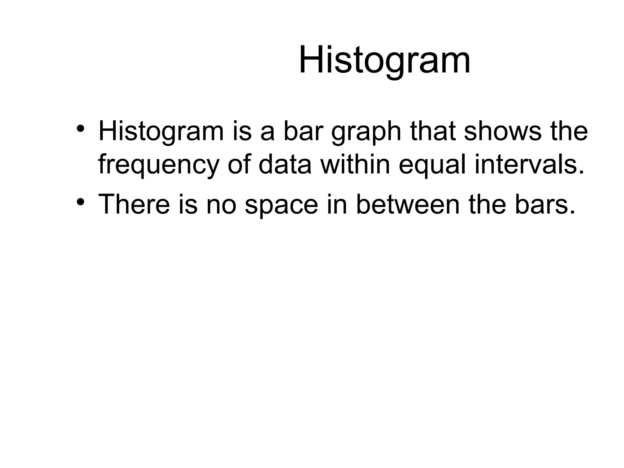
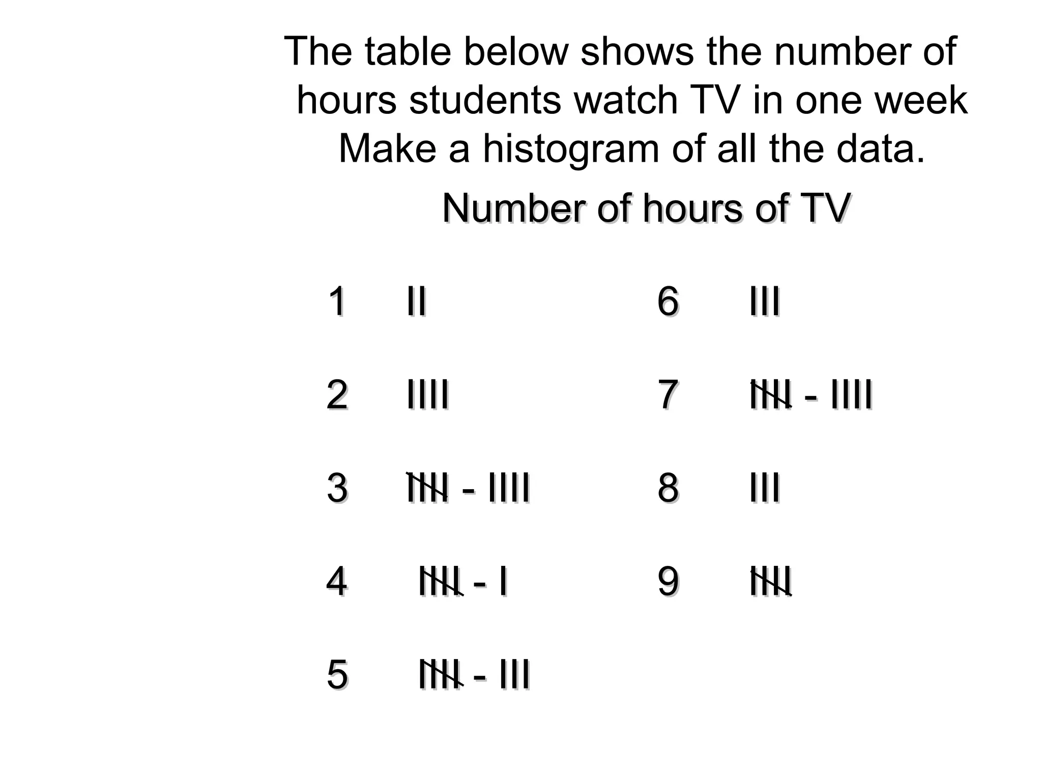
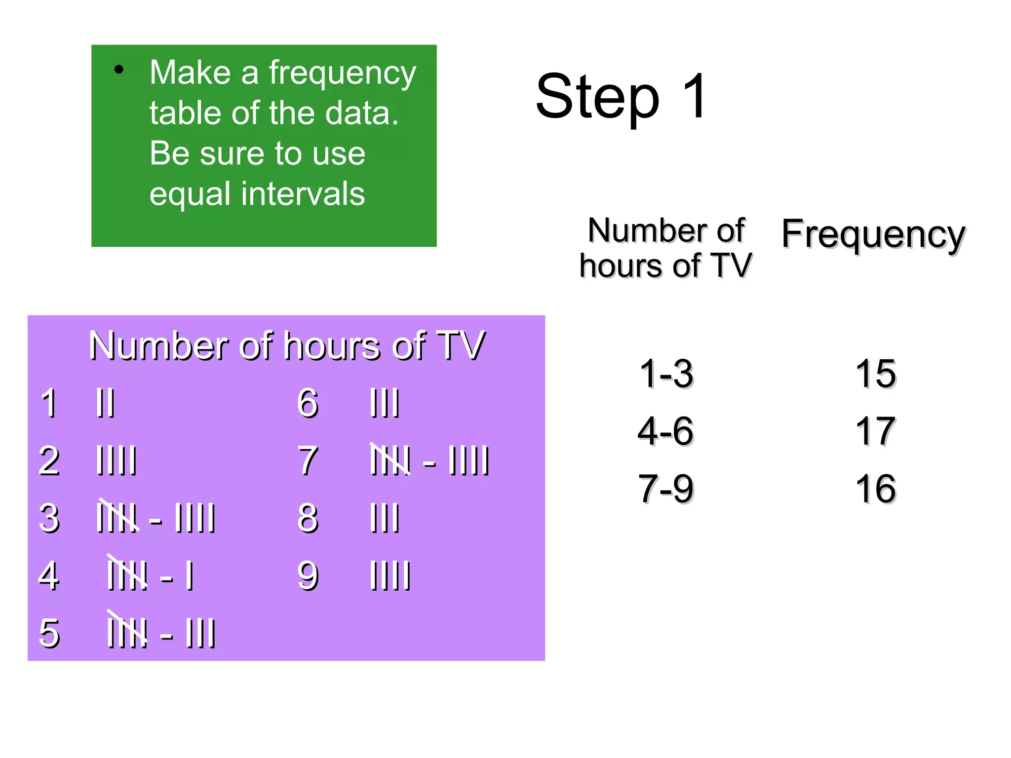
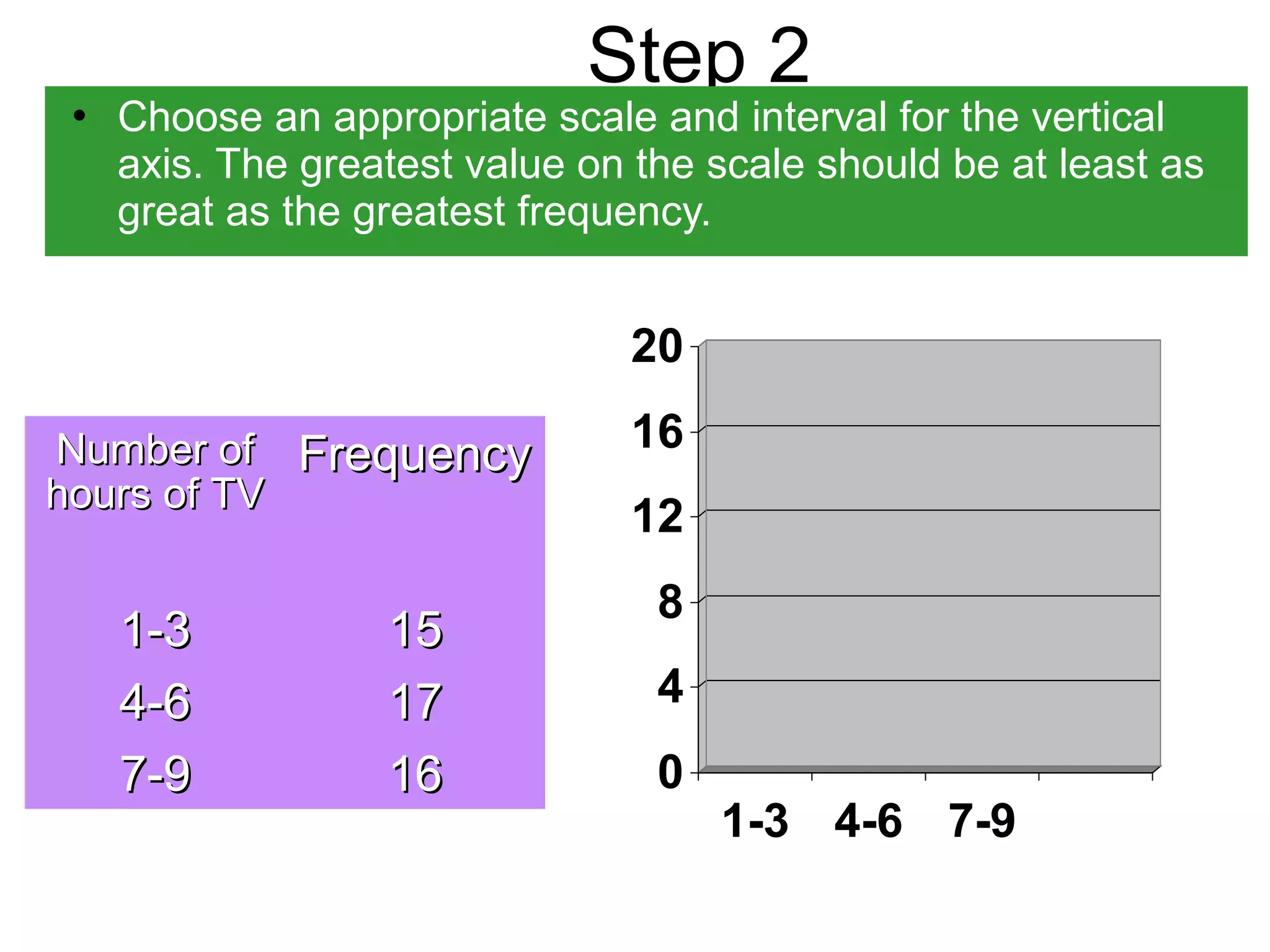
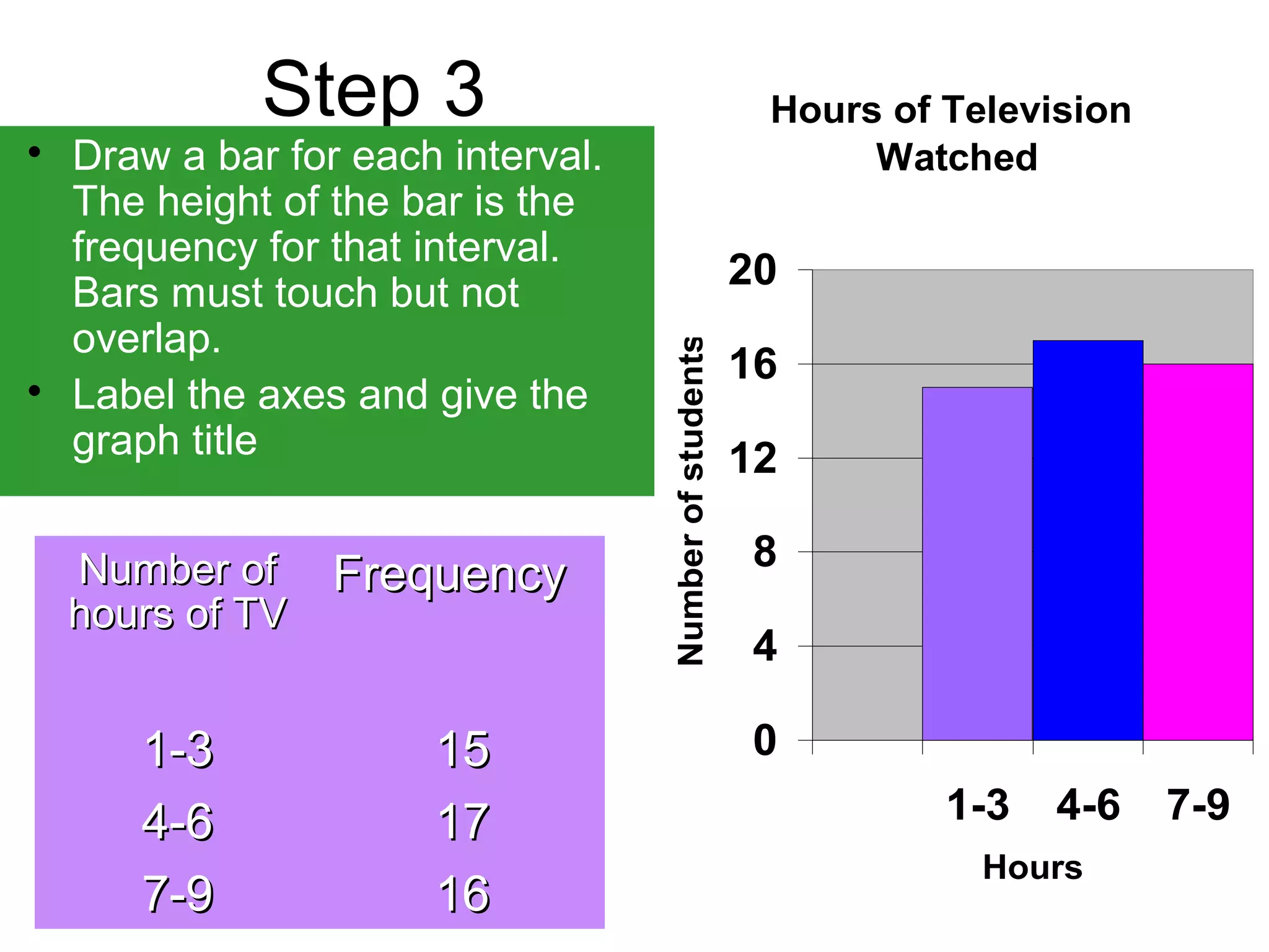
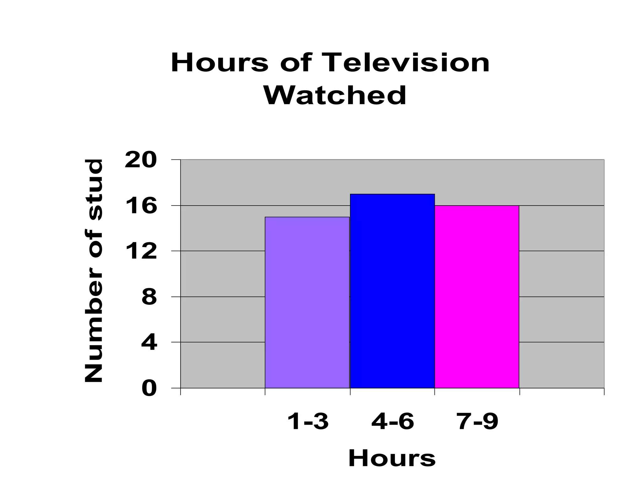
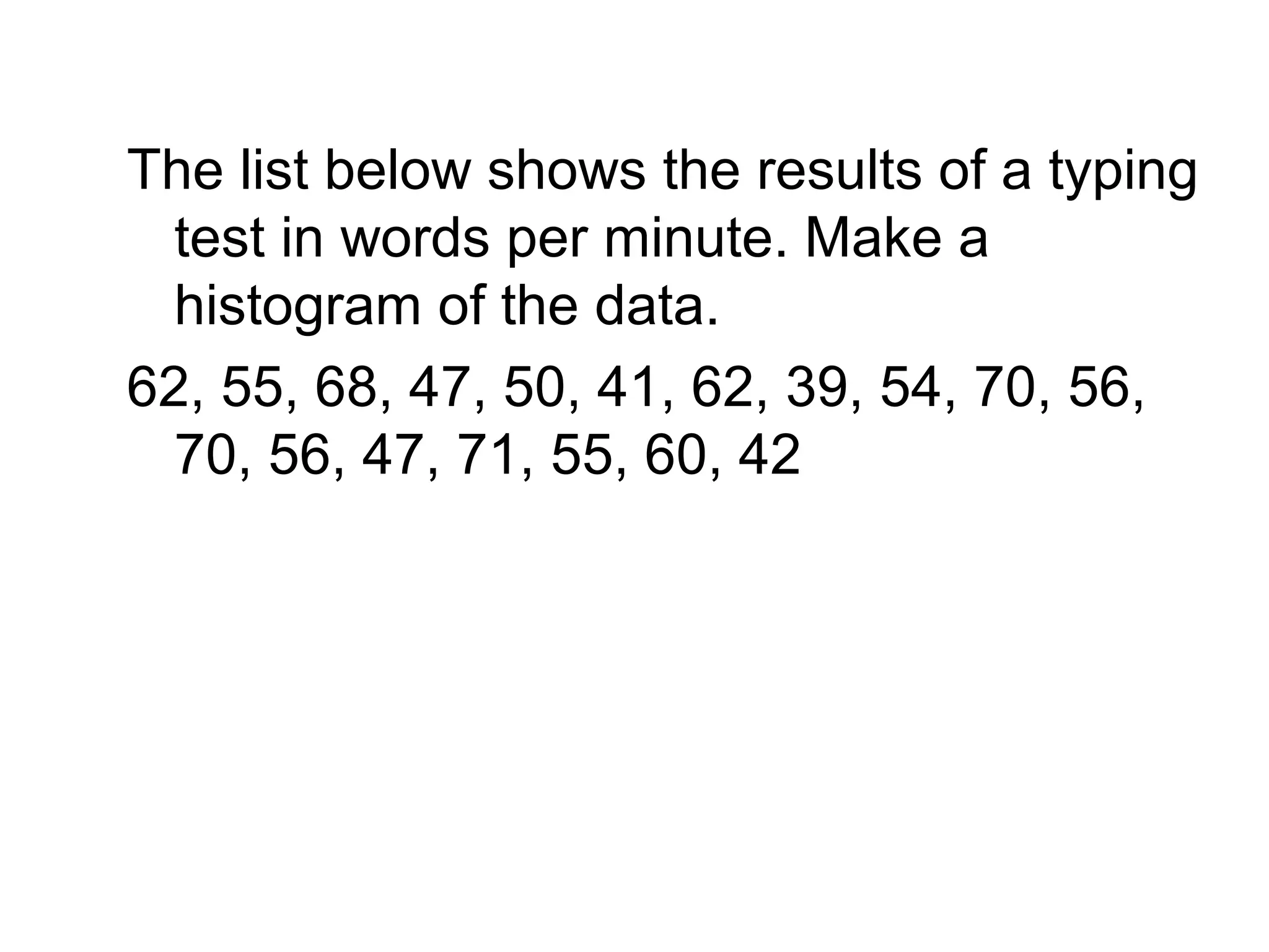
Bar Graphs and 
Histograms
What do you know about 
 bar graph? 
 double bar graph? 
 Histogram?
Bar Graph 
0 200 400 600 800 1000 
Spanish 
Mandarin 
Hindi 
English 
 A bar graph 
can be used to 
display and 
compare data 
 The scale 
should include 
all the data 
values and be 
easily divided 
into equal 
intervals.
How to interpret a Bar Graph? 
TThhee bbaarr ggrraapphh sshhoowwss MMrr.. SSnnoowwddeenn’’ss 
 How many of Mr. 
Snowden’s 
students are 
band members? 
 How many of Mr. 
Snowden’s 
students are not 
band members? 
7 
6 
5 
4 
3 
2 
1 
0 
Female 
band 
Female not 
band 
Male band Male not 
band 
ssttuuddeennttss bbyy ggeennddeerr aanndd bbaanndd 
..mmeemmbbeerrsshhiipp
Double Bar Graph 
90 
80 
70 
60 
50 
40 
30 
20 
10 
0 
1st 
Qtr 
2nd 
Qtr 
3rd 
Qtr 
4th 
Qtr 
 Can be used to 
compare two 
related sets of 
data
How to make a Double- 
Bar Graph? 
 Choose a scale and interval for the 
vertical axis. 
 Draw a pair of bars for each country’s 
data. Use different colors to show males 
and females. 
 Label the axes and give the graph a title. 
 Make a key to show what each bar 
represents.
The table shows the highway 
speed limits on interstate 
roads .within three states 
SSttaattee UUrrbbaann RRuurraall 
FFlloorriiddaa 6655mmii//hh 7700 mmii//hh 
TTeexxaass 7700 mmii//hh 7700 mmii//hh 
VVeerrmmoonntt 5555mmii//hh 6655 mmii//hh
Step 1 
 Choose a scale 
and interval for 
the vertical axis. 
80 
60 
40 
20 
0 
SSttaattee UUrrbbaann RRuurraall 
FFlloorriiddaa 6655mmii//hh 7700 mmii//hh 
TTeexxaass 7700 mmii//hh 7700 mmii//hh 
VVeerrmmoonntt 5555mmii//hh 6655 mmii//hh
Step 2  Draw a pair of bars for each 
state’s data. Use different 
colors to show urban and rural. 
80 
60 
40 
20 
0 
Florida Texas Vermont 
SSttaattee UUrrbbaann RRuurraall 
FFlloorriiddaa 6655mmii//hh 7700 mmii//hh 
TTeexxaass 7700 mmii//hh 7700 mmii//hh 
VVeerrmmoonntt 5555mmii//hh 6655 mmii//hh
Step 3 and 4 
 Label the axes 
and give the 
graph a title. 
 Make a key to 
show what each 
bar represents 
80 
60 
40 
20 
0 
Speed Limit on Interstate Roads 
Florida Texas Vermont 
(Speed Limit (mi/h 
Urban 
Rural
Histogram 
 Histogram is a bar graph that shows the 
frequency of data within equal intervals. 
 There is no space in between the bars.
How to make a 
histogram?
The table below shows the number of 
hours students watch TV in one week 
Make a histogram of all the data. 
NNuummbbeerr ooff hhoouurrss ooff TTVV 
11 IIII 66 IIIIII 
22 IIIIIIII 77 IIIIIIII -- IIIIIIII 
33 IIIIIIII -- IIIIIIII 88 IIIIII 
44 IIIIIIII -- II 99 IIIIIIII 
55 IIIIIIII -- IIIIII
Step 1  Make a frequency 
table of the data. 
Be sure to use 
equal intervals 
NNuummbbeerr ooff hhoouurrss ooff TTVV 
11 IIII 66 IIIIII 
22 IIIIIIII 77 IIIIIIII -- IIIIIIII 
33 IIIIIIII -- IIIIIIII 88 IIIIII 
44 IIIIIIII -- II 99 IIIIIIII 
55 IIIIIIII -- IIIIII 
NNuummbbeerr ooff 
hhoouurrss ooff TTVV 
FFrreeqquueennccyy 
11--33 1155 
44--66 1177 
77--99 1166
Step 2 
 Choose an appropriate scale and interval for the vertical 
axis. The greatest value on the scale should be at least as 
great as the greatest frequency. 
NNuummbbeerr ooff 
hhoouurrss ooff TTVV 
FFrreeqquueennccyy 
11--33 1155 
44--66 1177 
77--99 1166 
20 
16 
12 
8 
4 
0 
1-3 4-6 7-9
Step 3 
 Draw a bar for each interval. 
The height of the bar is the 
frequency for that interval. 
Bars must touch but not 
overlap. 
 Label the axes and give the 
graph title 
Hours of Television 
Watched 
20 
16 
12 
8 
4 
0 
1-3 4-6 7-9 
Hours 
Number of students 
NNuummbbeerr ooff 
hhoouurrss ooff TTVV 
FFrreeqquueennccyy 
11--33 1155 
44--66 1177 
77--99 1166
Hours of Television 
Watched 
20 
16 
12 
8 
4 
0 
1-3 4-6 7-9 
Hours 
Number of students
Can you now make a bar 
graph, double bar Graph 
and a histogram?
The list below shows the results of a typing 
test in words per minute. Make a 
histogram of the data. 
62, 55, 68, 47, 50, 41, 62, 39, 54, 70, 56, 
70, 56, 47, 71, 55, 60, 42
The end

notes on how to draw bar graphs and histograms

  • 1.
    Bar Graphs and Histograms
  • 2.
    What do youknow about  bar graph?  double bar graph?  Histogram?
  • 3.
    Bar Graph 0200 400 600 800 1000 Spanish Mandarin Hindi English  A bar graph can be used to display and compare data  The scale should include all the data values and be easily divided into equal intervals.
  • 4.
    How to interpreta Bar Graph? TThhee bbaarr ggrraapphh sshhoowwss MMrr.. SSnnoowwddeenn’’ss  How many of Mr. Snowden’s students are band members?  How many of Mr. Snowden’s students are not band members? 7 6 5 4 3 2 1 0 Female band Female not band Male band Male not band ssttuuddeennttss bbyy ggeennddeerr aanndd bbaanndd ..mmeemmbbeerrsshhiipp
  • 5.
    Double Bar Graph 90 80 70 60 50 40 30 20 10 0 1st Qtr 2nd Qtr 3rd Qtr 4th Qtr  Can be used to compare two related sets of data
  • 6.
    How to makea Double- Bar Graph?  Choose a scale and interval for the vertical axis.  Draw a pair of bars for each country’s data. Use different colors to show males and females.  Label the axes and give the graph a title.  Make a key to show what each bar represents.
  • 7.
    The table showsthe highway speed limits on interstate roads .within three states SSttaattee UUrrbbaann RRuurraall FFlloorriiddaa 6655mmii//hh 7700 mmii//hh TTeexxaass 7700 mmii//hh 7700 mmii//hh VVeerrmmoonntt 5555mmii//hh 6655 mmii//hh
  • 8.
    Step 1 Choose a scale and interval for the vertical axis. 80 60 40 20 0 SSttaattee UUrrbbaann RRuurraall FFlloorriiddaa 6655mmii//hh 7700 mmii//hh TTeexxaass 7700 mmii//hh 7700 mmii//hh VVeerrmmoonntt 5555mmii//hh 6655 mmii//hh
  • 9.
    Step 2 Draw a pair of bars for each state’s data. Use different colors to show urban and rural. 80 60 40 20 0 Florida Texas Vermont SSttaattee UUrrbbaann RRuurraall FFlloorriiddaa 6655mmii//hh 7700 mmii//hh TTeexxaass 7700 mmii//hh 7700 mmii//hh VVeerrmmoonntt 5555mmii//hh 6655 mmii//hh
  • 10.
    Step 3 and4  Label the axes and give the graph a title.  Make a key to show what each bar represents 80 60 40 20 0 Speed Limit on Interstate Roads Florida Texas Vermont (Speed Limit (mi/h Urban Rural
  • 11.
    Histogram  Histogramis a bar graph that shows the frequency of data within equal intervals.  There is no space in between the bars.
  • 12.
    How to makea histogram?
  • 13.
    The table belowshows the number of hours students watch TV in one week Make a histogram of all the data. NNuummbbeerr ooff hhoouurrss ooff TTVV 11 IIII 66 IIIIII 22 IIIIIIII 77 IIIIIIII -- IIIIIIII 33 IIIIIIII -- IIIIIIII 88 IIIIII 44 IIIIIIII -- II 99 IIIIIIII 55 IIIIIIII -- IIIIII
  • 14.
    Step 1 Make a frequency table of the data. Be sure to use equal intervals NNuummbbeerr ooff hhoouurrss ooff TTVV 11 IIII 66 IIIIII 22 IIIIIIII 77 IIIIIIII -- IIIIIIII 33 IIIIIIII -- IIIIIIII 88 IIIIII 44 IIIIIIII -- II 99 IIIIIIII 55 IIIIIIII -- IIIIII NNuummbbeerr ooff hhoouurrss ooff TTVV FFrreeqquueennccyy 11--33 1155 44--66 1177 77--99 1166
  • 15.
    Step 2 Choose an appropriate scale and interval for the vertical axis. The greatest value on the scale should be at least as great as the greatest frequency. NNuummbbeerr ooff hhoouurrss ooff TTVV FFrreeqquueennccyy 11--33 1155 44--66 1177 77--99 1166 20 16 12 8 4 0 1-3 4-6 7-9
  • 16.
    Step 3 Draw a bar for each interval. The height of the bar is the frequency for that interval. Bars must touch but not overlap.  Label the axes and give the graph title Hours of Television Watched 20 16 12 8 4 0 1-3 4-6 7-9 Hours Number of students NNuummbbeerr ooff hhoouurrss ooff TTVV FFrreeqquueennccyy 11--33 1155 44--66 1177 77--99 1166
  • 17.
    Hours of Television Watched 20 16 12 8 4 0 1-3 4-6 7-9 Hours Number of students
  • 18.
    Can you nowmake a bar graph, double bar Graph and a histogram?
  • 19.
    The list belowshows the results of a typing test in words per minute. Make a histogram of the data. 62, 55, 68, 47, 50, 41, 62, 39, 54, 70, 56, 70, 56, 47, 71, 55, 60, 42
  • 20.