Download as PDF, PPTX


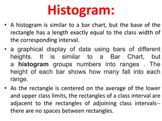
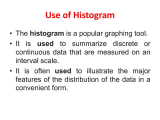
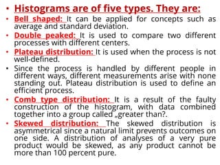
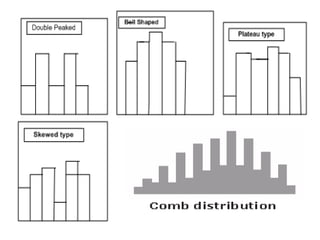
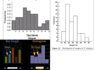
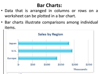
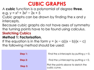
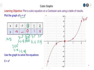
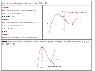
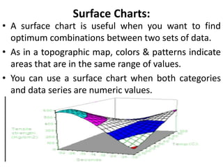
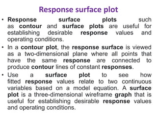
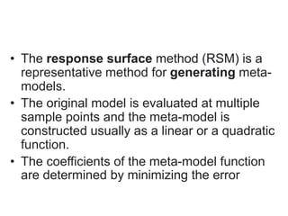
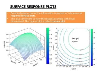
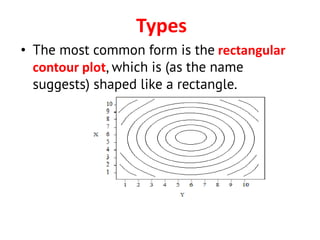

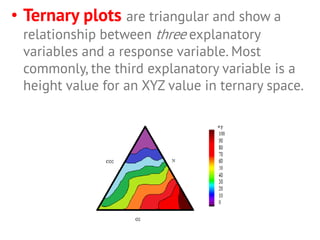
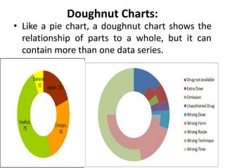
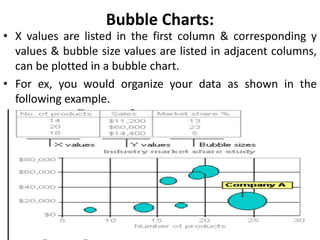


This document provides an overview of different types of graphs that can be used to present statistical data, including histograms, pie charts, bar charts, line charts, cubic graphs, response surface plots, and contour plots. It discusses the purpose and construction of each graph type, advantages and disadvantages, and provides examples of how and when each type of graph might be used. The overall goal is to help students identify, construct, and properly label different graphs to effectively communicate statistical data.