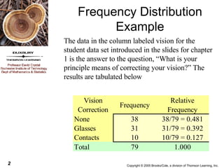
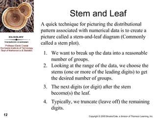
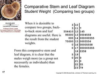
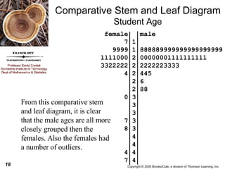
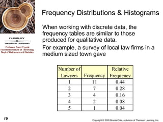
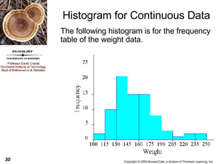
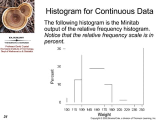
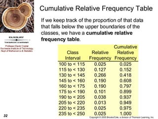
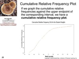
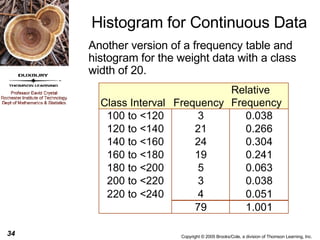
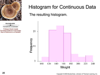
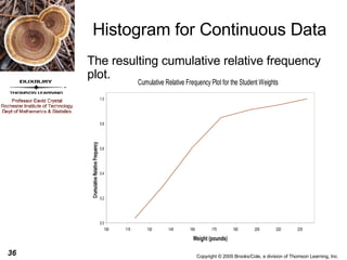
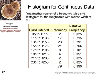
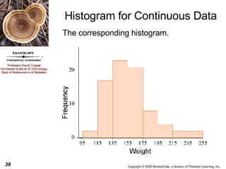
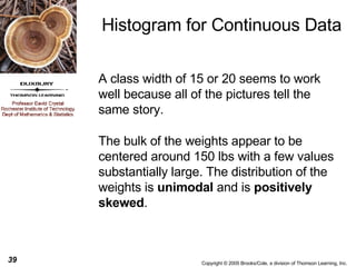
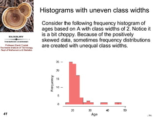
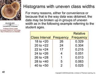
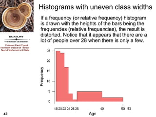
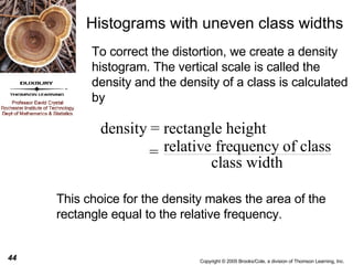
The document discusses various graphical methods for describing data, including bar charts, pie charts, stem-and-leaf diagrams, histograms, and cumulative relative frequency plots. It provides examples of each using sample student data on vision correction, weights, ages, and GPAs to illustrate how to construct and interpret the different graph types.
Please Subscribe to this Channel for more solutions and lectures
http://www.youtube.com/onlineteaching
Chapter 2: Exploring Data with Tables and Graphs
2.1: Frequency Distributions for Organizing and Summarizing Data
Please Subscribe to this Channel for more solutions and lectures
http://www.youtube.com/onlineteaching
Chapter 1: Introduction to Statistics
Section 1.2: Types of Data, Key Concept
Please Subscribe to this Channel for more solutions and lectures
http://www.youtube.com/onlineteaching
Chapter 2: Exploring Data with Tables and Graphs
2.1: Frequency Distributions for Organizing and Summarizing Data
Please Subscribe to this Channel for more solutions and lectures
http://www.youtube.com/onlineteaching
Chapter 1: Introduction to Statistics
Section 1.2: Types of Data, Key Concept
Frequency distribution, central tendency, measures of dispersionDhwani Shah
The presentation explains the theory of what is Frequency distribution, central tendency, measures of dispersion. It also has numericals on how to find CT for grouped and ungrouped data.
Please Subscribe to this Channel for more solutions and lectures
http://www.youtube.com/onlineteaching
Chapter 2: Exploring Data with Tables and Graphs
2.3: Graphs that Enlighten and Graphs that Deceive
Please Subscribe to this Channel for more solutions and lectures
http://www.youtube.com/onlineteaching
Chapter 3: Describing, Exploring, and Comparing Data
3.3: Measures of Relative Standing and Boxplots
ANOVA or analysis of variance is statistical test to find out if >2 groups are different or not. In this presentation a clinical scenario is depicted and stepwise procedure for applying ANOVA including its assumptions are shown.
This presentation is especially for those with a medical background and have just a basic understanding of statistics.
TSTD 6251 Fall 2014SPSS Exercise and Assignment 120 PointsI.docxnanamonkton
TSTD 6251 Fall 2014
SPSS Exercise and Assignment 1
20 Points
In this class, we are going to study descriptive summary statistics and learn how to construct box plot. We are still working with univariate variable for this exercise.
Practice Example:
Admission receipts (in million of dollars) for a recent season are given below for the
n =
30 major league baseball teams:
19.4 26.6 22.9 44.5 24.4 19.0 27.5 19.9 22.8 19.0 16.9 15.2 25.7 19.0 15.5 17.1 15.6 10.6 16.2 15.6 15.4 18.2 15.5 14.2 9.5 9.9
10.7 11.9 26.7 17.5
Require:
a. Compute the mean, variance and standard deviation.
b. Find the sample median, first quartile, and third quartile.
c. Construct a boxplot and interpret the distribution of the data.
d. Discuss the distribution of this set of data by examining kurtosis and skewness
statistics, such as if the distribution is skewed to one side of the distribution, and if the
distribution shows a peaked/skinny curve or a spread out/flat curve.
SPSS Procedures for Computing Summary Statistics
:
Enter the 30 data values in the first column of SPSS
Data View
Tab
Variable View
and name this variable
receipts
Adjust
Decimals
to 3 decimal points
Type
Admission Receipts
($ mn)
in the
Label
column for output viewer
Return to
Data View
and click
A
nalyze
on the menu bar
Click the second menu
D
e
scriptive Statistics
Click
F
requencies …
Move
Admission Receipts
to the
Variable(s)
list by clicking the arrow button
Click
S
tatistics …
button at the top of the dialog box
Now, you can select the descriptive statistics according to what the question requires. For this practice question, it requires central tendency, dispersion, percentile and distribution statistics, so we click all the boxes
except for
P
ercentile(s): and Va
l
ues are group midpoints
.
Click
Continue
to return to the
Frequencies
dialog box
Click
OK
to generate descriptive statistic output which is pasted below:
The first table provides summary statistics and the second table lists frequencies, relative frequencies and cumulative frequencies. The statistics required for solving this problem are highlighted in red.
Statistics
Admission Receipts
N
Valid
30
Missing
0
Mean
18.76333
Std. Error of Mean
1.278590
Median
17.30000
Mode
19.000
Std. Deviation
7.003127
Variance
49.043782
Skewness
1.734
Std. Error of Skewness
.427
Kurtosis
5.160
Std. Error of Kurtosis
.833
Range
35.000
Minimum
9.500
Maximum
44.500
Sum
562.900
Percentiles
10
10.61000
20
14.40000
25
15.35000
30
15.50000
40
15.84000
50
17.30000
60
19.00000
70
19.75000
75
22.82500
80
24.10000
90
26.69000
Admission Receipts
Frequency
Percent
Valid Percent
Cumulative Percent
Valid
9.500
1
3.3
3.3
3.3
9.900
1
3.3
3.3
6.7
10.600
1
3.3
3.3
10.0
10.700
1
3.3
3.3
13.3
11.900
1
3.3
3.3
16.7
14.200
1
3.3
3.3
20.0
15.2.
4 CREATING GRAPHS A PICTURE REALLY IS WORTH A THOUSAND WORDS4 M.docxgilbertkpeters11344
4 CREATING GRAPHS A PICTURE REALLY IS WORTH A THOUSAND WORDS
4: MEDIA LIBRARY
Premium Videos
Core Concepts in Stats Video
· Examining Data: Tables and Figures
Lightboard Lecture Video
· Creating a Simple Chart
Time to Practice Video
· Chapter 4: Problem 3
Difficulty Scale
(moderately easy but not a cinch)
WHAT YOU WILL LEARN IN THIS CHAPTER
· Understanding why a picture is really worth a thousand words
· Creating a histogram and a polygon
· Understanding the different shapes of different distributions
· Using SPSS to create incredibly cool charts
· Creating different types of charts and understanding their application and uses
WHY ILLUSTRATE DATA?
In the previous two chapters, you learned about the two most important types of descriptive statistics—measures of central tendency and measures of variability. Both of these provide you with the one best number for describing a group of data (central tendency) and a number reflecting how diverse, or different, scores are from one another (variability).
What we did not do, and what we will do here, is examine how differences in these two measures result in different-looking distributions. Numbers alone (such as M = 3 and s = 3) may be important, but a visual representation is a much more effective way of examining the characteristics of a distribution as well as the characteristics of any set of data.
So, in this chapter, we’ll learn how to visually represent a distribution of scores as well as how to use different types of graphs to represent different types of data.
CORE CONCEPTS IN STATS VIDEO
Examining Data: Tables and Figures
X-TIMESTAMP-MAP=LOCAL: Examining data helps find data entry errors, evaluate research methodology, identify outliers, and determine the shape of a distribution in a data set. Researchers typically examine collected data in two ways, by creating tables and figures. Imagine you asked a group of friends to rate a movie they've seen on a one to five scale. A table helps identify the variable and the possible values of the variable. The sample size, often referred to as n, is 14 because there are ratings reported from 14 people. This is how large the total sample is. From this, we can determine how many in the sample have each value of the variable. We can also determine the percentage that the sample has of each possible value. Figures display variables from the table. Nominal and ordinal variables can be depicted with bar charts, while interval and ratio variables can be depicted using histograms and frequency polygons. For this data set, we can use a bar chart. Distributions of data can be characterized along three aspects or dimensions, modality, symmetry, and variability. In a unimodal distribution, a small range of values has the greatest frequency or mode of the set. However, it's possible for a distribution to have more than one mode. For a bimodal distribution, we see two values that seem to occur w.
Problem I - Write your first name, middle name, and last name in c.docxanitramcroberts
Problem I
- Write your first name, middle name, and last name in capital letters. The letters involved in your full name would comprise your data set. In case you do not have a middle name, or you do not want to include your real middle name, make one up. Then, do the following
Write
your data
in order from A to Z and double check.
For example
, the student whose complete name is First Middle Last would have
A
A
E
E
E
J
K
M
N
N
R
R
S
Y
Your full name
: ………………..
Letters in order with existing repetitions :
What is the type of your data? Circle, or list, all that apply:
Numerical, continuous, discrete, categorical, non-numerical, quantitative, qualitative
What is the size of your data set?
What scale of measurement is applicable to your data (nominal, ordinal, interval, ratio)?
Support your answer briefly.
Is the word “range,” with its actual definition in statistics, applicable to your data set? How can you say something about your data involving “range” in your statement, anyway?
Is your data set a sample or a population?
Support your answer briefly.
Depending on your answer to Question 6 above, and recalling what we said in class, what is the correct notation to show the size of your data set in statistics?
What is (are) the mode(s) of within data set, if any? Is your data set unimodal, bimodal, trimodal, …?
What is the frequency of the mode? In case you have more than one mode, provide the frequency of each.
Recalling the example discussed in class or provided in your eTextbooks, construct a “Frequency Distribution Table,” a complete (seven-column) frequency distribution table. You should use the following headings for your table:
Letter, Frequency (F), Relative Frequency (RF), Percent Relative Frequency (PRF), Cumulative Frequency (CF), Cumulative Relative Frequency (CRF), and Cumulative Percent Relative Frequency (CPRF).
By examining appropriate rows and columns of the frequency table that you have constructed for Step 10 above, write down (in a small table) the fractions (in percentage) of your data set that the vowels A, E, I, O, and U comprise individually and collectively.
Using the frequency table created in Step 10 above and, preferably, hand drawing on graph paper (
show at least some work, in case you use technology),
Construct a bar chart for the frequency (F) distribution. (See NOTE below)
Construct a bar chart for the percent relative frequency (PRF) distribution. (See NOTE below)
Compare your F distribution with your PRF distribution. Briefly explain your finding(s).
NOTE
: You may do Parts (a) and (b) displaying the categories from highest F (or PRF) to lowest F (or PRF) from left to right; the resulting bar chart is called a “Pareto Bar Chart.”
Please note that each bar chart must have a
descriptive title
, and the x and y axes must have
descriptive labels
.
Plot the points corresponding to the
cumulative
percent relative frequency.
Title: Sense of Taste
Presenter: Dr. Faiza, Assistant Professor of Physiology
Qualifications:
MBBS (Best Graduate, AIMC Lahore)
FCPS Physiology
ICMT, CHPE, DHPE (STMU)
MPH (GC University, Faisalabad)
MBA (Virtual University of Pakistan)
Learning Objectives:
Describe the structure and function of taste buds.
Describe the relationship between the taste threshold and taste index of common substances.
Explain the chemical basis and signal transduction of taste perception for each type of primary taste sensation.
Recognize different abnormalities of taste perception and their causes.
Key Topics:
Significance of Taste Sensation:
Differentiation between pleasant and harmful food
Influence on behavior
Selection of food based on metabolic needs
Receptors of Taste:
Taste buds on the tongue
Influence of sense of smell, texture of food, and pain stimulation (e.g., by pepper)
Primary and Secondary Taste Sensations:
Primary taste sensations: Sweet, Sour, Salty, Bitter, Umami
Chemical basis and signal transduction mechanisms for each taste
Taste Threshold and Index:
Taste threshold values for Sweet (sucrose), Salty (NaCl), Sour (HCl), and Bitter (Quinine)
Taste index relationship: Inversely proportional to taste threshold
Taste Blindness:
Inability to taste certain substances, particularly thiourea compounds
Example: Phenylthiocarbamide
Structure and Function of Taste Buds:
Composition: Epithelial cells, Sustentacular/Supporting cells, Taste cells, Basal cells
Features: Taste pores, Taste hairs/microvilli, and Taste nerve fibers
Location of Taste Buds:
Found in papillae of the tongue (Fungiform, Circumvallate, Foliate)
Also present on the palate, tonsillar pillars, epiglottis, and proximal esophagus
Mechanism of Taste Stimulation:
Interaction of taste substances with receptors on microvilli
Signal transduction pathways for Umami, Sweet, Bitter, Sour, and Salty tastes
Taste Sensitivity and Adaptation:
Decrease in sensitivity with age
Rapid adaptation of taste sensation
Role of Saliva in Taste:
Dissolution of tastants to reach receptors
Washing away the stimulus
Taste Preferences and Aversions:
Mechanisms behind taste preference and aversion
Influence of receptors and neural pathways
Impact of Sensory Nerve Damage:
Degeneration of taste buds if the sensory nerve fiber is cut
Abnormalities of Taste Detection:
Conditions: Ageusia, Hypogeusia, Dysgeusia (parageusia)
Causes: Nerve damage, neurological disorders, infections, poor oral hygiene, adverse drug effects, deficiencies, aging, tobacco use, altered neurotransmitter levels
Neurotransmitters and Taste Threshold:
Effects of serotonin (5-HT) and norepinephrine (NE) on taste sensitivity
Supertasters:
25% of the population with heightened sensitivity to taste, especially bitterness
Increased number of fungiform papillae
Factory Supply Best Quality Pmk Oil CAS 28578–16–7 PMK Powder in Stockrebeccabio
Factory Supply Best Quality Pmk Oil CAS 28578–16–7 PMK Powder in Stock
Telegram: bmksupplier
signal: +85264872720
threema: TUD4A6YC
You can contact me on Telegram or Threema
Communicate promptly and reply
Free of customs clearance, Double Clearance 100% pass delivery to USA, Canada, Spain, Germany, Netherland, Poland, Italy, Sweden, UK, Czech Republic, Australia, Mexico, Russia, Ukraine, Kazakhstan.Door to door service
Hot Selling Organic intermediates
Explore natural remedies for syphilis treatment in Singapore. Discover alternative therapies, herbal remedies, and lifestyle changes that may complement conventional treatments. Learn about holistic approaches to managing syphilis symptoms and supporting overall health.
Couples presenting to the infertility clinic- Do they really have infertility...Sujoy Dasgupta
Dr Sujoy Dasgupta presented the study on "Couples presenting to the infertility clinic- Do they really have infertility? – The unexplored stories of non-consummation" in the 13th Congress of the Asia Pacific Initiative on Reproduction (ASPIRE 2024) at Manila on 24 May, 2024.
Prix Galien International 2024 Forum ProgramLevi Shapiro
June 20, 2024, Prix Galien International and Jerusalem Ethics Forum in ROME. Detailed agenda including panels:
- ADVANCES IN CARDIOLOGY: A NEW PARADIGM IS COMING
- WOMEN’S HEALTH: FERTILITY PRESERVATION
- WHAT’S NEW IN THE TREATMENT OF INFECTIOUS,
ONCOLOGICAL AND INFLAMMATORY SKIN DISEASES?
- ARTIFICIAL INTELLIGENCE AND ETHICS
- GENE THERAPY
- BEYOND BORDERS: GLOBAL INITIATIVES FOR DEMOCRATIZING LIFE SCIENCE TECHNOLOGIES AND PROMOTING ACCESS TO HEALTHCARE
- ETHICAL CHALLENGES IN LIFE SCIENCES
- Prix Galien International Awards Ceremony
TEST BANK for Operations Management, 14th Edition by William J. Stevenson, Ve...kevinkariuki227
TEST BANK for Operations Management, 14th Edition by William J. Stevenson, Verified Chapters 1 - 19, Complete Newest Version.pdf
Pulmonary Thromboembolism - etilogy, types, medical- Surgical and nursing man...VarunMahajani
Disruption of blood supply to lung alveoli due to blockage of one or more pulmonary blood vessels is called as Pulmonary thromboembolism. In this presentation we will discuss its causes, types and its management in depth.
ARTIFICIAL INTELLIGENCE IN HEALTHCARE.pdfAnujkumaranit
Artificial intelligence (AI) refers to the simulation of human intelligence processes by machines, especially computer systems. It encompasses tasks such as learning, reasoning, problem-solving, perception, and language understanding. AI technologies are revolutionizing various fields, from healthcare to finance, by enabling machines to perform tasks that typically require human intelligence.
These simplified slides by Dr. Sidra Arshad present an overview of the non-respiratory functions of the respiratory tract.
Learning objectives:
1. Enlist the non-respiratory functions of the respiratory tract
2. Briefly explain how these functions are carried out
3. Discuss the significance of dead space
4. Differentiate between minute ventilation and alveolar ventilation
5. Describe the cough and sneeze reflexes
Study Resources:
1. Chapter 39, Guyton and Hall Textbook of Medical Physiology, 14th edition
2. Chapter 34, Ganong’s Review of Medical Physiology, 26th edition
3. Chapter 17, Human Physiology by Lauralee Sherwood, 9th edition
4. Non-respiratory functions of the lungs https://academic.oup.com/bjaed/article/13/3/98/278874
Ethanol (CH3CH2OH), or beverage alcohol, is a two-carbon alcohol
that is rapidly distributed in the body and brain. Ethanol alters many
neurochemical systems and has rewarding and addictive properties. It
is the oldest recreational drug and likely contributes to more morbidity,
mortality, and public health costs than all illicit drugs combined. The
5th edition of the Diagnostic and Statistical Manual of Mental Disorders
(DSM-5) integrates alcohol abuse and alcohol dependence into a single
disorder called alcohol use disorder (AUD), with mild, moderate,
and severe subclassifications (American Psychiatric Association, 2013).
In the DSM-5, all types of substance abuse and dependence have been
combined into a single substance use disorder (SUD) on a continuum
from mild to severe. A diagnosis of AUD requires that at least two of
the 11 DSM-5 behaviors be present within a 12-month period (mild
AUD: 2–3 criteria; moderate AUD: 4–5 criteria; severe AUD: 6–11 criteria).
The four main behavioral effects of AUD are impaired control over
drinking, negative social consequences, risky use, and altered physiological
effects (tolerance, withdrawal). This chapter presents an overview
of the prevalence and harmful consequences of AUD in the U.S.,
the systemic nature of the disease, neurocircuitry and stages of AUD,
comorbidities, fetal alcohol spectrum disorders, genetic risk factors, and
pharmacotherapies for AUD.
2. Frequency Distribution Example The data in the column labeled vision for the student data set introduced in the slides for chapter 1 is the answer to the question, “What is your principle means of correcting your vision?” The results are tabulated below
3. Bar Chart Examples This comparative bar chart is based on frequencies and it can be difficult to interpret and misleading. Would you mistakenly interpret this to mean that the females and males use contacts equally often? You shouldn’t. The picture is distorted because the frequencies of males and females are not equal.
4. Bar Chart Examples When the comparative bar chart is based on percents (or relative frequencies) (each group adds up to 100%) we can clearly see a difference in pattern for the eye correction proportions for each of the genders. Clearly for this sample of students, the proportion of female students with contacts is larger then the proportion of males with contacts.
5. Bar Chart Examples Stacking the bar chart can also show the difference in distribution of eye correction method. This graph clearly shows that the females have a higher proportion using contacts and both the no correction and glasses group have smaller proportions then for the males.
6.
7.
8.
9. Another Example This data constitutes the grades earned by the distance learning students during one term in the Winter of 2002.
10.
11.
12.
13. Stem and Leaf Choosing the 1 st two digits as the stem and the 3 rd digit as the leaf we have the following 150 140 155 195 139 200 157 130 113 130 121 140 140 150 125 135 124 130 150 125 120 103 170 124 160 For our first example, we use the weights of the 25 female students. 10 11 12 13 14 15 16 17 18 19 20 3 3 154504 90050 000 05700 0 0 5 0
14. Stem and Leaf Typically we sort the order the stems in increasing order. We also note on the diagram the units for stems and leaves Stem: Tens and hundreds digits Leaf: Ones digit 10 11 12 13 14 15 16 17 18 19 20 3 3 014455 00059 000 00057 0 0 5 0 Probable outliers
15. Stem-and-leaf – GPA example The following are the GPAs for the 20 advisees of a faculty member. If the ones digit is used as the stem, you only get three groups. You can expand this a little by breaking up the stems by using each stem twice letting the 2 nd digits 0-4 go with the first and the 2 nd digits 5-9 with the second. The next slide gives two versions of the stem-and-leaf diagram. GPA 3.09 2.04 2.27 3.94 3.70 2.69 3.72 3.23 3.13 3.50 2.26 3.15 2.80 1.75 3.89 3.38 2.74 1.65 2.22 2.66
16. Stem-and-leaf – GPA example Stem: Ones digit Leaf: Tenths digits Note: The characters in a stem-and-leaf diagram must all have the same width, so if typing a fixed character width font such as courier. Stem: Ones digit Leaf: Tenths and hundredths digits 1L 1H 2L 2H 3L 3H 65,75 04,22,26,27 66,69,74,80 09,13,15,23,38 50,70,72,89,94 1L 1H 2L 2H 3L 3H 67 0222 6678 01123 57789
17. Comparative Stem and Leaf Diagram Student Weight (Comparing two groups) When it is desirable to compare two groups, back-to-back stem and leaf diagrams are useful. Here is the result from the student weights. From this comparative stem and leaf diagram, it is clear that the males weigh more (as a group not necessarily as individuals) than the females. 3 10 3 11 7 554410 12 145 95000 13 0004558 000 14 000000555 75000 15 0005556 0 16 00005558 0 17 000005555 18 0358 5 19 0 20 0 21 0 22 55 23 79
18. Comparative Stem and Leaf Diagram Student Age From this comparative stem and leaf diagram, it is clear that the male ages are all more closely grouped then the females. Also the females had a number of outliers. female male 7 1 9999 1 888889999999999999999 1111000 2 00000001111111111 3322222 2 2222223333 4 2 445 2 6 2 88 0 3 3 3 7 3 8 3 4 4 4 4 7 4