
More Related Content
Similar to Handling_Data-_Frequency_Diagrams_and_Frequency_Polygons.pptx
Similar to Handling_Data-_Frequency_Diagrams_and_Frequency_Polygons.pptx (20)
Recently uploaded
Recently uploaded (20)
Handling_Data-_Frequency_Diagrams_and_Frequency_Polygons.pptx
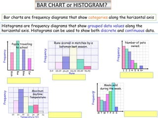
- 1. Histograms are frequency diagrams that show grouped data values along the horizontal axis. Histograms can be used to show both discrete and continuous data. Bar charts are frequency diagrams that show categories along the horizontal axis BAR CHART or HISTOGRAM?
- 2. A bar chart shows the frequency of events occurring. The height of the bar is the frequency. BAR CHARTS
- 3. BAR CHARTS versus HISTOGRAMS Histograms are frequency diagrams that show grouped data values along the horizontal axis. Histograms can be used to show both discrete and continuous data. Bar charts are frequency diagrams that show categories along the horizontal axis
- 5. Key terms: A histogram looks like a bar chart, except the area of the bar, and not the height, shows the frequency of the data. Histograms are typically used when the data is in groups of unequal width. Discrete data = Continuous data information that can only take certain values, information that we collect that can be counted. = data that can take any value. the number of people in a class height temperature test questions answered correctly length
- 6. Histograms for Continuous Data A histogram for continuous data is a frequency diagram that shows part of the number line on the horizontal axis. 0 1 2 3 4 5 6 7 8 9 10 11 12 13 14 15 16 17 18 19 20 …… 5 Frequency Length in cm 4 6 8 10 12 14 10 15 20 Length of Objects Class Interval 4 to 6 This histogram has 5 Class Intervals each of class width 2 Class Interval 10 to 12 Modal Class
- 7. Drawing a Histogram from raw data. The following data show the number of runs scored by an opening batsman during matches last season. 42 34 39 49 62 99 18 24 37 38 59 112 47 72 85 68 53 101 45 12 0 33 42 61 80 30 21 27 56 90 5 35 94 63 75 33 20 44 33 71 Frequency Tally Runs Histograms for Discrete Data When a lot of data needs to be sorted, one of the most efficient ways is to use a frequency table.
- 8. Drawing a Histogram from raw data. The following data show the number of runs scored by an opening batsman during matches last season. 42 34 39 49 62 99 18 24 37 38 59 112 47 72 85 68 53 101 45 12 0 33 42 61 80 30 21 27 56 90 5 35 94 63 75 33 20 44 33 71 Frequency Tally Runs 100 - 119 80 - 99 60 - 79 40 - 59 20 - 39 0 - 19 1. Choose a suitable grouping and display in a frequency table. 2. Complete the frequency table then draw the histogram. 0-19 20-39 40-59 60-79 80-99 100-119 Runs Scored 2 5 7 9 13 4 f 5 10 15 0 Runs scored in matches
- 9. HISTOGRAMS frequency density Class width/ class interval Class width Frequency 0<v≤20 0.3 20<v≤40 40<v≤60 60<v≤80 80<v≤100 20 40 60 0 80 100 0.1 0.2 0.3 0.4 0.5 0.6 0.7 0.8 0.9 Equal class Intervals In a histogram the heights of the bars give the frequency.
- 10. HISTOGRAMS frequency density Class width/ class interval Class width Frequency 0<v≤40 40<v≤60 60<v≤80 80<v≤100 Frequency = frequency density X class width 20 40 60 0 80 100 0.1 0.2 0.3 0.4 0.5 0.6 0.7 0.8 0.9 Unequal class Intervals
- 11. HISTOGRAMS Class width Frequency (Fd x class width) 0<v≤40 40<v≤60 60<v≤80 80<v≤100 Frequency = frequency density X class width
- 12. 20 40 60 0 80 100 10 20 30 40 50 60 80 70 90 100 120 Speed mph frequency density Recorded Speeds of Cars on a Motorway Use the histogram to work out the missing frequencies from the table: Step 1: Remember frequency is not the height of the bar, but the area Area = L x w Frequency = frequency density X class width (speed) Speed frequency density Step 2: Add an extra column in your frequency table, to help
- 13. Class width (Cw) Frequency density (Fd) Frequency (Fd x Cw) 0-30 8 8x30=240 30-40 32 32x10=320 40-50 50-60 60-70 70-80 80-120 Frequency = frequency density X class width
- 14. 20 40 60 0 80 100 10 20 30 40 50 60 80 70 90 100 120 Speed mph frequency density Recorded Speeds of Cars on a Motorway Speed f fd 0 - 30 240 8 30 - 40 320 32 40 - 50 500 50 50 - 60 780 78 60 - 70 960 96 70 - 80 820 82 80 - 120 640 16
- 15. Answer the questions first: 1) What is this graph about? 2) What type of graph is this? Bar chart or histogram? What is the difference? 3) What is on the x- axis? 4) What is on the y-axis? 5) What does 0≤w<20 means? 6) What does frequency means? 7) Is frequency the same as frequency density?
- 16. Class width (Cw) Frequency density (Fd) Frequency (Fd x Cw) 0-20 a= 20-30 b= 30-40 c= 40-60 d= 60-80 e=
- 17. Any questions?
- 18. FREQUENCY POLYGONS Use the frequency polygon to work out an estimate for the mean rounded to 1 dp
- 19. A frequency distribution can be shown using a frequency polygon. 5 Frequency Polygons 5-9 0 10 15 20 10-14 15-19 20-24 25-30 Frequency Marks Test Scores A Frequency Polygon can be drawn onto an existing histogram. 1. Mark the mid - points of each bar at the top with a point. 2. Draw in straight lines connecting points. 3. Extend lines if necessary ½ a class interval beyond first and last bars
- 20. How do you find the mean of a frequency polygon? Step 1: Find the midpoint of each interval. – we already have the midpoints! Step 2: Multiply the frequency of each interval by its mid- point. Step 3: Get the sum of all the frequencies (f) and the sum of all the fx. Divide 'sum of fx' by 'sum of f ' to get the mean.
- 21. How do you find the mean of a frequency polygon? Step 1: Find the midpoint of each interval. – we already have the midpoints! Step 2: Multiply the frequency of each interval by its mid-point. Step 3: Get the sum of all the frequencies (f) and the sum of all the fx. Divide 'sum of fx' by 'sum of f ' to get the mean. ∑(f)= 2+4+.. ∑(fx)= 80+.. Class interval midpoint frequency Frequency x mid-point 40 2 2x40=80 52.5 4 4x52.5 = 65 77.5 90 Calculate the mean: ∑(fx) ÷ ∑(f)=
- 23. a) Frequency Diagram b) Frequency Poligon Step 1: choose a scale for x-axis (Time, in mins) and label the graph Step 2: choose a scale for y-axis (Frequency) and label the graph Step 3: !A frequency diagram shows the frequencies for different groups. To plot a frequency polygon of grouped data, plot the frequency at the midpoint of each group.
- 24. HISTOGRAMS GROUP FREQUENCY TABLES Frequency polygons