This document provides information about pie charts, including:
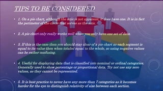
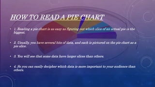
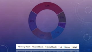
1. It defines a pie chart as a circular chart divided into sectors where the area of each sector represents the size of data categories, with the full circle totaling 360 degrees.
2. Pie charts are useful for showing comparisons of data categories at a glance, with the largest slices indicating the most prevalent categories. Common applications include displaying business metrics, classroom statistics, and household budgets.
3. Pie charts work best for displaying proportional data when the categories total 100% and there are only a few categories for easy visualization. Tips include limiting the number of categories to under seven.


![Presenting-Experimental-Data-Grade-8 [Autosaved].pptx](https://cdn.slidesharecdn.com/ss_thumbnails/presenting-experimental-data-grade-8autosaved-240925105557-9775d0ae-thumbnail.jpg?width=640&height=640&fit=bounds)
![Presenting-Experimental-Data-Grade-8 [Autosaved].pptx](https://cdn.slidesharecdn.com/ss_thumbnails/presenting-experimental-data-grade-8autosaved-240925104859-008a237a-thumbnail.jpg?width=640&height=640&fit=bounds)


![제 23회 보아즈(BOAZ) 빅데이터 컨퍼런스 - [MBOAX] : ABSA를 활용한 소비자 반응 분석 기반 운영 효율화 대시보드 설계](https://cdn.slidesharecdn.com/ss_thumbnails/3-1boaz23rdconferencemboax-260203102709-9d519923-thumbnail.jpg?width=640&height=640&fit=bounds)


