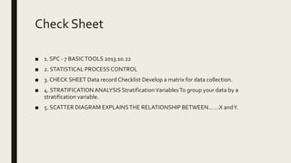
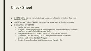
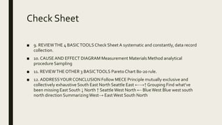
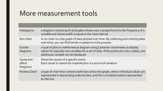
MEASUREMENT
TOOLS
Lesson 13
Check Sheet
■ 1. SPC - 7 BASICTOOLS 2013.10.22
■ 2. STATISTICAL PROCESS CONTROL
■ 3. CHECK SHEET Data record Checklist Develop a matrix for data collection.
■ 4. STRATIFICATIONANALYSIS StratificationVariablesTo group your data by a
stratification variable.
■ 5. SCATTER DIAGRAM EXPLAINSTHE RELATIONSHIP BETWEEN... ...X andY.
Check Sheet
■ 6. HISTOGRAM Normal manufacturing process, normal quality Limitation Data from
difference sources
■ 7. HISTOGRAMVS. BAR GRAPH Histogram Size, shape and the density of interval.
■ 8. CREATING HISTOGRAM
– 1. Collecting input data (n>50).
– 2. Define K (base on sampling size, density of the bin, narrow the interval) Either the
experience or use the formula K=1+3.32*log(n)
– 3. Define I the Range: R=X max – X min i= R/ K (take the odd number)
– 4. Bin range L = X min-(unit/2), U=L+I ...apply to other number, till > X max
– 5. On theTools menu, click Data Analysis.
– 6. In the AnalysisTools box, click Histogram, and then click OK.
Check Sheet
■ 9. REVIEWTHE 4 BASICTOOLSCheck Sheet A systematic and constantly, data record
collection.
■ 10. CAUSEAND EFFECT DIAGRAM Measurement Materials Method analytical
procedure Sampling
■ 11. REVIEWTHE OTHER 3 BASICTOOLS Pareto Chart 80-20 rule.
■ 12. ADDRESSYOUR CONCLUSION Follow MECE Principle mutually exclusive and
collectively exhaustive South East North Seattle East ←→↑ Grouping Find what’ve
been missing East South ↓ North ↑ SeattleWest North ← BlueWest Blue west south
north direction SummarizingWest→ EastWest South North
More measurement tools
Histograms a diagram consisting of rectangles whose area is proportional to the frequency of a
variable and whose width is equal to the class interval.
Run chart A run chart is a line graph of data plotted over time. By collecting and charting data
over time, you can find trends or patterns in the process.
Scatter
diagrams
a type of plot or mathematical diagram usingCartesian coordinates to display
values for typically two variables for a set of data. If the points are color-coded, one
additional variable can be displayed.
Cause and
affect
Diagrams
Show the causes of a specific event.
Each cause or reason for imperfection is a source of variation
Paretos Chart a type of chart that contains both bars and a line graph, where individual values are
represented in descending order by bars, and the cumulative total is represented
by the line.

Lesson13

  • 1.
  • 2.
    Check Sheet ■ 1.SPC - 7 BASICTOOLS 2013.10.22 ■ 2. STATISTICAL PROCESS CONTROL ■ 3. CHECK SHEET Data record Checklist Develop a matrix for data collection. ■ 4. STRATIFICATIONANALYSIS StratificationVariablesTo group your data by a stratification variable. ■ 5. SCATTER DIAGRAM EXPLAINSTHE RELATIONSHIP BETWEEN... ...X andY.
  • 3.
    Check Sheet ■ 6.HISTOGRAM Normal manufacturing process, normal quality Limitation Data from difference sources ■ 7. HISTOGRAMVS. BAR GRAPH Histogram Size, shape and the density of interval. ■ 8. CREATING HISTOGRAM – 1. Collecting input data (n>50). – 2. Define K (base on sampling size, density of the bin, narrow the interval) Either the experience or use the formula K=1+3.32*log(n) – 3. Define I the Range: R=X max – X min i= R/ K (take the odd number) – 4. Bin range L = X min-(unit/2), U=L+I ...apply to other number, till > X max – 5. On theTools menu, click Data Analysis. – 6. In the AnalysisTools box, click Histogram, and then click OK.
  • 4.
    Check Sheet ■ 9.REVIEWTHE 4 BASICTOOLSCheck Sheet A systematic and constantly, data record collection. ■ 10. CAUSEAND EFFECT DIAGRAM Measurement Materials Method analytical procedure Sampling ■ 11. REVIEWTHE OTHER 3 BASICTOOLS Pareto Chart 80-20 rule. ■ 12. ADDRESSYOUR CONCLUSION Follow MECE Principle mutually exclusive and collectively exhaustive South East North Seattle East ←→↑ Grouping Find what’ve been missing East South ↓ North ↑ SeattleWest North ← BlueWest Blue west south north direction SummarizingWest→ EastWest South North
  • 5.
    More measurement tools Histogramsa diagram consisting of rectangles whose area is proportional to the frequency of a variable and whose width is equal to the class interval. Run chart A run chart is a line graph of data plotted over time. By collecting and charting data over time, you can find trends or patterns in the process. Scatter diagrams a type of plot or mathematical diagram usingCartesian coordinates to display values for typically two variables for a set of data. If the points are color-coded, one additional variable can be displayed. Cause and affect Diagrams Show the causes of a specific event. Each cause or reason for imperfection is a source of variation Paretos Chart a type of chart that contains both bars and a line graph, where individual values are represented in descending order by bars, and the cumulative total is represented by the line.