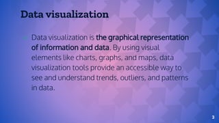
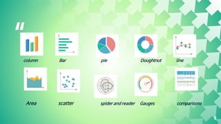
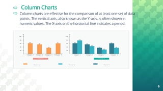
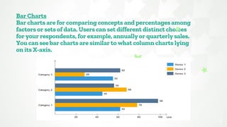
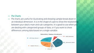
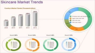
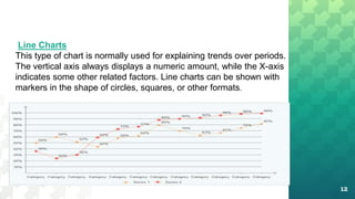
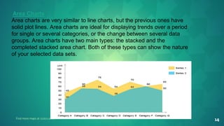
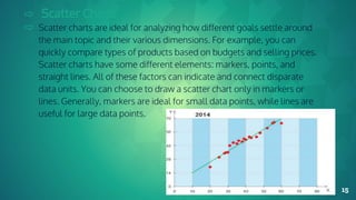
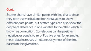
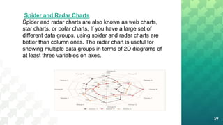
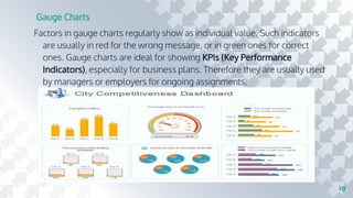
TYPE OF CHART
BY,
B.Sakthibala,
ll-M.sc(cs)
Nadar saraswathi
college of arts&science
Department of CS&IT,
Contents
Types of Charts - Overview
Column Charts
Bar Charts
Pie Charts
Doughnut Charts
Line Charts
Area Charts
Scatter Charts
Spider and Radar Charts
Gauge Charts
Comparison Charts
Data visualization
⇨ Data visualization is the graphical representation
of information and data. By using visual
elements like charts, graphs, and maps, data
visualization tools provide an accessible way to
see and understand trends, outliers, and patterns
in data.
3
Types of Charts - Overview
Generally, the most popular types of charts are column
charts, bar charts, pie charts, doughnut charts, line
charts, area charts, scatter charts, spider (radar)
charts, gauges, and comparison charts. Here is a quick
view of all of these types of charts.
The biggest challenge is how to select the most
effective type of chart for your task.
“
column Bar pie Doughtnut line
Area scatter spider and reader Gauges comparisons
5
⇨ Column Charts
⇨ Column charts are effective for the comparison of at least one set of data
points. The vertical axis, also known as the Y-axis, is often shown in
numeric values. The X-axis on the horizontal line indicates a period.
6
Bar Charts
Bar charts are for comparing concepts and percentages among
factors or sets of data. Users can set different distinct choices
for your respondents, for example, annually or quarterly sales.
You can see bar charts are similar to what column charts lying
on its X-axis.
7
If you are not sure about when to insert a bar chart for
your work, you should think about the specific kind of
your original data and your personal preference.
Usually, compared to other types of charts, bar charts
are better for showing and comparing vast sets of
data or numbers.
cont.,
8
⇨ Pie Charts
⇨ Pie charts are useful for illustrating and showing sample break down in
an individual dimension. It is in the shape of a pie to show the relationship
between your data's main and sub-categories. It is good to use when you
are dealing with categorized groups of data, or if you want to show
differences among data based on a single variable.
.
9
⇨ Doughnut Charts
⇨ Doughnut charts are very similar to pie charts in terms of
the area in the center cut out. Doughnut charts have
several elements, including the division of segments, and
the meaning of arc of an individual section. Doughnut
charts are suitable for presenting the relationship between
the proportions of different data groups. In this case, users
can focus on the proportional areas of the slices.
Doughnuts also cover more details than pie charts via
their blank space.
⇨
10
11
12
Line Charts
This type of chart is normally used for explaining trends over periods.
The vertical axis always displays a numeric amount, while the X-axis
indicates some other related factors. Line charts can be shown with
markers in the shape of circles, squares, or other formats.
cont.,
13
Line charts are not as colorful as other charts, but it is
evident for users to see the trend within a specific
period for a single set of data. Alternatively, you can
compare trends for several different data groups.
Managers or financial leaders may use such charts to
measure and analyze long-term trends in sales,
financial data, or marketing statistics.
14
Find more maps at slidescarniv
Area Charts
Area charts are very similar to line charts, but the previous ones have
solid plot lines. Area charts are ideal for displaying trends over a period
for single or several categories, or the change between several data
groups. Area charts have two main types: the stacked and the
completed stacked area chart. Both of these types can show the nature
of your selected data sets.
⇨ Scatter Charts
⇨ Scatter charts are ideal for analyzing how different goals settle around
the main topic and their various dimensions. For example, you can
quickly compare types of products based on budgets and selling prices.
Scatter charts have some different elements: markers, points, and
straight lines. All of these factors can indicate and connect disparate
data units. You can choose to draw a scatter chart only in markers or
lines. Generally, markers are ideal for small data points, while lines are
useful for large data points.
15
Cont.,
Scatter charts have similar points with line charts since
they both use vertical and horizontal axes to show
different data points, but scatter types can also show the
degree of difference in one variable to the other, which is
known as correlation. Correlations can be positive,
negative, or equals to zero. Positive ones, for example,
mean data increases simultaneously most of the time
based on the given time.
16
17
Spider and Radar Charts
Spider and radar charts are also known as web charts,
star charts, or polar charts. If you have a large set of
different data groups, using spider and radar charts are
better than column ones. The radar chart is useful for
showing multiple data groups in terms of 2D diagrams of
at least three variables on axes.
Cont.,
Human resource (HR) managers usually use the spider or radar
charts for checking the skill pattern of different employee groups
and their career performance. Besides, product managers in IT or
trading organizations can use such charts to compare different
products over a wide range of features, like showing a set of
various smart electrics based on their quality, battery figures,
appearance, and processors. Therefore consumers can easily and
quickly choose the best option based on their preference.
18
Gauge Charts
Factors in gauge charts regularly show as individual value. Such indicators
are usually in red for the wrong message, or in green ones for correct
ones. Gauge charts are ideal for showing KPIs (Key Performance
Indicators), especially for business plans. Therefore they are usually used
by managers or employers for ongoing assignments.
19
⇨ Comparison Charts
⇨ Comparison charts, also known as cluster diagrams, are
typically used to compare between at least two objects, units, or
groups of data. The chart can provide a visual comparison of
both qualitative and quantitative details. There are types of
comparison charts, including comparisons between
components, items, time series, correlations, and distributions
frequency. The primary purpose of comparison charts is to show
an outline of possibilities for different circumferences.
⇨
20
21
22
Cont.,
The uses of comparison diagrams covering
research topics, the decision-making process for
both business and science subjects. For larger
organizations, decision-makers may need an all-
around comparison with rich details to analyze the
progress of different data groups and data from
competitors over time.
Thank you
23

Bigdata

  • 1.
    TYPE OF CHART BY, B.Sakthibala, ll-M.sc(cs) Nadarsaraswathi college of arts&science Department of CS&IT,
  • 2.
    Contents Types of Charts- Overview Column Charts Bar Charts Pie Charts Doughnut Charts Line Charts Area Charts Scatter Charts Spider and Radar Charts Gauge Charts Comparison Charts
  • 3.
    Data visualization ⇨ Datavisualization is the graphical representation of information and data. By using visual elements like charts, graphs, and maps, data visualization tools provide an accessible way to see and understand trends, outliers, and patterns in data. 3
  • 4.
    Types of Charts- Overview Generally, the most popular types of charts are column charts, bar charts, pie charts, doughnut charts, line charts, area charts, scatter charts, spider (radar) charts, gauges, and comparison charts. Here is a quick view of all of these types of charts. The biggest challenge is how to select the most effective type of chart for your task.
  • 5.
    “ column Bar pieDoughtnut line Area scatter spider and reader Gauges comparisons 5
  • 6.
    ⇨ Column Charts ⇨Column charts are effective for the comparison of at least one set of data points. The vertical axis, also known as the Y-axis, is often shown in numeric values. The X-axis on the horizontal line indicates a period. 6
  • 7.
    Bar Charts Bar chartsare for comparing concepts and percentages among factors or sets of data. Users can set different distinct choices for your respondents, for example, annually or quarterly sales. You can see bar charts are similar to what column charts lying on its X-axis. 7
  • 8.
    If you arenot sure about when to insert a bar chart for your work, you should think about the specific kind of your original data and your personal preference. Usually, compared to other types of charts, bar charts are better for showing and comparing vast sets of data or numbers. cont., 8
  • 9.
    ⇨ Pie Charts ⇨Pie charts are useful for illustrating and showing sample break down in an individual dimension. It is in the shape of a pie to show the relationship between your data's main and sub-categories. It is good to use when you are dealing with categorized groups of data, or if you want to show differences among data based on a single variable. . 9
  • 10.
    ⇨ Doughnut Charts ⇨Doughnut charts are very similar to pie charts in terms of the area in the center cut out. Doughnut charts have several elements, including the division of segments, and the meaning of arc of an individual section. Doughnut charts are suitable for presenting the relationship between the proportions of different data groups. In this case, users can focus on the proportional areas of the slices. Doughnuts also cover more details than pie charts via their blank space. ⇨ 10
  • 11.
  • 12.
    12 Line Charts This typeof chart is normally used for explaining trends over periods. The vertical axis always displays a numeric amount, while the X-axis indicates some other related factors. Line charts can be shown with markers in the shape of circles, squares, or other formats.
  • 13.
    cont., 13 Line charts arenot as colorful as other charts, but it is evident for users to see the trend within a specific period for a single set of data. Alternatively, you can compare trends for several different data groups. Managers or financial leaders may use such charts to measure and analyze long-term trends in sales, financial data, or marketing statistics.
  • 14.
    14 Find more mapsat slidescarniv Area Charts Area charts are very similar to line charts, but the previous ones have solid plot lines. Area charts are ideal for displaying trends over a period for single or several categories, or the change between several data groups. Area charts have two main types: the stacked and the completed stacked area chart. Both of these types can show the nature of your selected data sets.
  • 15.
    ⇨ Scatter Charts ⇨Scatter charts are ideal for analyzing how different goals settle around the main topic and their various dimensions. For example, you can quickly compare types of products based on budgets and selling prices. Scatter charts have some different elements: markers, points, and straight lines. All of these factors can indicate and connect disparate data units. You can choose to draw a scatter chart only in markers or lines. Generally, markers are ideal for small data points, while lines are useful for large data points. 15
  • 16.
    Cont., Scatter charts havesimilar points with line charts since they both use vertical and horizontal axes to show different data points, but scatter types can also show the degree of difference in one variable to the other, which is known as correlation. Correlations can be positive, negative, or equals to zero. Positive ones, for example, mean data increases simultaneously most of the time based on the given time. 16
  • 17.
    17 Spider and RadarCharts Spider and radar charts are also known as web charts, star charts, or polar charts. If you have a large set of different data groups, using spider and radar charts are better than column ones. The radar chart is useful for showing multiple data groups in terms of 2D diagrams of at least three variables on axes.
  • 18.
    Cont., Human resource (HR)managers usually use the spider or radar charts for checking the skill pattern of different employee groups and their career performance. Besides, product managers in IT or trading organizations can use such charts to compare different products over a wide range of features, like showing a set of various smart electrics based on their quality, battery figures, appearance, and processors. Therefore consumers can easily and quickly choose the best option based on their preference. 18
  • 19.
    Gauge Charts Factors ingauge charts regularly show as individual value. Such indicators are usually in red for the wrong message, or in green ones for correct ones. Gauge charts are ideal for showing KPIs (Key Performance Indicators), especially for business plans. Therefore they are usually used by managers or employers for ongoing assignments. 19
  • 20.
    ⇨ Comparison Charts ⇨Comparison charts, also known as cluster diagrams, are typically used to compare between at least two objects, units, or groups of data. The chart can provide a visual comparison of both qualitative and quantitative details. There are types of comparison charts, including comparisons between components, items, time series, correlations, and distributions frequency. The primary purpose of comparison charts is to show an outline of possibilities for different circumferences. ⇨ 20
  • 21.
  • 22.
    22 Cont., The uses ofcomparison diagrams covering research topics, the decision-making process for both business and science subjects. For larger organizations, decision-makers may need an all- around comparison with rich details to analyze the progress of different data groups and data from competitors over time.
  • 23.