Download as PDF, PPTX


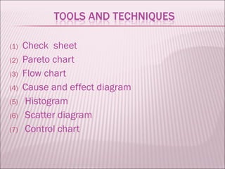


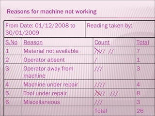


This document discusses various quality control tools used for data collection and analysis including check sheets, Pareto charts, flow charts, cause and effect diagrams, histograms, scatter diagrams, and control charts. It provides examples of how each tool can be used to identify issues, determine root causes, and monitor processes for quality improvement in areas like manufacturing and customer service. The document emphasizes using graphical representations to more easily recognize patterns in data and determine appropriate actions.