Downloaded 153 times
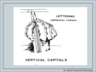
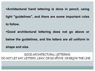
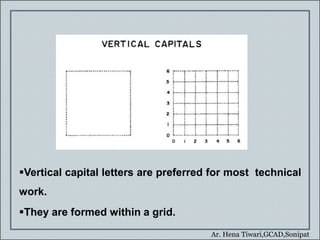
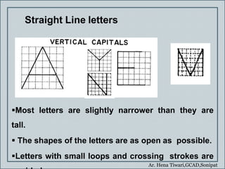
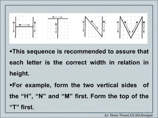
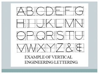
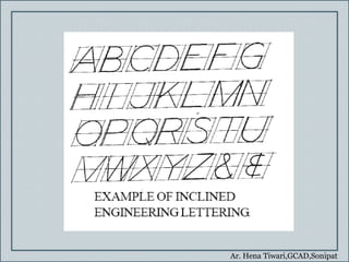
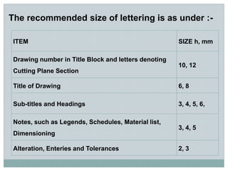
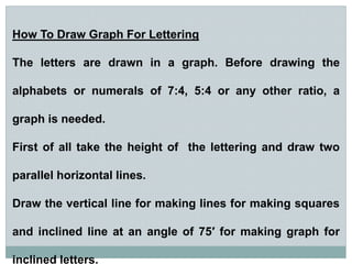
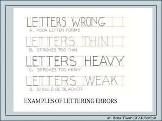
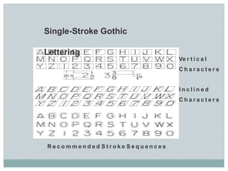


This document provides guidance on lettering for architectural drawings. It discusses that lettering should be clear, legible, uniform in style and size to convey important details on a drawing. It describes single-stroke lettering as the recommended style, which involves vertical or inclined capital letters of uniform width and height. The document also provides tips on pencil grip, freehand lettering techniques, and recommended sizes for different types of text on drawings. Sample letters and numerals are shown to demonstrate proper form within guidelines.


