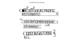
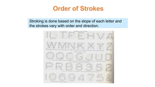
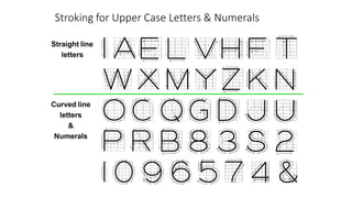
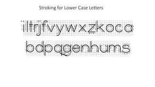
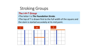
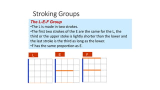
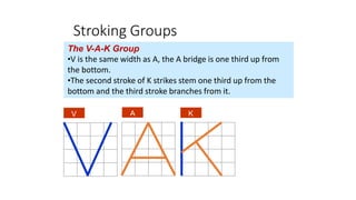
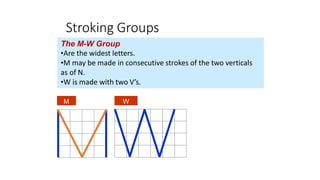
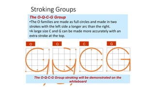
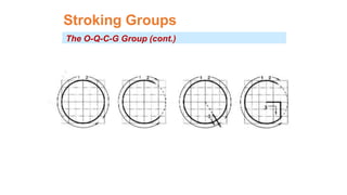
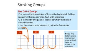
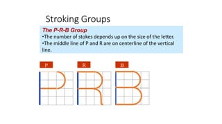
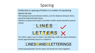
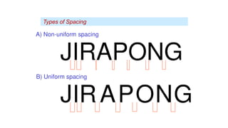
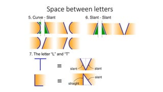
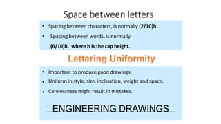
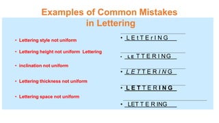
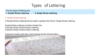
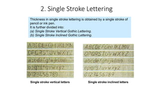
Lettering is an essential element in engineering drawings that provides notes, annotations, and other information in a legible and uniform manner. There are two main types of lettering: double stroke and single stroke. Single stroke lettering is created using a single line and is further divided into vertical and inclined styles. Proper lettering conventions include using all capital letters, uniform size and thickness, and kerning between letters. Guidelines are also important for placement and consistency of lettering. Various lettering groups have standardized stroke orders to improve legibility. Spacing between letters and words must be uniform for readability. Lettering is a key skill for clear technical communication in engineering drawings.
![Conventions for Lettering
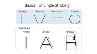
•
•
•
•
•
•
Use all CAPITAL LETTERS.
Use even pressure to draw precise, clean lines.
Use one stroke per line.
Horizontal Stroke are drawn left to right.
Vertical Strokes are drawn downward.
Curved strokes are drawn top to bottom in one continuous stroke on
each side.
Use kerning to eliminate excessive space between letters. –
[kerning refers to adjusting the space between characters, especially by
placing two characters closer together than normal. Kerning makes certain
combinations of letters, such as WA, MW, TA, and VA, look better.]
•](https://image.slidesharecdn.com/week3letteringtechnique-201103061404/85/Lettering-technique-5-320.jpg)