
Recommended
More Related Content
What's hot
What's hot (18)
Viewers also liked
Viewers also liked (17)
Similar to Kerrang analysis
Similar to Kerrang analysis (20)
More from asmediac14
More from asmediac14 (20)
Recently uploaded
Recently uploaded (20)
Kerrang analysis
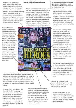
- 1. Masthead is the specific fontand size that is always used on every single Kerrang! magazine, itis at the top of the page as this meets the codes and conventions of a magazine. The masthead clearly indicates thatKerrang is a rock magazine becauseof the format it’s in. The mast head is being slightly covered by a head which shows that Kerrang! Is a well established brand and doesn’t need the whole masthead on show for itto be recognised. The main image shows well known celebrities in the rock scene, such as Kurt Cobain,by usinga medium long shot. These well known artistwill draw in attention to the magazine by appealingto fans of these artists.Itis uses a directmode of address which makes the reader feel involved with the magazine. The main cover lineis bigand bold so it stands out. It’s clearly the main coverlinebecauseit is the largestbitof text, apartfrom the masthead. The word “Heroes” is in block capitalsso this makes is stand out and also itgoes across two hotspots (rule of thirds) so the reader will bedrawn to look there. It denotates that in the magazine there will be an articleabout heroes in the magazine because it is anchoragetext, it also relates to the main image on the front cover as itgives context to the picture, it has connotations thatthe people on the front are heroes. The puff “10 amazing posters” uses the colour scheme (red and yellow) so it links with the rest of the front cover. Itattracts buyers becausethey’ll be getting 10 “free” posters with the magazine and a lot of teenagers liketo have posters in their rooms so this would appeal to them. There is another puff: “Going to university...” this would attractthe older range of the target audienceas the magazine is relatingto their lives.The white and yellow stand out on the red background. The “exclusive”cover linewould drawin the reader because they would feel like they were getting news and gossip before anyone else and this would convincethem to buy the magazineas they want to be up to date with anythingthat is goingon in the rock world. The colour scheme Kerrang uses is red, black and yellow.On nearly every edition the Main cover lineis in yellow because itmakes the words stand out and has a consistenttheme for the magazine. In this edition (the same as many others) the masthead is black a colour which has connotations of rock music which is the genre the magazine focuses on. Kerrang costs £2.20 and this is an appropriatecostbecausethe target audienceis teenagers whose parents are in the working classso they wouldn’t have much money so couldn’t afford an expensive magazine. The bar code is a legal requirement on a magazineand is usually in theright hand corner however Kerrang breaks the codes and conventions as on this magazineits towards the left hand sizeand it’s not at the bottom; it is slightly raised. The issuenumber and date allows the audienceto stay up to date with the magazine and know which edition they are reading. The footer bar is not clearly a bar however atthe bottom you can see that there is more information aboutwhat is in this issueof the magazine. The informal language“what the hell” shows that this is a magazine aimed at teenagers becauseof the languageused. If it was aimed at adults itprobably wouldn’t use the word “hell” on the front cover. The languageused is the sortof thinga “rock star”might say so this would help the reader associate with their rolemodels. The grab quote “These people changed lives” adds more detail to the main cover lineand to the main image. It gives an idea to the reader about why these people are “Rocks greatest heroes” There is a second grab quote “we’ve been throwing beanbags in the car park”would attractthe reader becauseit is not the thing you would expect to read so they would want to buy the magazineand read on becauseit is an interesting cover linewhich are important. Analysis of Music Magazine Kerrang! The target audience for Kerrang! is males aged between 14 and 18, who are a White-British ethnicity and their parents are in the working class.
- 2. The mast head is on the contents page exactly the same as itis on the front cover justsmaller in size.This reminds the target audienceof the name of the magazine, and because the brand is well established itdoesn't matter that the end of the word is covered on the contents page as well as itbeing covered on the front page. Kerrang! Have stuck to the codes and conventions by repeating the issue number and the cover date on the contents page as well as on the front cover. This again allows thereader to make surethat they are readingthe up to date issueof the magazine. The contents page does not includeany social media links which stops the magazine being ableto reach out to their onlineaudience. Kerrang! have broken the codes and conventions of magazines because in most magazines the page numbers are bigger than the text on the contents page but in Kerrang! the page numbers are the same sizeas the titleof the page. The features are, likeNME, grouped under headers which allows the reader to have some routine in their reading and allows Kerrangto have specific types of articles each week. The message from the editor makes the audience feel more involved with the magazine as itgives the magazine a personal touch as though itis justfor them. The photo allows thereader to put a face to a name again makingthe magazinehave a more personal feel. The columns on the contents page are not obvious:there is one clear column on the right hand sidewith the page numbers and an advert for subscribing to Kerrang! On the left there is a larger image and the text underneath is split into two columns.At the bottom the editor’s message is splitinto 3 columns: a photograph in one and the text in two. By splittingthe text it makes it easier and more appealingto read. The main image is promoting a T-shirt the photograph is on a purple background and has a white border around it. It is then in a black box.This image would appeal to the target audienceas it is relatingto a competition that they would be interest in.The other images arethe photo of the editor which gives a personal feel and the pictureof the magazine in the advert. The advert is encouragingthe reader to subscribeto the kerrang. This promotes there magazine so helps with their brandingand also itis a suitableadvert because if the reader is readingthis magazine then they would probably be interested in getting a subscription as it would be cheaper and also get delivered straightto their house instead of them havingto go the shop.It also means that they would never miss an edition. The title of the page (code and convention) tells the reader what the page is set to do – tell the reader what to expect in this edition of Kerrang.
- 3. A code and convention of magazineis to give credit to the person who wrote the articleand to the person who has taken the photos for the article. However Kerrang has not done this in this particulararticle. The headlineof the articleis thelargest text on the page and is bold to draw the reader’s attention to the articleif they are skimmingthrough the magazine italso gives an initial idea of what the articleis about. The main image is the band that the articleis aboutso itgives a visual aid for people to quickly seewhich band it is,italso updates the target audience with the bands visual styleand how each band member looks becauseover their time as a band they have changed their appearancea lot. The middletwo band members use directmode of address,which would attract the audience, and the two on the side are not completely direct but they aren’t indirecteither. None of them aresmiling which could suggest that they take their music very seriously as mostof the target audienceare serious aboutmusic as well they could possibly relateto this. The main image takes up most of the top half of the page and adds a visual appeal to the magazine. The writingis in columns,keeping to the codes and conventions of a magazine, makingit easier to read and more appealingthan a big block of text. Teenagers would find itdifficultto be motivated to read bigblocks of text so it is better that itis in columns. Kerrang does not use a drop capital to visually indicateto the reader that the articlehas begun. A drop capital is a common feature of an articlein a magazine. Kerrang has used a stand firstbut instead of placing it underneath the headlinethey have placed it above the headlinein the middleof the left hand top half. Kerrang have not included a large quote as such but they have included a mini interview on the righthand sideof the page. This changes up the way the text is presented and adds more detail to the articlewithout it getting too long. The page number at the bottom of the page connects the articleto the contents page and allows the magazine to flow. The reader can find the article again easily if they put it down as they will knowwhat page to find iton. The “33 days and still no justicefor pussy riot”would interest the target audiencebecause itkeeps them up to date with what is going on with bands elsewhere in the world and italso gets pussy riot attention and if people didn’tknow what was goingon they would look it up to find out more. “NEWS” shows what ‘category/section’ this articleis in,in this magazine. It shows that this is an articlebased on/uses facts so the reader will be interested and will wantto read this section so that they can keep up to date with news on bands that they like. The word “Album” being the largeston the pager would grab the reader’s attention becausethey would relate the word “album” to new music from the band and if they were a fan of the band then they would want to hear more music and have more released. Usingthe Main Image as the background makes the page look more interesting more appealing.I likethe way that the red hair and the red jacket match with the colour scheme of Kerrang! It makes everything look linked together, italso stands outon the white background colour makingit easier to see and read.