1. This masthead is typically at the top of the page in a large and
bold font making it stand out on the cover and getting the
initial attention of the readers, Furthermore, it is capitals and
the text is in a plain colour that makes it easier to notice,
moreover, creating the magazines brand as it is the same for
each issue and standing out from afar and getting recognized
for it’s masthead.
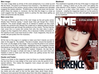
Masthead:Main image:
The main image takes up all the of the cover background, it is a close up and
fills the frame. The photo is of Florence from Florence + The Machine and she
is looking directly at the camera, giving a direct mode of address and ultimately
engaging the readers attention. Furthermore, her eyes look down into the lens
which draws the viewers in, moreover, the fact that the image is a close up
could suggest how the magazine wants to portray the idea about getting up
close and personal with the artists.
Main cover line:
Font/text:
Header and Footer:
Audience:
The main cover line again links to the main image as the pull quote comes
directly from Florence saying “I would never have got though the x factor
auditions” This would straight away be of interest to readers as they could
wonder why someone who already has a label and is releasing albums doubts
that she would even get through the auditions on the x factor. The fact that the
main cover line is a quote and comes from who the main story is about
singles out this magazine from others, this is because it defies convection of
the majority of main cover lines found on other music magazines, they do not
usually use pull quotes from the musicians.
All the text on this page is in capitals to make sure that it stands out and is
clear on the page for the readers. The text is located around the boarder of
this cover, on the edges of the image. This is so that the photo is not covered
up too much by the text, furthermore, highlighting how the magazine brands
themselves as having high quality images that they do not want hide, they rely
on the image to attract the attention of readers. However, the text that is
displayed on the page is simple and easy to read with any cover lines and
headers in bold to make sure that they stand out, getting across the most
important information.
There is no footer to this magazine cover but there is a header highlighting
the fact that this is a new design of the cover and is only the second of ten
special editions. This makes the magazine more unique and seem more
valuable to readers.
The audience for this magazine is people who enjoy listening to music from
the charts and who want to find out the latest news about these artists,
finding out more personal information about them that other magazine do not.
2. Masthead: Main image:
Main cover line:
Audience:
The masthead is at the top of the page against a block
of black colour making the text stand out to the readers.
The font is unique and the colours link with the rock
genre, furthermore even though it is behind the main
image is still stands out to the readers. Also the same
masthead is found on each issue creating the
magazines brand.
The main image is of a band who all have a direct mode of address looking into the
camera lens, ultimately making the magazine seem more personal to the readers,
as though they are looking directly at them. The image overlaps over the masthead
highlighting how the producers of the magazine are confidence that readers will still
be able to recognise the magazine and how the image it is an important part to the
cover. Similarly, linking to how the magazine focuses on readers who know the
musicians which feature, alienating readers who do not know who they are. The
facial expression and body language of the band members creates a rebellious
persona as they present attitude, this links in with the ‘rock’ genre meeting the
stereotypical assumptions and the branding of the magazine.
Font/text:
Header and Footer:
The main cover line of this magazine is ‘The return of My Chemical Romance’ it is
extremely vibrant , looking dominant and standout out to readers with its bright
colour, yellow and red colour. The colour scheme is used throughout the rest of the
text and is part of the overall theme. Furthermore, this could link to how the
magazine wants to portray the return as exciting through the use of colour and it
makes it clear that it is the main story in the magazine. As a whole the cover line is
very bold and “in your face” making sure that it is noticed from afar and amongst
over magazines. The connection between the main cover line and main image
highlights a frequent norm found on music magazine covers.
The flasher found between the main image and the masthead is used to make the
magazine more unique highlighting how it is a world exclusive. Overall, this makes it
seem packed with unique and entertaining information that no other magazines
would have.
Flasher:
Depending on how important the story is the text size changes, however all text on
the page is in capitals and bold making sure that it is all seen. A variation of colour
has been used for the different text and stories but it is mostly yellow, red, black and
white, these are all bold colours which stand out. Furthermore, the colour of the text
links with the genre of music being loud and distinctive.
The header at the top of the page displays another story which is found inside and
the footer has been used to announce what other bands and artists that will feature
in the magazine. Against a yellow block of colour it guarantees makes sure they are
noticed.
This cover targets the audience of people who love
‘rock’ music and rock bands so want to find out more
about them and where they will be playing.
3. Masthead:
Main image:
Strapline:
Main cover line:
Audience:
This masthead is found at the top of the page, supporting music magazine
conventions, it is very formal and is written in an elegant font. The style targets an
older audience and creates a serious branding personality. The image slightly
overlaps the masthead however, it is made sure it is still clear and readable. Overall
the masthead looks very professional and elegant .
The image of Pierre-Laurent Aimard takes up the whole of the cover with just text
overlapping it. The image is very calming and peaceful reflecting on the music genre
of classical music. Furthermore, it is a very formal image with Pierre-Laurent
dressed smartly and his body language demonstrates confidence but gives a laid
back feel to the magazine. However, there is no direct mode of address as he is
looking away from the camera looking into the distance, this could engage readers
as they wonder what he’s looking at or thinking about. On the other hand, this also
defies convention of other music magazine covers as they mostly have direct modes
of address with the model looking at the camera. The image links with the magazine
brand as it simplistic and may be considered old fashioned, this relates to fact that
classical music is an old genre of music.
The main cover line of this magazine cover is ‘Pierre-Laurent Aimard French
revolution at Aldeburgh’ this cover line links with the main image as it is of the
musician. The text again is simple in a plain white colour, creating a sophisticated
presentation, this makes sure that it appeals to the target audience. Furthermore,
the writing may be seen as complicated, using words that not everyone would
understand, aiming it at mature and educated readers.
Font/Text:
Most of the larger text on this page is in a formal sophisticated font, making sure that
it stands out to the readers but is clear and easy to read. The text is all spread out
on the cover so that it is not over crowded and overlapping with each other.
Similarly, it is easy on the eye for older readers. The same colours have been used
all over the page, keeping to white and baby blue, these are mellow colours which
aren’t too bright. The magazine brand has directed for quality and having a
professional cover, not to compete against over music magazines to stand out, this
highlight how the magazine trusts that it’s targeted readers with look for it.The audience for this magazine would probably be
older people who enjoy knowing the whereabouts of
classical musicians and what they are doing. It is aimed
towards more educated readers who will take the time
to notice and read all it’s features.
Genre: Classical
The strapline is very small and not very noticeable, it also is a boring description of
the magazine, not being very imaginative and unique. Summarising how the whole
cover is kept simple.