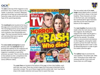
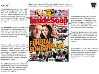
This document analyzes the cover of a soap opera magazine. It discusses several design elements used on the cover to attract readers' attention and build hype for upcoming episodes. These include a prominent date, red masthead, central images of characters involved in an advertised story, headlines using words like "bombshells" and "crash" to leave readers on a cliffhanger, and cover lines with images and text for additional stories. The analysis suggests these elements are intended to entice readers to learn more secrets and stories from their favorite soap operas in the magazine.