
Recommended
More Related Content
What's hot
What's hot (20)
Viewers also liked
Viewers also liked (20)
Similar to Analysis of kerrang
Similar to Analysis of kerrang (20)
Recently uploaded
Recently uploaded (13)
Analysis of kerrang
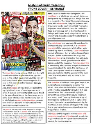
- 1. Analysis of music magazine – FRONT COVER – ‘KERRANG!’ KERRANG! is a weekly music magazine. The masthead is of a bold red font, which stands out being at the top of the page. It is a large font and is in the centre. They keep this the same in every issue which brands the company (makes it well known and can be easily identified). This is also important because in this case, the celebrities head is covering up part of the masthead, but being a well known music magazine – it is easy to identify and doesn’t necessarily matter that it is partially covered up. The main image is of a very well known band in the rock industry – Linkin Park. It is a medium long shot of the two artists, which allows us to see the top half of their body.. Cover lines follow the rule of thirds as they are placed in significant hotspots on the front cover of the magazine. The cover lines are a strong clear font with quite vibrant colours which go well with the white background of the magazine. The main cover line is mentioning who the main image is to show the magazine is about the band. The significance of them covering their mouth and making quiet gestures also links into the question in the main cover line which would be a hot topic in the magazine. The issue date, being January 2012, is at the right hand corner of the front cover at the top. It is easy to find and all issue dates would be here on each magazine so when they are organise, it is easy to flick through to find the issue date you are looking for. Also, the barcode is below the issue date at the top right hand corner of the magazines front cover. It is also a convenient place because it isn't in the way of anything on the front cover, and it is in a place where people would usually look for it. It is following codes and conventions because both the issue date and the barcode are in the same place on every magazine. The strap line of the front cover gives more of an insight of what the magazine contains. This allows the audience to briefly find out what they will be reading about before they buy it. It also uses different font colours which highlight certain things to make them sound important and a must read. The strap line is at the top of the magazine front cover which is a place that attracts the readers attention because it by the masthead. It also consists of images in the strap line to give a visual representation of what the The genre of the magazine is rock. It appeals to a target magazine has to offer. audience of the ages 16-25. Gender wise, it would typically be attractive to males, however some females may find interest in it if they enjoy rock, especially the band – Linkin Park. I would say that all ethnicities would be interested in this magazine, maybe more English people as rock is very common in the UK and Kerrang is a UK magazine. The layout of the magazine follows codes and conventions and rule of thirds which brands the magazine because the layout is similar for each issue of the music magazine.
- 2. Analysis of music magazine – CONTENTS– ‘KERRANG!’ The contents page of Kerrang is very busy containing multiple images, being the main image slightly off centred near the middle of the page with limited white space background due to the many things going on on the contents page. Them main image is an extreme long shot allowing the audience to see what is going on the image, especially as there are multiple people present in the image. The colour scheme of the contents page is the same as the front cover of the magazine, mainly using red, white and black. This is branding the magazine as people would identify what magazine it is by the colours used in the layout of the magazine in each issue. Still with the colour scheme, the masthead stays the same colour throughout each magazine front cover, and the contents pages. (the masthead stays with the colours red, white and black, the contents title stays these colours) By doing this, it is branding the magazine due to being identified easily, which would allow people to identify the magazine due to the colours continuously used. The magazine features are ordered in a list at the right side of the contents page. This gives the readers a guidance of where to find specific features of the magazine. It is also arranged so it is easy to find the article you are looking for. The issue date is present on the contents being at the very top along the strap containing the title on the right. This is following codes and conventions and this would also be laid out here on every issue to make it easier to organise the magazines in issue order. There are nine articles presented on the contents page which lures the reader to wanting to buy the magazine as it is not giving anything away and is only presenting the main feature articles to show the main things talked about in the magazine. Then there is a brief drop list of what consists in the articles. The feature article is paired with the main image, being the largest image on the contents page. The main cover line which is the part in the middle of the main image, links to the main image itself. Again this is showing that the magazine is partly about Linkin Park, and it gives the reader a small insight into the main article about the celebrity. The target audience of the magazine (previously said being 12-25 years old) applies to this contents page as well as the people used in the contents page would be most appropriate fro people aged 16 and over. I don’t think these pictures would appeal to many people over the age of 25, as the people seem to be dancing and clubbing, and they are having fun and messing around. I think people over 25 may feel like they are being immature and therefore may be put off by the actions of the people in the contents page.
- 3. Analysis of music magazine – DOUBLE PAGE– ‘KERRANG!’ The main image in the article fills a whole page of the magazine (over half of the double page spread). This shows that the image is very important and dominating in this article. It also shows who the article is about, and the seriousness of their faces and body language symbolises the seriousness of what the article is about. The main image is a clear image to show the 5 men. It looks like the image has a filter on it to make it look rugged and old. This makes it look vintage and original. The clothes the men are wearing also links into the theme of vintage which makes him look appealing to the target audience, however they are wearing fairly modern clothes to represent they are a modern band. Lighting is used to brighten and enhance the definition of the 5 men to make the main image look more professional. This created mise en scene. The colour scheme is consistent throughout the double page spread of the article, consisting of the classic red, white and black. This makes the magazine look professional and all together with the layout being simple too. There is not too much going on on the page so there is not an overload of information, and the image is large to dominate the double page, going with the information about them. The page number is presented on every page of the magazine or every other page. This helps the reader to navigate through the magazine, especially how on the contents page, page numbers are used to tell you where to look for a specific article. The masthead of this article is bold and eye catching. The black colour contrasts with the background of the article. This helps to emphasise it and make it stand out. Also, the font is square and bold, which is similar to the other fonts on the pages, which again makes it stand out more. The font of the title makes it seem quite masculine, which suggests that this specific article is aimed at males. It also links into the target audience in terms of the gender. Mainly boys would reads this magazine. The layout of the double page spread of the article is professional and well laid out. They have put the information into three columns which organises the information which also makes it look better, as it isn't all in just one big paragraph. The subheading of this article outlines what is included in the information given. The subheading links to the main image of the band, Linkin Park. This is because it says that they essentially don’t want to create music they have already simillarly done, and the article…. speaks about how they like to change up their music to make it different every time.