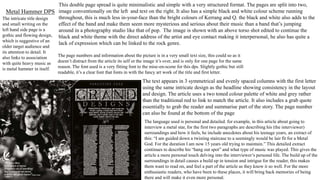
SlideShare a Scribd company logo
1 of 8
In this contents page it also includes the
magazine logo/masthead in the boldest font
so it is clear. Beneath the masthead is also
cities of where some iconic music is made.
Mojo is aimed at an older demographic which is why it uses quite a simple colour palette of
grey, black and gold which are quite muted and not too bright, but still includes a touch of
colour so it is not completely dull.
Like most magazines it also separates main
articles by using a bold font appealing to the
reader then explains in a smaller font
underneath so the reader can decide whether
its what they want to read. The cover story at
the bottom of the page is also sectioned off
making it stand out and emphasises that it is
the main article with a longer breakdown, but
remains in the same font maintaining
consistency.
At the bottom of the article there is also a pull
quote included which is designed to draw readers
in by it being in a different font and separated from
the main body of the text. The quote also gives a
personal account as it from an artist and could
appeal to their fans.
Another convention is the inclusion of
the date and issue number this allows
collectors to keep up to date and collect
their magazine, it also indicates how
successful the magazine is and for how
long it has been publishing emphasising
authenticity.
In the image the artist also takes up a
proportion of the cover from the left hand
side at a high angle with direct address as
he looks directly at the audience adding to
intimacy and attracting the readers
attention. This image is also shot using high
key lighting and quite smart/casual clothing
to appeal to an older fan base. The mise-
en-scene also stands out amongst the
house style colours as red is quite bright
and draws the eyes of the reader
Mojo Contents Page
Conventionally includes the magazines logo/masthead,
issue number and date.
The image takes up quite a large proportion of the page with a
single artist, wearing conventional black clothing to suit the
genre
The informative text is placed on the left making it
easy to follow with page numbers and is laid out in
columns quite formally. The colours used for text is
white and pink in this issue however the white
remains a staple colour throughout the magazine as
I have seen in a few of there other contents pages.
The text used also remains the same font
adding to consistency of the magazine,
however the band names appear bigger
with a small bit about what the article
consists of making it easier to locate
articles.
It also includes a quote from the artist possibly appealing to fans and
indicating what the article could be about.
The image is also shot using quite high key lighting with the
artist not conventionally staring directly at the audience with a
mid torso shot.
The colour choice and mise-en-scene used indicates the magazine
is for a younger fan base as it uses brighter colours than ones
from older magazines like mojo which use a more muted palette.
Rock Sound Contents Page
Classic Rock Contents Page In this classic rock contents page the image
is the focal point taking up three quarters
on the page. This image was taken using long
shot to capture all of the members. Editing
of the image is related to the dusty brown
imagery associated with the classic rock
style and the lack of saturation/colour. The
editing of the image can also connote that
the band are quite well known or have been
around for a long time. The whole appearance
of the image is quite minimalistic with its
muted colour palette and lack of emotion
which can be linked to the rock genre.
The colour scheme is also quite
minimal sticking to consistently
used colours in the rock genre of
white, black and red which
compliment each other well.
Other conventions which can be
found in this example are the
issue number and date the issue
was released. It also includes
columned text and page numbers
to make it easy for the reader
to navigate through the
magazine.
The text in the contents page
appears quite uniformed sticking
to a specific and classic font
style referring to the magazines
selling point. Comparing this to
the likes of Kerrang’s house
style it is very minimal whereas
Kerrang is quite chaotic,
appealing to a younger
demographic.
The article heading is strategically
placed in the centre of the page towards
the top using a different font to appeal
to the reader and is an important part
of the article used to attract the
readers attention.
Unlike other magazines the masthead
‘Classic Rock’ appears in a smaller
font than the subheading subverting to
typical conventions. It also appears
along the boarder in the colour black
making it hard to tell what magazine you
are reading and other text appears in
black as well.
Metal Hammer Contents PageLike most other music magazines the
masthead appears quite boldly on the
contents page so people are aware of
what the are reading and the ‘contents’
below it as well as release date and issue
number all aligned.
The main body of the text appears
on the left hand side of the page in
a columned format. Using a
conventional colour palette of
black white and red as these are
often associated with the rock
genre. The font used is quite old
fashioned and appears with page
numbers helping direct the
reader to key elements within the
magazine.
On the right hand side of the page there are
a line of images related to the articles
within the magazine and the pages they can
be found on. This helps breakup the text and
appeal to people visually indicating what
the article is based on. They have also
chosen to include the front cover of the
issue amongst the images.
On some contents pages they may also
include an interpersonal message from
the editor appealing to the reader and
including them. This can be found on the
far right hand side using white and red
font on a black background to help it
stand out, it also includes a signature
which may hold sentimental value to the
reader.
This contents page also includes buttons
like most front covers to try and coax the
reader by offering them something
related to the issue and selling it. As far
as layout is concerned it is chaotic
compared to the likes of Mojo and the
previous Classic Rock ones I have looked
at.
Metal Hammer DPS
This double page spread is quite minimalistic and simple with a very structured format. The pages are split into two,
image conventionally on the left and text on the right. It also has a simple black and white colour scheme running
throughout, this is much less in-your-face than the bright colours of Kerrang and Q. the black and white also adds to the
effect of the band and make them seem more mysterious and serious about their music than a band that’s jumping
around in a photography studio like that of pop. The image is shown with an above torso shot edited to continue the
black and white theme with the direct address of the artist and eye contact making it interpersonal, he also has quite a
lack of expression which can be linked to the rock genre.
The intricate title design
and small writing on the
left hand side page is a
gothic and flowing design,
which is suggestive of an
older target audience and
its attention to detail. It
also links to association
with quite heavy music as
is metal hammer in itself.
The page numbers and information about the picture is in a very small text size, this could so as it
doesn’t distract from the article its self or the image it’s over, and is only for one page for the same
reason. The font used is a very fitting font to the mise-en-scene for this dps. Slightly gothic but still
readable, it’s a clear font that fonts in with the fancy art work of the title and first letter.
The text appears in 3 symmetrical and evenly spaced columns with the first letter
using the same intricate design as the headline showing consistency in the layout
and design. The article uses a two toned colour palette of white and grey rather
than the traditional red to link to match the article. It also includes a grab quote
essentially to grab the reader and summarise part of the story. The page number
can also be found at the bottom of the page
The language used is personal and detailed. for example, in this article about going to
interview a metal star, for the first two paragraphs are describing his (the interviewer)
surroundings and how it feels, he include anecdotes about his teenage years, an extract of
this: “I am guided down a twisting staircase to a seemingly would be lair fit for a Metal
God. For the duration I am now 15 years old trying to maintain.” This detailed extract
continues to describe his “hang out spot” and what type of music was played. This gives the
article a more personal touch delving into the interviewer’s personal life. The build up of the
surroundings in detail causes a build up in tension and intrigue for the reader, this makes
them want to read on, and feel a part of the article as they know it so well. For the more
enthusiastic readers, who have been to these places, it will bring back memories of being
there and will make it even more personal.
Rock sound DPS
For this Dps they have also put an image on the left hand side and the
text on the right hand side as it is convenient for the reader. The image
uses colour which subverts to usual conventions of rock as they are
commonly black and white or muted. The image is taken in long shot so
it fits in all the members and quite playful compared to other images in
this genre.
It uses the conventional colour palette of black, red and white and
maintains three main columns for the text with a grab quote showing
in bigger font giving an idea of the artists views.
The headline is conventionally the biggest font to appear on the page with a thick red box under it so it
stands out which can be linked to the band as they are known for chaotic performances and the running of
the box could connote that as it isn’t solid and straight. The font used particularly on ‘s’ appears shattered
also relating to the genre and its violent stereotypes.
The box sectioned off below the title is also in a different box making it stand out and
the bands name appears in a bold white standing out even further.
Like many other dps’s the text s started using a drop capital often used to gain the readers attention and
get them to read the article which is shown in an ordered and consistent format.
Here is a classic rock dps. Unconventionally the image takes up
approximately 75% of the page for the right hand side unlike most
where the image is on the right hand side. The band name
‘audioslave’ appears t the top of the page separated from all other
text in a small orange font.
The headline slave to the rhythm appears in a differentstyle font to grab the
readersattentionbut I one not as bold as it is quite thin with slave being a bigger
font to purposely to get the readers attentionand them to read into the article. Like
a few of the other dps’s I have looked at this one also containsa drop capitalin a
thick bold font and is one chunk of text in a single column.
The design is quite minimalistic sticking to an old fashionedlooking
style of photographyand the classic rocks dusty brown house style.
The image appearsto look quite serious and as though it is taken in a
hidden space drawing suspense and intriguingthe reader.
The masthead ‘classic rock’appears at the bottom of the
articleby each page number remainingquite subtle unlike
other brands which may have bolder and more visible
mastheads. This article style also uses minimal colour
straying away from typicallyassociatedrock colourslike red
and white, keeping it muted with blackand a pop of green
and orange.
The uses an unconventional colour of orange to substitute with the more common red, white and black colour
scheme. The words ‘In Good Health’ contrast with Pete Doherty in general, this is ironic as Pete doesn’t have great
health which is shown by him holding a beer and not looking his best, like he’s been out with the lads wearing quite
neutral clothing and minimal facial expressions. Like in other dps’s there are three main columns involving the
article on the right hand side and the image on the left hand side. I think this DPS is effective because of the image,
the colour scheme and the article just looks interesting. I like the layout and think it looks interesting and jumbled
up like Pete himself. This DPS does appeal to it’s target audience of indie rock as Pete is a main feature in this genre,
even though he isn’t necessarily known as a role model and he is part of the stereotypical rock culture of today.
The article appears structures quite well with a torso and above shot
and to break up the large chunk of text they have used a bold orange
drop capital maintaining consistency with the colour palette of black,
white and orange. The also use a grab quote to break up the text and
draw the readers attention as these usually consist of something the
artist is saying relating to them.
They also include a small picture below the last
paragraph of text and a small caption as well as page
numbers.

More Related Content

What's hot

Deconstructions
DeconstructionsDeconstructions
Deconstructionsspidergap
 
Presentation1
Presentation1Presentation1
Presentation1spidergap
 
Detailed analysis of a music magazine
Detailed analysis of a music magazineDetailed analysis of a music magazine
Detailed analysis of a music magazineayreslou
 
Task 2 - Detailed Analysis of Music Magazines
Task 2 - Detailed Analysis of Music MagazinesTask 2 - Detailed Analysis of Music Magazines
Task 2 - Detailed Analysis of Music Magazinesayreslou
 
Mojo magazine analysis
Mojo magazine analysisMojo magazine analysis
Mojo magazine analysisLittlePainter
 
NME Music magazine analysis
NME Music magazine analysisNME Music magazine analysis
NME Music magazine analysisNajat Hachem
 
Analysing music magazines tasks 1,2,3
Analysing music magazines tasks 1,2,3Analysing music magazines tasks 1,2,3
Analysing music magazines tasks 1,2,3asmediag13
 
Mojo magazine analysis
Mojo magazine analysis Mojo magazine analysis
Mojo magazine analysis Najat Hachem
 
Cover and contents page analysis
Cover and contents page analysisCover and contents page analysis
Cover and contents page analysisjevans_1
 
NME analysis
NME analysisNME analysis
NME analysisbeckyt95
 
Magazine contents page deconstructions
Magazine contents page deconstructionsMagazine contents page deconstructions
Magazine contents page deconstructionsljones1897
 
My analysis of 4 Contents Pages
My analysis of 4 Contents PagesMy analysis of 4 Contents Pages
My analysis of 4 Contents PagesKieran Hadfield
 
Double Page Spread Analyses
Double Page Spread AnalysesDouble Page Spread Analyses
Double Page Spread AnalysesKieran Hadfield
 

What's hot (16)

Deconstructions
DeconstructionsDeconstructions
Deconstructions
 
Presentation1
Presentation1Presentation1
Presentation1
 
Detailed analysis of a music magazine
Detailed analysis of a music magazineDetailed analysis of a music magazine
Detailed analysis of a music magazine
 
Classic Rock
Classic Rock Classic Rock
Classic Rock
 
Task 2 - Detailed Analysis of Music Magazines
Task 2 - Detailed Analysis of Music MagazinesTask 2 - Detailed Analysis of Music Magazines
Task 2 - Detailed Analysis of Music Magazines
 
Mojo magazine analysis
Mojo magazine analysisMojo magazine analysis
Mojo magazine analysis
 
NME Music magazine analysis
NME Music magazine analysisNME Music magazine analysis
NME Music magazine analysis
 
Analysing music magazines tasks 1,2,3
Analysing music magazines tasks 1,2,3Analysing music magazines tasks 1,2,3
Analysing music magazines tasks 1,2,3
 
Mojo magazine analysis
Mojo magazine analysis Mojo magazine analysis
Mojo magazine analysis
 
Cover and contents page analysis
Cover and contents page analysisCover and contents page analysis
Cover and contents page analysis
 
NME analysis
NME analysisNME analysis
NME analysis
 
Magazine contents page deconstructions
Magazine contents page deconstructionsMagazine contents page deconstructions
Magazine contents page deconstructions
 
My analysis of 4 Contents Pages
My analysis of 4 Contents PagesMy analysis of 4 Contents Pages
My analysis of 4 Contents Pages
 
Front Covers
Front CoversFront Covers
Front Covers
 
Double Page Spread Analyses
Double Page Spread AnalysesDouble Page Spread Analyses
Double Page Spread Analyses
 
Analysis of Double Page Spread
Analysis of Double Page SpreadAnalysis of Double Page Spread
Analysis of Double Page Spread
 

Similar to Media contents and dps analysis

Magazine covers
Magazine coversMagazine covers
Magazine coversrj5453
 
Tasks 1 4 and hwk 1
Tasks 1 4 and hwk 1Tasks 1 4 and hwk 1
Tasks 1 4 and hwk 1charlie__1
 
Analysis of Contents Pages
Analysis of Contents PagesAnalysis of Contents Pages
Analysis of Contents PagesLterry95
 
Analysis of Contents Pages
Analysis of Contents PagesAnalysis of Contents Pages
Analysis of Contents PagesLterry95
 
Kerrang Magazine Deconstruction
Kerrang Magazine Deconstruction Kerrang Magazine Deconstruction
Kerrang Magazine Deconstruction bethhupchurchh
 
Tasks 1 4 and hwk 2
Tasks 1 4 and hwk 2Tasks 1 4 and hwk 2
Tasks 1 4 and hwk 2charlie__97
 
Music mag analysis
Music mag analysisMusic mag analysis
Music mag analysiskellyanb
 
Music Magazine Research
Music Magazine ResearchMusic Magazine Research
Music Magazine ResearchOccy Occomore
 
Analysis of three magazines (3)
Analysis of three magazines (3)Analysis of three magazines (3)
Analysis of three magazines (3)domingochristal
 
Tasks 1, 2 & 3 music magazine covers powerpoint
Tasks 1, 2 & 3 music magazine covers powerpointTasks 1, 2 & 3 music magazine covers powerpoint
Tasks 1, 2 & 3 music magazine covers powerpointlindseyberrill
 
Magazine anaylisis
Magazine anaylisisMagazine anaylisis
Magazine anaylisissineadjen
 
Magazine anaylisis
Magazine anaylisisMagazine anaylisis
Magazine anaylisissineadjen
 
Front cover analysis, kerrang!, mojo, q
Front cover analysis, kerrang!, mojo, qFront cover analysis, kerrang!, mojo, q
Front cover analysis, kerrang!, mojo, qAnthonyTeazdale
 
Music magazines annotation
Music magazines annotationMusic magazines annotation
Music magazines annotationLukeBrazierMedia
 
Media Evaluation - Quuestion 1
Media Evaluation - Quuestion 1Media Evaluation - Quuestion 1
Media Evaluation - Quuestion 1KatyBB1997
 
Market research on the pop and rock music genre
Market research on the pop and rock music genreMarket research on the pop and rock music genre
Market research on the pop and rock music genreivelinaemilova
 

Similar to Media contents and dps analysis (20)

Magazine covers
Magazine coversMagazine covers
Magazine covers
 
Tasks 1 4 and hwk 1
Tasks 1 4 and hwk 1Tasks 1 4 and hwk 1
Tasks 1 4 and hwk 1
 
Analysis of Contents Pages
Analysis of Contents PagesAnalysis of Contents Pages
Analysis of Contents Pages
 
Analysis of Contents Pages
Analysis of Contents PagesAnalysis of Contents Pages
Analysis of Contents Pages
 
Kerrang Magazine Deconstruction
Kerrang Magazine Deconstruction Kerrang Magazine Deconstruction
Kerrang Magazine Deconstruction
 
Media magaine analysis
Media magaine analysisMedia magaine analysis
Media magaine analysis
 
Tasks 1 4 and hwk 2
Tasks 1 4 and hwk 2Tasks 1 4 and hwk 2
Tasks 1 4 and hwk 2
 
Music mag analysis
Music mag analysisMusic mag analysis
Music mag analysis
 
Music Magazine Research
Music Magazine ResearchMusic Magazine Research
Music Magazine Research
 
Question 1
Question 1Question 1
Question 1
 
Analysis of three magazines (3)
Analysis of three magazines (3)Analysis of three magazines (3)
Analysis of three magazines (3)
 
Tasks 1, 2 & 3 music magazine covers powerpoint
Tasks 1, 2 & 3 music magazine covers powerpointTasks 1, 2 & 3 music magazine covers powerpoint
Tasks 1, 2 & 3 music magazine covers powerpoint
 
Magazine anaylisis
Magazine anaylisisMagazine anaylisis
Magazine anaylisis
 
Magazine anaylisis
Magazine anaylisisMagazine anaylisis
Magazine anaylisis
 
Front cover analysis, kerrang!, mojo, q
Front cover analysis, kerrang!, mojo, qFront cover analysis, kerrang!, mojo, q
Front cover analysis, kerrang!, mojo, q
 
Med
MedMed
Med
 
Music magazines annotation
Music magazines annotationMusic magazines annotation
Music magazines annotation
 
Media Evaluation - Quuestion 1
Media Evaluation - Quuestion 1Media Evaluation - Quuestion 1
Media Evaluation - Quuestion 1
 
Market research
Market researchMarket research
Market research
 
Market research on the pop and rock music genre
Market research on the pop and rock music genreMarket research on the pop and rock music genre
Market research on the pop and rock music genre
 

Recently uploaded

Discover Ardency Elite: Elevate Your Lifestyle
Discover Ardency Elite: Elevate Your LifestyleDiscover Ardency Elite: Elevate Your Lifestyle
Discover Ardency Elite: Elevate Your LifestyleMy Heart Throw Pillow
 
[Expert Panel] New Google Shopping Ads Strategies Uncovered
[Expert Panel] New Google Shopping Ads Strategies Uncovered[Expert Panel] New Google Shopping Ads Strategies Uncovered
[Expert Panel] New Google Shopping Ads Strategies UncoveredSearch Engine Journal
 
Crypto Quantum Leap - Digital - membership area
Crypto Quantum Leap -  Digital - membership areaCrypto Quantum Leap -  Digital - membership area
Crypto Quantum Leap - Digital - membership areajaynee G
 
Abortion Clinic in Alberton +27791653574 WhatsApp Abortion Clinic Services in...
Abortion Clinic in Alberton +27791653574 WhatsApp Abortion Clinic Services in...Abortion Clinic in Alberton +27791653574 WhatsApp Abortion Clinic Services in...
Abortion Clinic in Alberton +27791653574 WhatsApp Abortion Clinic Services in...mikehavy0
 
SP Search Term Data Optimization Template.pdf
SP Search Term Data Optimization Template.pdfSP Search Term Data Optimization Template.pdf
SP Search Term Data Optimization Template.pdfPauleneNicoleLapira
 
Aiizennxqc Digital Marketing | SEO & SMM
Aiizennxqc Digital Marketing | SEO & SMMAiizennxqc Digital Marketing | SEO & SMM
Aiizennxqc Digital Marketing | SEO & SMMaiizennxqc
 
Iranian Strikes on Israel Assessing the Impact and Implications.pptx
Iranian Strikes on Israel  Assessing the Impact and Implications.pptxIranian Strikes on Israel  Assessing the Impact and Implications.pptx
Iranian Strikes on Israel Assessing the Impact and Implications.pptxelizabethella096
 
The seven principles of persuasion by Dr. Robert Cialdini
The seven principles of persuasion by Dr. Robert CialdiniThe seven principles of persuasion by Dr. Robert Cialdini
The seven principles of persuasion by Dr. Robert CialdiniSurya Prasath
 
Taprank - Boost your Google reviews with personalized NFC cards
Taprank - Boost your Google reviews with personalized NFC cardsTaprank - Boost your Google reviews with personalized NFC cards
Taprank - Boost your Google reviews with personalized NFC cardsJuan Pablo Ponce
 
Niche Analysis for Client Outreach Outside Marketplace.pptx
Niche Analysis for Client Outreach Outside Marketplace.pptxNiche Analysis for Client Outreach Outside Marketplace.pptx
Niche Analysis for Client Outreach Outside Marketplace.pptxAhnaf Tahmid Haque
 
TAM_AdEx-Cross_Media_Report-Banking_Finance_Investment_(BFSI)_2023.pdf
TAM_AdEx-Cross_Media_Report-Banking_Finance_Investment_(BFSI)_2023.pdfTAM_AdEx-Cross_Media_Report-Banking_Finance_Investment_(BFSI)_2023.pdf
TAM_AdEx-Cross_Media_Report-Banking_Finance_Investment_(BFSI)_2023.pdfSocial Samosa
 
Optimizing Your Marketing with AI-Powered Prompts
Optimizing Your Marketing with AI-Powered PromptsOptimizing Your Marketing with AI-Powered Prompts
Optimizing Your Marketing with AI-Powered PromptsVbout.com
 
SEO: A Beginner's Guide to Ranking Higher
SEO: A Beginner's Guide to Ranking HigherSEO: A Beginner's Guide to Ranking Higher
SEO: A Beginner's Guide to Ranking Highervkvacker
 
Micro-Choices, Max Impact Personalizing Your Journey, One Moment at a Time.pdf
Micro-Choices, Max Impact Personalizing Your Journey, One Moment at a Time.pdfMicro-Choices, Max Impact Personalizing Your Journey, One Moment at a Time.pdf
Micro-Choices, Max Impact Personalizing Your Journey, One Moment at a Time.pdfPiyush Kumar
 
Alpha Media March 2024 Buyers Guide.pptx
Alpha Media March 2024 Buyers Guide.pptxAlpha Media March 2024 Buyers Guide.pptx
Alpha Media March 2024 Buyers Guide.pptxDave McCallum
 
Killer Packaging__Published in PrintAction
Killer Packaging__Published in PrintActionKiller Packaging__Published in PrintAction
Killer Packaging__Published in PrintActionVictoria Gaitskell
 
INCOME TAXATION- CHAPTER 13-A ADDITIONAL CLAIMABLE COMPENSATION EXPENSE
INCOME TAXATION- CHAPTER 13-A ADDITIONAL CLAIMABLE COMPENSATION EXPENSEINCOME TAXATION- CHAPTER 13-A ADDITIONAL CLAIMABLE COMPENSATION EXPENSE
INCOME TAXATION- CHAPTER 13-A ADDITIONAL CLAIMABLE COMPENSATION EXPENSERicaAbellanosa
 
HOW TO HANDLE SALES OBJECTIONS | SELLING AND NEGOTIATION
HOW TO HANDLE SALES OBJECTIONS | SELLING AND NEGOTIATIONHOW TO HANDLE SALES OBJECTIONS | SELLING AND NEGOTIATION
HOW TO HANDLE SALES OBJECTIONS | SELLING AND NEGOTIATIONpratheeshraj987
 
Mastering Affiliate Marketing: A Comprehensive Guide to Success
Mastering Affiliate Marketing: A Comprehensive Guide to SuccessMastering Affiliate Marketing: A Comprehensive Guide to Success
Mastering Affiliate Marketing: A Comprehensive Guide to SuccessAbdulsamad Lukman
 
The Essence of Mothers Celebrating the Heart of the Family.pptx
The Essence of Mothers Celebrating the Heart of the Family.pptxThe Essence of Mothers Celebrating the Heart of the Family.pptx
The Essence of Mothers Celebrating the Heart of the Family.pptxelizabethella096
 

Recently uploaded (20)

Discover Ardency Elite: Elevate Your Lifestyle
Discover Ardency Elite: Elevate Your LifestyleDiscover Ardency Elite: Elevate Your Lifestyle
Discover Ardency Elite: Elevate Your Lifestyle
 
[Expert Panel] New Google Shopping Ads Strategies Uncovered
[Expert Panel] New Google Shopping Ads Strategies Uncovered[Expert Panel] New Google Shopping Ads Strategies Uncovered
[Expert Panel] New Google Shopping Ads Strategies Uncovered
 
Crypto Quantum Leap - Digital - membership area
Crypto Quantum Leap -  Digital - membership areaCrypto Quantum Leap -  Digital - membership area
Crypto Quantum Leap - Digital - membership area
 
Abortion Clinic in Alberton +27791653574 WhatsApp Abortion Clinic Services in...
Abortion Clinic in Alberton +27791653574 WhatsApp Abortion Clinic Services in...Abortion Clinic in Alberton +27791653574 WhatsApp Abortion Clinic Services in...
Abortion Clinic in Alberton +27791653574 WhatsApp Abortion Clinic Services in...
 
SP Search Term Data Optimization Template.pdf
SP Search Term Data Optimization Template.pdfSP Search Term Data Optimization Template.pdf
SP Search Term Data Optimization Template.pdf
 
Aiizennxqc Digital Marketing | SEO & SMM
Aiizennxqc Digital Marketing | SEO & SMMAiizennxqc Digital Marketing | SEO & SMM
Aiizennxqc Digital Marketing | SEO & SMM
 
Iranian Strikes on Israel Assessing the Impact and Implications.pptx
Iranian Strikes on Israel  Assessing the Impact and Implications.pptxIranian Strikes on Israel  Assessing the Impact and Implications.pptx
Iranian Strikes on Israel Assessing the Impact and Implications.pptx
 
The seven principles of persuasion by Dr. Robert Cialdini
The seven principles of persuasion by Dr. Robert CialdiniThe seven principles of persuasion by Dr. Robert Cialdini
The seven principles of persuasion by Dr. Robert Cialdini
 
Taprank - Boost your Google reviews with personalized NFC cards
Taprank - Boost your Google reviews with personalized NFC cardsTaprank - Boost your Google reviews with personalized NFC cards
Taprank - Boost your Google reviews with personalized NFC cards
 
Niche Analysis for Client Outreach Outside Marketplace.pptx
Niche Analysis for Client Outreach Outside Marketplace.pptxNiche Analysis for Client Outreach Outside Marketplace.pptx
Niche Analysis for Client Outreach Outside Marketplace.pptx
 
TAM_AdEx-Cross_Media_Report-Banking_Finance_Investment_(BFSI)_2023.pdf
TAM_AdEx-Cross_Media_Report-Banking_Finance_Investment_(BFSI)_2023.pdfTAM_AdEx-Cross_Media_Report-Banking_Finance_Investment_(BFSI)_2023.pdf
TAM_AdEx-Cross_Media_Report-Banking_Finance_Investment_(BFSI)_2023.pdf
 
Optimizing Your Marketing with AI-Powered Prompts
Optimizing Your Marketing with AI-Powered PromptsOptimizing Your Marketing with AI-Powered Prompts
Optimizing Your Marketing with AI-Powered Prompts
 
SEO: A Beginner's Guide to Ranking Higher
SEO: A Beginner's Guide to Ranking HigherSEO: A Beginner's Guide to Ranking Higher
SEO: A Beginner's Guide to Ranking Higher
 
Micro-Choices, Max Impact Personalizing Your Journey, One Moment at a Time.pdf
Micro-Choices, Max Impact Personalizing Your Journey, One Moment at a Time.pdfMicro-Choices, Max Impact Personalizing Your Journey, One Moment at a Time.pdf
Micro-Choices, Max Impact Personalizing Your Journey, One Moment at a Time.pdf
 
Alpha Media March 2024 Buyers Guide.pptx
Alpha Media March 2024 Buyers Guide.pptxAlpha Media March 2024 Buyers Guide.pptx
Alpha Media March 2024 Buyers Guide.pptx
 
Killer Packaging__Published in PrintAction
Killer Packaging__Published in PrintActionKiller Packaging__Published in PrintAction
Killer Packaging__Published in PrintAction
 
INCOME TAXATION- CHAPTER 13-A ADDITIONAL CLAIMABLE COMPENSATION EXPENSE
INCOME TAXATION- CHAPTER 13-A ADDITIONAL CLAIMABLE COMPENSATION EXPENSEINCOME TAXATION- CHAPTER 13-A ADDITIONAL CLAIMABLE COMPENSATION EXPENSE
INCOME TAXATION- CHAPTER 13-A ADDITIONAL CLAIMABLE COMPENSATION EXPENSE
 
HOW TO HANDLE SALES OBJECTIONS | SELLING AND NEGOTIATION
HOW TO HANDLE SALES OBJECTIONS | SELLING AND NEGOTIATIONHOW TO HANDLE SALES OBJECTIONS | SELLING AND NEGOTIATION
HOW TO HANDLE SALES OBJECTIONS | SELLING AND NEGOTIATION
 
Mastering Affiliate Marketing: A Comprehensive Guide to Success
Mastering Affiliate Marketing: A Comprehensive Guide to SuccessMastering Affiliate Marketing: A Comprehensive Guide to Success
Mastering Affiliate Marketing: A Comprehensive Guide to Success
 
The Essence of Mothers Celebrating the Heart of the Family.pptx
The Essence of Mothers Celebrating the Heart of the Family.pptxThe Essence of Mothers Celebrating the Heart of the Family.pptx
The Essence of Mothers Celebrating the Heart of the Family.pptx
 

Media contents and dps analysis

  • 1. In this contents page it also includes the magazine logo/masthead in the boldest font so it is clear. Beneath the masthead is also cities of where some iconic music is made. Mojo is aimed at an older demographic which is why it uses quite a simple colour palette of grey, black and gold which are quite muted and not too bright, but still includes a touch of colour so it is not completely dull. Like most magazines it also separates main articles by using a bold font appealing to the reader then explains in a smaller font underneath so the reader can decide whether its what they want to read. The cover story at the bottom of the page is also sectioned off making it stand out and emphasises that it is the main article with a longer breakdown, but remains in the same font maintaining consistency. At the bottom of the article there is also a pull quote included which is designed to draw readers in by it being in a different font and separated from the main body of the text. The quote also gives a personal account as it from an artist and could appeal to their fans. Another convention is the inclusion of the date and issue number this allows collectors to keep up to date and collect their magazine, it also indicates how successful the magazine is and for how long it has been publishing emphasising authenticity. In the image the artist also takes up a proportion of the cover from the left hand side at a high angle with direct address as he looks directly at the audience adding to intimacy and attracting the readers attention. This image is also shot using high key lighting and quite smart/casual clothing to appeal to an older fan base. The mise- en-scene also stands out amongst the house style colours as red is quite bright and draws the eyes of the reader Mojo Contents Page
  • 2. Conventionally includes the magazines logo/masthead, issue number and date. The image takes up quite a large proportion of the page with a single artist, wearing conventional black clothing to suit the genre The informative text is placed on the left making it easy to follow with page numbers and is laid out in columns quite formally. The colours used for text is white and pink in this issue however the white remains a staple colour throughout the magazine as I have seen in a few of there other contents pages. The text used also remains the same font adding to consistency of the magazine, however the band names appear bigger with a small bit about what the article consists of making it easier to locate articles. It also includes a quote from the artist possibly appealing to fans and indicating what the article could be about. The image is also shot using quite high key lighting with the artist not conventionally staring directly at the audience with a mid torso shot. The colour choice and mise-en-scene used indicates the magazine is for a younger fan base as it uses brighter colours than ones from older magazines like mojo which use a more muted palette. Rock Sound Contents Page
  • 3. Classic Rock Contents Page In this classic rock contents page the image is the focal point taking up three quarters on the page. This image was taken using long shot to capture all of the members. Editing of the image is related to the dusty brown imagery associated with the classic rock style and the lack of saturation/colour. The editing of the image can also connote that the band are quite well known or have been around for a long time. The whole appearance of the image is quite minimalistic with its muted colour palette and lack of emotion which can be linked to the rock genre. The colour scheme is also quite minimal sticking to consistently used colours in the rock genre of white, black and red which compliment each other well. Other conventions which can be found in this example are the issue number and date the issue was released. It also includes columned text and page numbers to make it easy for the reader to navigate through the magazine. The text in the contents page appears quite uniformed sticking to a specific and classic font style referring to the magazines selling point. Comparing this to the likes of Kerrang’s house style it is very minimal whereas Kerrang is quite chaotic, appealing to a younger demographic. The article heading is strategically placed in the centre of the page towards the top using a different font to appeal to the reader and is an important part of the article used to attract the readers attention. Unlike other magazines the masthead ‘Classic Rock’ appears in a smaller font than the subheading subverting to typical conventions. It also appears along the boarder in the colour black making it hard to tell what magazine you are reading and other text appears in black as well.
  • 4. Metal Hammer Contents PageLike most other music magazines the masthead appears quite boldly on the contents page so people are aware of what the are reading and the ‘contents’ below it as well as release date and issue number all aligned. The main body of the text appears on the left hand side of the page in a columned format. Using a conventional colour palette of black white and red as these are often associated with the rock genre. The font used is quite old fashioned and appears with page numbers helping direct the reader to key elements within the magazine. On the right hand side of the page there are a line of images related to the articles within the magazine and the pages they can be found on. This helps breakup the text and appeal to people visually indicating what the article is based on. They have also chosen to include the front cover of the issue amongst the images. On some contents pages they may also include an interpersonal message from the editor appealing to the reader and including them. This can be found on the far right hand side using white and red font on a black background to help it stand out, it also includes a signature which may hold sentimental value to the reader. This contents page also includes buttons like most front covers to try and coax the reader by offering them something related to the issue and selling it. As far as layout is concerned it is chaotic compared to the likes of Mojo and the previous Classic Rock ones I have looked at.
  • 5. Metal Hammer DPS This double page spread is quite minimalistic and simple with a very structured format. The pages are split into two, image conventionally on the left and text on the right. It also has a simple black and white colour scheme running throughout, this is much less in-your-face than the bright colours of Kerrang and Q. the black and white also adds to the effect of the band and make them seem more mysterious and serious about their music than a band that’s jumping around in a photography studio like that of pop. The image is shown with an above torso shot edited to continue the black and white theme with the direct address of the artist and eye contact making it interpersonal, he also has quite a lack of expression which can be linked to the rock genre. The intricate title design and small writing on the left hand side page is a gothic and flowing design, which is suggestive of an older target audience and its attention to detail. It also links to association with quite heavy music as is metal hammer in itself. The page numbers and information about the picture is in a very small text size, this could so as it doesn’t distract from the article its self or the image it’s over, and is only for one page for the same reason. The font used is a very fitting font to the mise-en-scene for this dps. Slightly gothic but still readable, it’s a clear font that fonts in with the fancy art work of the title and first letter. The text appears in 3 symmetrical and evenly spaced columns with the first letter using the same intricate design as the headline showing consistency in the layout and design. The article uses a two toned colour palette of white and grey rather than the traditional red to link to match the article. It also includes a grab quote essentially to grab the reader and summarise part of the story. The page number can also be found at the bottom of the page The language used is personal and detailed. for example, in this article about going to interview a metal star, for the first two paragraphs are describing his (the interviewer) surroundings and how it feels, he include anecdotes about his teenage years, an extract of this: “I am guided down a twisting staircase to a seemingly would be lair fit for a Metal God. For the duration I am now 15 years old trying to maintain.” This detailed extract continues to describe his “hang out spot” and what type of music was played. This gives the article a more personal touch delving into the interviewer’s personal life. The build up of the surroundings in detail causes a build up in tension and intrigue for the reader, this makes them want to read on, and feel a part of the article as they know it so well. For the more enthusiastic readers, who have been to these places, it will bring back memories of being there and will make it even more personal.
  • 6. Rock sound DPS For this Dps they have also put an image on the left hand side and the text on the right hand side as it is convenient for the reader. The image uses colour which subverts to usual conventions of rock as they are commonly black and white or muted. The image is taken in long shot so it fits in all the members and quite playful compared to other images in this genre. It uses the conventional colour palette of black, red and white and maintains three main columns for the text with a grab quote showing in bigger font giving an idea of the artists views. The headline is conventionally the biggest font to appear on the page with a thick red box under it so it stands out which can be linked to the band as they are known for chaotic performances and the running of the box could connote that as it isn’t solid and straight. The font used particularly on ‘s’ appears shattered also relating to the genre and its violent stereotypes. The box sectioned off below the title is also in a different box making it stand out and the bands name appears in a bold white standing out even further. Like many other dps’s the text s started using a drop capital often used to gain the readers attention and get them to read the article which is shown in an ordered and consistent format.
  • 7. Here is a classic rock dps. Unconventionally the image takes up approximately 75% of the page for the right hand side unlike most where the image is on the right hand side. The band name ‘audioslave’ appears t the top of the page separated from all other text in a small orange font. The headline slave to the rhythm appears in a differentstyle font to grab the readersattentionbut I one not as bold as it is quite thin with slave being a bigger font to purposely to get the readers attentionand them to read into the article. Like a few of the other dps’s I have looked at this one also containsa drop capitalin a thick bold font and is one chunk of text in a single column. The design is quite minimalistic sticking to an old fashionedlooking style of photographyand the classic rocks dusty brown house style. The image appearsto look quite serious and as though it is taken in a hidden space drawing suspense and intriguingthe reader. The masthead ‘classic rock’appears at the bottom of the articleby each page number remainingquite subtle unlike other brands which may have bolder and more visible mastheads. This article style also uses minimal colour straying away from typicallyassociatedrock colourslike red and white, keeping it muted with blackand a pop of green and orange.
  • 8. The uses an unconventional colour of orange to substitute with the more common red, white and black colour scheme. The words ‘In Good Health’ contrast with Pete Doherty in general, this is ironic as Pete doesn’t have great health which is shown by him holding a beer and not looking his best, like he’s been out with the lads wearing quite neutral clothing and minimal facial expressions. Like in other dps’s there are three main columns involving the article on the right hand side and the image on the left hand side. I think this DPS is effective because of the image, the colour scheme and the article just looks interesting. I like the layout and think it looks interesting and jumbled up like Pete himself. This DPS does appeal to it’s target audience of indie rock as Pete is a main feature in this genre, even though he isn’t necessarily known as a role model and he is part of the stereotypical rock culture of today. The article appears structures quite well with a torso and above shot and to break up the large chunk of text they have used a bold orange drop capital maintaining consistency with the colour palette of black, white and orange. The also use a grab quote to break up the text and draw the readers attention as these usually consist of something the artist is saying relating to them. They also include a small picture below the last paragraph of text and a small caption as well as page numbers.