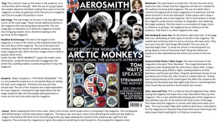
SlideShare a Scribd company logo
Plug: This is key for mojo as this draws in the audience, as it
entices them with a free gift . With the use of a plug it grabs
the readers attention therefore making them want to buy the
magazine, as they are getting a cd for the price of a magazine
and CDs are usually £10 pounds or more.
Sub-Image: The sub-image can be seen in the top right hand
corner of the cover page. These include additional stories in
the magazine (this one being about Aerosmith). The sub-
image give an indication as to what the magazine includes,
thus intriguing readers more, therefore leading to the
purchase of the magazine.
Headline & Anchorage: The text is the largest on the
magazine, it is also in the centre so the audience know this is
the main focus of the magazine. The use of the band artic
monkeys, peaks the interest of specific audience, boosting
mojos magazine sale. Often the main image/ article is often a
popular band/ artist.
Under the title “ARTIC MONKEYS” it gives the reader more
information. Using the word ultimate it exaggerates the
article thus, building readers curiosity bring them to buy the
magazine.
Strapline: Mojo’s Strapline is “THE MUSIC MAGAZINE”. This
is a very powerful strapline as it connotates Mojo are selling
the best music magazine. Therefore the only one they
should read. The use of this strapline sets a high expectation
for mojo magazine. Creating this high expectations set the
target audience high, and that people with good taste in
music are the only ones who read this magazine.
Layout:. When viewing the front of this cover, there is lots of text, which shows there is a lot going in the magazine. This corresponds
with MOJO being a monthly subscription magazine. The layout uses very basic colours thus attracting the audiences the bright cd
image in the bottom left hand corner and the plug at the top. Again peaking the interest as the audience get a gift from the
magazine. This promotes the magazine as it gives the audience something to look forward to, thus buying the magazine more.
Masthead: The mast head is a simple font. The fact the main artist
covers the title it shows that the magazines full title isn’t needed for
the audience to know what magazine. The use of a white title is
common throughout all of mojos magazines.in tis particular one the
white contrasts in front the solid black. These colours don’t show a
particular gender bias to the magazine. This is interesting as is shows
the magazine using neutral and open to all genders, thus widening
the target audience. The title mojo is a connotation of magic charm
or influence so perhaps the magazine has an influence on the
audience. That there is no other magazine like mojo.
Sub-heading & Cover line: On the bottom right hand side of the page
there are subheading of other types of articles in the magazine. The
smaller text reinforces that it is not as central as the main story. They
use cover lines like “Sex! Drugs! Mirrorballs! The true story of
Saturday Night Fever” to show the article is interesting with out
giving away to much of the article itself. Doing this allows the
audience to feel captivated by the article and curious to find out
more.
Feature Article Photo / Main Image: The main focal point of the
magazine is the band “Artic Monkeys”. The image dominates the
magazine cover showing that the main story is about them. Using a
band well know, gives MOJO a higher reading audience as Artic
Monkeys is well known and liked. Using the whole band shows its not
just about one of then (EG. Alex Turner) It is about them all. Having
them looking directly at the camera gives the affect the audience are
looking into the bands eyes then again pulls them in interesting them
more cause they are pulled in by the bands eye contact.
Date, issue and Price: This is a feature that all magazines have. When
buying the magazine the buyer has a clear idea where they scan the
magazine. This is a less aesthetically pleasing part of the magazine so
the publishers put this at the bottom left hand corner of the page.
This shows that the magazine is current ands helps them keep up to
date. The issue number helps with audience who have a subscription
for the magazine as it because they know what issues they’ve got and
what issues they’re waiting for or if they’ve missed any.
Masthead: Q has a very unique masthead. This is because it
only takes up the top left hand corner. This is a really
interesting idea because it is never seen in a magazine
except for this one. Furthermore this magazine has a letter
instead of a word as there mast head. This makes it much
easier for the audience to see this magazine and pick it out
from other magazines. It is also in a vibrant red colour so the
audience see this eye-catching masthead with then peaks
there interest of the audience because the use of a bold
letter shows that this magazine is bold and unique.
Banner: Underneath the masthead there is a text in cursive
lettering. “Awards Special Edition” this shows that Q only
show the best of the best. However looking further into
more cover pages of Q it seems that this is a temporary
banner and their regular one is “discover great music” this is
clever because not many magazines change up their banner
so this shows that Q is a magazine that can do this as they’re
a very popular music magazine. It is a way to tell the
consumer that Q will only ever provide you with top quality
information about music.
Subheading & Coverline: Using smaller text the cover
shows everything in the magazine. What is interesting is
from these we can see Q does not limit themselves to one
genre. This is good because it can open their audience range
thus boosting sales over all. The subheading and coverlines
are on both sides of the magazine which shows that there is
a lot going on. This can be negative as it can make the
magazine look very cluttered and put readers off reading as
there is a lot going on in the magazine.
Date line, price & Barcode: unlike mojo Q presents the
barcode. This is unusual because the barcode is the most
unaesthtetic part but Q puts it so the audience can see. This
may show that Q are unique and different. Although it is
very small text, Q want there magazine to know what the
price of the magazine, this shows that Q has confidence in
the magazines and feel their price is right for their targeted
audience.
Layout: The cover of the magazine has a very neat clean look. It
follows a typical style for all of it’s magazines. It uses the colour
scheme of red white and grey. It gives the effect of the
magazine being classic and bold. As red does not specify a
certain gender it means its open for anyone to read. Q uses
varying text sizes which makes the cover interesting because the
magazine does not need to change the font or colour to make it
more interesting. The use of a popular singer Ed Sheeran can
also boost sales because people will see him and be inclined to
read it to keep up with the latest news on him. Putting his guitar
in the photo shows he is serious and professional which boosts
the professional atmosphere Q gives the audience.
Plug: using a plug acts as a sticker which creates the eye-
catching feature. The word essential that the audience need to
read the article, with the use of the exclamation point suggests
that it is an important article and the audience must read it. It is
in red. Red symbolises importance so there fore the plug is an
important feature and needs to be read. This is an important
article. This is interesting because red catches the audiences
attention and they're more inclined to buy this issue
Feature Photo: The feature photo is of popular singer song
writer. This is interesting because it shows Q as a popular
magazine as they have the status to use Ed Sheeran as the main
image. Using him with his guitar shows the kind of music he
plays, which shows the atmosphere of this Issue. The camera
shot is a medium shot of Ed Sheeran sat down. Again supporting
the idea of this issue being a chilled out issue. Ed contrasts
against all the red which makes him stand out against
everything. This stresses the idea that this is the main article .
Masthead: The masthead is easy to see against the complex
magazine cover. This is because they have used a vibrant red
and a fairly simple font. This is good as it helps the audience
recognise the brand. I looked at a range of RockSound
magazines and the colour changes of the mast head changes
to fit better with the colour scheme. However this specific one
fits with the colour scheme of red, yellow and blue. The
masthead is not just a solid red it has a gradient that gets
darker towards the top of the word. This is interesting as it
could catch the audiences eyes as it is a simple yet distinctive
colour scale that it ties the magazine together.
Main Photo: RockSound use various small images to on the
cover yet our focus is on the band Paramore. The character use
direct address which grabs the consumer's attention and then
they’re curious to buy the magazine. The band are in all black
which contrasts against the red, this is clever as it brings the
attention of the reader to them thus reinforcing them to be the
focal point of the magazine, it also shows that they are definitely
a band as they’re dressed very similar.
Headline, Pull-quote & anchorage: The text for the focal article
is at a slight angle, this is interesting as the audience will have to
look at this properly to read it. The Headline is the bands name
in bold letters contrasting against a red background which
makes the name stand out, again reinforcing that this is the main
article. The pull-quote RockSound have given the audience an
insight to what the magazine is about thus giving the audience a
feel of the article and getting to know what it is about. “I used to
feel guilty about who I was…” this tell the audience that is it a
serious article and not just a comical interview. Finally we have
the anchorage which says “growing up not growing old” This
suggests that Paramore are timeless and not going out of style.
This can gain the audience as they may agree and buy the
magazine as it holds the same opinion of them.
Layout: RockSound uses a very complex layout to attract the young audience in. Using primary colours create a
bold and eye catching magazine, this also opens up the audience range as these colours do not stick to a specific
gender. RockSound also uses text boxes to show the audiences to see the texts in different formats opening up the
audience to a more exciting magazine for the younger audience to appreciate.
Menu Strip: Under the headline is a small list this is to show the
consumer what else is featured in the magazine. This is helpful to the
audience as it help them decide if they want the magazine or if it is
the right magazine for them. Using the names only evokes mystery
and we want to know exactly what is going on in the articles about
the artists.
Date line and price& barcode: the barcode at the bottom of the
magazine makes it clear for the audience where they scan it. The
date helps the audience know if the magazine is up to date. What is
interesting about this magazines is the price, it has all different
currencies on it. This means that RockSound is a very popular
magazine all over the world.
Buzz Word: the use of the word free attracts the audience because
they’re getting more than just a magazine. This draws the audience in
because they’re getting a freebie, which is something not many
magazines do. The word uses an exclamation point, the use of this
punctuation makes the audience feel like they need it as the
exclamation point gives the word some significance. This really draws
the audience in because it comes attached to the original cd no one
has heard.
Plug: To really attract the audience RockSound use a free cd to make
the audience buy the magazine. This is interests the audience because
not every magazine offers a free original CD. This plug shows a very
definitive genre that RockSound follow. The plug is a vibrant blue
making it stand out against the full magazine. Thus attracting audience
attention because their eyes cast to the bright blue square at the
corner.
Subheadings & Coverlines: most of the subheadings are to the
left side of the magazine. They are very short and to the point,
they’re titles of artists with small coverlines underneath like
“saving lives”. This is interesting because with such a complex
layout the magazine keeps the subheading short and simple a
huge contrast, however, this makes the audience more curious
to find out what these subheadings are about.
Mast Head: Mojo does not specifically state that this is the contents
page. This is an interesting feature as it assumes the audience know
exactly what this page is, this means Mojo is well known so therefore
they do not need to address to the audience that this is the contents
page. The use of the magazine title shows a sense of uniqueness as
no other magazine does. It is in a bold black text to stand out against
the white background.
Banner: Below the masthead is a tag line, It says “London. Memphis,
Kerville”. This tagline is vague but it increases the curiosity of the
audience. There are many questions as to what it means. It could be
where the magazine is sold if that is the case London being the first
place in the tag line shows that the magazine is loyal to England,
however having the other countries show a broader range of
audiences . It is displayed in a smaller font giving the Mojo contents
page more of a professional look and it is not a busy contents so the
audience aren’t overwhelmed
Feature Article Photo / Main Image: There is only one photograph
on the contents page. Drawing the audiences attention to the photo.
The character in the image is using direct address, just like the front
cover on the previous, this intrigues the audience , be cause they feel
they connected to the character and feel obliged to buy the
magazine.
Pull-Quotes: Using quotes from the article in the magazine gives the
audience an insight into what the article is about. This is interesting
because as well as the small paragraph under subheading’s the
magazine gives us as the audience a taste of the feature article.
Layout: The contents page holds a professional look with the test on
the left hand side and the picture on the right. This shows Mojo to be
more simplistic look. Which effects the audience because the
magazine is not cluttered so there for they’re not overwhelmed and
do not know where to look, and overall get put off by the magazine.
However there is still enough information of the page to keep the
audience enthralled and reading on.
Page Numbers: Using page numbers allows the audience to find
certain contents and articles to the magazine. This is helpful because
it clearly lets the audience know where things are . The use of the
colour red matches with the headlines and draws the audiences
attention to the numbers then ultimately the articles.
Date Line: Underneath the masthead and banner the date can be
seen. It shows April 2010. This is key when a magazine is made
because it lets the audience know when the magazine was published.
This allows the audience to know the magazine is current.
Headline: Using headlines the audience are aware of the different
sections. The headline “features” specifies the stories going on in
the issue. You also have the “cover story”. The cover story is
separate from the rest to show it s more important than the rest.
This could attract the audiences attention because they’ll see that it
has its own headline.
Subheadings: These subheadings help show the audience what the
articles are about the are in bold black letters to grab the audiences
attention. To top that after they have read the big writing there is
some small writing underneath. The subheadings are what attract the
audience to read the little paragraph underneath.
Masthead: Q uses an interesting way to show its masthead. It
uses the Q and then puts contents next to it. This instantly
shows the audience what this page is and why it is here. The
mast head surrounded by white, which produces a huge
contrast making the masthead contrast thus making the
masthead stand out. Doing this allows Q to let everyone know
that this is their contents page and no one else’s. it also means Q
have indirectly copyrighted their magazine.
Sub-images: There are many images presented on this page,
there are quite small and link to articles in the magazine, they do
this by putting white numbers in red boxes at the bottoms of the
picture. All the images used look to be studio shot photos, this
can again be negative because it doesn’t show Q to go out and
explore concerts so the fans who missed could get reviews of
them. However the studio shots show a professionality to Qs
magazine which is consistent with the whole magazine. The use
of so many images show Q to have lots of information for the
audience to read and get up to date with everything in the music
world. The images are of musical icons (EG. Lana Del Rey) thus
supporting the idea Q is a music magazine.
Headlines: The magazine uses the names of popular music
artists to attract the audience as they’re familiar with the artist
and will want to read them. Using these people shows the
audience that Q is definitely a music magazine and it gives the
audience a hint as to what the article is about. The headlines are
all in the same font showing a very clean and neat contents
page.
Coverlines: There are only a small amount of cover lines, this is
because this is only the feature page as Q is a monthly
magazine. These tell the audience what the articles are about
and gives them information as to what is in the articles. These
cover lines are very short and to the point this makes it simple
and easy for the audience to read as the audience may be
younger so they possibly don’t want to spend much time on the
contents page
Main Image: although there are several images on this page the
main image is the biggest image. In this cause it is the close up of
Lana Del Reys’s face. This is interesting because not many
magazines do this as is it not a conventional thing that most
magazines do. It can peak interest in the audience as they’re
curious to find out what this article is about. The eye we can see
is using direct address, this is interesting as it makes the
audience connect with the image so feel they need to read the
article. There is also red blood running down her face which can
peak attention in the audience as they may want to know what's
going on in the article.
Layout: Q likes to use squares which makes the page clean and
neat. Instead of cluttered. This also divides the page for the
audience making it easier to read the page. Putting the images in
squares gives the idea that the images are taken from articles.
Instead of taking new images for the contents page. Using
different sized images shows the audience which are the main
articles as well. Using basic yet powerful dividing of the contents
page shows an innovative design that no other magazine uses
thus creating Q to be a unique magazine.
Page Numbers: The page numbers are all different sizes. There
are several big ones which suggest that some of the articles are
more important that the others showing which are the main
feature articles and which are not. Putting the page numbers in
red boxes makes the numbers pop so it is clear to the reader
which article is on which page.
Masthead: RockSound use there name as the masthead as
a substitute for the word “Contents”. Like Mojo,
RockSound fell that they make their contents fairly clear.it
shows that this is Rock Sounds Magazine and no one
else's. The masthead is a solid white writing which
contrasts against the very dark background. The font is
very simple and basic. This is interesting as it contrasts
with the very busy front cover.
Dateline: The date line is something that is in every
magazine. It states the month and the year it was
published, keeping the audience knowing whether there
magazine is current or old. Although it is an important
feature it is in small writing to show it is not the focal
point of the magazine.
Main Image: The is only one main image on the contents
page and it is of Gerard Way. This reinforce that the article
will be. about Gerard or his former band, My Chemical
Romance. The audience will be able to familiarise
themselves with Gerard thus wanting to read the articles
to find out why he is on the contents page of RockSound.
The character is not using direct address which looks as
though he is deep in thought. This is interesting because it
peaks curiosity in the audience as they want to know what
Gerard is thinking so therefore need to read the article to
find out.
Pull-quote: There is a pull quote in the top left hand
corner of the magazine. It is a quote from Gerard way
again reinforcing the idea that he is part of the main
article. What is interesting is the play on words with the
word “danger” as it links to their album Danger Days. The
pull quote also tells us exactly what genre this magazine is
about. As it says rock band so the audience can conclude
this magazine is Rock magazine.
Layout.: the overall colour scheme is black pink and white.
The background looks to be like a leather backdrop. Which
matches Gerard’s jacket. The white writing is made easier
to read with the black background. Which helps the
audience understand the writing .
Headline: The headline is in a pink rectangle with the
words main features. This gives the audience a clear
distinctive idea what this is about. The interesting things
about this is that the headline is telling us that these are
the most important parts of the magazine and so the
audience should read them all.
Subheading: Next to the page numbers are headings
about the articles. These are interesting because it shows
little information about the articles without giving away
too much information. Using these breakdown the
information for the audience so there is not much text so
they are not put off by all the text. They’re in bolder
letters to distinguish those are the titles so the audience
have a clear understanding of everything going on.
Mast Head: The mast head of
the double page spread is
considerably smaller than the
pull quote just below. Showing
that this isn’t as important to
the audience and it’s just there
for professional purposes.
Mojo spaces out the letters at
the top so it spreads across for
2 reasons, it makes it easier for
the audience to read and to
add to the aesthetics of the
page. Highlighting the “50”
shows the importance of the
statistic, it interests the
audience as it leaves them
thinking about what that
statistic means. It being the
only word highlighted it
provokes confusion in the
audience thus peaking the
interest
Pull quote: the pull quote is the most eye-catching item in the article. As the headline is so small the pull-quote then
acts as the header. It adds to the mystery and lures the audience to read on as the pull quote is vague and does not give
the audience much information and entices them to read on. The fact the middle line is in gold it intrigues the audience.
It also says “Be There Now” it is an order. It suggests be there and read the article.
Main Image: There is only
one image of the double
page spread. Using a black
and white photo it helps
provide mojo with the
professional image it keeps
throughout the entire
magazine. The image it very
dark which adds to the
mysterious and controversial
layout to the whole article.
This is interesting because
there is little to no detail yet
the picture provokes a
response in the audience and
thus creating a need to read
this article.
Coverline: Again mojo reinforces
the idea that the pull quote is
the masthead. The cover line is
what tells the audience what this
article is truly about. Highlighting
the names of important people
gives the page some credibility
thus audiences wanting to read
more of mojo. The use of this
cover line helps tie the page
together and mojo uses that to
make there magazine appeal to
the audiences. Drop Cap: The article uses a drop cap to show that it stands by traditional values of a magazine. It also introduces the audiences to the
article. It is intriguing as the audience want to know what “W” stands for and in order to find out what it means they need to read more. It is
also one of the main features that stand out in the article along with the pull quote and image. So it could be one of the leading features as
to why people read the article
Article: The article itself uses a
professional and uses very
traditional and uniform fonts.
This is interesting as it makes the
magazine easier to read so the
audience don’t have clutter, it is
also written in paragraphs again
making it easier to read. The
article its self focuses on subject
and matter giving the audience
exactly what the want, and it
gives them information about
Neil Young.
Drop cap: Q uses its usual house style with the drop capital, the letter
is in a red square which will grab the audiences attention because it is
bright and in your face. It also indicates that this is the start of the
article. A drop cap is often use in stories so this is interesting because it
intrigues the audience as the article can be like a story, so they are
wondering what it has to offer.
Main Image: there is only one image on
the entire double page spread, this shows
that he is the main focal point of the
article. The fact the image spread across
both pages reinforces the article is on this
character. Ed Sheeran is not using direct
address which shows that he’s deep in
thought and this peaks audience curiosity
and wonder why he is this way. Thus
leading to them picking up the magazine
to read and buy it. The background is in
London so the audience can see this and
can familiarise themselves with the
magazine thus wanting to buy the
magazine.
Masthead: the mast head is located at
right hand side of the double page
spread. It is interesting because it is the
words “HOT LIST” and the word hot is in
red, this emphasises the heat and
fierceness of the article, showing it to be
a good article encouraging people to read
on. This is a clever play on colour of the
words to evoke interaction with the
audience. As most of the text is on the
right hand side it helps the audience have
a clear distinction of what the article is
about and are able to see the link
between the masthead and the article.
Reference: The little red box on the top
right corner is the details of who took the
picture. This is used to give the
photographer credit. It also shows the
professional element of the magazine.
This is interesting because it show if the
photo is current or older. It also small so
the audience’s attention isn’t taken up by
it.
Pull-Quote: to get the audiences
into the article, Q uses a pull quote
to give slight insight into the article
therefore acting like a headline for
the whole two pages. This displayed
text is an eye-catching focal point for
the reader, drawing them in to know
important information. Using a
comical pull-quote draws the
audience more and it gives a light
hearted approach to the article.
Article: The text is in a white text box so
the audience are able to read the text
easier, aside from the drop cap this is one
of the only shape on the article so it gives
the double page spread that little bit of
excitement to the page. The text is
traditional article form with two columns,
this divides the text and makes it more
easy for the audience and they are not
thrown off by the amount of text on the
page. It takes up less room and looks very
professional. The solid white background
fits into the colour scheme of the front
cover so showing that is professional and
the colour scheme is the same
throughout the whole magazine.
Masthead: RockSound use an
unconventional way to present the
mast head. It is at the bottom of
page. This is interesting because
the audience are not familiar with
so they’re not sure what to expect
out of this magazine so are curious
and will read on further because it
is laid out completely different. The
masthead is directly in front of the
picture, this is showing the who
they are and what this double page
spread is about.
Banner: Underneath the banner
which peaks the audiences interest
“The new sound of sacrifice” this is
interesting because RockSound are
referring to the band as new. The
word new evokes that this band is
up to date. By using this as a
banner it initiates to the audience
to read this article as it is new and
up to date. This pulls the audience
in and gives them a small hint as to
what the magazine is really about.
Layout: the magazine is focused
around the image on the page, this
gives the impression that the article
is about these characters. The little
amount of text seems like just a
little bit of information about these
characters. It gives the impression
that the audience should know a
lot about the band already as they
are popular. This is supported by
the size of the picture.
Main Image.: There is only one image on the
double page spread and it spans across two
pages . The image shows five people all
pulling silly faces whilst using direct address
this is interesting because it shows the back
to have a silly side whereas most of the
images the band/ artist will be looking very
serious. The image its self shows the boys all
stood together and the image is very bright
which contrasts against the dark background.
The image takes up the blank space very well
s the double page does not look empty
reading it so the audience do not get bored by
what is going on with this article. Making thd
image so big gives the audience the effect
that this band has importance and interests
us as we want to find out about the band
more
Pull-quote: Rocksound has two pull quotes both directly taken from the text itself this is quite interest as
it divides up the text but also highlights important features of the article itself. And the audience are
drawn to them because they stand out against the background. The pull-quote uses the term band shows
the audience that this article is about the band and possibly the music, thus interesting the audience and
making them want to read more.
Article: there is a small amount of text presented on the page. This has a lot of information and shows this is the article.
The text size is very small which could put off the audience or it could completely focus their attention on the article. This
article is written in paragraphs making it easier for the audience to read and also divides the text so it looks like there is
less that there actually is.
Coverline & Introduction: the focal point of
the audiences eyes are drawn to it the
introduction telling us what the article is
about. It is placed above the mast head
which is interesting as that could be
interpreted to say that what the article is
about is more important that who the
article is about. The use of colloquial
language will intrigue the audience as it
shows this article is very chilled out and the
audience can familiarise themselves around
this, thus wanting to read more about the
article. It is on a diagonal angle which
captivates the audience as it shows the
magazine to be able to break the rules to
make the magazine look more interesting

More Related Content

What's hot

NME Analysis
NME AnalysisNME Analysis
NME Analysisscoley
 
Magazine analysis
Magazine analysisMagazine analysis
Magazine analysis
millerjess
 
Analyising music magazines
Analyising music magazinesAnalyising music magazines
Analyising music magazines
jessasmedia4
 
Magazine Analysis
Magazine AnalysisMagazine Analysis
Magazine Analysis
JessDruett
 
Kerrang!
Kerrang!Kerrang!
Kerrang!
J_h45
 
Music Magazine Analysis
Music Magazine AnalysisMusic Magazine Analysis
Music Magazine Analysisasmediag13
 
Task 2,3
Task 2,3Task 2,3
Task 2,3akii786
 
Front cover conventions
Front cover conventionsFront cover conventions
Front cover conventions
embugler
 
Analyising music magazines
Analyising music magazinesAnalyising music magazines
Analyising music magazines
jessasmedia4
 
Magazine anaylisis
Magazine anaylisisMagazine anaylisis
Magazine anaylisis
katiemarieedwards001
 
Magazine research 1
Magazine research 1Magazine research 1
Magazine research 1
ewanmiller
 
Kerrang analysis
Kerrang analysisKerrang analysis
Kerrang analysisShelby
 
Analyising music magazines
Analyising music magazinesAnalyising music magazines
Analyising music magazinesjessasmedia4
 
Lifestyle Magazine Analysis
Lifestyle Magazine AnalysisLifestyle Magazine Analysis
Lifestyle Magazine Analysisguest01ece09
 
Music Magazine Research
Music Magazine ResearchMusic Magazine Research
Music Magazine Researchasiyam
 

What's hot (17)

Magazine Analysis
Magazine AnalysisMagazine Analysis
Magazine Analysis
 
Magazine anaylsis
Magazine anaylsisMagazine anaylsis
Magazine anaylsis
 
NME Analysis
NME AnalysisNME Analysis
NME Analysis
 
Magazine analysis
Magazine analysisMagazine analysis
Magazine analysis
 
Analyising music magazines
Analyising music magazinesAnalyising music magazines
Analyising music magazines
 
Magazine Analysis
Magazine AnalysisMagazine Analysis
Magazine Analysis
 
Kerrang!
Kerrang!Kerrang!
Kerrang!
 
Music Magazine Analysis
Music Magazine AnalysisMusic Magazine Analysis
Music Magazine Analysis
 
Task 2,3
Task 2,3Task 2,3
Task 2,3
 
Front cover conventions
Front cover conventionsFront cover conventions
Front cover conventions
 
Analyising music magazines
Analyising music magazinesAnalyising music magazines
Analyising music magazines
 
Magazine anaylisis
Magazine anaylisisMagazine anaylisis
Magazine anaylisis
 
Magazine research 1
Magazine research 1Magazine research 1
Magazine research 1
 
Kerrang analysis
Kerrang analysisKerrang analysis
Kerrang analysis
 
Analyising music magazines
Analyising music magazinesAnalyising music magazines
Analyising music magazines
 
Lifestyle Magazine Analysis
Lifestyle Magazine AnalysisLifestyle Magazine Analysis
Lifestyle Magazine Analysis
 
Music Magazine Research
Music Magazine ResearchMusic Magazine Research
Music Magazine Research
 

Similar to Textual analsis

Magazine analysis
Magazine analysis Magazine analysis
Magazine analysis
Vickie Louise
 
Magazine analysis
Magazine analysisMagazine analysis
Magazine analysis
millerjess
 
Market research
Market researchMarket research
Market research
Karis Hays
 
Music magazine research
Music magazine researchMusic magazine research
Music magazine researchbroganl4
 
Magazine analysis
Magazine analysisMagazine analysis
Magazine analysis
ellenheathfield11
 
Magazine analysis
Magazine analysis Magazine analysis
Magazine analysis
ellenheathfield11
 
Textanalysis
TextanalysisTextanalysis
Magazine analysis
Magazine analysisMagazine analysis
Magazine analysis
Ellie Preston
 
The Music Magazine Industry
The Music Magazine IndustryThe Music Magazine Industry
The Music Magazine Industry
izzymoore99
 
Front cover analysis
Front cover analysisFront cover analysis
Front cover analysis
mollymediablog
 
Evaluation of 3 other music magazines nme q kerrang
Evaluation of 3 other music magazines nme q kerrangEvaluation of 3 other music magazines nme q kerrang
Evaluation of 3 other music magazines nme q kerrangemmalouise1410
 
Analysis of 3 Front Pages
Analysis of 3 Front PagesAnalysis of 3 Front Pages
Analysis of 3 Front Pagesemmalouise1410
 
Analysis of Music magazine front covers, contents pages and double page spreads.
Analysis of Music magazine front covers, contents pages and double page spreads.Analysis of Music magazine front covers, contents pages and double page spreads.
Analysis of Music magazine front covers, contents pages and double page spreads.
Ceri Lewis
 
MOJO
MOJOMOJO
PRESENTATION KERRANG
PRESENTATION KERRANGPRESENTATION KERRANG
PRESENTATION KERRANGPriya Cee
 
Front cover analysis.
Front cover analysis.Front cover analysis.
Front cover analysis.
AmyShields00
 
Textual analysis
Textual analysis Textual analysis
Textual analysis
Daniel Clipperton
 
Textual analysis
Textual analysis Textual analysis
Textual analysis
Daniel Clipperton
 
Textual analysis
Textual analysis Textual analysis
Textual analysis
Daniel Clipperton
 
Chosen genre pop music
Chosen genre pop musicChosen genre pop music
Chosen genre pop music
EMILYCORBET
 

Similar to Textual analsis (20)

Magazine analysis
Magazine analysis Magazine analysis
Magazine analysis
 
Magazine analysis
Magazine analysisMagazine analysis
Magazine analysis
 
Market research
Market researchMarket research
Market research
 
Music magazine research
Music magazine researchMusic magazine research
Music magazine research
 
Magazine analysis
Magazine analysisMagazine analysis
Magazine analysis
 
Magazine analysis
Magazine analysis Magazine analysis
Magazine analysis
 
Textanalysis
TextanalysisTextanalysis
Textanalysis
 
Magazine analysis
Magazine analysisMagazine analysis
Magazine analysis
 
The Music Magazine Industry
The Music Magazine IndustryThe Music Magazine Industry
The Music Magazine Industry
 
Front cover analysis
Front cover analysisFront cover analysis
Front cover analysis
 
Evaluation of 3 other music magazines nme q kerrang
Evaluation of 3 other music magazines nme q kerrangEvaluation of 3 other music magazines nme q kerrang
Evaluation of 3 other music magazines nme q kerrang
 
Analysis of 3 Front Pages
Analysis of 3 Front PagesAnalysis of 3 Front Pages
Analysis of 3 Front Pages
 
Analysis of Music magazine front covers, contents pages and double page spreads.
Analysis of Music magazine front covers, contents pages and double page spreads.Analysis of Music magazine front covers, contents pages and double page spreads.
Analysis of Music magazine front covers, contents pages and double page spreads.
 
MOJO
MOJOMOJO
MOJO
 
PRESENTATION KERRANG
PRESENTATION KERRANGPRESENTATION KERRANG
PRESENTATION KERRANG
 
Front cover analysis.
Front cover analysis.Front cover analysis.
Front cover analysis.
 
Textual analysis
Textual analysis Textual analysis
Textual analysis
 
Textual analysis
Textual analysis Textual analysis
Textual analysis
 
Textual analysis
Textual analysis Textual analysis
Textual analysis
 
Chosen genre pop music
Chosen genre pop musicChosen genre pop music
Chosen genre pop music
 

Recently uploaded

How to Make a Field invisible in Odoo 17
How to Make a Field invisible in Odoo 17How to Make a Field invisible in Odoo 17
How to Make a Field invisible in Odoo 17
Celine George
 
Model Attribute Check Company Auto Property
Model Attribute  Check Company Auto PropertyModel Attribute  Check Company Auto Property
Model Attribute Check Company Auto Property
Celine George
 
1.4 modern child centered education - mahatma gandhi-2.pptx
1.4 modern child centered education - mahatma gandhi-2.pptx1.4 modern child centered education - mahatma gandhi-2.pptx
1.4 modern child centered education - mahatma gandhi-2.pptx
JosvitaDsouza2
 
CLASS 11 CBSE B.St Project AIDS TO TRADE - INSURANCE
CLASS 11 CBSE B.St Project AIDS TO TRADE - INSURANCECLASS 11 CBSE B.St Project AIDS TO TRADE - INSURANCE
CLASS 11 CBSE B.St Project AIDS TO TRADE - INSURANCE
BhavyaRajput3
 
Welcome to TechSoup New Member Orientation and Q&A (May 2024).pdf
Welcome to TechSoup   New Member Orientation and Q&A (May 2024).pdfWelcome to TechSoup   New Member Orientation and Q&A (May 2024).pdf
Welcome to TechSoup New Member Orientation and Q&A (May 2024).pdf
TechSoup
 
Chapter 3 - Islamic Banking Products and Services.pptx
Chapter 3 - Islamic Banking Products and Services.pptxChapter 3 - Islamic Banking Products and Services.pptx
Chapter 3 - Islamic Banking Products and Services.pptx
Mohd Adib Abd Muin, Senior Lecturer at Universiti Utara Malaysia
 
The Art Pastor's Guide to Sabbath | Steve Thomason
The Art Pastor's Guide to Sabbath | Steve ThomasonThe Art Pastor's Guide to Sabbath | Steve Thomason
The Art Pastor's Guide to Sabbath | Steve Thomason
Steve Thomason
 
Sectors of the Indian Economy - Class 10 Study Notes pdf
Sectors of the Indian Economy - Class 10 Study Notes pdfSectors of the Indian Economy - Class 10 Study Notes pdf
Sectors of the Indian Economy - Class 10 Study Notes pdf
Vivekanand Anglo Vedic Academy
 
ESC Beyond Borders _From EU to You_ InfoPack general.pdf
ESC Beyond Borders _From EU to You_ InfoPack general.pdfESC Beyond Borders _From EU to You_ InfoPack general.pdf
ESC Beyond Borders _From EU to You_ InfoPack general.pdf
Fundacja Rozwoju Społeczeństwa Przedsiębiorczego
 
aaaaaaaaaaaaaaaaaaaaaaaaaaaaaaaaaaaaaaaaaaaaaaaaaaaaaaa
aaaaaaaaaaaaaaaaaaaaaaaaaaaaaaaaaaaaaaaaaaaaaaaaaaaaaaaaaaaaaaaaaaaaaaaaaaaaaaaaaaaaaaaaaaaaaaaaaaaaaaaaaaaaaa
aaaaaaaaaaaaaaaaaaaaaaaaaaaaaaaaaaaaaaaaaaaaaaaaaaaaaaa
siemaillard
 
Supporting (UKRI) OA monographs at Salford.pptx
Supporting (UKRI) OA monographs at Salford.pptxSupporting (UKRI) OA monographs at Salford.pptx
Supporting (UKRI) OA monographs at Salford.pptx
Jisc
 
How to Split Bills in the Odoo 17 POS Module
How to Split Bills in the Odoo 17 POS ModuleHow to Split Bills in the Odoo 17 POS Module
How to Split Bills in the Odoo 17 POS Module
Celine George
 
Mule 4.6 & Java 17 Upgrade | MuleSoft Mysore Meetup #46
Mule 4.6 & Java 17 Upgrade | MuleSoft Mysore Meetup #46Mule 4.6 & Java 17 Upgrade | MuleSoft Mysore Meetup #46
Mule 4.6 & Java 17 Upgrade | MuleSoft Mysore Meetup #46
MysoreMuleSoftMeetup
 
Students, digital devices and success - Andreas Schleicher - 27 May 2024..pptx
Students, digital devices and success - Andreas Schleicher - 27 May 2024..pptxStudents, digital devices and success - Andreas Schleicher - 27 May 2024..pptx
Students, digital devices and success - Andreas Schleicher - 27 May 2024..pptx
EduSkills OECD
 
The geography of Taylor Swift - some ideas
The geography of Taylor Swift - some ideasThe geography of Taylor Swift - some ideas
The geography of Taylor Swift - some ideas
GeoBlogs
 
The approach at University of Liverpool.pptx
The approach at University of Liverpool.pptxThe approach at University of Liverpool.pptx
The approach at University of Liverpool.pptx
Jisc
 
The Roman Empire A Historical Colossus.pdf
The Roman Empire A Historical Colossus.pdfThe Roman Empire A Historical Colossus.pdf
The Roman Empire A Historical Colossus.pdf
kaushalkr1407
 
Phrasal Verbs.XXXXXXXXXXXXXXXXXXXXXXXXXX
Phrasal Verbs.XXXXXXXXXXXXXXXXXXXXXXXXXXPhrasal Verbs.XXXXXXXXXXXXXXXXXXXXXXXXXX
Phrasal Verbs.XXXXXXXXXXXXXXXXXXXXXXXXXX
MIRIAMSALINAS13
 
The Challenger.pdf DNHS Official Publication
The Challenger.pdf DNHS Official PublicationThe Challenger.pdf DNHS Official Publication
The Challenger.pdf DNHS Official Publication
Delapenabediema
 
TESDA TM1 REVIEWER FOR NATIONAL ASSESSMENT WRITTEN AND ORAL QUESTIONS WITH A...
TESDA TM1 REVIEWER  FOR NATIONAL ASSESSMENT WRITTEN AND ORAL QUESTIONS WITH A...TESDA TM1 REVIEWER  FOR NATIONAL ASSESSMENT WRITTEN AND ORAL QUESTIONS WITH A...
TESDA TM1 REVIEWER FOR NATIONAL ASSESSMENT WRITTEN AND ORAL QUESTIONS WITH A...
EugeneSaldivar
 

Recently uploaded (20)

How to Make a Field invisible in Odoo 17
How to Make a Field invisible in Odoo 17How to Make a Field invisible in Odoo 17
How to Make a Field invisible in Odoo 17
 
Model Attribute Check Company Auto Property
Model Attribute  Check Company Auto PropertyModel Attribute  Check Company Auto Property
Model Attribute Check Company Auto Property
 
1.4 modern child centered education - mahatma gandhi-2.pptx
1.4 modern child centered education - mahatma gandhi-2.pptx1.4 modern child centered education - mahatma gandhi-2.pptx
1.4 modern child centered education - mahatma gandhi-2.pptx
 
CLASS 11 CBSE B.St Project AIDS TO TRADE - INSURANCE
CLASS 11 CBSE B.St Project AIDS TO TRADE - INSURANCECLASS 11 CBSE B.St Project AIDS TO TRADE - INSURANCE
CLASS 11 CBSE B.St Project AIDS TO TRADE - INSURANCE
 
Welcome to TechSoup New Member Orientation and Q&A (May 2024).pdf
Welcome to TechSoup   New Member Orientation and Q&A (May 2024).pdfWelcome to TechSoup   New Member Orientation and Q&A (May 2024).pdf
Welcome to TechSoup New Member Orientation and Q&A (May 2024).pdf
 
Chapter 3 - Islamic Banking Products and Services.pptx
Chapter 3 - Islamic Banking Products and Services.pptxChapter 3 - Islamic Banking Products and Services.pptx
Chapter 3 - Islamic Banking Products and Services.pptx
 
The Art Pastor's Guide to Sabbath | Steve Thomason
The Art Pastor's Guide to Sabbath | Steve ThomasonThe Art Pastor's Guide to Sabbath | Steve Thomason
The Art Pastor's Guide to Sabbath | Steve Thomason
 
Sectors of the Indian Economy - Class 10 Study Notes pdf
Sectors of the Indian Economy - Class 10 Study Notes pdfSectors of the Indian Economy - Class 10 Study Notes pdf
Sectors of the Indian Economy - Class 10 Study Notes pdf
 
ESC Beyond Borders _From EU to You_ InfoPack general.pdf
ESC Beyond Borders _From EU to You_ InfoPack general.pdfESC Beyond Borders _From EU to You_ InfoPack general.pdf
ESC Beyond Borders _From EU to You_ InfoPack general.pdf
 
aaaaaaaaaaaaaaaaaaaaaaaaaaaaaaaaaaaaaaaaaaaaaaaaaaaaaaa
aaaaaaaaaaaaaaaaaaaaaaaaaaaaaaaaaaaaaaaaaaaaaaaaaaaaaaaaaaaaaaaaaaaaaaaaaaaaaaaaaaaaaaaaaaaaaaaaaaaaaaaaaaaaaa
aaaaaaaaaaaaaaaaaaaaaaaaaaaaaaaaaaaaaaaaaaaaaaaaaaaaaaa
 
Supporting (UKRI) OA monographs at Salford.pptx
Supporting (UKRI) OA monographs at Salford.pptxSupporting (UKRI) OA monographs at Salford.pptx
Supporting (UKRI) OA monographs at Salford.pptx
 
How to Split Bills in the Odoo 17 POS Module
How to Split Bills in the Odoo 17 POS ModuleHow to Split Bills in the Odoo 17 POS Module
How to Split Bills in the Odoo 17 POS Module
 
Mule 4.6 & Java 17 Upgrade | MuleSoft Mysore Meetup #46
Mule 4.6 & Java 17 Upgrade | MuleSoft Mysore Meetup #46Mule 4.6 & Java 17 Upgrade | MuleSoft Mysore Meetup #46
Mule 4.6 & Java 17 Upgrade | MuleSoft Mysore Meetup #46
 
Students, digital devices and success - Andreas Schleicher - 27 May 2024..pptx
Students, digital devices and success - Andreas Schleicher - 27 May 2024..pptxStudents, digital devices and success - Andreas Schleicher - 27 May 2024..pptx
Students, digital devices and success - Andreas Schleicher - 27 May 2024..pptx
 
The geography of Taylor Swift - some ideas
The geography of Taylor Swift - some ideasThe geography of Taylor Swift - some ideas
The geography of Taylor Swift - some ideas
 
The approach at University of Liverpool.pptx
The approach at University of Liverpool.pptxThe approach at University of Liverpool.pptx
The approach at University of Liverpool.pptx
 
The Roman Empire A Historical Colossus.pdf
The Roman Empire A Historical Colossus.pdfThe Roman Empire A Historical Colossus.pdf
The Roman Empire A Historical Colossus.pdf
 
Phrasal Verbs.XXXXXXXXXXXXXXXXXXXXXXXXXX
Phrasal Verbs.XXXXXXXXXXXXXXXXXXXXXXXXXXPhrasal Verbs.XXXXXXXXXXXXXXXXXXXXXXXXXX
Phrasal Verbs.XXXXXXXXXXXXXXXXXXXXXXXXXX
 
The Challenger.pdf DNHS Official Publication
The Challenger.pdf DNHS Official PublicationThe Challenger.pdf DNHS Official Publication
The Challenger.pdf DNHS Official Publication
 
TESDA TM1 REVIEWER FOR NATIONAL ASSESSMENT WRITTEN AND ORAL QUESTIONS WITH A...
TESDA TM1 REVIEWER  FOR NATIONAL ASSESSMENT WRITTEN AND ORAL QUESTIONS WITH A...TESDA TM1 REVIEWER  FOR NATIONAL ASSESSMENT WRITTEN AND ORAL QUESTIONS WITH A...
TESDA TM1 REVIEWER FOR NATIONAL ASSESSMENT WRITTEN AND ORAL QUESTIONS WITH A...
 

Textual analsis

  • 1. Plug: This is key for mojo as this draws in the audience, as it entices them with a free gift . With the use of a plug it grabs the readers attention therefore making them want to buy the magazine, as they are getting a cd for the price of a magazine and CDs are usually £10 pounds or more. Sub-Image: The sub-image can be seen in the top right hand corner of the cover page. These include additional stories in the magazine (this one being about Aerosmith). The sub- image give an indication as to what the magazine includes, thus intriguing readers more, therefore leading to the purchase of the magazine. Headline & Anchorage: The text is the largest on the magazine, it is also in the centre so the audience know this is the main focus of the magazine. The use of the band artic monkeys, peaks the interest of specific audience, boosting mojos magazine sale. Often the main image/ article is often a popular band/ artist. Under the title “ARTIC MONKEYS” it gives the reader more information. Using the word ultimate it exaggerates the article thus, building readers curiosity bring them to buy the magazine. Strapline: Mojo’s Strapline is “THE MUSIC MAGAZINE”. This is a very powerful strapline as it connotates Mojo are selling the best music magazine. Therefore the only one they should read. The use of this strapline sets a high expectation for mojo magazine. Creating this high expectations set the target audience high, and that people with good taste in music are the only ones who read this magazine. Layout:. When viewing the front of this cover, there is lots of text, which shows there is a lot going in the magazine. This corresponds with MOJO being a monthly subscription magazine. The layout uses very basic colours thus attracting the audiences the bright cd image in the bottom left hand corner and the plug at the top. Again peaking the interest as the audience get a gift from the magazine. This promotes the magazine as it gives the audience something to look forward to, thus buying the magazine more. Masthead: The mast head is a simple font. The fact the main artist covers the title it shows that the magazines full title isn’t needed for the audience to know what magazine. The use of a white title is common throughout all of mojos magazines.in tis particular one the white contrasts in front the solid black. These colours don’t show a particular gender bias to the magazine. This is interesting as is shows the magazine using neutral and open to all genders, thus widening the target audience. The title mojo is a connotation of magic charm or influence so perhaps the magazine has an influence on the audience. That there is no other magazine like mojo. Sub-heading & Cover line: On the bottom right hand side of the page there are subheading of other types of articles in the magazine. The smaller text reinforces that it is not as central as the main story. They use cover lines like “Sex! Drugs! Mirrorballs! The true story of Saturday Night Fever” to show the article is interesting with out giving away to much of the article itself. Doing this allows the audience to feel captivated by the article and curious to find out more. Feature Article Photo / Main Image: The main focal point of the magazine is the band “Artic Monkeys”. The image dominates the magazine cover showing that the main story is about them. Using a band well know, gives MOJO a higher reading audience as Artic Monkeys is well known and liked. Using the whole band shows its not just about one of then (EG. Alex Turner) It is about them all. Having them looking directly at the camera gives the affect the audience are looking into the bands eyes then again pulls them in interesting them more cause they are pulled in by the bands eye contact. Date, issue and Price: This is a feature that all magazines have. When buying the magazine the buyer has a clear idea where they scan the magazine. This is a less aesthetically pleasing part of the magazine so the publishers put this at the bottom left hand corner of the page. This shows that the magazine is current ands helps them keep up to date. The issue number helps with audience who have a subscription for the magazine as it because they know what issues they’ve got and what issues they’re waiting for or if they’ve missed any.
  • 2. Masthead: Q has a very unique masthead. This is because it only takes up the top left hand corner. This is a really interesting idea because it is never seen in a magazine except for this one. Furthermore this magazine has a letter instead of a word as there mast head. This makes it much easier for the audience to see this magazine and pick it out from other magazines. It is also in a vibrant red colour so the audience see this eye-catching masthead with then peaks there interest of the audience because the use of a bold letter shows that this magazine is bold and unique. Banner: Underneath the masthead there is a text in cursive lettering. “Awards Special Edition” this shows that Q only show the best of the best. However looking further into more cover pages of Q it seems that this is a temporary banner and their regular one is “discover great music” this is clever because not many magazines change up their banner so this shows that Q is a magazine that can do this as they’re a very popular music magazine. It is a way to tell the consumer that Q will only ever provide you with top quality information about music. Subheading & Coverline: Using smaller text the cover shows everything in the magazine. What is interesting is from these we can see Q does not limit themselves to one genre. This is good because it can open their audience range thus boosting sales over all. The subheading and coverlines are on both sides of the magazine which shows that there is a lot going on. This can be negative as it can make the magazine look very cluttered and put readers off reading as there is a lot going on in the magazine. Date line, price & Barcode: unlike mojo Q presents the barcode. This is unusual because the barcode is the most unaesthtetic part but Q puts it so the audience can see. This may show that Q are unique and different. Although it is very small text, Q want there magazine to know what the price of the magazine, this shows that Q has confidence in the magazines and feel their price is right for their targeted audience. Layout: The cover of the magazine has a very neat clean look. It follows a typical style for all of it’s magazines. It uses the colour scheme of red white and grey. It gives the effect of the magazine being classic and bold. As red does not specify a certain gender it means its open for anyone to read. Q uses varying text sizes which makes the cover interesting because the magazine does not need to change the font or colour to make it more interesting. The use of a popular singer Ed Sheeran can also boost sales because people will see him and be inclined to read it to keep up with the latest news on him. Putting his guitar in the photo shows he is serious and professional which boosts the professional atmosphere Q gives the audience. Plug: using a plug acts as a sticker which creates the eye- catching feature. The word essential that the audience need to read the article, with the use of the exclamation point suggests that it is an important article and the audience must read it. It is in red. Red symbolises importance so there fore the plug is an important feature and needs to be read. This is an important article. This is interesting because red catches the audiences attention and they're more inclined to buy this issue Feature Photo: The feature photo is of popular singer song writer. This is interesting because it shows Q as a popular magazine as they have the status to use Ed Sheeran as the main image. Using him with his guitar shows the kind of music he plays, which shows the atmosphere of this Issue. The camera shot is a medium shot of Ed Sheeran sat down. Again supporting the idea of this issue being a chilled out issue. Ed contrasts against all the red which makes him stand out against everything. This stresses the idea that this is the main article .
  • 3. Masthead: The masthead is easy to see against the complex magazine cover. This is because they have used a vibrant red and a fairly simple font. This is good as it helps the audience recognise the brand. I looked at a range of RockSound magazines and the colour changes of the mast head changes to fit better with the colour scheme. However this specific one fits with the colour scheme of red, yellow and blue. The masthead is not just a solid red it has a gradient that gets darker towards the top of the word. This is interesting as it could catch the audiences eyes as it is a simple yet distinctive colour scale that it ties the magazine together. Main Photo: RockSound use various small images to on the cover yet our focus is on the band Paramore. The character use direct address which grabs the consumer's attention and then they’re curious to buy the magazine. The band are in all black which contrasts against the red, this is clever as it brings the attention of the reader to them thus reinforcing them to be the focal point of the magazine, it also shows that they are definitely a band as they’re dressed very similar. Headline, Pull-quote & anchorage: The text for the focal article is at a slight angle, this is interesting as the audience will have to look at this properly to read it. The Headline is the bands name in bold letters contrasting against a red background which makes the name stand out, again reinforcing that this is the main article. The pull-quote RockSound have given the audience an insight to what the magazine is about thus giving the audience a feel of the article and getting to know what it is about. “I used to feel guilty about who I was…” this tell the audience that is it a serious article and not just a comical interview. Finally we have the anchorage which says “growing up not growing old” This suggests that Paramore are timeless and not going out of style. This can gain the audience as they may agree and buy the magazine as it holds the same opinion of them. Layout: RockSound uses a very complex layout to attract the young audience in. Using primary colours create a bold and eye catching magazine, this also opens up the audience range as these colours do not stick to a specific gender. RockSound also uses text boxes to show the audiences to see the texts in different formats opening up the audience to a more exciting magazine for the younger audience to appreciate. Menu Strip: Under the headline is a small list this is to show the consumer what else is featured in the magazine. This is helpful to the audience as it help them decide if they want the magazine or if it is the right magazine for them. Using the names only evokes mystery and we want to know exactly what is going on in the articles about the artists. Date line and price& barcode: the barcode at the bottom of the magazine makes it clear for the audience where they scan it. The date helps the audience know if the magazine is up to date. What is interesting about this magazines is the price, it has all different currencies on it. This means that RockSound is a very popular magazine all over the world. Buzz Word: the use of the word free attracts the audience because they’re getting more than just a magazine. This draws the audience in because they’re getting a freebie, which is something not many magazines do. The word uses an exclamation point, the use of this punctuation makes the audience feel like they need it as the exclamation point gives the word some significance. This really draws the audience in because it comes attached to the original cd no one has heard. Plug: To really attract the audience RockSound use a free cd to make the audience buy the magazine. This is interests the audience because not every magazine offers a free original CD. This plug shows a very definitive genre that RockSound follow. The plug is a vibrant blue making it stand out against the full magazine. Thus attracting audience attention because their eyes cast to the bright blue square at the corner. Subheadings & Coverlines: most of the subheadings are to the left side of the magazine. They are very short and to the point, they’re titles of artists with small coverlines underneath like “saving lives”. This is interesting because with such a complex layout the magazine keeps the subheading short and simple a huge contrast, however, this makes the audience more curious to find out what these subheadings are about.
  • 4. Mast Head: Mojo does not specifically state that this is the contents page. This is an interesting feature as it assumes the audience know exactly what this page is, this means Mojo is well known so therefore they do not need to address to the audience that this is the contents page. The use of the magazine title shows a sense of uniqueness as no other magazine does. It is in a bold black text to stand out against the white background. Banner: Below the masthead is a tag line, It says “London. Memphis, Kerville”. This tagline is vague but it increases the curiosity of the audience. There are many questions as to what it means. It could be where the magazine is sold if that is the case London being the first place in the tag line shows that the magazine is loyal to England, however having the other countries show a broader range of audiences . It is displayed in a smaller font giving the Mojo contents page more of a professional look and it is not a busy contents so the audience aren’t overwhelmed Feature Article Photo / Main Image: There is only one photograph on the contents page. Drawing the audiences attention to the photo. The character in the image is using direct address, just like the front cover on the previous, this intrigues the audience , be cause they feel they connected to the character and feel obliged to buy the magazine. Pull-Quotes: Using quotes from the article in the magazine gives the audience an insight into what the article is about. This is interesting because as well as the small paragraph under subheading’s the magazine gives us as the audience a taste of the feature article. Layout: The contents page holds a professional look with the test on the left hand side and the picture on the right. This shows Mojo to be more simplistic look. Which effects the audience because the magazine is not cluttered so there for they’re not overwhelmed and do not know where to look, and overall get put off by the magazine. However there is still enough information of the page to keep the audience enthralled and reading on. Page Numbers: Using page numbers allows the audience to find certain contents and articles to the magazine. This is helpful because it clearly lets the audience know where things are . The use of the colour red matches with the headlines and draws the audiences attention to the numbers then ultimately the articles. Date Line: Underneath the masthead and banner the date can be seen. It shows April 2010. This is key when a magazine is made because it lets the audience know when the magazine was published. This allows the audience to know the magazine is current. Headline: Using headlines the audience are aware of the different sections. The headline “features” specifies the stories going on in the issue. You also have the “cover story”. The cover story is separate from the rest to show it s more important than the rest. This could attract the audiences attention because they’ll see that it has its own headline. Subheadings: These subheadings help show the audience what the articles are about the are in bold black letters to grab the audiences attention. To top that after they have read the big writing there is some small writing underneath. The subheadings are what attract the audience to read the little paragraph underneath.
  • 5. Masthead: Q uses an interesting way to show its masthead. It uses the Q and then puts contents next to it. This instantly shows the audience what this page is and why it is here. The mast head surrounded by white, which produces a huge contrast making the masthead contrast thus making the masthead stand out. Doing this allows Q to let everyone know that this is their contents page and no one else’s. it also means Q have indirectly copyrighted their magazine. Sub-images: There are many images presented on this page, there are quite small and link to articles in the magazine, they do this by putting white numbers in red boxes at the bottoms of the picture. All the images used look to be studio shot photos, this can again be negative because it doesn’t show Q to go out and explore concerts so the fans who missed could get reviews of them. However the studio shots show a professionality to Qs magazine which is consistent with the whole magazine. The use of so many images show Q to have lots of information for the audience to read and get up to date with everything in the music world. The images are of musical icons (EG. Lana Del Rey) thus supporting the idea Q is a music magazine. Headlines: The magazine uses the names of popular music artists to attract the audience as they’re familiar with the artist and will want to read them. Using these people shows the audience that Q is definitely a music magazine and it gives the audience a hint as to what the article is about. The headlines are all in the same font showing a very clean and neat contents page. Coverlines: There are only a small amount of cover lines, this is because this is only the feature page as Q is a monthly magazine. These tell the audience what the articles are about and gives them information as to what is in the articles. These cover lines are very short and to the point this makes it simple and easy for the audience to read as the audience may be younger so they possibly don’t want to spend much time on the contents page Main Image: although there are several images on this page the main image is the biggest image. In this cause it is the close up of Lana Del Reys’s face. This is interesting because not many magazines do this as is it not a conventional thing that most magazines do. It can peak interest in the audience as they’re curious to find out what this article is about. The eye we can see is using direct address, this is interesting as it makes the audience connect with the image so feel they need to read the article. There is also red blood running down her face which can peak attention in the audience as they may want to know what's going on in the article. Layout: Q likes to use squares which makes the page clean and neat. Instead of cluttered. This also divides the page for the audience making it easier to read the page. Putting the images in squares gives the idea that the images are taken from articles. Instead of taking new images for the contents page. Using different sized images shows the audience which are the main articles as well. Using basic yet powerful dividing of the contents page shows an innovative design that no other magazine uses thus creating Q to be a unique magazine. Page Numbers: The page numbers are all different sizes. There are several big ones which suggest that some of the articles are more important that the others showing which are the main feature articles and which are not. Putting the page numbers in red boxes makes the numbers pop so it is clear to the reader which article is on which page.
  • 6. Masthead: RockSound use there name as the masthead as a substitute for the word “Contents”. Like Mojo, RockSound fell that they make their contents fairly clear.it shows that this is Rock Sounds Magazine and no one else's. The masthead is a solid white writing which contrasts against the very dark background. The font is very simple and basic. This is interesting as it contrasts with the very busy front cover. Dateline: The date line is something that is in every magazine. It states the month and the year it was published, keeping the audience knowing whether there magazine is current or old. Although it is an important feature it is in small writing to show it is not the focal point of the magazine. Main Image: The is only one main image on the contents page and it is of Gerard Way. This reinforce that the article will be. about Gerard or his former band, My Chemical Romance. The audience will be able to familiarise themselves with Gerard thus wanting to read the articles to find out why he is on the contents page of RockSound. The character is not using direct address which looks as though he is deep in thought. This is interesting because it peaks curiosity in the audience as they want to know what Gerard is thinking so therefore need to read the article to find out. Pull-quote: There is a pull quote in the top left hand corner of the magazine. It is a quote from Gerard way again reinforcing the idea that he is part of the main article. What is interesting is the play on words with the word “danger” as it links to their album Danger Days. The pull quote also tells us exactly what genre this magazine is about. As it says rock band so the audience can conclude this magazine is Rock magazine. Layout.: the overall colour scheme is black pink and white. The background looks to be like a leather backdrop. Which matches Gerard’s jacket. The white writing is made easier to read with the black background. Which helps the audience understand the writing . Headline: The headline is in a pink rectangle with the words main features. This gives the audience a clear distinctive idea what this is about. The interesting things about this is that the headline is telling us that these are the most important parts of the magazine and so the audience should read them all. Subheading: Next to the page numbers are headings about the articles. These are interesting because it shows little information about the articles without giving away too much information. Using these breakdown the information for the audience so there is not much text so they are not put off by all the text. They’re in bolder letters to distinguish those are the titles so the audience have a clear understanding of everything going on.
  • 7. Mast Head: The mast head of the double page spread is considerably smaller than the pull quote just below. Showing that this isn’t as important to the audience and it’s just there for professional purposes. Mojo spaces out the letters at the top so it spreads across for 2 reasons, it makes it easier for the audience to read and to add to the aesthetics of the page. Highlighting the “50” shows the importance of the statistic, it interests the audience as it leaves them thinking about what that statistic means. It being the only word highlighted it provokes confusion in the audience thus peaking the interest Pull quote: the pull quote is the most eye-catching item in the article. As the headline is so small the pull-quote then acts as the header. It adds to the mystery and lures the audience to read on as the pull quote is vague and does not give the audience much information and entices them to read on. The fact the middle line is in gold it intrigues the audience. It also says “Be There Now” it is an order. It suggests be there and read the article. Main Image: There is only one image of the double page spread. Using a black and white photo it helps provide mojo with the professional image it keeps throughout the entire magazine. The image it very dark which adds to the mysterious and controversial layout to the whole article. This is interesting because there is little to no detail yet the picture provokes a response in the audience and thus creating a need to read this article. Coverline: Again mojo reinforces the idea that the pull quote is the masthead. The cover line is what tells the audience what this article is truly about. Highlighting the names of important people gives the page some credibility thus audiences wanting to read more of mojo. The use of this cover line helps tie the page together and mojo uses that to make there magazine appeal to the audiences. Drop Cap: The article uses a drop cap to show that it stands by traditional values of a magazine. It also introduces the audiences to the article. It is intriguing as the audience want to know what “W” stands for and in order to find out what it means they need to read more. It is also one of the main features that stand out in the article along with the pull quote and image. So it could be one of the leading features as to why people read the article Article: The article itself uses a professional and uses very traditional and uniform fonts. This is interesting as it makes the magazine easier to read so the audience don’t have clutter, it is also written in paragraphs again making it easier to read. The article its self focuses on subject and matter giving the audience exactly what the want, and it gives them information about Neil Young.
  • 8. Drop cap: Q uses its usual house style with the drop capital, the letter is in a red square which will grab the audiences attention because it is bright and in your face. It also indicates that this is the start of the article. A drop cap is often use in stories so this is interesting because it intrigues the audience as the article can be like a story, so they are wondering what it has to offer. Main Image: there is only one image on the entire double page spread, this shows that he is the main focal point of the article. The fact the image spread across both pages reinforces the article is on this character. Ed Sheeran is not using direct address which shows that he’s deep in thought and this peaks audience curiosity and wonder why he is this way. Thus leading to them picking up the magazine to read and buy it. The background is in London so the audience can see this and can familiarise themselves with the magazine thus wanting to buy the magazine. Masthead: the mast head is located at right hand side of the double page spread. It is interesting because it is the words “HOT LIST” and the word hot is in red, this emphasises the heat and fierceness of the article, showing it to be a good article encouraging people to read on. This is a clever play on colour of the words to evoke interaction with the audience. As most of the text is on the right hand side it helps the audience have a clear distinction of what the article is about and are able to see the link between the masthead and the article. Reference: The little red box on the top right corner is the details of who took the picture. This is used to give the photographer credit. It also shows the professional element of the magazine. This is interesting because it show if the photo is current or older. It also small so the audience’s attention isn’t taken up by it. Pull-Quote: to get the audiences into the article, Q uses a pull quote to give slight insight into the article therefore acting like a headline for the whole two pages. This displayed text is an eye-catching focal point for the reader, drawing them in to know important information. Using a comical pull-quote draws the audience more and it gives a light hearted approach to the article. Article: The text is in a white text box so the audience are able to read the text easier, aside from the drop cap this is one of the only shape on the article so it gives the double page spread that little bit of excitement to the page. The text is traditional article form with two columns, this divides the text and makes it more easy for the audience and they are not thrown off by the amount of text on the page. It takes up less room and looks very professional. The solid white background fits into the colour scheme of the front cover so showing that is professional and the colour scheme is the same throughout the whole magazine.
  • 9. Masthead: RockSound use an unconventional way to present the mast head. It is at the bottom of page. This is interesting because the audience are not familiar with so they’re not sure what to expect out of this magazine so are curious and will read on further because it is laid out completely different. The masthead is directly in front of the picture, this is showing the who they are and what this double page spread is about. Banner: Underneath the banner which peaks the audiences interest “The new sound of sacrifice” this is interesting because RockSound are referring to the band as new. The word new evokes that this band is up to date. By using this as a banner it initiates to the audience to read this article as it is new and up to date. This pulls the audience in and gives them a small hint as to what the magazine is really about. Layout: the magazine is focused around the image on the page, this gives the impression that the article is about these characters. The little amount of text seems like just a little bit of information about these characters. It gives the impression that the audience should know a lot about the band already as they are popular. This is supported by the size of the picture. Main Image.: There is only one image on the double page spread and it spans across two pages . The image shows five people all pulling silly faces whilst using direct address this is interesting because it shows the back to have a silly side whereas most of the images the band/ artist will be looking very serious. The image its self shows the boys all stood together and the image is very bright which contrasts against the dark background. The image takes up the blank space very well s the double page does not look empty reading it so the audience do not get bored by what is going on with this article. Making thd image so big gives the audience the effect that this band has importance and interests us as we want to find out about the band more Pull-quote: Rocksound has two pull quotes both directly taken from the text itself this is quite interest as it divides up the text but also highlights important features of the article itself. And the audience are drawn to them because they stand out against the background. The pull-quote uses the term band shows the audience that this article is about the band and possibly the music, thus interesting the audience and making them want to read more. Article: there is a small amount of text presented on the page. This has a lot of information and shows this is the article. The text size is very small which could put off the audience or it could completely focus their attention on the article. This article is written in paragraphs making it easier for the audience to read and also divides the text so it looks like there is less that there actually is. Coverline & Introduction: the focal point of the audiences eyes are drawn to it the introduction telling us what the article is about. It is placed above the mast head which is interesting as that could be interpreted to say that what the article is about is more important that who the article is about. The use of colloquial language will intrigue the audience as it shows this article is very chilled out and the audience can familiarise themselves around this, thus wanting to read more about the article. It is on a diagonal angle which captivates the audience as it shows the magazine to be able to break the rules to make the magazine look more interesting