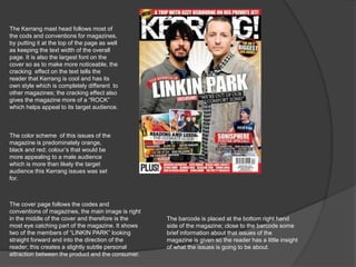
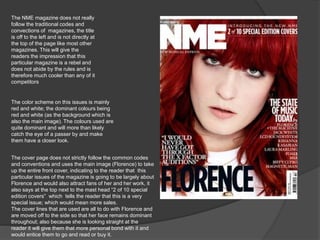
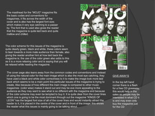
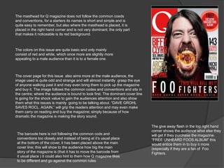
The document analyzes the cover designs of four music magazines - Kerrang, NME, Mojo, and Q - and how they follow or break conventions to appeal to audiences. For Kerrang, the cracked text and bold colors appeal to rock fans. NME breaks rules to seem rebellious and cool. Mojo uses a green color scheme and laidback font to signal a relaxed tone. Q draws attention with odd images and dramatic headlines to intrigue potential buyers. Across magazines, placement of mastheads, images, and free gifts aim to attract readers through diverting from or following standard magazine formats.