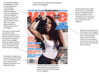
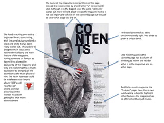
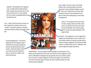
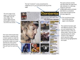
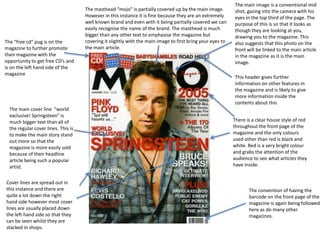
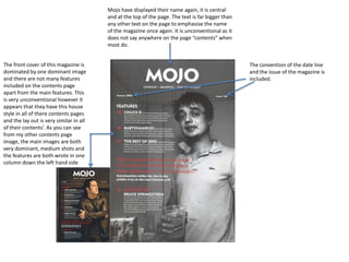
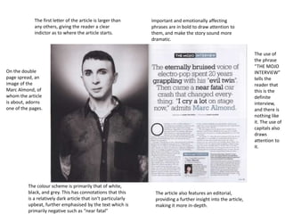
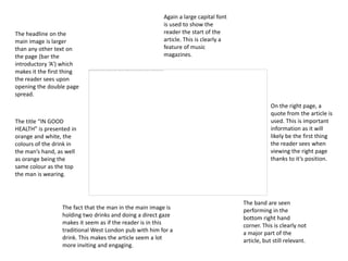
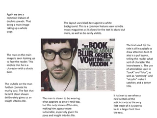
The document analyzes magazine covers and layouts. It discusses conventions like placing the masthead prominently, using bright colors to attract attention, centering the main photo to draw the eye, and including cover lines and barcodes. Key details that stand out include the artist's eyes looking at the viewer, main stories in large font, and sections highlighted through formatting and positioning. The purpose is to entice readers through visuals and information about featured articles and artists.
2. The masthead is always
the biggest piece of text
on the magazine and
is so that people
recognised there
preferred magazine.
The picture overlaps the
masthead slightly but
because it is such a well
established magazine
we still know it is clearly
VIBE. It is in bright
yellow, bold font to
emphasise the name of
the magazine
This header gives further information about
stories in the magazine
The main photo in the middle
of the cover is a conventional
device on magazines with the
persons eyes central and in
the top third. This is so it looks
as though they are looking at
you, to draw you to the
magazine
Main cover line indicates the
main feature of the magazine
and is one of the main selling
points. After seeing the
name in this case “Janet
Jackson” you are supposed
to be drawn to the name and
want to read more about the
particular person.
The cover lines which are the
main features of the
magazine are down the left
third so that they can be seen
the way they are stacked in
shops. They are brightly
coloured orange and blue to
attract the eye of potential
buyers to read these cover
lines and buy the magazine.
A convention of magazines is
to have the barcode and date
on the front however some
are on the back of the
magazine to keep the cover
ascetically pleasing
The house style of blue and orange
really makes the text stand out and
grab the attention of people looking
to buy a magazine.
3. The name of the magazine is not written on this page
instead it is represented by a faint letter “v” to represent
vibe. Although it is the biggest text, the word “contnets”
stands out more in bold, black text as the magazine name is
not too important to have on the contents page but should
be clear what page you are on
The hand reaching over with a
bright red heart, contrasting
with the grey background and a
black and white Kanye West
really stands out. This is done to
bring the main focus onto
Kanye who is clearly the main
feature of the magazine.
Having someone as famous as
Kanye West shows the
popularity of the magazine and
they are exploiting this as much
as possible by bringing all the
attention to the main photo of
him. The heart however could
be in reference to Kanye’s
album “808’s and
Heartbreak”
where a similar
picture is on the
front of his album
getting his that more
advertisement
The word contents has been
unconventionally split into three to
given a unique twist.
Like most magazines the
contents page has a column of
writhing to inform the reader
what is in the magazine and on
what page.
As this is a music magazine the
“Fashion” pages have there own
sub heading in bold to highlight
other features the magazine has
to offer other than just music .
4.
5. The text “contents” is very conventional to
magazines as it is just one word at the top of the
page.
The main image on the
page is a close up and is
much bigger than the
other images. This
would suggest that the
photo graph is linked to
one of the main articles.
The name of the bands have
bee written in bold text and
in block capitals to make the
band name stand out clearly
so that the reader can easily
identify the artists which
interest them and the ones
they will want to read more
on.
The word contents and the
sub-titles down the right hand
side indicates it is a Kerrang
magazine with their
recognisable yellow and black
text which is a consistent
house style through out the
Kerrang magazines.
The conventional date
line on the contents
page is also displayed
The contents has been split
into different sections. They
are sub-headed down the
right hand side so they are
easily visible. There are also
separate photos for other
articles in the magazine
which would be major
features being highlighted for
the reader
6. The “free cd” pug is on the
magazine to further promote
their magazine with the
opportunity to get free CD’s and
is on the left hand side of the
magazine
The main cover line “world
exclusive! Springsteen” is
much bigger text than all of
the regular cover lines. This is
to make the main story stand
out more so that the
magazine is more easily sold
because of their headline
article being such a popular
artist.
Cover lines are spread out in
this instance and there are
quite a lot down the right
hand side however most cover
lines are usually placed down
the left hand side so that they
can be seen whilst they are
stacked in shops.
The masthead “mojo” is partially covered up by the main image.
However in this instance it is fine because they are an extremely
well known brand and even with it being partially covered we can
easily recognise the name of the brand. The masthead is much
bigger than any other text to emphasise the magazine but
covering it slightly with the main image to first bring your eyes to
the main article.
The main image is a conventional mid
shot, gazing into the camera with his
eyes in the top third of the page. The
purpose of this is so that it looks as
though they are looking at you,
drawing you to the magazine. This
also suggests that this photo on the
front will be linked to the main article
in the magazine as it is the main
image.
This header gives further
information on other features in
the magazine and is likely to give
more information inside the
contents about this
There is a clear house style of red
throughout the front page of the
magazine and the only colours
used other than red is black and
white. Red is a very bright colour
and grabs the attention of the
audience to see what articles they
have inside.
The convention of having the
barcode on the front page of the
magazine is again being followed
here as do many other
magazines.
7. Mojo have displayed their name again, it is central
and at the top of the page. The text is far bigger than
any other text on the page to emphasise the name
of the magazine once again. It is unconventional as it
does not say anywhere on the page “contents” when
most do.
The front cover of this magazine is
dominated by one dominant image
and there are not many features
included on the contents page
apart from the main features. This
is very unconventional however it
appears that they have this house
style in all of there contents pages
and the lay out is very similar in all
of their contents’. As you can see
from my other contents page
image, the main images are both
very dominant, medium shots and
the features are both wrote in one
column down the left hand side
The convention of the date line
and the issue of the magazine is
included.
8. The first letter of the article is larger than
any others, giving the reader a clear
indictor as to where the article starts.
Important and emotionally affecting
phrases are in bold to draw attention to
them, and make the story sound more
dramatic.
The use of
the phrase
“THE MOJO
INTERVIEW”
tells the
reader that
this is the
definite
interview,
and there is
nothing like
it. The use of
capitals also
draws
attention to
it.
On the double
page spread, an
image of the
Marc Almond, of
whom the article
is about, adorns
one of the pages.
The colour scheme is primarily that of white,
black, and grey. This has connotations that this
is a relatively dark article that isn’t particularly
upbeat, further emphasised by the text which is
primarily negative such as “near fatal”
The article also features an editorial,
providing a further insight into the article,
making it more in-depth.
9. The headline on the
main image is larger
than any other text on
the page (bar the
introductory ‘A’) which
makes it the first thing
the reader sees upon
opening the double page
spread.
Again a large capital font
is used to show the
reader the start of the
article. This is clearly a
feature of music
magazines.
The title “IN GOOD
HEALTH” is presented in
orange and white, the
colours of the drink in
the man’s hand, as well
as orange being the
same colour as the top
the man is wearing.
The fact that the man in the main image is
holding two drinks and doing a direct gaze
makes it seem as if the reader is in this
traditional West London pub with him for a
drink. This makes the article seem a lot
more inviting and engaging.
On the right page, a
quote from the article is
used. This is important
information as it will
likely be the first thing
the reader sees when
viewing the right page
thanks to it’s position.
The band are seen
performing in the
bottom right hand
corner. This is clearly not
a major part of the
article, but still relevant.
10. Again we see a
common feature of
double spreads. That
being a main image
taking up a whole
page.
The layout uses black text against a white
background. This is a common feature seen in indie
music magazines as it allows for the text to stand out
more, as well as be easily visible.
The text used for the
title is all in capitals to
draw attention to it. It
also is a pull quote,
telling the reader what
sort of character the
interviewee is. The use
of alliteration seen in
“book” and “blur”, as
well as “vomiting” and
“vicodin” make it
catchier, and a better
title.
The man on the main
image is seen looking up
to face the reader. This
implies that he is a
character with a shady
past.
The stubble on the man
further connote his
murky past. The fact that
he isn’t clean shaven
deliberately gives us an
insight into his life.
The man is shown to be wearing
what appears to be a v-neck top,
but this only shows off his skin,
making him appear more
vulnerable, especially given his
pose and insight into his life.
It is clear to see when a
new section of the
article starts as the very
first letter of it is seen to
be in a larger font than
the rest.