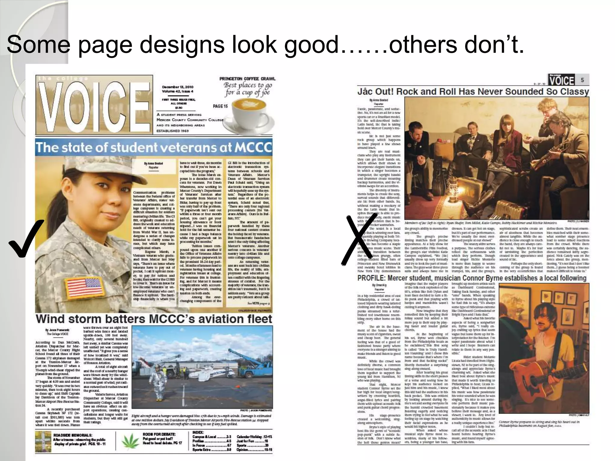
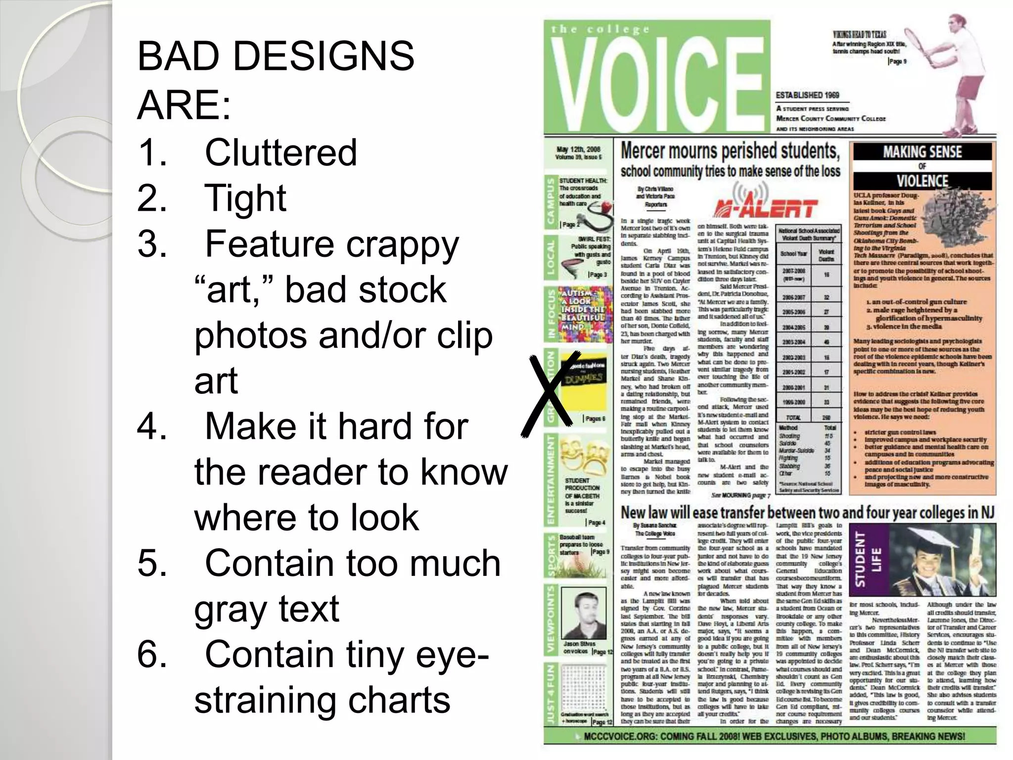
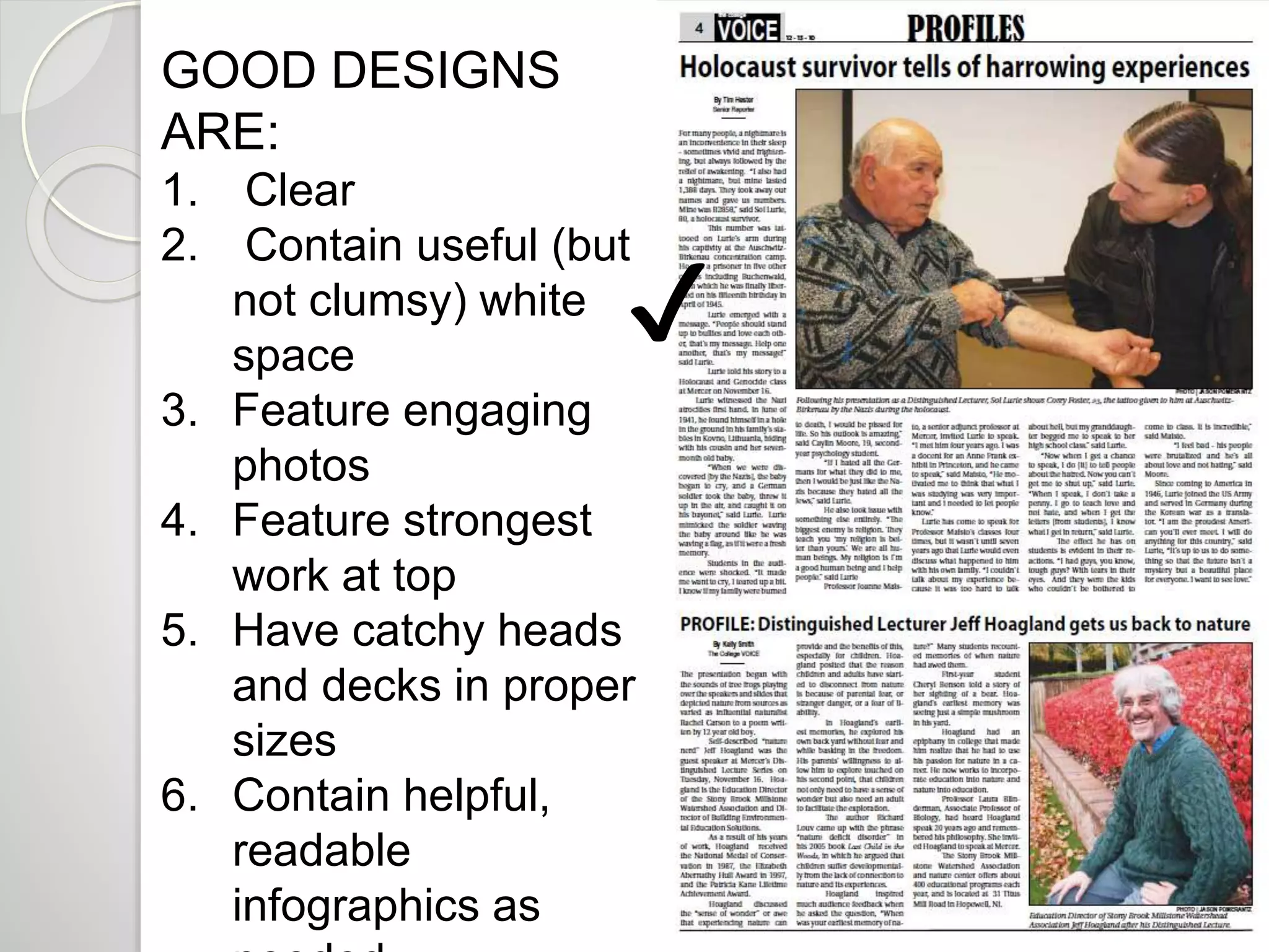
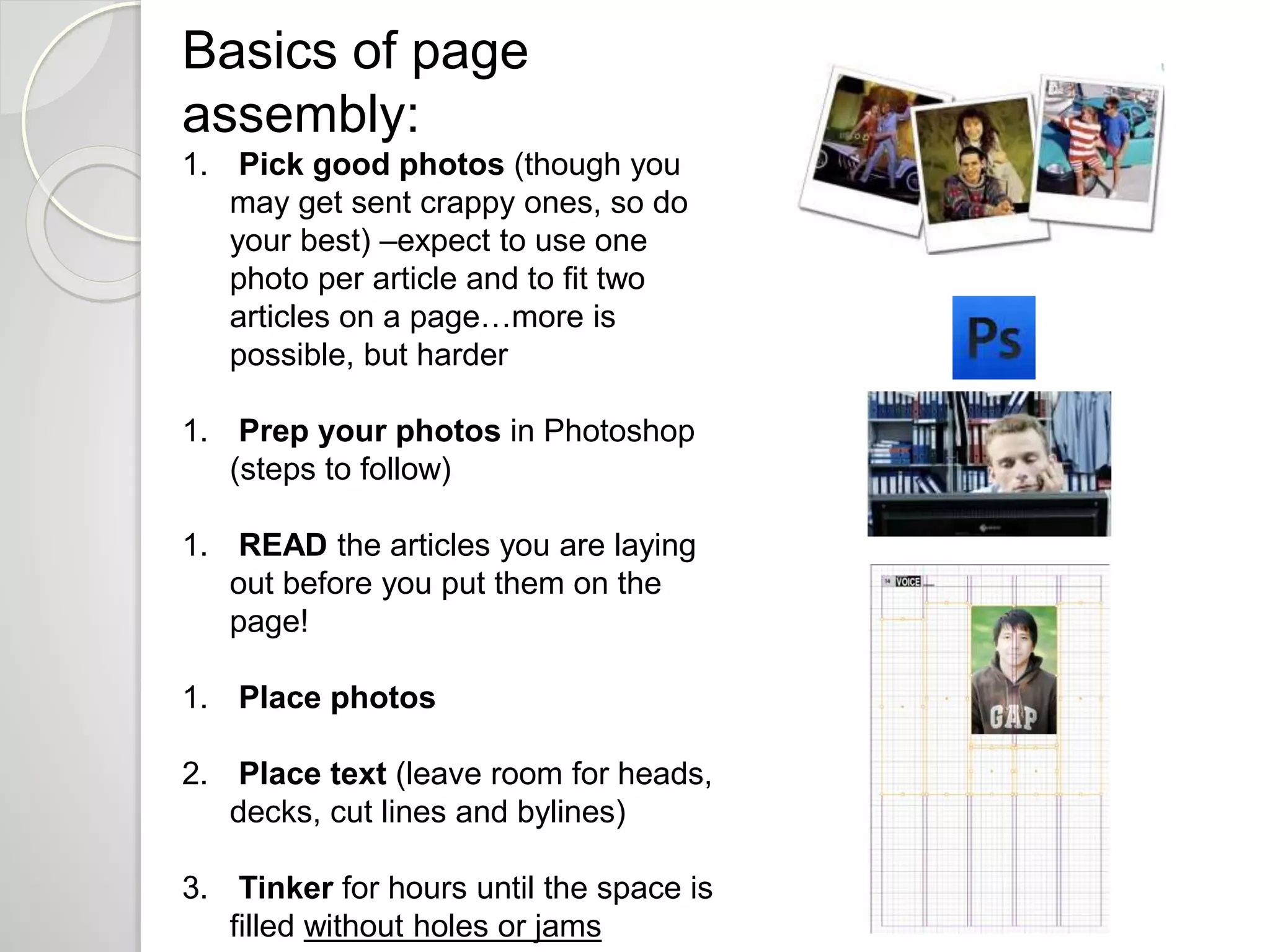
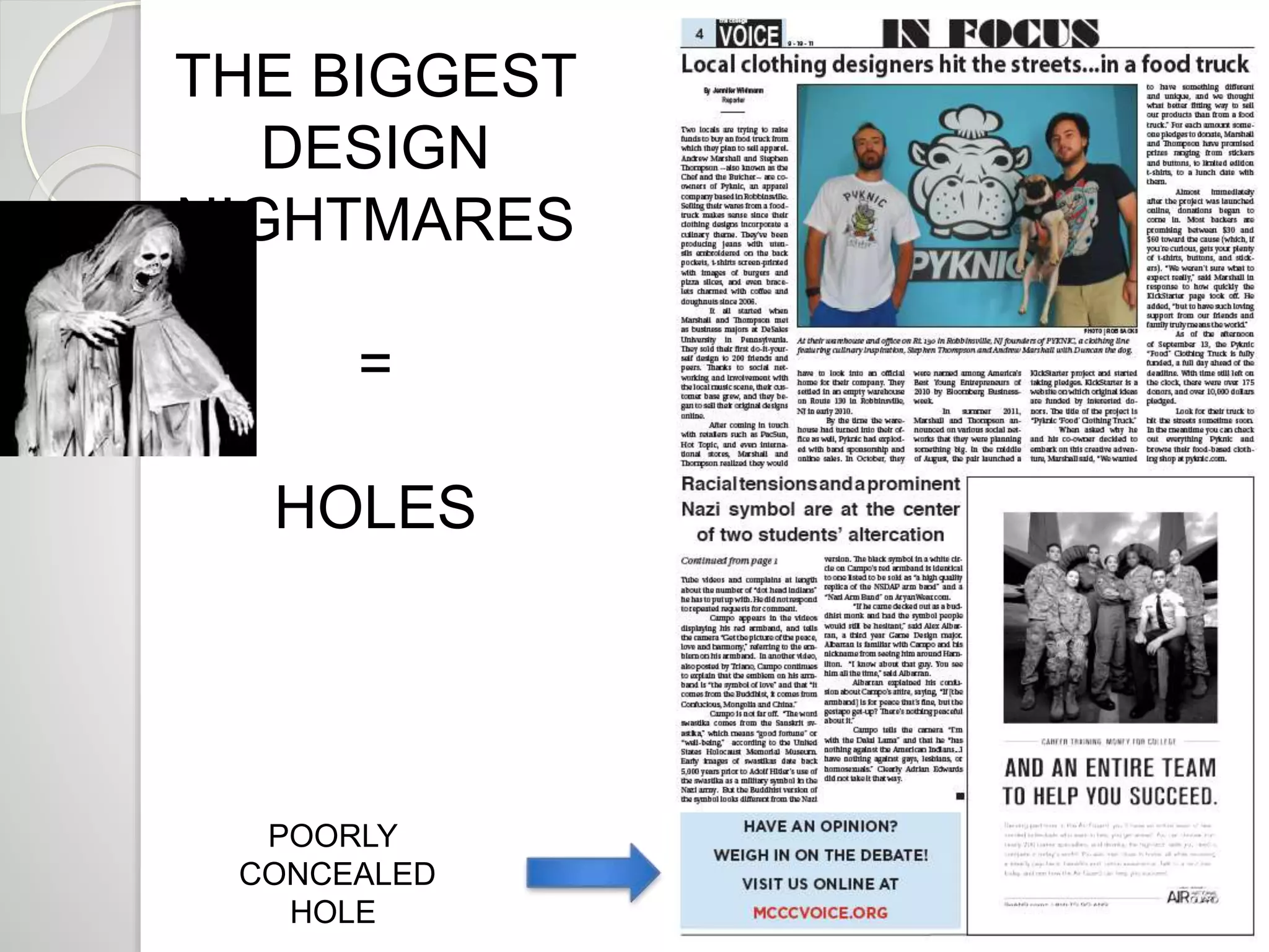
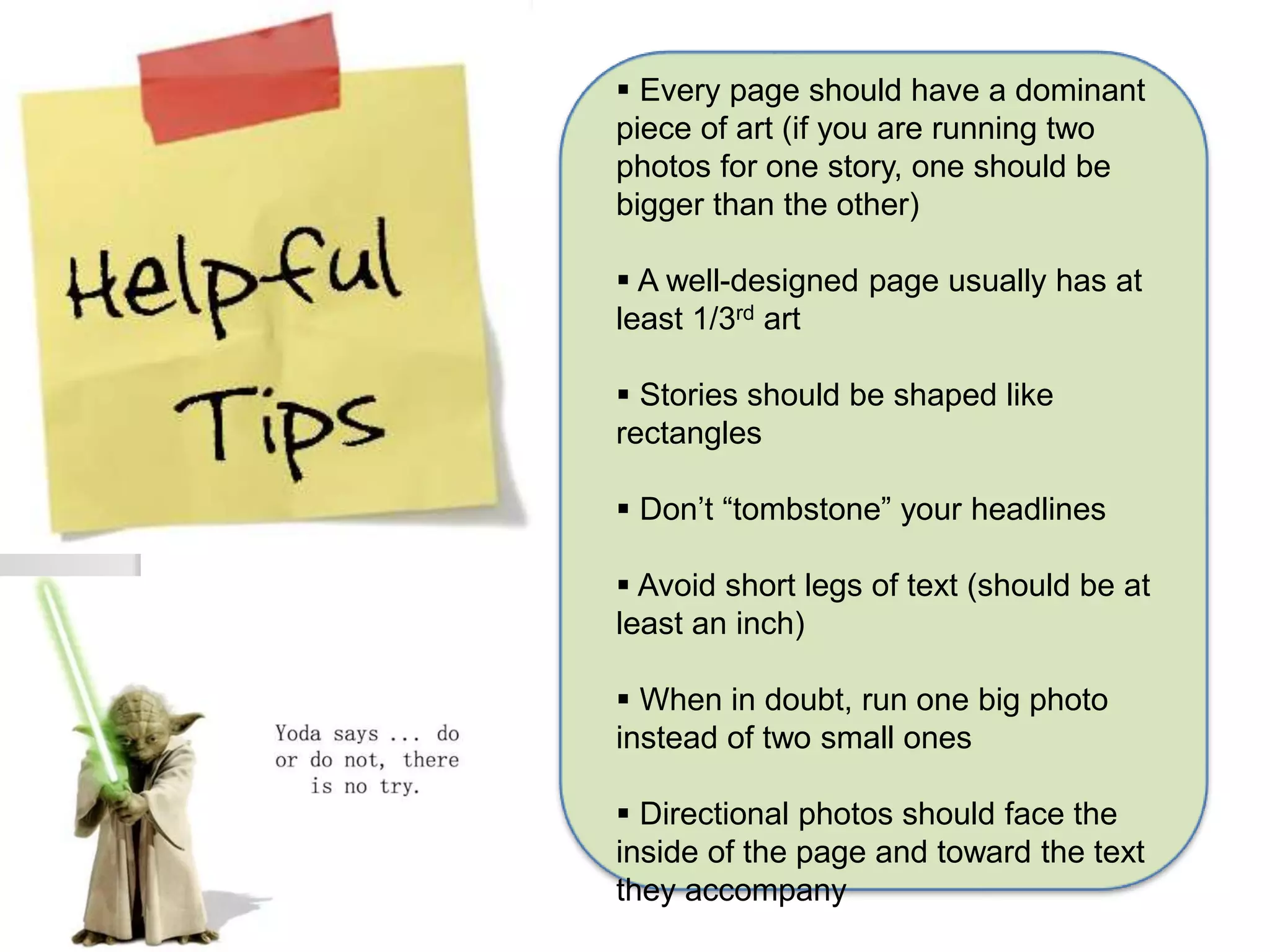
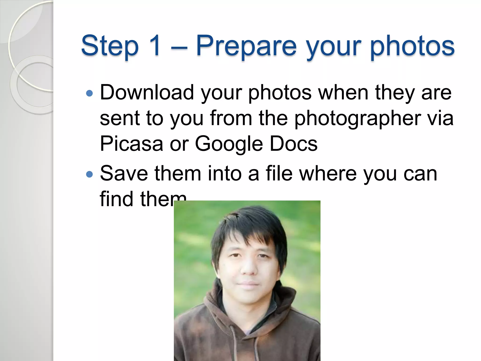
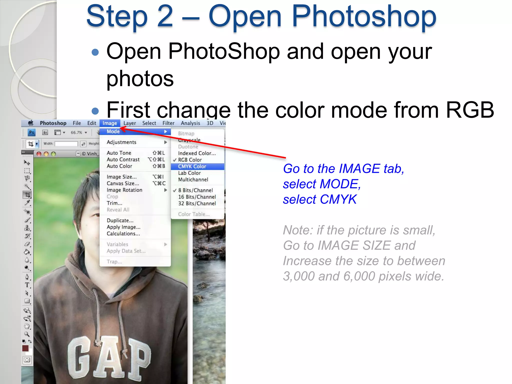
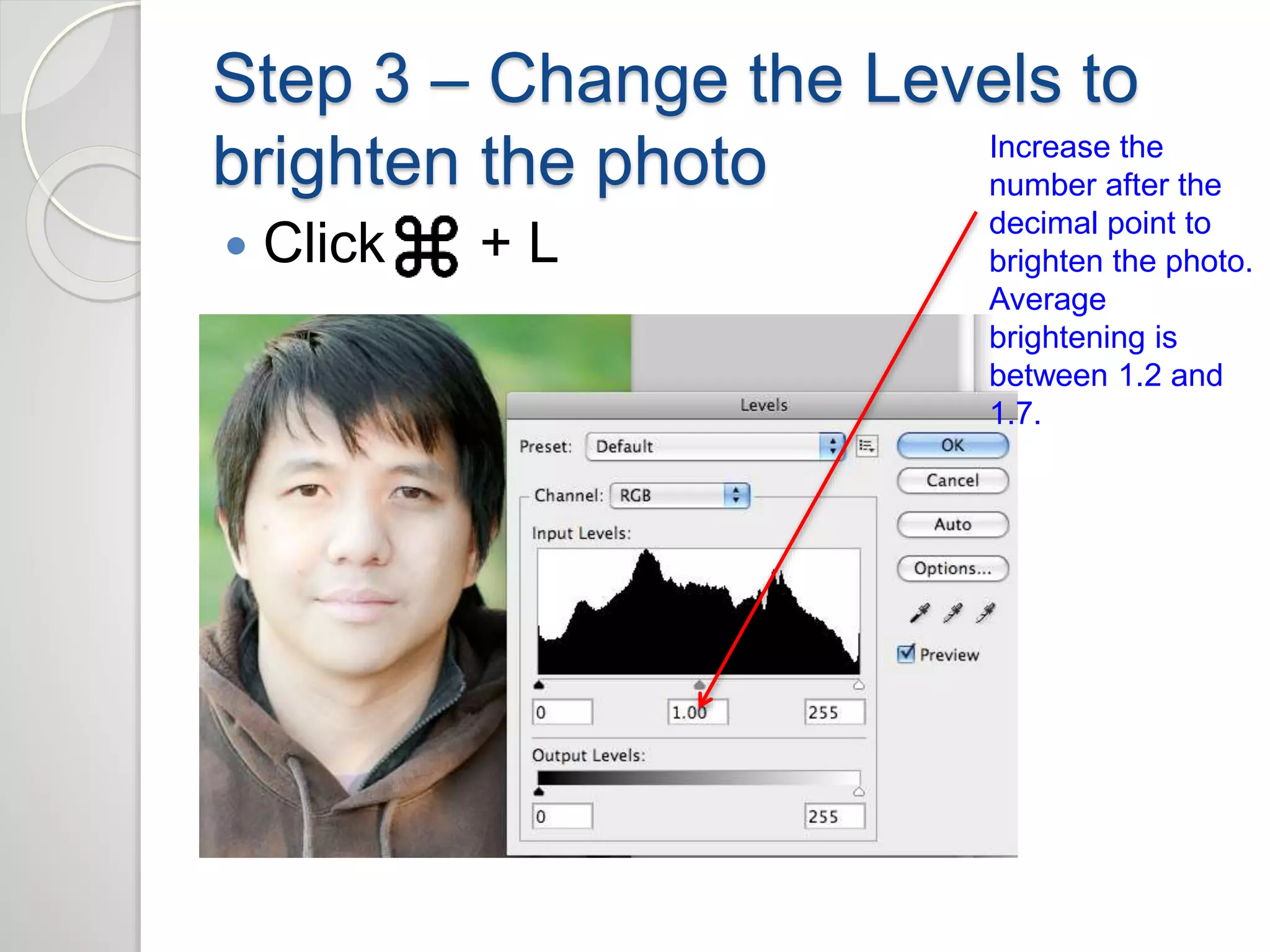
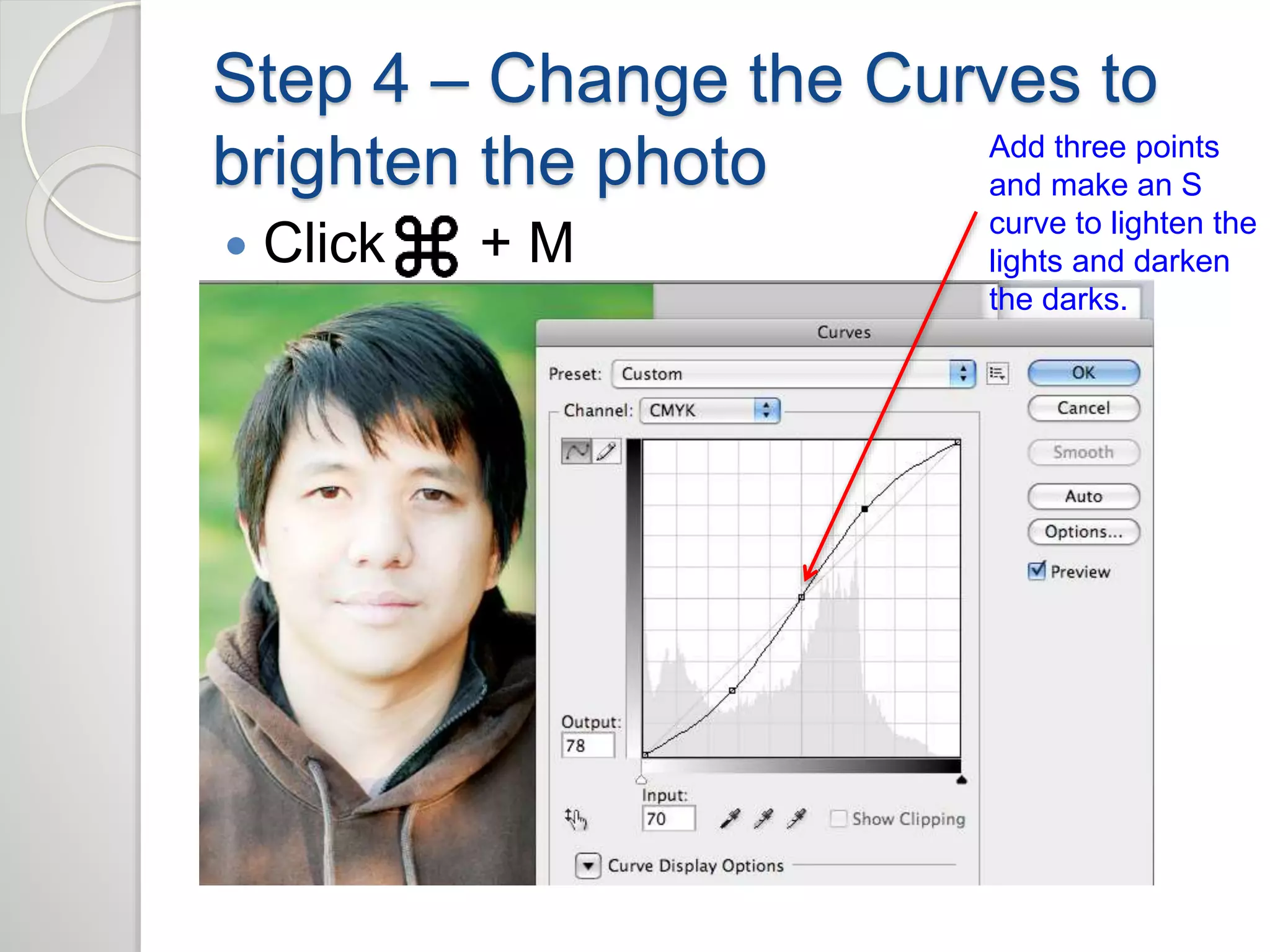
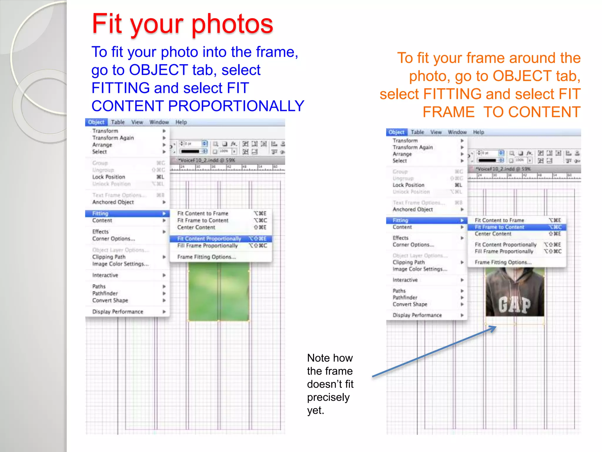
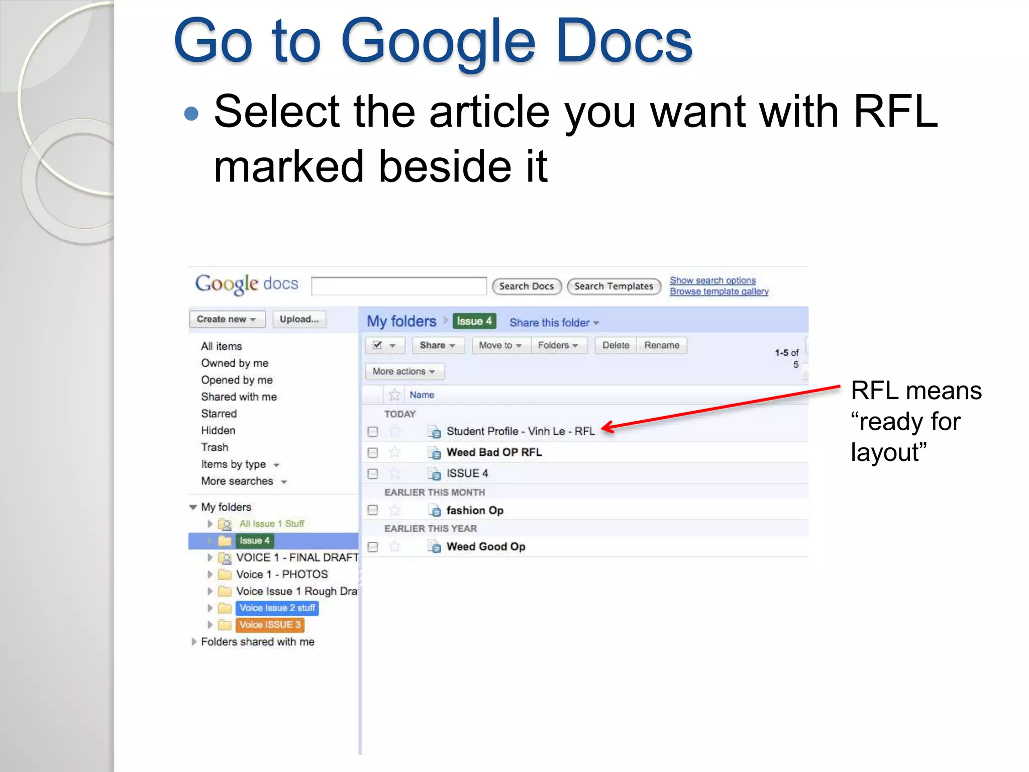
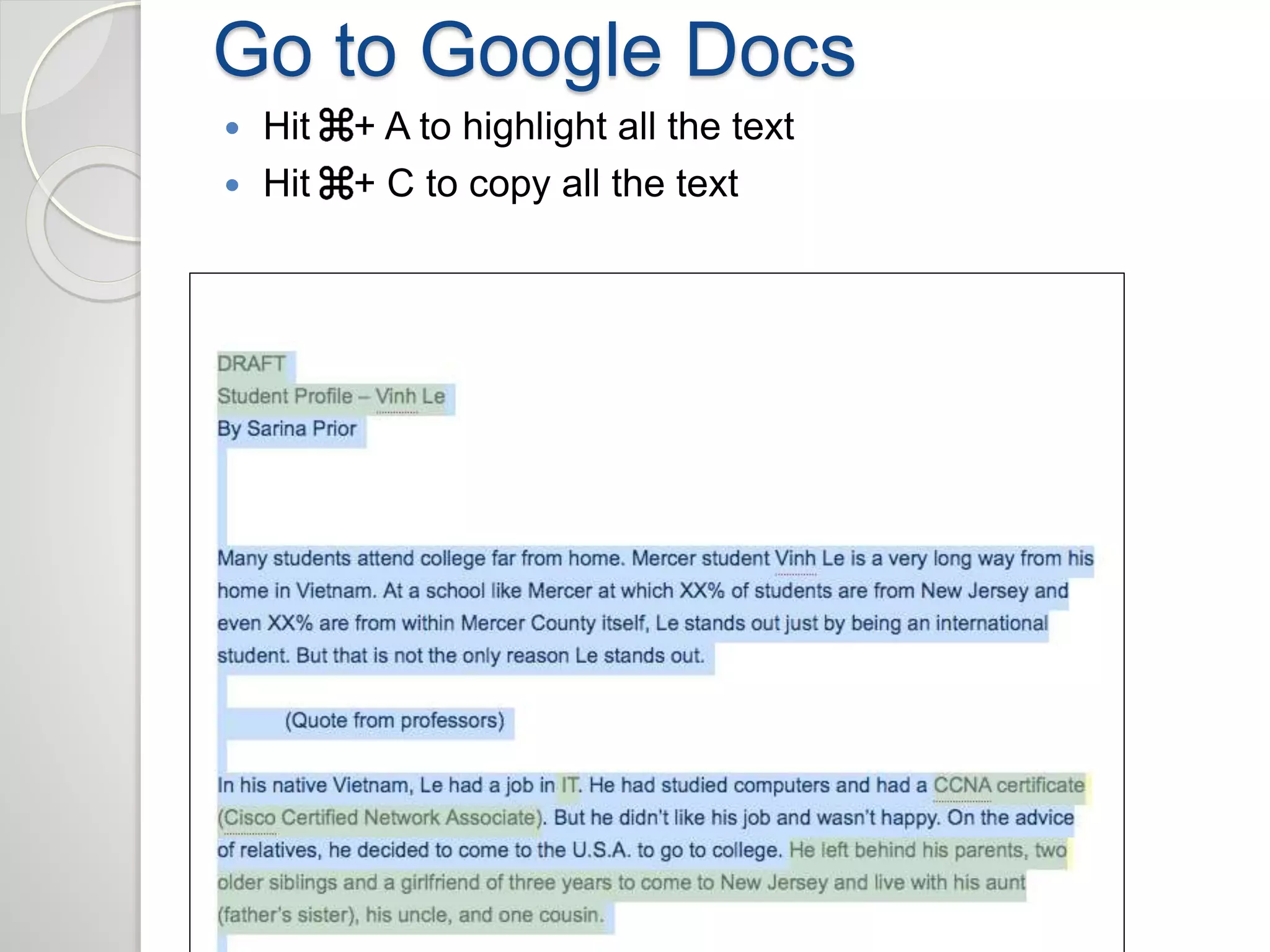
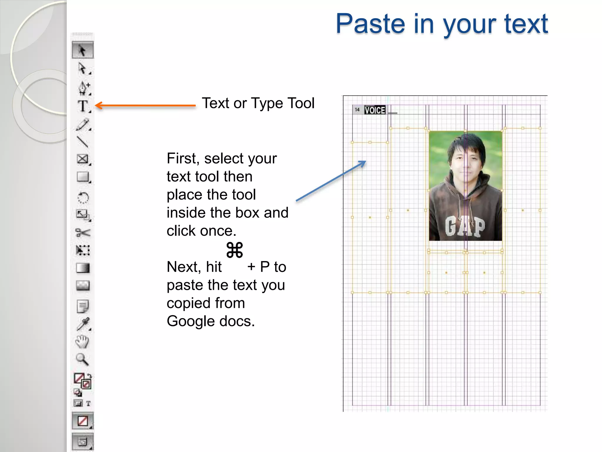
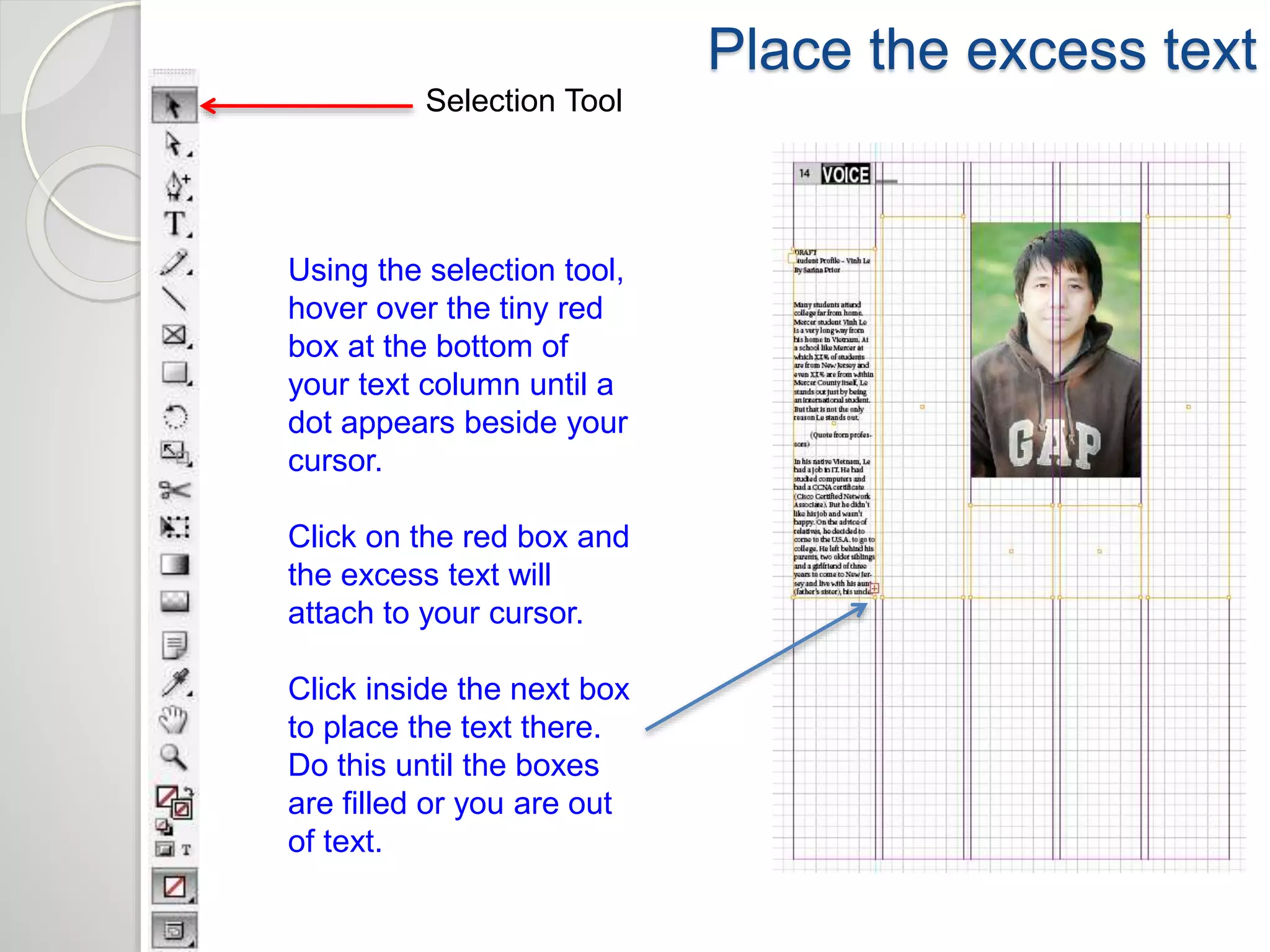
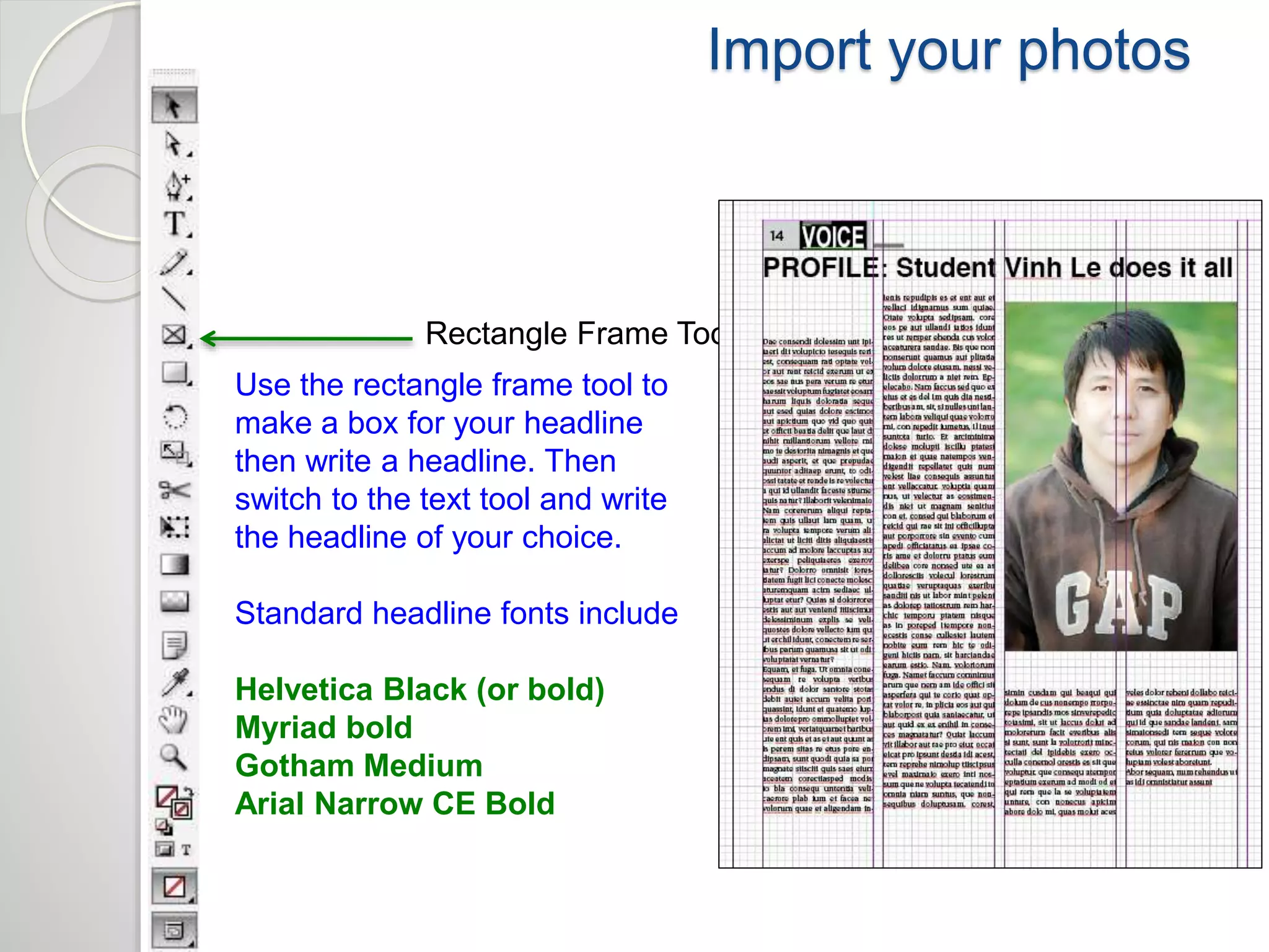
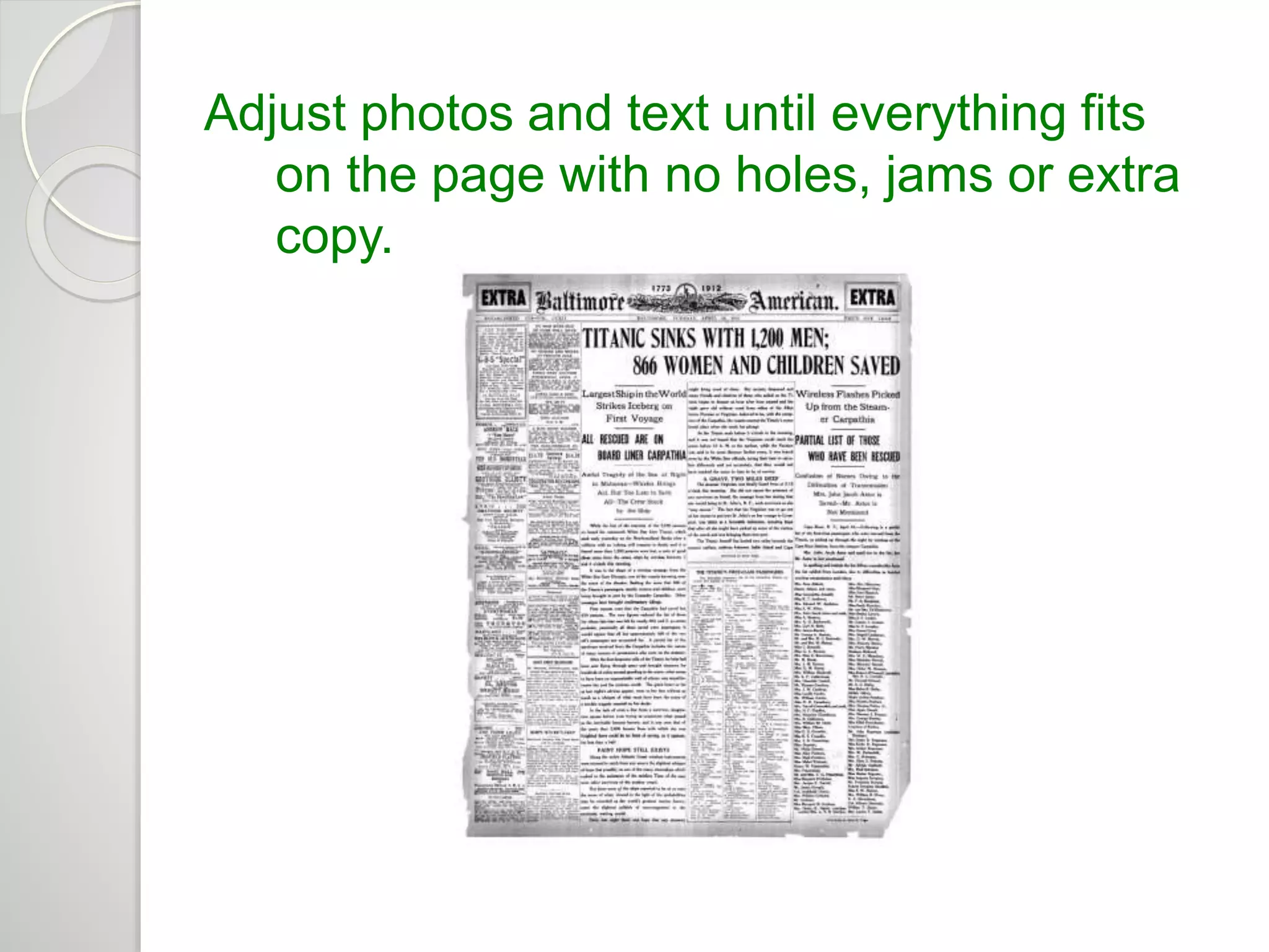
Intro to News Design and 
Layout 
Nor Azilah Binti Hj. Azmil
NAMES OF STUFF 
 Text is also called “copy” 
 Photos and graphics are called “art” 
 Columns are also called “legs”
Some page designs look good……others don’t. 
✔ ✗
BAD DESIGNS 
ARE: 
1. Cluttered 
2. Tight 
3. Feature crappy 
“art,” bad stock 
photos and/or clip 
art 
4. Make it hard for 
the reader to know 
where to look 
5. Contain too much 
gray text 
6. Contain tiny eye-straining 
charts 
✗
MORE BAD  
✗
EVEN WORSE  
✗
Good articles, 
AWFUL 
DESIGN  
✗
GOOD DESIGNS 
ARE: 
1. Clear 
2. Contain useful (but 
not clumsy) white 
space 
3. Feature engaging 
photos 
4. Feature strongest 
work at top 
5. Have catchy heads 
and decks in proper 
sizes 
6. Contain helpful, 
readable 
infographics as 
needed 
✔
GOOD 
✔
COMPLEX, BUT GOOD 
✔
Basics of page 
assembly: 
1. Pick good photos (though you 
may get sent crappy ones, so do 
your best) –expect to use one 
photo per article and to fit two 
articles on a page…more is 
possible, but harder 
1. Prep your photos in Photoshop 
(steps to follow) 
1. READ the articles you are laying 
out before you put them on the 
page! 
1. Place photos 
2. Place text (leave room for heads, 
decks, cut lines and bylines) 
3. Tinker for hours until the space is 
filled without holes or jams
THE BIGGEST 
DESIGN 
NIGHTMARES 
= 
HOLES 
POORLY 
CONCEALED 
HOLE
AND JAMS
HOW TO FIX A HOLE: 
1. Add decks to headlines 
2. Make photos bigger 
3. Put in a(n ugly little) promo box 
Handy 
deck 
Big honkin’ 
photo 
Ugly little promo box
HOW TO FIX A JAM: 
1. Trim the text CAREFULLY!!!! 
(Bottom up…YOU better have read 
it!) 
NOTE: Do not trim more than 10% 
The top story runs 
long, giving you an 
inch or more of 
overlapping text = 
trouble.
 Every page should have a dominant 
piece of art (if you are running two 
photos for one story, one should be 
bigger than the other) 
 A well-designed page usually has at 
least 1/3rd art 
 Stories should be shaped like 
rectangles 
 Don’t “tombstone” your headlines 
 Avoid short legs of text (should be at 
least an inch) 
 When in doubt, run one big photo 
instead of two small ones 
 Directional photos should face the 
inside of the page and toward the text 
they accompany
NEXT - 
Making the magic happen…a step by step 
guide
Step 1 – Prepare your photos 
 Download your photos when they are 
sent to you from the photographer via 
Picasa or Google Docs 
 Save them into a file where you can 
find them
Step 2 – Open Photoshop 
 Open PhotoShop and open your 
photos 
 First change the color mode from RGB 
to CMYK 
Go to the IMAGE tab, 
select MODE, 
select CMYK 
Note: if the picture is small, 
Go to IMAGE SIZE and 
Increase the size to between 
3,000 and 6,000 pixels wide.
Step 3 – Change the Levels to 
brighten the photo 
 Click + L 
Increase the 
number after the 
decimal point to 
brighten the photo. 
Average 
brightening is 
between 1.2 and 
1.7.
Step 4 – Change the Curves to 
brighten the photo 
 Click + M 
Add three points 
and make an S 
curve to lighten the 
lights and darken 
the darks.
Step 5 - SAVE YOUR WORK 
 Save your color corrected photos in a 
file where you can find them. 
SAVE 
YOUR 
WORK
Open InDesign
Know your basic tools 
Selection Tool 
Text or Type Tool 
Rectangle Frame Tool 
Magnifying Glass 
Fill and Stroke
Import your photos 
Rectangle Frame Tool 
Use the rectangle frame tool to 
make a box for your 
photograph. 
Stay between the column lines! 
Hit + D to select your 
photograph. Then hit okay. 
Note: If the photo is larger than 
the box, not all of it will appear, 
if it’s too small it won’t fill the 
box (make it larger in 
Photoshop).
Fit your photos 
To fit your photo into the frame, 
go to OBJECT tab, select 
FITTING and select FIT 
CONTENT PROPORTIONALLY 
To fit your frame around the 
photo, go to OBJECT tab, 
select FITTING and select FIT 
FRAME TO CONTENT 
Note how 
the frame 
doesn’t fit 
precisely 
yet.
Import your photos 
Rectangle Frame Tool 
Use the rectangle frame tool to 
make boxes for your text
Go to Google Docs 
 Select the article you want with RFL 
marked beside it 
RFL means 
“ready for 
layout”
Go to Google Docs 
 Hit + A to highlight all the text 
 Hit + C to copy all the text
Paste in your text 
Text or Type Tool 
First, select your 
text tool then 
place the tool 
inside the box and 
click once. 
Next, hit + P to 
paste the text you 
copied from 
Google docs.
Place the excess text 
Selection Tool 
Using the selection tool, 
hover over the tiny red 
box at the bottom of 
your text column until a 
dot appears beside your 
cursor. 
Click on the red box and 
the excess text will 
attach to your cursor. 
Click inside the next box 
to place the text there. 
Do this until the boxes 
are filled or you are out 
of text.
Change text to Utopia Std. 10 pt. 
Text or Type Tool 
First, select your 
text tool then 
place the tool 
inside the box and 
click once. 
Next, hit + A to 
highlight all the 
text. In the font 
box make sure 
that your body 
text is in Utopia 
Std. 10 pt font.
Import your photos 
Rectangle Frame Tool 
Use the rectangle frame tool to 
make a box for your headline 
then write a headline. Then 
switch to the text tool and write 
the headline of your choice. 
Standard headline fonts include 
Helvetica Black (or bold) 
Myriad bold 
Gotham Medium 
Arial Narrow CE Bold
Writing good headlines 
Headlines should be accurate and instantly understandable. 
 Every story must have a headline 
 5-10 words is optimum for most headlines 
 Headlines get smaller as you move down the page. Smaller 
stories get smaller headlines. 
 Don’t butt headlines. 
 Writing headlines: avoid awkward wording, jargon, omitted 
verbs, bad splits. 
 Write in the present tense.
Lather, rinse…repeat 
Keep adding and adjusting design elements until each page is full. 
Consult the News Designers Handbook for further layout ideas.
Adjust photos and text until everything fits 
on the page with no holes, jams or extra 
copy.
SAVE YOUR WORK 
 Save your InDesign files and photos . 
SAVE 
YOUR 
WORK
Intro to news design and layout

Intro to news design and layout

  • 1.
    Intro to NewsDesign and Layout Nor Azilah Binti Hj. Azmil
  • 2.
    NAMES OF STUFF  Text is also called “copy”  Photos and graphics are called “art”  Columns are also called “legs”
  • 3.
    Some page designslook good……others don’t. ✔ ✗
  • 4.
    BAD DESIGNS ARE: 1. Cluttered 2. Tight 3. Feature crappy “art,” bad stock photos and/or clip art 4. Make it hard for the reader to know where to look 5. Contain too much gray text 6. Contain tiny eye-straining charts ✗
  • 5.
  • 6.
  • 7.
    Good articles, AWFUL DESIGN  ✗
  • 8.
    GOOD DESIGNS ARE: 1. Clear 2. Contain useful (but not clumsy) white space 3. Feature engaging photos 4. Feature strongest work at top 5. Have catchy heads and decks in proper sizes 6. Contain helpful, readable infographics as needed ✔
  • 9.
  • 10.
  • 11.
    Basics of page assembly: 1. Pick good photos (though you may get sent crappy ones, so do your best) –expect to use one photo per article and to fit two articles on a page…more is possible, but harder 1. Prep your photos in Photoshop (steps to follow) 1. READ the articles you are laying out before you put them on the page! 1. Place photos 2. Place text (leave room for heads, decks, cut lines and bylines) 3. Tinker for hours until the space is filled without holes or jams
  • 12.
    THE BIGGEST DESIGN NIGHTMARES = HOLES POORLY CONCEALED HOLE
  • 13.
  • 14.
    HOW TO FIXA HOLE: 1. Add decks to headlines 2. Make photos bigger 3. Put in a(n ugly little) promo box Handy deck Big honkin’ photo Ugly little promo box
  • 15.
    HOW TO FIXA JAM: 1. Trim the text CAREFULLY!!!! (Bottom up…YOU better have read it!) NOTE: Do not trim more than 10% The top story runs long, giving you an inch or more of overlapping text = trouble.
  • 16.
     Every pageshould have a dominant piece of art (if you are running two photos for one story, one should be bigger than the other)  A well-designed page usually has at least 1/3rd art  Stories should be shaped like rectangles  Don’t “tombstone” your headlines  Avoid short legs of text (should be at least an inch)  When in doubt, run one big photo instead of two small ones  Directional photos should face the inside of the page and toward the text they accompany
  • 17.
    NEXT - Makingthe magic happen…a step by step guide
  • 18.
    Step 1 –Prepare your photos  Download your photos when they are sent to you from the photographer via Picasa or Google Docs  Save them into a file where you can find them
  • 19.
    Step 2 –Open Photoshop  Open PhotoShop and open your photos  First change the color mode from RGB to CMYK Go to the IMAGE tab, select MODE, select CMYK Note: if the picture is small, Go to IMAGE SIZE and Increase the size to between 3,000 and 6,000 pixels wide.
  • 20.
    Step 3 –Change the Levels to brighten the photo  Click + L Increase the number after the decimal point to brighten the photo. Average brightening is between 1.2 and 1.7.
  • 21.
    Step 4 –Change the Curves to brighten the photo  Click + M Add three points and make an S curve to lighten the lights and darken the darks.
  • 22.
    Step 5 -SAVE YOUR WORK  Save your color corrected photos in a file where you can find them. SAVE YOUR WORK
  • 23.
  • 24.
    Know your basictools Selection Tool Text or Type Tool Rectangle Frame Tool Magnifying Glass Fill and Stroke
  • 25.
    Import your photos Rectangle Frame Tool Use the rectangle frame tool to make a box for your photograph. Stay between the column lines! Hit + D to select your photograph. Then hit okay. Note: If the photo is larger than the box, not all of it will appear, if it’s too small it won’t fill the box (make it larger in Photoshop).
  • 26.
    Fit your photos To fit your photo into the frame, go to OBJECT tab, select FITTING and select FIT CONTENT PROPORTIONALLY To fit your frame around the photo, go to OBJECT tab, select FITTING and select FIT FRAME TO CONTENT Note how the frame doesn’t fit precisely yet.
  • 27.
    Import your photos Rectangle Frame Tool Use the rectangle frame tool to make boxes for your text
  • 28.
    Go to GoogleDocs  Select the article you want with RFL marked beside it RFL means “ready for layout”
  • 29.
    Go to GoogleDocs  Hit + A to highlight all the text  Hit + C to copy all the text
  • 30.
    Paste in yourtext Text or Type Tool First, select your text tool then place the tool inside the box and click once. Next, hit + P to paste the text you copied from Google docs.
  • 31.
    Place the excesstext Selection Tool Using the selection tool, hover over the tiny red box at the bottom of your text column until a dot appears beside your cursor. Click on the red box and the excess text will attach to your cursor. Click inside the next box to place the text there. Do this until the boxes are filled or you are out of text.
  • 32.
    Change text toUtopia Std. 10 pt. Text or Type Tool First, select your text tool then place the tool inside the box and click once. Next, hit + A to highlight all the text. In the font box make sure that your body text is in Utopia Std. 10 pt font.
  • 33.
    Import your photos Rectangle Frame Tool Use the rectangle frame tool to make a box for your headline then write a headline. Then switch to the text tool and write the headline of your choice. Standard headline fonts include Helvetica Black (or bold) Myriad bold Gotham Medium Arial Narrow CE Bold
  • 34.
    Writing good headlines Headlines should be accurate and instantly understandable.  Every story must have a headline  5-10 words is optimum for most headlines  Headlines get smaller as you move down the page. Smaller stories get smaller headlines.  Don’t butt headlines.  Writing headlines: avoid awkward wording, jargon, omitted verbs, bad splits.  Write in the present tense.
  • 35.
    Lather, rinse…repeat Keepadding and adjusting design elements until each page is full. Consult the News Designers Handbook for further layout ideas.
  • 36.
    Adjust photos andtext until everything fits on the page with no holes, jams or extra copy.
  • 37.
    SAVE YOUR WORK  Save your InDesign files and photos . SAVE YOUR WORK