Downloaded 150 times

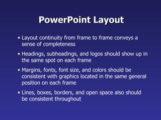
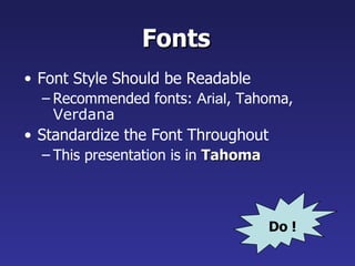
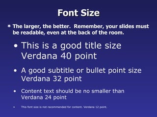
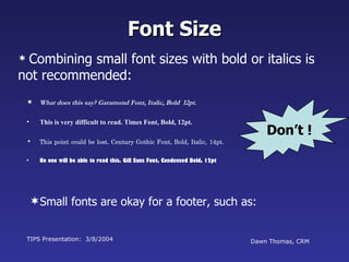

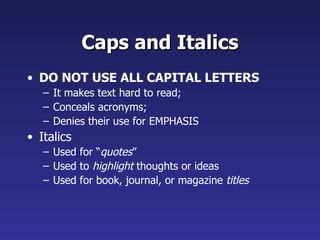
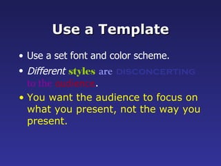

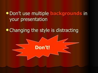
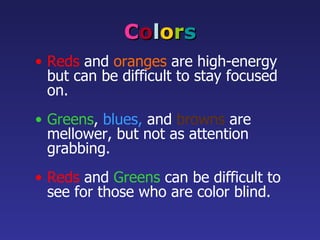


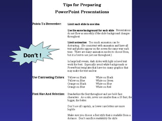


This document provides comprehensive guidelines for creating effective PowerPoint presentations, emphasizing the importance of readability, consistency in layout and fonts, and the strategic use of colors and graphics. Key recommendations include limiting text to key points, using a standard font size for visibility, and maintaining a uniform background across slides. The document cautions against common pitfalls, such as overcrowding slides with text and using distracting animations.