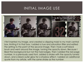
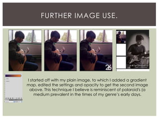
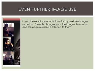
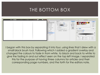
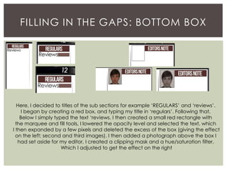
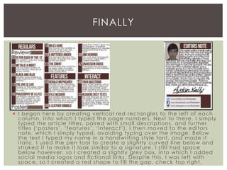
Aydan KellyCONTENTS
IN THE BEGINNING
I began by titling my page, ‘Contents’ in a
font used on my cover. To this text I added an
outer glow for a subtle shadow effect and a
pattern overlay which I had created of
horizontal lines. I then filled a rectangle in red
(using the rectangular marquee tool and fill
tool, slightly overlapping with the text.) From
here I selected the text, expanded the
selection and deleted the overlapping
rectangle. Following that, I selected the
rectangle and in blue and red, and using the
brush tool, I drew horizontal lines to replicate
the union jack colour scheme. I turned the
opacity down to reach the effect below.
A SIMPLE TOUCH
Here I just made a red box (using the fill tool
and rectangular marquee tool) I added an
outer glow and drop shadow for an
enhanced shadow effect. I then simply
added the date in a previously used font and
added a drop shadow.
INITIAL FRAMEWORK.
I began here, by creating the center
box, for my feature image (using the
rectangular marquee and fill tools). I
then used a similar process for all
other boxes. The ones on the sides
being for images from other feature
articles. And the bottom being for
any and all text, including the editors
note and titles and page numbers for
all articles. I then added the name of
my character on the side of the
center image (in a previously used
font) as he would be the focus of the
article. I added a red bar (using the
rectangular marquee and fill tools).
Mainly to fill the empty space, and
on top of this bar, I added a quote
from my article.
INITIAL IMAGE USE
I first inserted my image, and created a clipping mask to my main central
box, limiting it to that box. I added a hue and saturation filter and edited
the setting to the point of the second image. Then I took a soft black
brush and went around the image, turning the opacity down. Because I
liked the background but not the hard edges. Then I added the red page
number, in a previously used font, added a stroke with the opacity turned
down, and a black outer glow for a shadow effect. I added an additional
quote from my article, with the same stroke as the number.
FURTHER IMAGE USE.
I started off with my plain image, to which I added a gradient
map, edited the settings and opacity to get the second image
above. This technique I believe is reminiscent of polaroid's (a
medium prevalent in the times of my genre’s early days.
EVEN FURTHER IMAGE USE
I used the exact same technique for my next two images
as before. The only changes were the images themselves
and the page numbers attributed to them
THE BOTTOM BOX
I began with this box by separating it into four, using lines that I drew with a
small black brush tool. Following which I added a gradient overlay and
changed the colours to fade in from white, to black and back to white to
give the fading in and out effect seen on the top left image. I separated
this for the purpose of having three columns for articles and their
corresponding page numbers, and the forth for the editors note.
FILLING IN THE GAPS: BOTTOM BOX
Here, I decided to titles of the sub sections for example ‘REGULARS’ and ‘reviews’.
I began by creating a red box, and typing my title in ‘regulars’. Following that,
Below I simply typed the text ‘reviews. I then created a small red rectangle with
the marquee and fill tools, I lowered the opacity level and selected the text, which
I then expanded by a few pixels and deleted the excess of the box (giving the effect
on the left; second and third images). I then added a photograph above the box I
had set aside for my editor, I created a clipping mask and a hue/saturation filter,
Which I adjusted to get the effect on the right
 I began here by creating vertical red rectangles to the left of each
column, into which I typed the page numbers. Next to these, I simply
typed the article titles, paired with small descriptions, and further
titles (‘posters’, ‘features’, ‘interact’). I then moved to the editors
note, which I simply typed, avoiding typing over the image. Below
the text I typed my name in a handwriting style font, and made it
italic. I used the pen tool to create a slightly curved line below and
stroked it to make it look similar to a signature. I still had space
below however, so I created a slightly grey box, into which I added
social media logos and fictional links. Despite this, I was left with
space, so I created a red shape to fill the gap, check top right.
FINALLY

Contents page screenshotting so far

  • 1.
  • 2.
    IN THE BEGINNING Ibegan by titling my page, ‘Contents’ in a font used on my cover. To this text I added an outer glow for a subtle shadow effect and a pattern overlay which I had created of horizontal lines. I then filled a rectangle in red (using the rectangular marquee tool and fill tool, slightly overlapping with the text.) From here I selected the text, expanded the selection and deleted the overlapping rectangle. Following that, I selected the rectangle and in blue and red, and using the brush tool, I drew horizontal lines to replicate the union jack colour scheme. I turned the opacity down to reach the effect below.
  • 3.
    A SIMPLE TOUCH HereI just made a red box (using the fill tool and rectangular marquee tool) I added an outer glow and drop shadow for an enhanced shadow effect. I then simply added the date in a previously used font and added a drop shadow.
  • 4.
    INITIAL FRAMEWORK. I beganhere, by creating the center box, for my feature image (using the rectangular marquee and fill tools). I then used a similar process for all other boxes. The ones on the sides being for images from other feature articles. And the bottom being for any and all text, including the editors note and titles and page numbers for all articles. I then added the name of my character on the side of the center image (in a previously used font) as he would be the focus of the article. I added a red bar (using the rectangular marquee and fill tools). Mainly to fill the empty space, and on top of this bar, I added a quote from my article.
  • 5.
    INITIAL IMAGE USE Ifirst inserted my image, and created a clipping mask to my main central box, limiting it to that box. I added a hue and saturation filter and edited the setting to the point of the second image. Then I took a soft black brush and went around the image, turning the opacity down. Because I liked the background but not the hard edges. Then I added the red page number, in a previously used font, added a stroke with the opacity turned down, and a black outer glow for a shadow effect. I added an additional quote from my article, with the same stroke as the number.
  • 6.
    FURTHER IMAGE USE. Istarted off with my plain image, to which I added a gradient map, edited the settings and opacity to get the second image above. This technique I believe is reminiscent of polaroid's (a medium prevalent in the times of my genre’s early days.
  • 7.
    EVEN FURTHER IMAGEUSE I used the exact same technique for my next two images as before. The only changes were the images themselves and the page numbers attributed to them
  • 8.
    THE BOTTOM BOX Ibegan with this box by separating it into four, using lines that I drew with a small black brush tool. Following which I added a gradient overlay and changed the colours to fade in from white, to black and back to white to give the fading in and out effect seen on the top left image. I separated this for the purpose of having three columns for articles and their corresponding page numbers, and the forth for the editors note.
  • 9.
    FILLING IN THEGAPS: BOTTOM BOX Here, I decided to titles of the sub sections for example ‘REGULARS’ and ‘reviews’. I began by creating a red box, and typing my title in ‘regulars’. Following that, Below I simply typed the text ‘reviews. I then created a small red rectangle with the marquee and fill tools, I lowered the opacity level and selected the text, which I then expanded by a few pixels and deleted the excess of the box (giving the effect on the left; second and third images). I then added a photograph above the box I had set aside for my editor, I created a clipping mask and a hue/saturation filter, Which I adjusted to get the effect on the right
  • 10.
     I beganhere by creating vertical red rectangles to the left of each column, into which I typed the page numbers. Next to these, I simply typed the article titles, paired with small descriptions, and further titles (‘posters’, ‘features’, ‘interact’). I then moved to the editors note, which I simply typed, avoiding typing over the image. Below the text I typed my name in a handwriting style font, and made it italic. I used the pen tool to create a slightly curved line below and stroked it to make it look similar to a signature. I still had space below however, so I created a slightly grey box, into which I added social media logos and fictional links. Despite this, I was left with space, so I created a red shape to fill the gap, check top right. FINALLY