Download to read offline


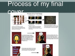

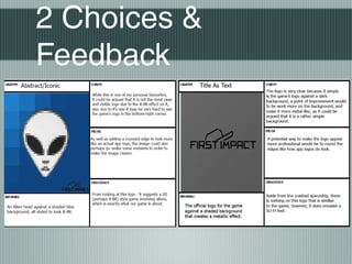
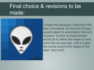
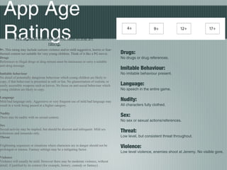
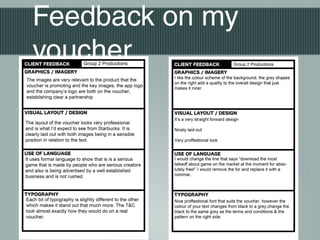

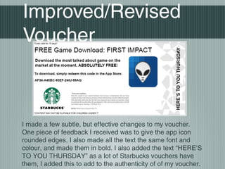


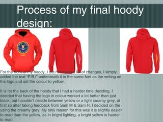
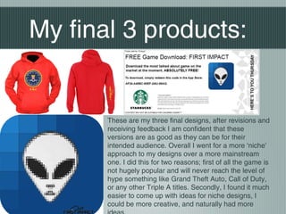
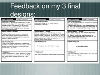
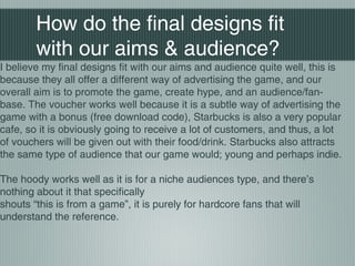

The document provides designs for promotional materials for an app called "First Impact", including an app icon, voucher, and hoody designs. Key points discussed include refining the app icon to have rounded edges like real icons, ensuring consistent fonts and colors on the voucher, and choosing a hoody design that is more niche to appeal to hardcore fans rather than a mainstream design. Feedback was received on the designs and revisions were made to improve readability and authenticity.