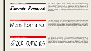
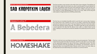
This document discusses potential fonts to use for a print production. It analyzes several fonts and their suitability based on the connotations and themes they may evoke. One font is described as formal with neat handwriting, linking it to the ideas of romance explored in the music video. Another font is said to be commonly associated with romance due to its use in restaurants, though it may provide too much contrast given the theme of a complicated break-up. A third "stereotypical" font risks making the demographic seem too young. In the end, the document recommends a font with lines that project continuity and is inspired by psychedelic art, linking it to the illusory nature of love depicted in the music video.