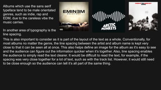
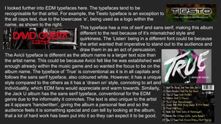
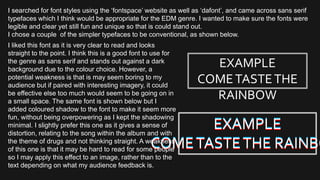
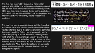
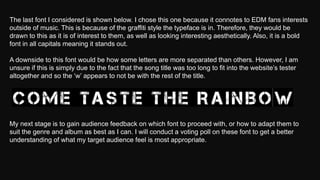
The document discusses typography and font choices for album covers in different music genres. It explains that sans serif fonts are generally more appropriate than serif fonts for EDM album covers due to their informal nature. Examples are provided of EDM album covers that use bold, all-caps sans serif fonts with close character spacing, appealing to a male audience. The document also discusses considerations like line spacing and color when designing album text. Feedback will be gathered from the target audience on potential font choices to ensure the most appropriate option is selected.
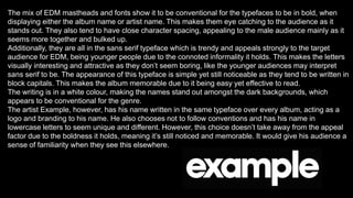
![Typography is the appearance and style of text. It holds importance due to the impact it can have on
the audience as it can make them feel a certain way, or give them the preferred reading [Hall] of the
album, or entice them into the purchase of the album as a persuasive device.
The font has to suit the genre of music in order to be interpreted the intended way. This can be done
by choosing the typeface, which will either fall into the serif or sans serif category. As my chosen
genre is EDM, sans serif would be most appropriate as it is used informally, whereas, serif would be
used for a more formal context, such as classical music and opera.
Sans serif is a typeface with rounded letters.
Serif is different as the letters have strokes on them.
Examples of albums using the serif typeface are
shown here. In pop, it’s more common for serif to
be used due to the femininity is connotes. This is
because the text tends to be aimed at a female
dominated target audience so the font appears to
be sophisticated and elegant.](https://image.slidesharecdn.com/14-171104220248/85/Font-Practices-1-320.jpg)
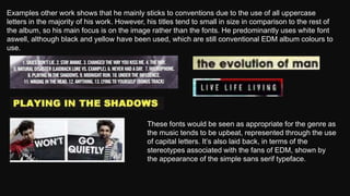
![Typography is the appearance and style of text. It holds importance due to the impact it can have on
the audience as it can make them feel a certain way, or give them the preferred reading [Hall] of the
album, or entice them into the purchase of the album as a persuasive device.
The font has to suit the genre of music in order to be interpreted the intended way. This can be done
by choosing the typeface, which will either fall into the serif or sans serif category. As my chosen
genre is EDM, sans serif would be most appropriate as it is used informally, whereas, serif would be
used for a more formal context, such as classical music and opera.
Sans serif is a typeface with rounded letters.
Serif is different as the letters have strokes on them.
Examples of albums using the serif typeface are
shown here. In pop, it’s more common for serif to
be used due to the femininity is connotes. This is
because the text tends to be aimed at a female
dominated target audience so the font appears to
be sophisticated and elegant.](https://image.slidesharecdn.com/14-171104220248/75/Font-Practices-1-2048.jpg)