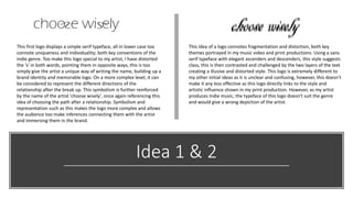
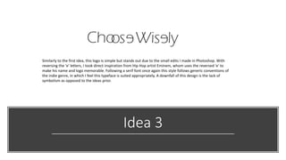
This document discusses initial logo ideas for an artist. Idea 1 displays a simple serif typeface in lowercase with distorted letterforms to represent the artist's uniqueness and the different directions of their relationship after a breakup. Idea 2 uses a sans serif typeface with elegant letterforms to suggest class, but the layered text creates a distorted style linking to the artist's productions, though the typeface may not suit the indie genre. Idea 3 similarly uses a simple serif typeface but with a reversed 'e' letter inspired by Eminem to make the name memorable, though it lacks symbolism of the prior ideas.