How to Troubleshoot Apps for the Modern Connected Worker
AM Poster Analysis
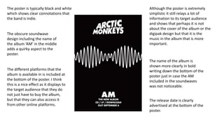
1. The poster is typically black and white
which shows clear connotations that
the band is indie.
The obscure soundwave
design including the name of
the album ‘AM’ in the middle
adds a quirky aspect to the
poster.
The name of the album is
shown more clearly in bold
writing down the bottom of the
poster just in case the AM
included in the soundwaves
was not noticeable.
The different platforms that the
album is available in is included at
the bottom of the poster. I think
this is a nice effect as it displays to
the target audience that they do
not just have to buy the album,
but that they can also access it
from other online platforms.
Although the poster is extremely
simplistic it still relays a lot of
information to its target audience
and shows that perhaps it is not
about the cover of the album or the
digipak design but that it is the
music in the album that is more
important.
The release date is clearly
advertised at the bottom of the
poster.