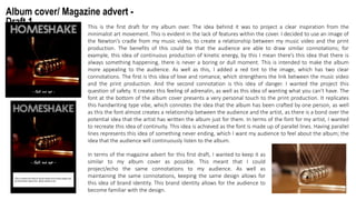
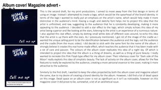
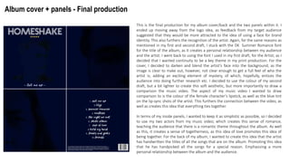
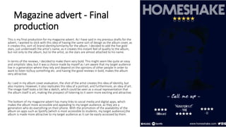
2. Album cover/ Magazine advert -
Draft 1 This is the first draft for my album over. The idea behind it was to project a clear inspiration from the
minimalist art movement. This is evident in the lack of features within the cover. I decided to use an image of
the Newton’s cradle from my music video, to create a relationship between my music video and the print
production. The benefits of this could be that the audience are able to draw similar connotations; for
example, this idea of continuous production of kinetic energy, by this I mean there’s this idea that there is
always something happening, there is never a boring or dull moment. This is intended to make the album
more appealing to the audience. As well as this, I added a red tint to the image, which has two clear
connotations. The first is this idea of love and romance, which strengthens the link between the music video
and the print production. And the second connotation is this idea of danger. I wanted the project this
question of safety. It creates this feeling of adrenalin, as well as this idea of wanting what you can’t have. The
font at the bottom of the album cover presents a very personal touch to the print production. It replicates
this handwriting type vibe, which connotes the idea that the album has been crafted by one person, as well
as this the font almost creates a relationship between the audience and the artist, as there is a bond over the
potential idea that the artist has written the album just for them. In terms of the font for my artist, I wanted
to recreate this idea of continuity. This idea is achieved as the font is made up of parallel lines. Having parallel
lines represents this idea of something never ending, which I want my audience to feel about the album; the
idea that the audience will continuously listen to the album.
In terms of the magazine advert for this first draft, I wanted to keep it as
similar to my album cover as possible. This meant that I could
project/echo the same connotations to my audience. As well as
maintaining the same connotations, keeping the same design allows for
this idea of brand identity. This brand identity allows for the audience to
become familiar with the design.
3. Album cover/ Magazine advert -
Draft 2 This is the second draft, for my print productions. I aimed to move away from the first design in terms of
using an image. Instead I attempted to create a logo, which would be the spearhead of the brand identity. In
terms of the logo I wanted to really put an emphasis on the artist’s name, which would help make it more
distinctive in the audience’s mind. Having a rough and sketchy font helps me to project this idea that the
artist is unfinished, and raw, suggesting to the audience that he is constantly developing, making it more
appealing to the audience. I decided to add a star effect to the logo, which simply echoes this idea of my
artist being superior and like looking at the stars, listening to the artist is an experience of a numinous nature.
I also applied this stat effect, simply by dotting small white dots of different sizes around, to echo this idea
that the artist is up there with the stars. As I previously mentioned, I got rid of the image of the cradle as I
wanted the unique selling point to be the identification between the audience and the logo, not the audience
and the cradle (from the music video). I did decide to stick with the same font for the name of the album. I
strongly believe it creates this real home-made effect, which teaches the audience that it has been made with
a lot of care and passion. The colours of the album cover replicates this idea of a night sky. Of which is
intended to project this idea that the album is a thing of dreams, as well as a thing of pure beauty. I really
wanted to recreate this Pink Floyd-type effect for my album cover. Their infamous cover for ‘Dark side of the
Moon’ really exploits this idea of simplistic beauty. The lack of activity on the album cover, allows for the few
features to really be explored by the audience, creating a more personal essence to the cover, making it more
attractive to the audience.
Similarly to the first draft, I wanted to keep the vibes projected by both the album cover and magazine advert
the same, due to my desire of creating a brand identity for the album. However, I did find a lot of dead space
on this image. Dead space on an album cover is not as significant as it isn’t as noticeable, however on this
magazine cover it did prove to be, somewhat, a bit of an aesthetical issue.
4. Album cover + panels - Final production
This is the final production for my album cover/back and the two panels within it. I
ended up moving away from the logo idea, as feedback from my target audience
suggested that they would be more attracted to the idea of using a face for brand
identity. This also furthers the recognition of the artist. Again, for the same reasons as
mentioned in my first and second draft, I stuck with the DK Summer Romance font
for the title of the album, as it creates a personal relationship between my audience
and the artist. I went back to using the font I used in my first draft, for the Artist; as I
decided that I wanted continuity to be a key theme in my print production. For the
cover, I decided to darken and blend the artist’s face into the background, as the
image is clear to make out, however, not clear enough to get a full feel of who the
artist is; adding an exciting element of mystery, of which, hopefully, entices the
audience into doing further research etc. I decided to use the colour of my second
draft, but a bit lighter to create this soft aesthetic, but more importantly to draw a
comparison the music video. The aspect of my music video I wanted to draw
comparison to is the colour of the female character’s lipstick, as well as the blue tint
on the lip-sync shots of the artist. This furthers the connection between the video, as
well as creates this idea that everything ties together.
In terms of my inside panels, I wanted to keep it as simplistic as possible, so I decided
to use my two actors from my music video; which creates this sense of romance,
teaching the audience that there is a romantic theme throughout the album. As well
as this, it creates a sense of togetherness, as this idea of love promotes this idea of
being together. For the back of my album, I wanted to create this idea that the artist
has handwritten the titles of all the songs that are on the album. Promoting this idea
that he has handpicked all the songs for a special reason. Emphasizing a more
personal relationship between the album and the audience.
5. Magazine advert - Final
production
This is my final production for my magazine advert. As I have said in my previous drafts for the
advert, I wanted to stick with this idea of having the same sort of design as the album cover, as
it creates this, sort of, brand identity/similarity for the album. I decided to add the five gold
stars, just underneath the artist’s name, as it creates this instant feel of quality to the album,
but not only to the album, but to the artist, as the stars are almost attached to his name.
In terms of the reviews, I decided to make them very bold. This might seem like quite an easy
and simplistic idea, but it was a choice made by myself as I am aware that my target audience
live in a generation where they rely and depend on the opinions of other people in order to
want to listen to/buy something etc. and having the good reviews in bold, makes the album
very attractive.
As I said in my album cover evaluation, the shot of the artist creates this idea of identity, but
also mystery. However, it also replicates this idea of a portrait, and furthermore, an idea of art.
The image itself looks a bit like a sketch, which could be seen as a visual representation that
the album itself is art, making the prospect of listening to it seem more exciting and attractive.
The bottom of my magazine advert has many links to social media and digital apps, which
makes the album more accessible and appealing to my target audience, as they are a
generation who do everything on their phone. With the promotion of the availability of the
album on apps such as Spotify (which is most accessible to students; my target audience),the
album is made more attractive to my target audience as it can be easily accessed by them.